Yes, you are seeing this correctly… a second post within a month. No, it’s not that I don’t have a boatload of painting ahead of me or a million-and-one things that I need to do; It’s just that I really know how things go. Meaning, if I don’t post more of the odds and ends that I have done between last Summer and now, you may not ever see them. For good or bad, I am constantly pointed in the forward position. I’m an ADHD-plagued do’er. I’ve come to understand that my mentality doesn’t allow much in the way of spending time and/or energy looking in the rearview. Nor do my eager curiosities in the present and near future account for prolonged interests in the past. Don’t get me wrong - I do realize the importance of reflection and recalling the experiences that shape us. Nostalgia and sentimentality… these things definitely stir my soul. I simply find it immensely challenging, the act of slowing down; taking the time to glance over my shoulder.
Therefore, in the interest of halting my pace and giving my present focus a brief rest, I am offering a visual smorgasbord of several “sign” projects that, for the past few months or so, have garnered much of my attention and captured my curiosities.
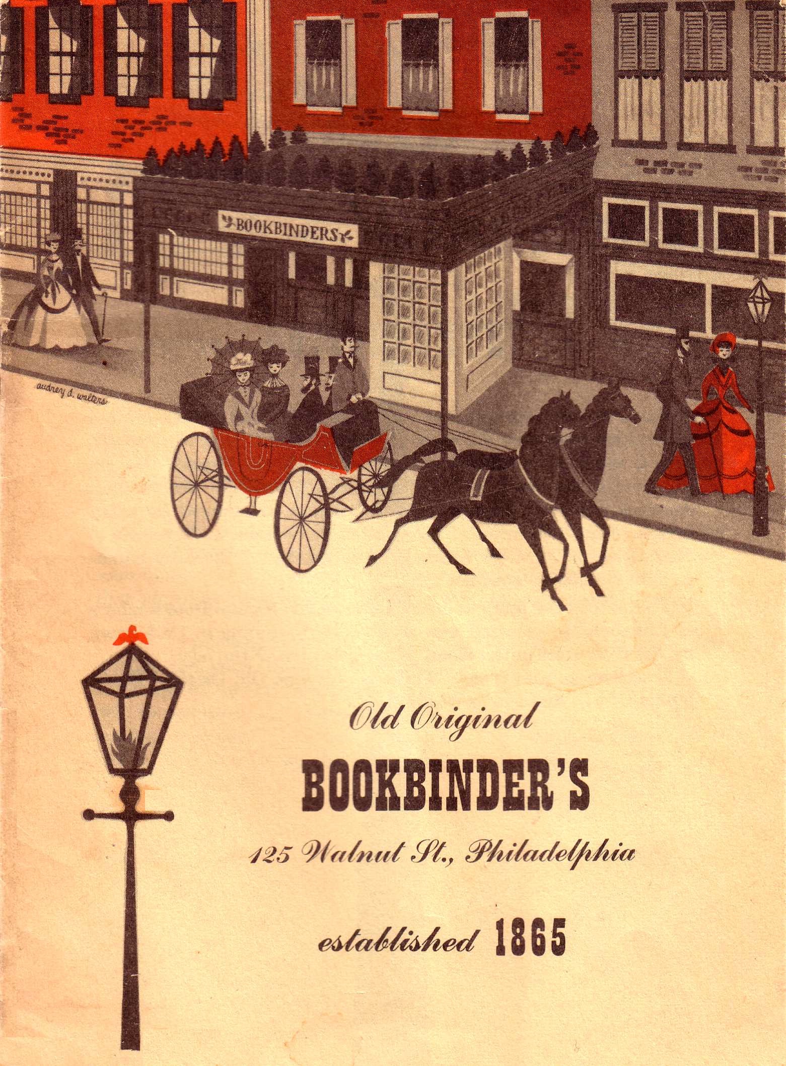
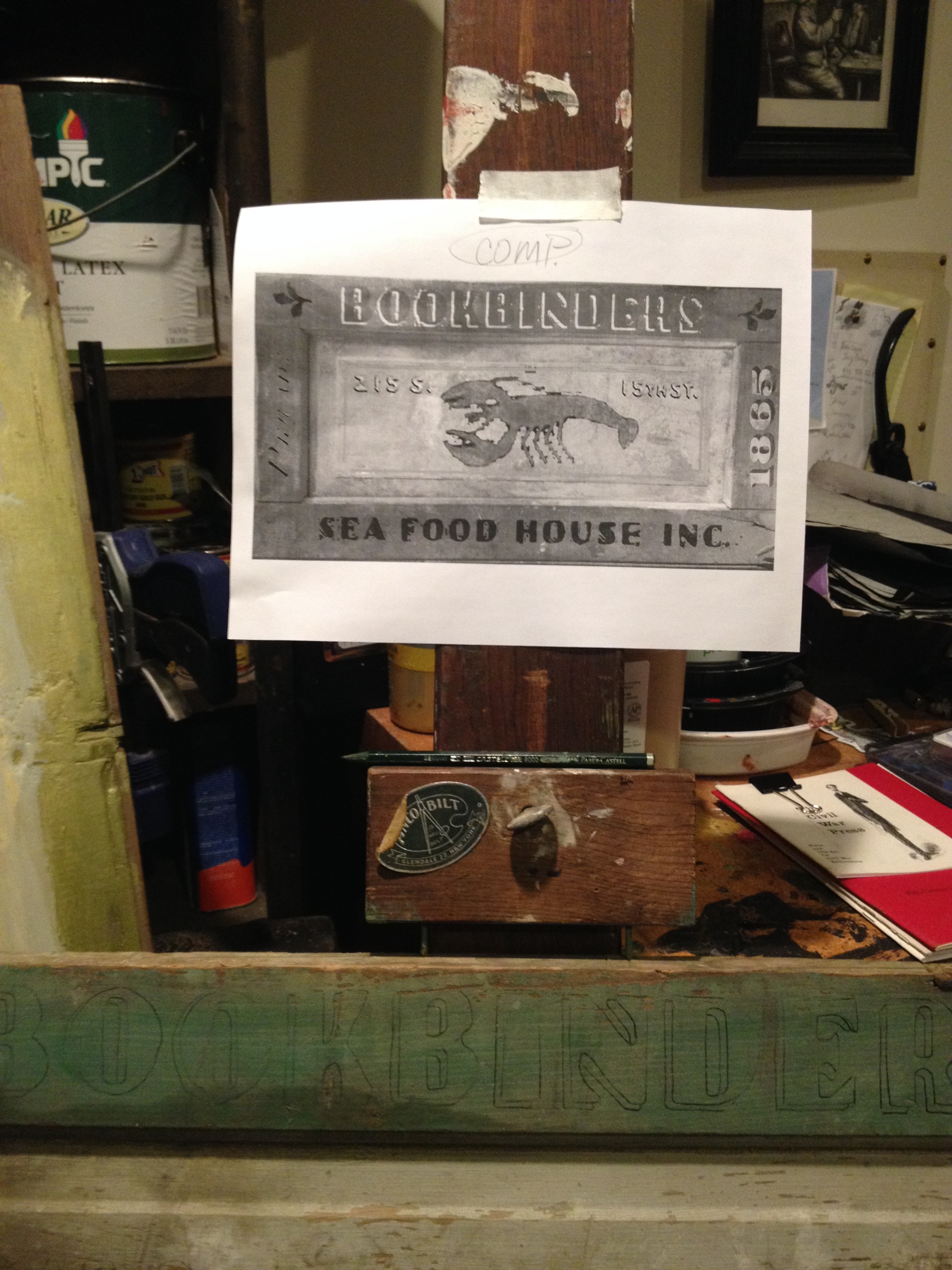
This was the visual example provided to me from the clients; The idea was to paint this scene on the beautiful blue substrate.

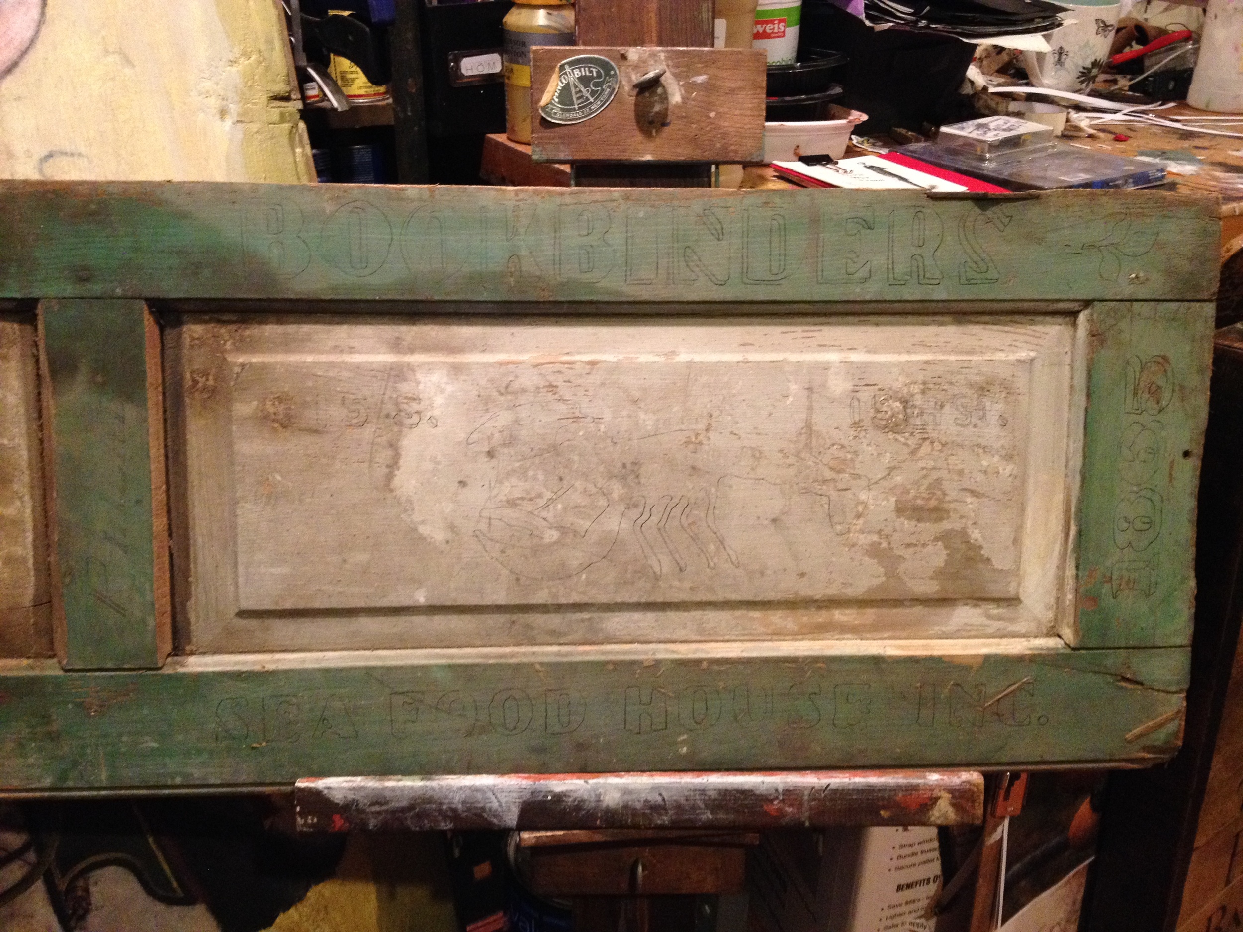
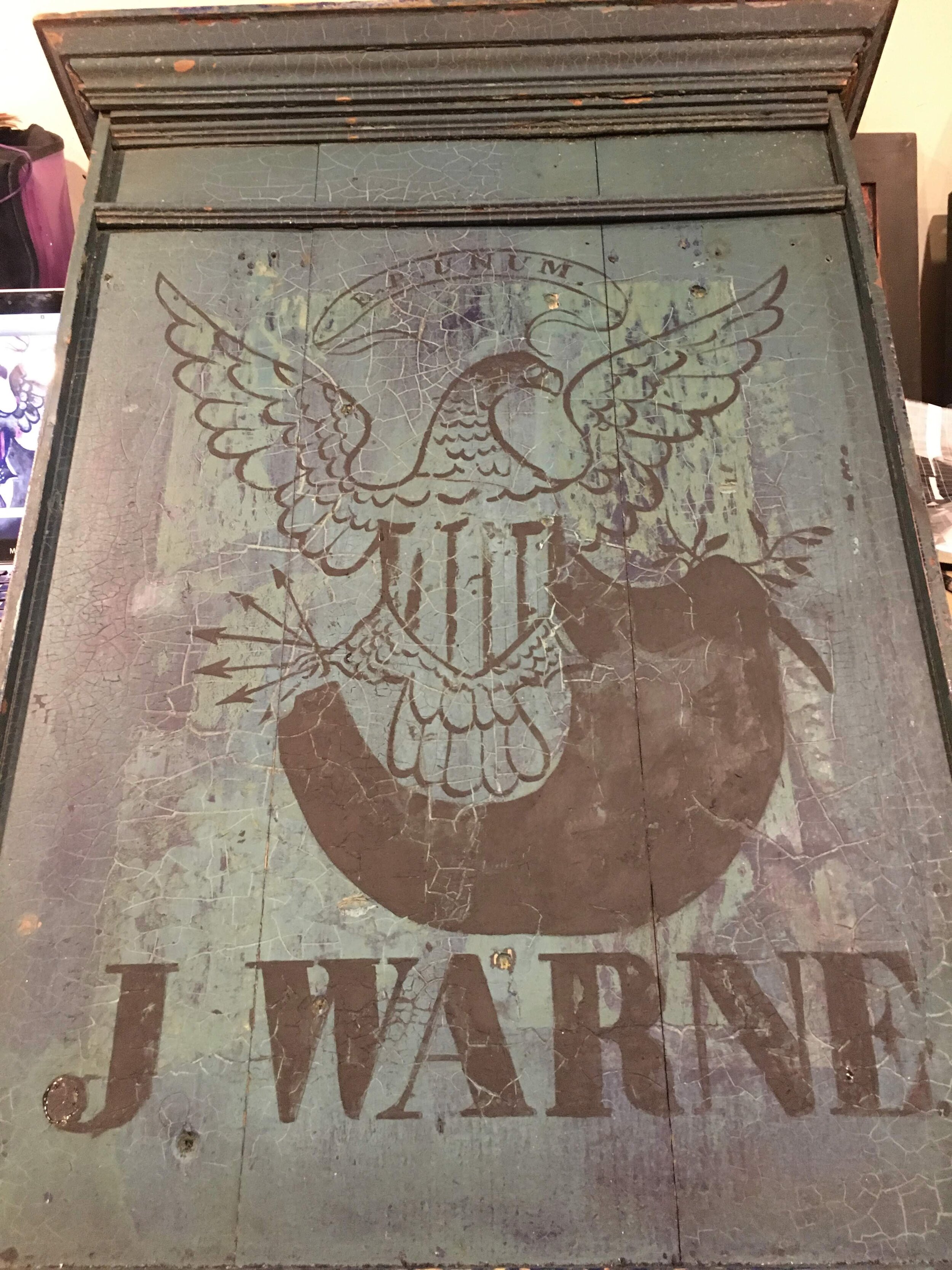
This was the amazingly-patinated object that would serve as the substrate for my reproduction.

Just look at this patina. And the molding…and the craquelure! One-of-a-kind for sure; There’s just too much goodness in one object here!
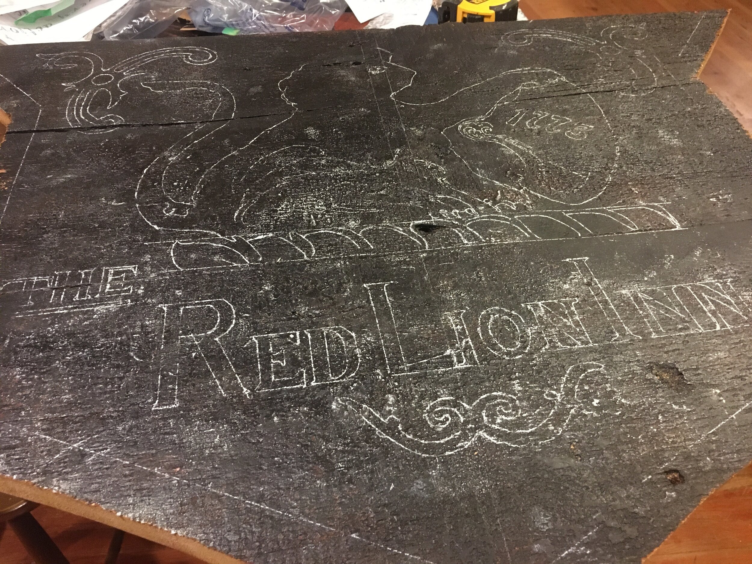
After the design and lettering were drawn up, using light pencil lines, the foundation paint layers were laid in using black milk paint.

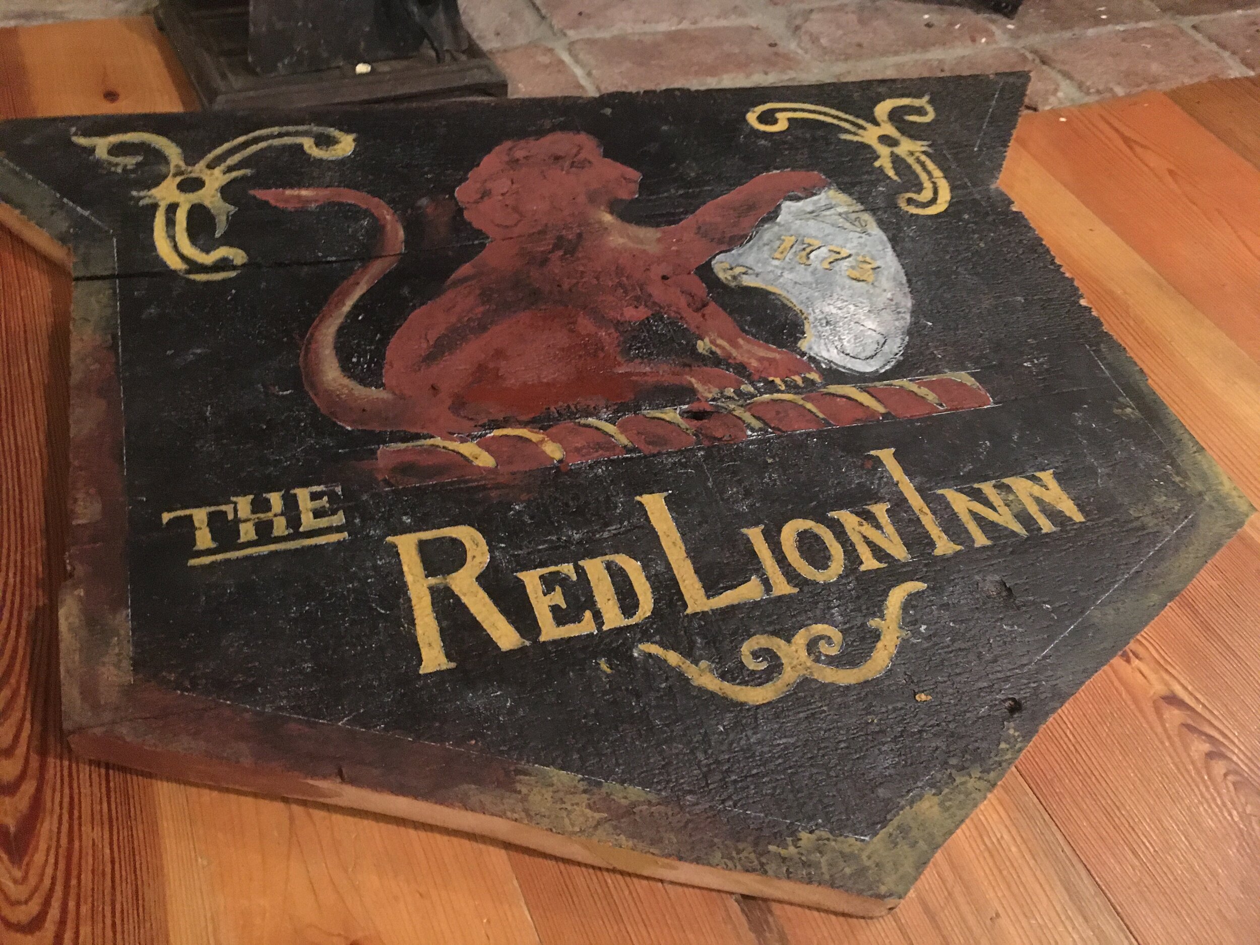
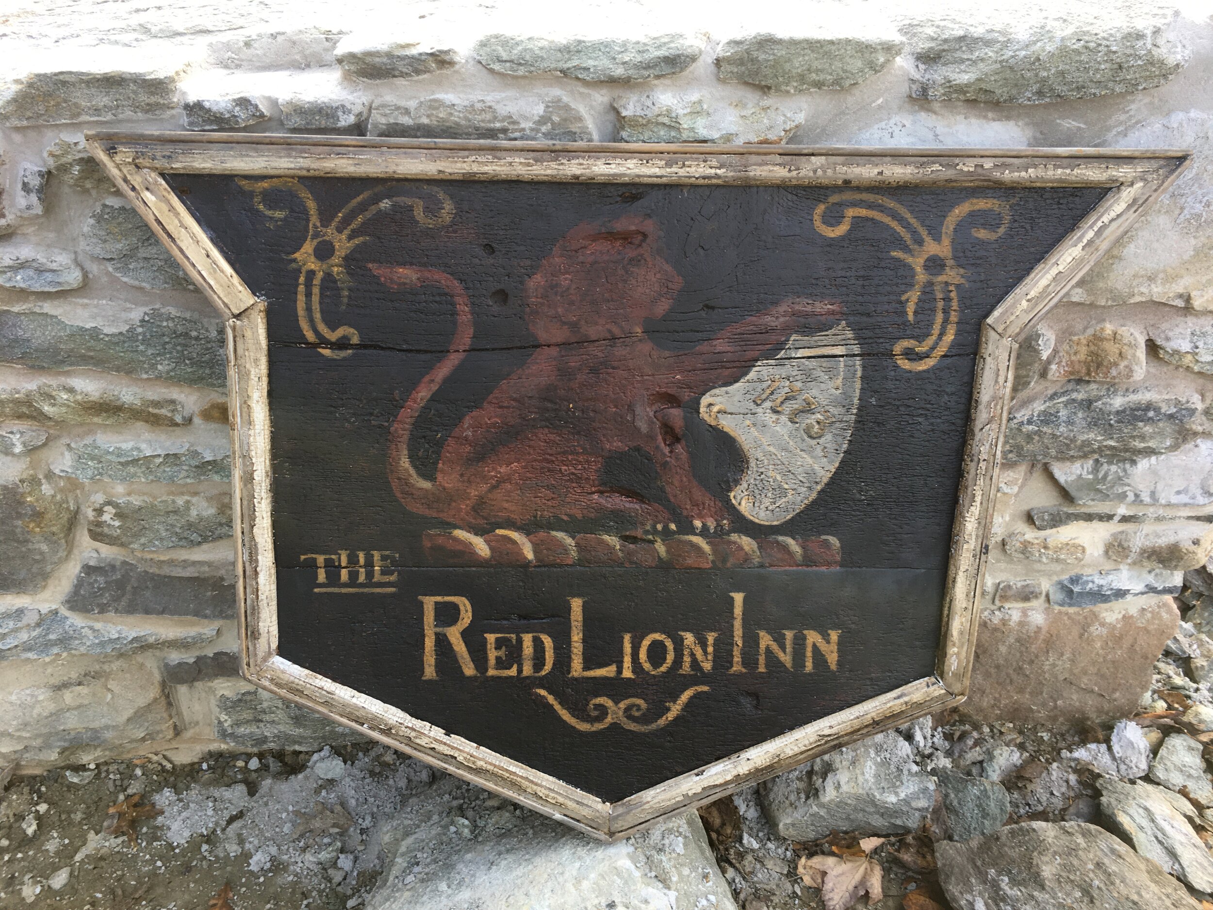
The finished sign reflects a modest color palette; The simplicity of the monochromatic color scheme increases its visual power. “Unity” is key in both fine art and sign-painting.
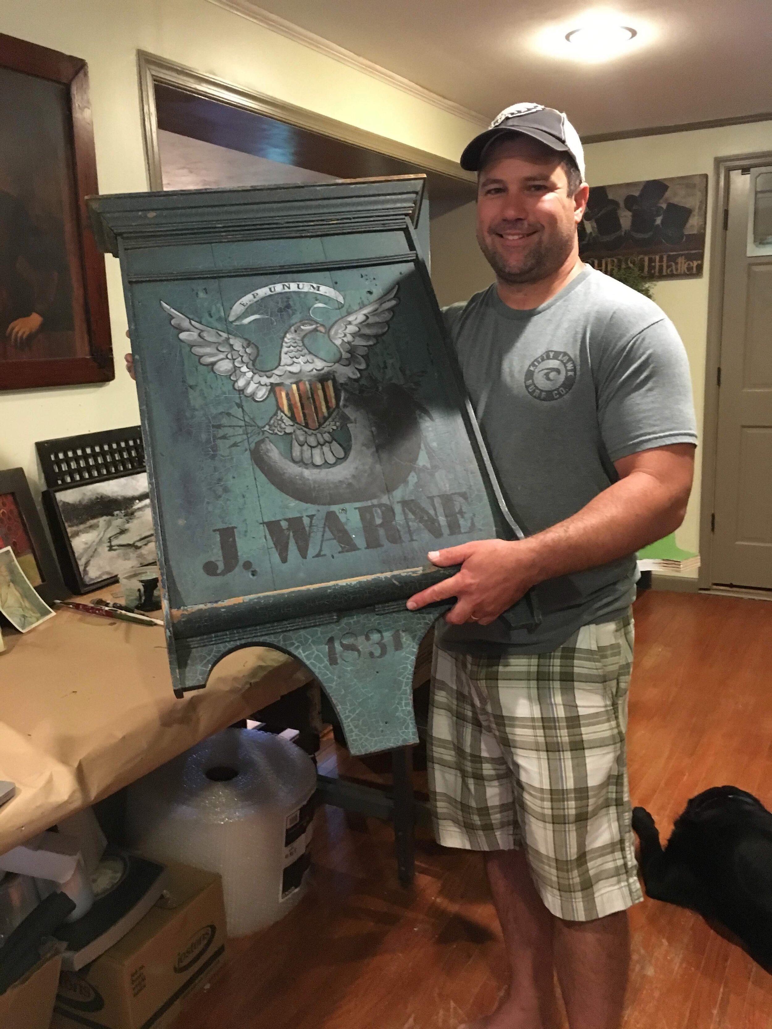

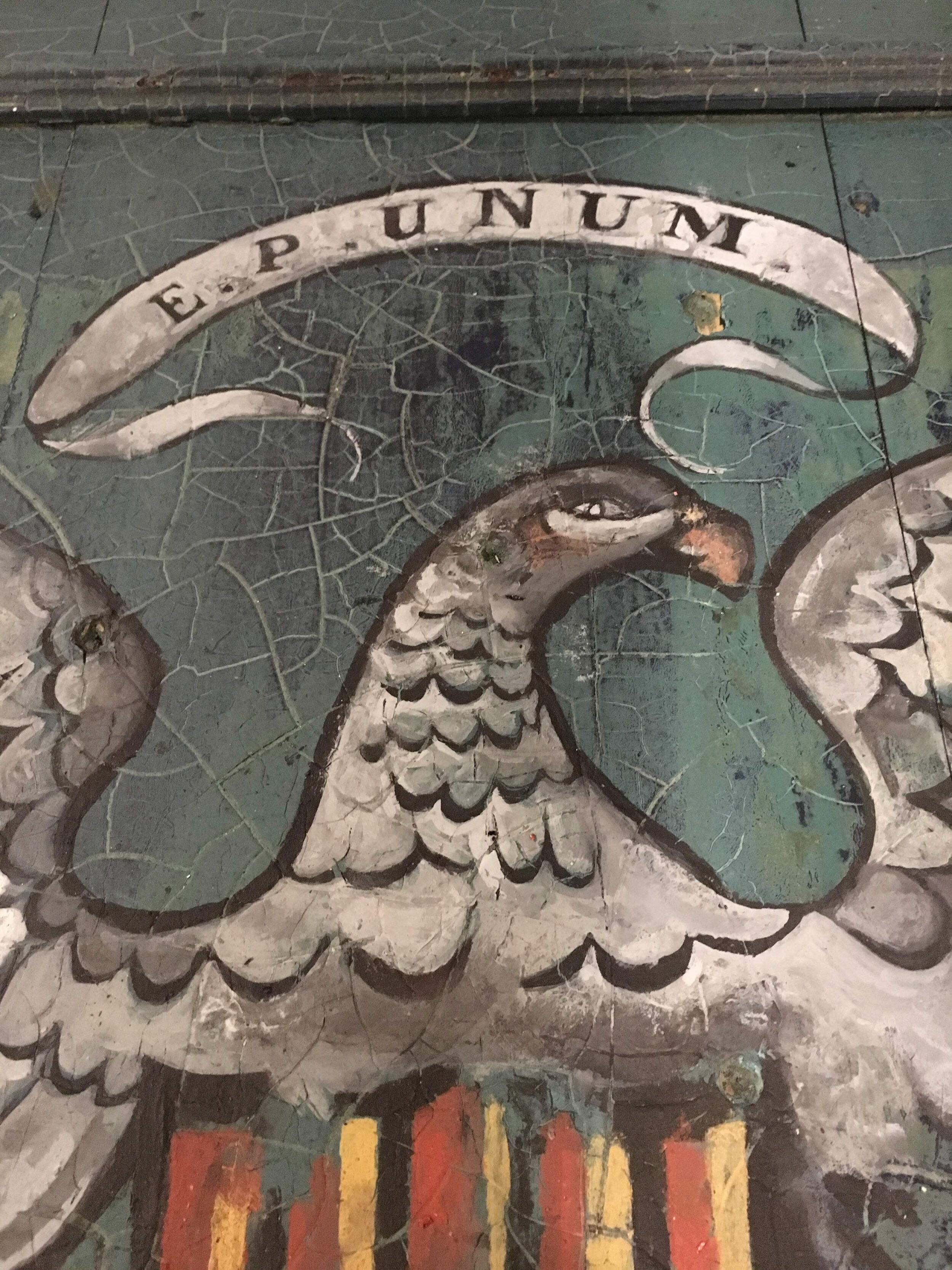
This pic reflects another angle of the sign, as do the others following. This is a true case where my work was further enhanced by the surface on which I worked. Painting on a surface like this was like a baseball player being placed on third. All they need to do is ‘steal home’! I certainly cannot take all of the credit for this beauty.


I do feel it’s important to provide potential customers with a small window of what I do. Although I tend to keep much of my “gritty process pics” veiled in a layer of mystery, some of these images should reflect the notion that many steps or stages take place in any given process. Those of you who have commissioned work from me know that I share much with you throughout the process of making your piece. So, if you wish to learn a bit more about the grit and “trade secrets” associated with the construction and painting of a wooden tavern sign, you will need to commission me :)
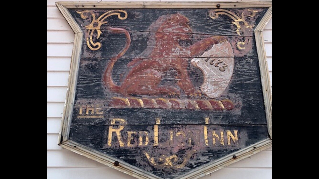
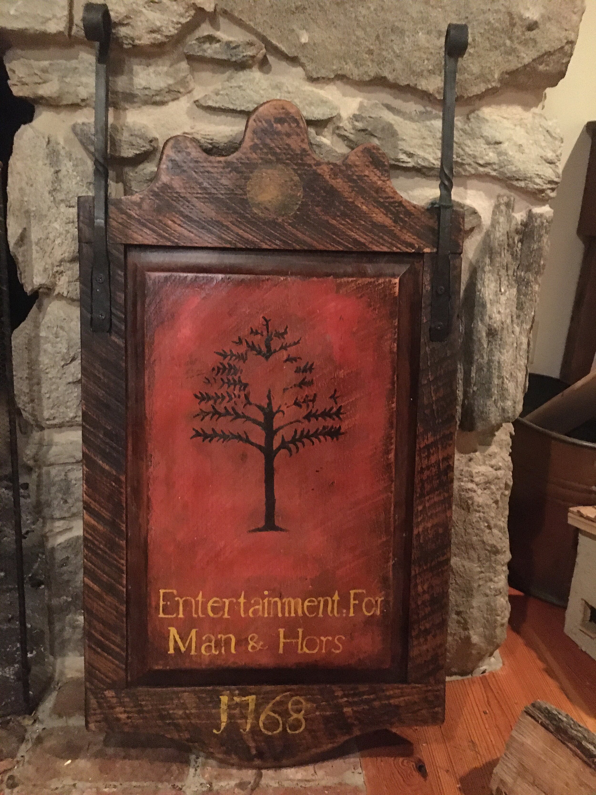
Here is a picture taken of what appears to be the original sign that hung from the Red Lion Inn (Stockbridge, MA). One of my loyal customers provided this to me and asked me to reproduce it as faithfully as possible. I did my very best to translate the rugged design to a clean line drawing / pattern. Once this was done, I transferred this drawing to a substrate constructed of century-old barn wood.
Because the background is predominantly black, painting the base layer in black made the most sense. Due to the fact that carbon transfer paper is normally… well, black or dark blue - it obviously wouldn’t show due to a lack of contrast. So, I called upon my good ole white transfer paper and proceeded to make the impression for the transfer.
Here, we see quite a jump, in terms of the process. However, what I normally do is what I call “laying-in” or “blocking-in”. Essentially, I apply solid color in the larger areas of the design. Many times, the initial color applied to an area may be something other than what one might eventually see. Painting is a layering process; The final image you see in the surface of any painting - be it a tavern sign or a beautiful oil painting by Paul Cezanne - is the result of numerous, subsequent layers of paint buried beneath. Most paint is transparent to a degree and, although the final layer is the one getting all of the credit, it is built upon the foundation that exists below.
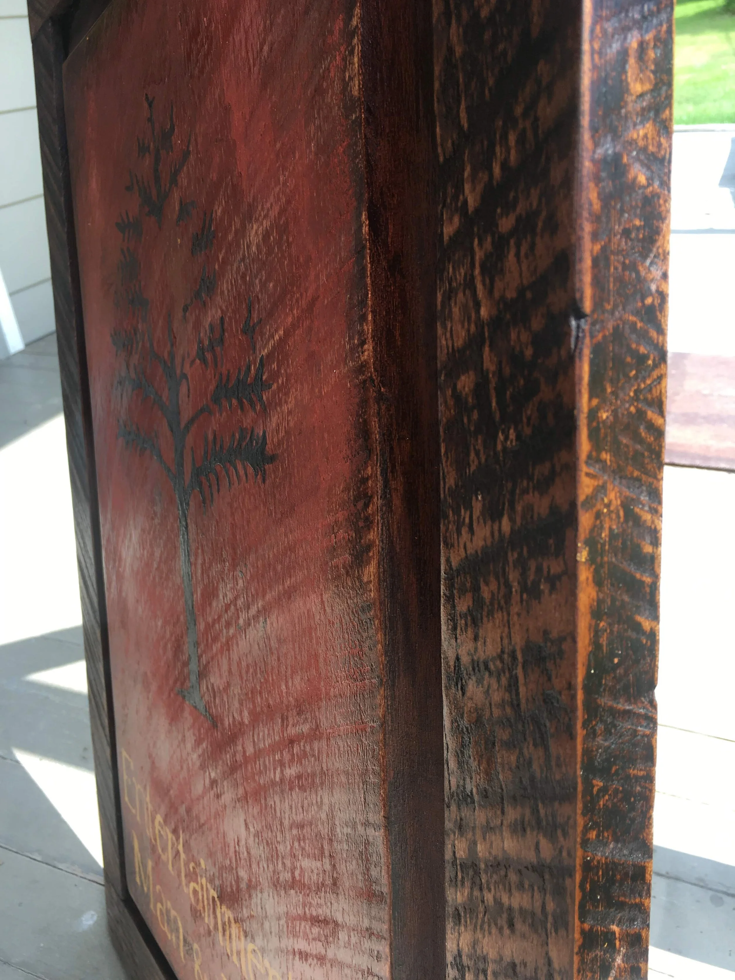
Here is a close-up detailed view of the inherent physical texture of the old barn wood.

By this point, you can see that the blocked-in areas have received a bit more modeling. For example, the red lion contains a variety of alternative “reds” within its shape. There are lighter reds (tints) and darker reds (shades). When these tints and shades are placed in the right locations of the overall shape, the human eye can begin to discern what we call ‘volume’. Volume is the perception of three-dimensional (3D) form or space. In other words, we begin to get a sense of illusionism - the appearance of dimension on a flat surface.
There ^ You have just been given a mini art lesson for free :)

Does this look old / authentic? I really think that the texture of the black paint used here adds to the look. Sometimes, I apply a torch to semi-wet paint. When this occurs - depending on the exact nature of the paint and atmospheric conditions - the paint congeals, blisters and peels back in ways that make it seem as though the surface has been kissed by a million sunsets in the course of its life.


Just to be clear here - By no means am I a professional photographer. I take many pictures for purposes of personal documentation and for sharing with my customers through the duration of their project. It’s just that here - on my blog - you will find much more variety than what is offered on my main webpage - pictures taken from odd angles, even the reverse sides of some of the signs. There are also ‘details’ that feature different aspects of signs (edges, patina, texture, etc.). My apologies if there are any redundancies, but there shouldn’t be too many.
Okay… next sign -
Talk about girthy! Well, the framework (rails and stiles) that I constructed for this sign felt as though they were fit for building a ship. The wood was poplar and was very easy to work with. I believe I pulled out every tool in my arsenal for this project. It certainly does validate the purchases of my “toys… er, I mean tools when a project calls upon an array of equipment!


The custom nature of this job centered around capturing the essence of the client’s property (and his furry friends). The entire sign, including the framework, was painted using old fashioned milk paints. Whenever a product requires you to mix a powder with water in order to yield the semi-viscous solution we call “paint”, well - that really sends you back in time and gives you the feeling like you are living in the olden times! Most people forget that the notion of the ‘paint tube’ was only invented in the 1840s; We take that for granted!


This is a version of the “Tarbox Tavern” sign. The original hails from the depths of the beautiful New England countryside, initially constructed and painted well over a century ago. I have added an edge band of leather to the lower portion of this sign, a practice common to several early American tavern sign examples.


Most of the old barn wood used contains more than its share of wind-worn texture and surface patina. In some cases, the square nails originally driven into the wood still remain. Here, we can see such an instance.

Alright - Now, in this commission, I was asked to faithfully adhere to the dimensions of the “J Alderman” tavern sign. The client explained how they wished to use this sign as the model through which a new sign would be constructed. I researched the provenance and examined the construction notes provided for it.
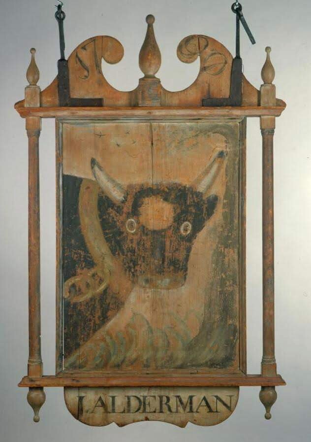
Next, I drew it up to scale and determined the measurements of each of the components comprised within. This was necessary, due to the need to maintain a faithful adherence to the original in the new sign.

In some cases during a job, I seek help beyond my studio. In this case, I consulted with a good friend and extremely accomplished woodworker. Using his lathe, he turned the posts and finials for this sign. Mind you, we are dealing with a true craftsman, in every sense of the word. These pieces were made from a variety of hardwoods - cherry and walnut - and were precise reproductions of those elements found on the original sign! It’s very smart to know where one’s strengths and weaknesses lie; I knew that outsourcing, so-to-speak was definitely the most effective move here.


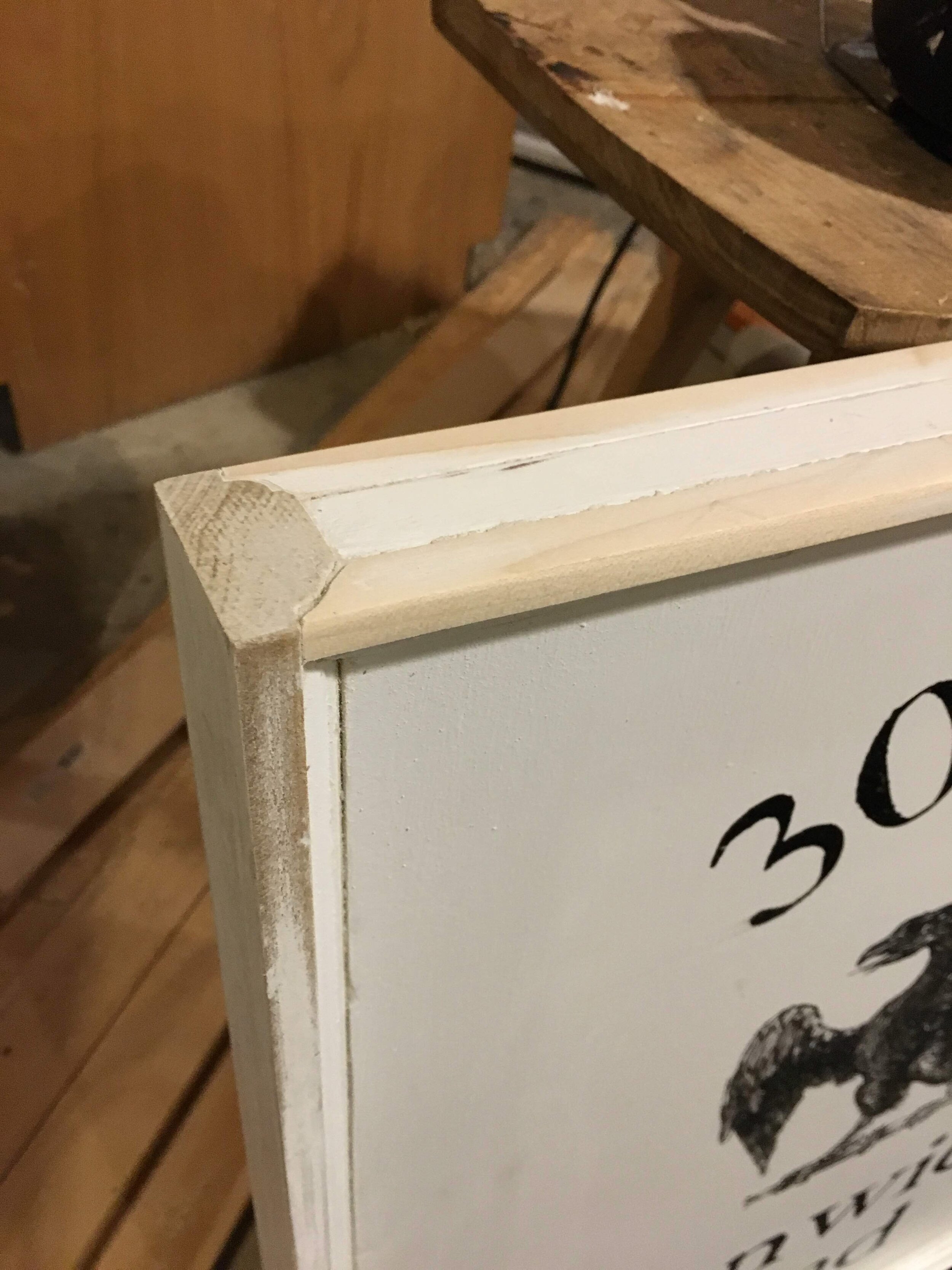
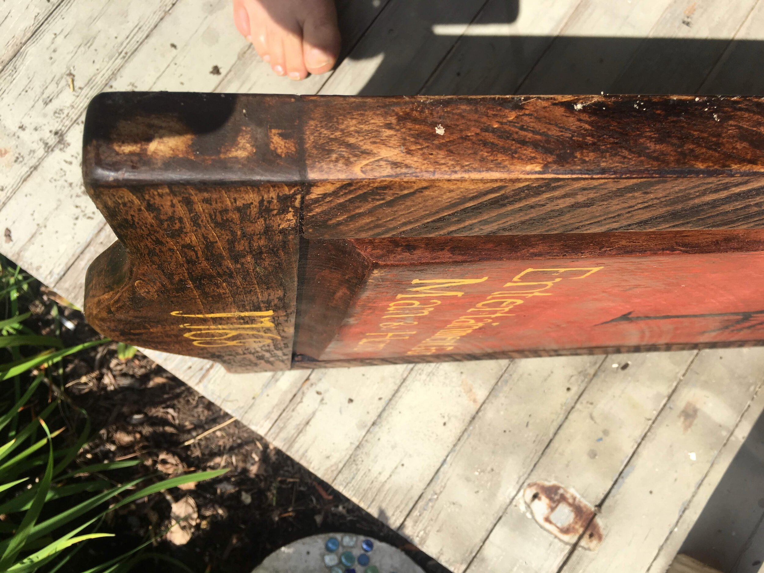
Here is a view of the corner joint. Edges and corners are very important, but too easily overlooked.


Another reproduction of the “J Porter” sign… always a classic!


A somewhat unique commission, this one was fun to fulfill. The client described the context for this sign - a place where friends and family gathered in the afternoon for cold drinks and lively yet relaxing socialization. Mix in a break-taking view of the Gulf and what you have is a setting that even Jimmy Buffet would envy.


Nothing crazy here… just a rustic frame :)


This customer sent the metal cow medallion and, between us, we determined a way to create a unique sign that reflected the name of the property and featured the special cow.


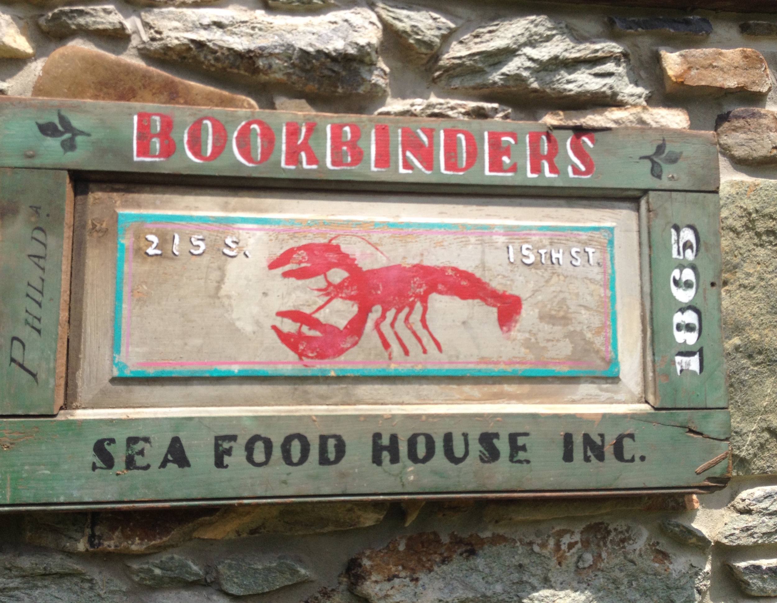
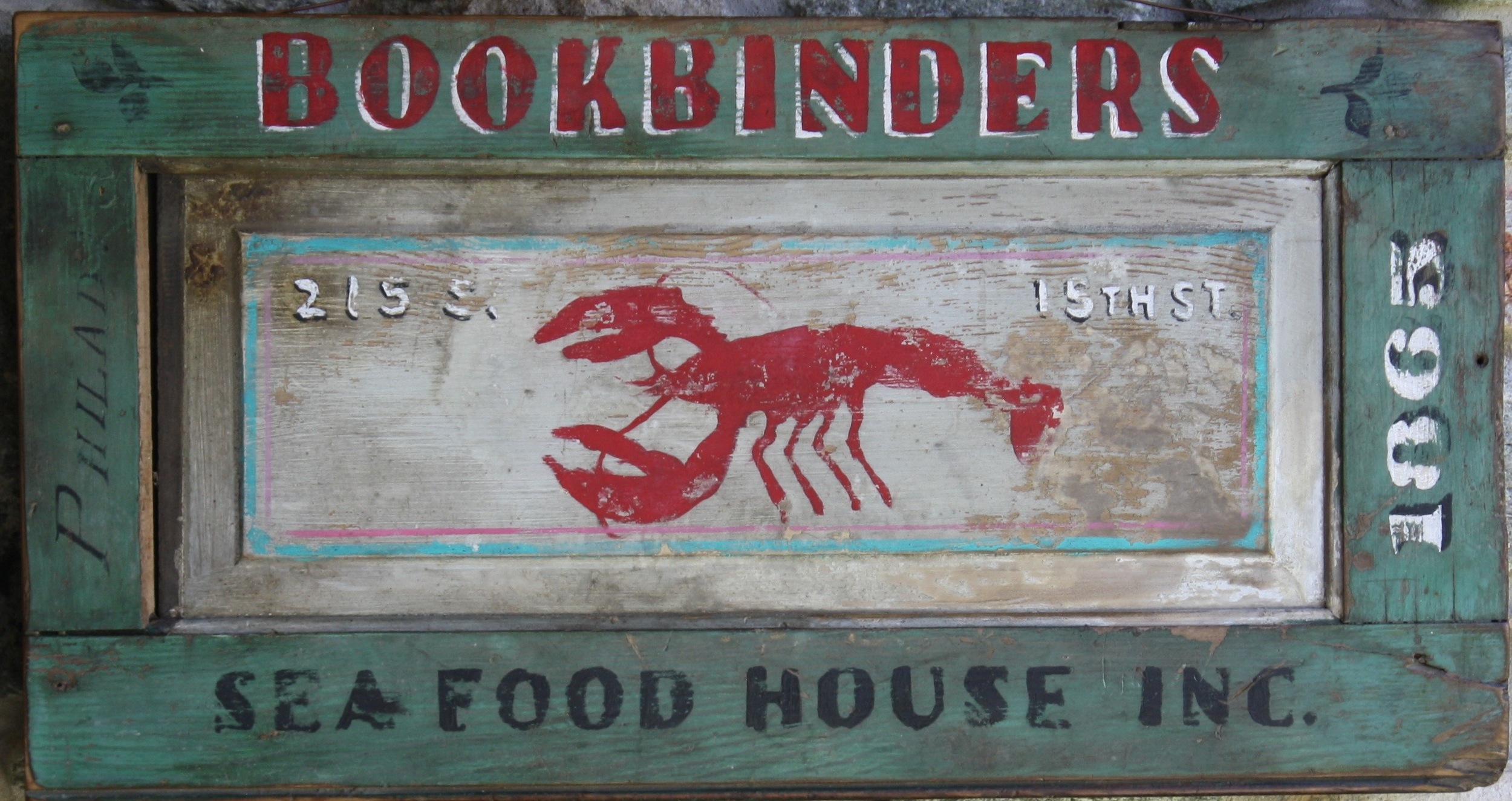
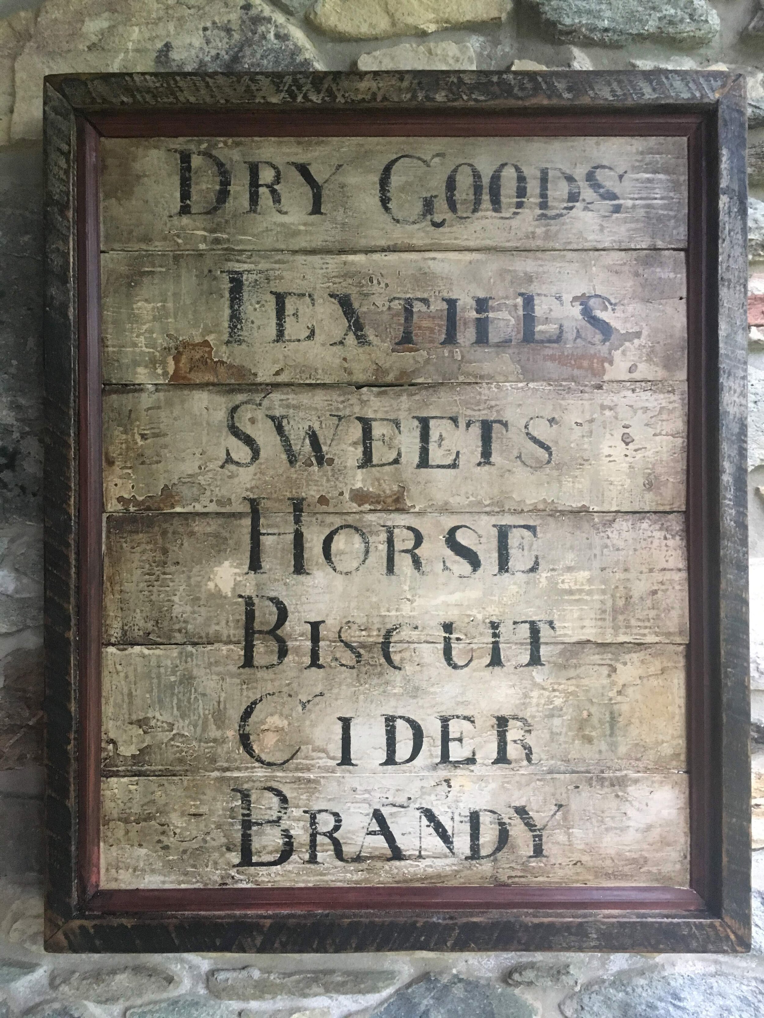
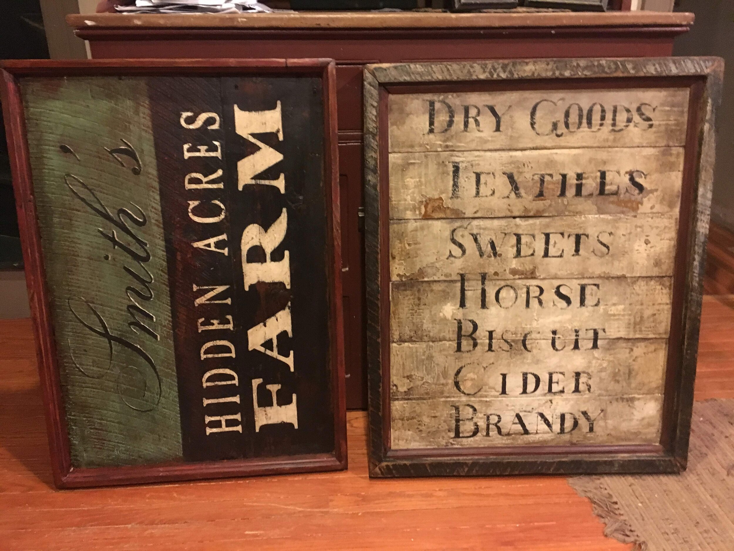
Here are several versions of the “Sign of the Pine Tree” signs.


This was a rather large “Temperance” sign.


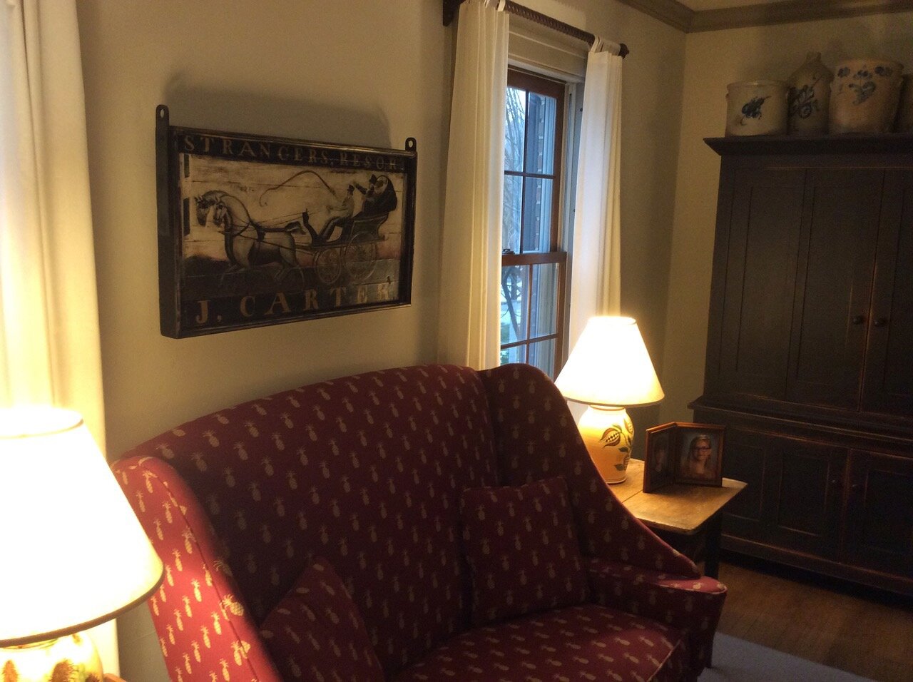
Here are 2 different versions of the “J. Carter” tavern sign, featuring the “carriage” side of the sign.


Here are a half-dozen signs that were painted for the Old Clinton Historic District, Georgia.


This was a fun commission. Slow and steady wins the race, right? One side of the sign features a snapping turtle; The other a box turtle.


What’s ye deal? Did you know that the word “Ye” means “The”? Well, if you didn’t… now you do :)

Another version of the ever-popular tavern menu board.

Here is a brief example that relates to my custom work. Provided are a couple images that reflect the early discussions and planning efforts that go into the formation of a commission. The design process in any commission is absolutely paramount to the success of the project. Here, you can see some of the development that takes place on this job.
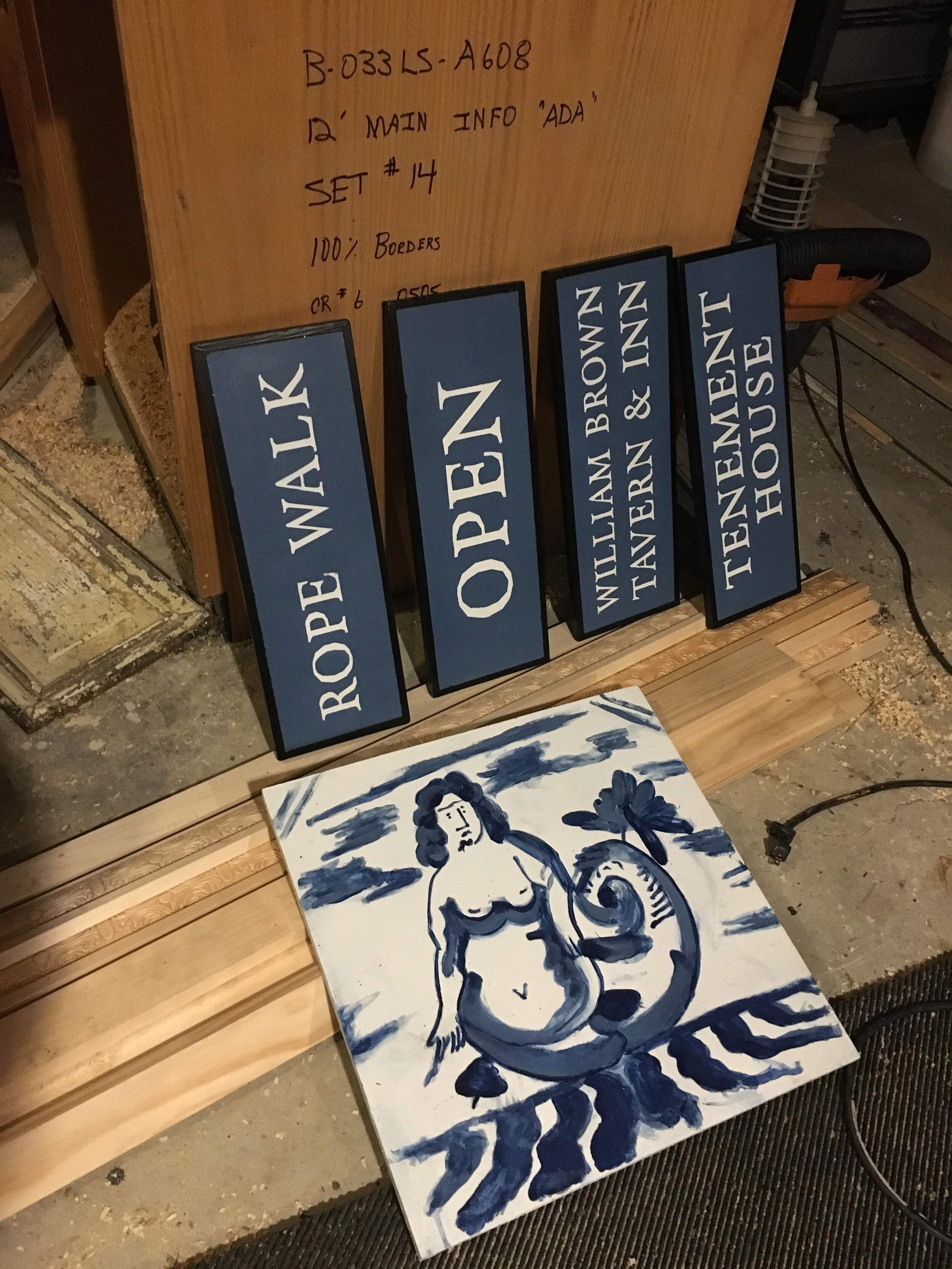
Historic London Town and Gardens identifies with an image of a mermaid. Such an identity is the result of an allegiance to an image found on an old plate, excavated on the premises. This fragmentary item features, in beautiful cobalt blue glaze, a rather interesting version of a siren / mermaid. The goal was to develop signage that honored this very version of a mermaid and tie it into the the historical aesthetic set forth by the surrounding property.
While the exact meaning of this particular mermaid and its association to the grounds of Edgewater, Maryland are unknown, there are some rather interesting meanings and fascinating stories that surround this symbol. The usual association with these long-haired females whose predilection for water and rocky coasts is equaled only by their legendary love for beautiful song, is that of a temptress. The idea here, sailors, is to steer clear of such water-laden beauties; Nothing but trouble will result from giving into the urges of such entertaining and enigmatic creatures. Many a boat has been wrecked by taking one’s eyes off the waterline ahead.


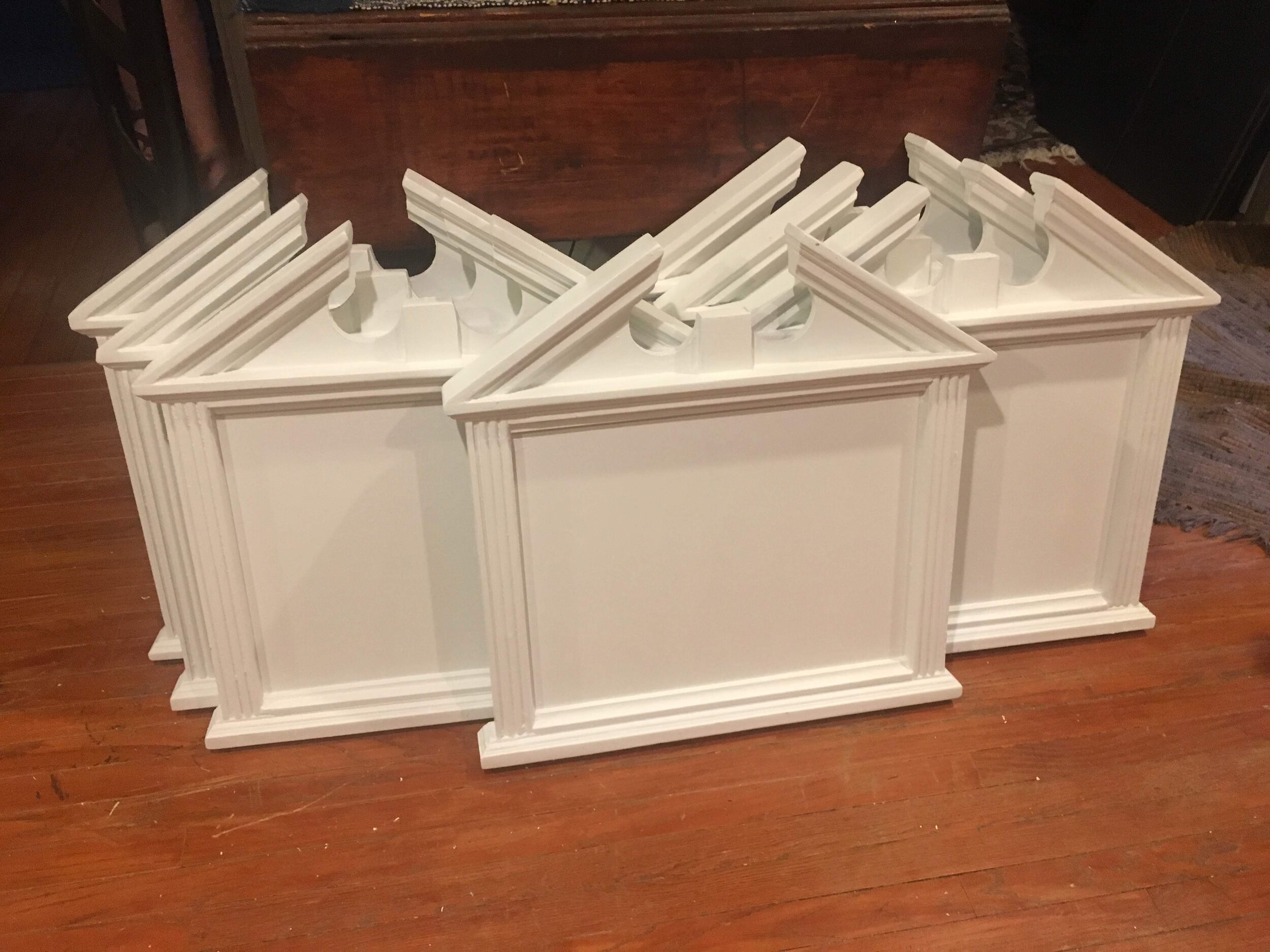
Below, I have just tossed in a handful of odds-and-ends. Consider it a potluck, if you will :)
I do believe in addressing all dimensions of a sign, even those that may be hidden from the standard view. These things are being hung in your houses, folks! The last thing a you want to learn when you eagerly open up the box on your doorstep is that your sign has a ‘dirty / ugly backside’. Not here! In fact, through the years, many of my clients have expressed a wish to somehow feature the back side of their sign… that its character was too cool to place against a wall. Now, when I get feedback like that, satisfaction is certainly felt on my part for a job well done.


The last pic is probably the most random of the group. It’s a snapshot of me torching iron to a cherry-red color. It’s precisely at this point when the iron becomes soft and malleable enough to shape. Shaping occurs by the means of force and the instrument of such force is none other than the hammer. I am most definitely not a trained blacksmith or farrier. Trust me when I tell you that I want nobody around me while I’m pounding away at molten iron. I cannot imagine what one might think I’m doing, should they happen to catch a glimpse of me attempting to shape metal using the most barbaric equipment :)