What ever happened to Customer Service? (Part 1 - CS Series)

A word or two on Customer Service...

As a consumer, I find “customer service” to be an essential ingredient within my personal consumer formula. Countless times, my decisions (some of them quite momentous, I might add) have hinged on the subtle experiences relating to the service experience in which I am confronted. Honesty, transparency and a willingness on the part of an establishment’s service members seems to be something of a lost art… speaking from my own, personal perspective, of course.

Certainly, it’s not hard to find a customer service representative at any given establishment who is oozing with zealous energy, but I often question the motives behind many such smiling faces. For example, what motivates this man or woman? Is it a commission that can be gained from a sale made on my behalf? A step closer to a promotion? Might this individual actually have nothing more to gain from me than the personal satisfaction that their eager help will increase my life through my newfound interaction with their product / service?

Is it really a lost art, in such a short period of time?

Smart, conscious consumers must wonder about these things. I mean – when I was a young kid accompanying my parents on their ritual errand runs, I never questioned the quality customer service that I witnessed all around me. Whether it be seen in the eyes of a restaurant waitress, the knowledgeable words offered by an employee at Sears, or in the helpful hands of the customer service representatives who combed the expansive aisles of the local lumber yard in search of facilitating the experience of the typical weekend warrior – I simply cannot recall any negative feeling about our consumer experiences.  I hate to swallow the feeling that “customer service is a lost art”. That said, I cannot help but say that – because I rarely witness the same care today (in relation to what I recall as a child), when I am met with what I consider to be ‘quality customer service’, it most certainly possesses overwhelming power. This power compels me to feelings of great respect and, quite honestly, the results are most certainly quite favorable for the service representative. Okay – I suppose that I’m a sucker for good service. Call me whatever you like, I have a substantial weakness here.
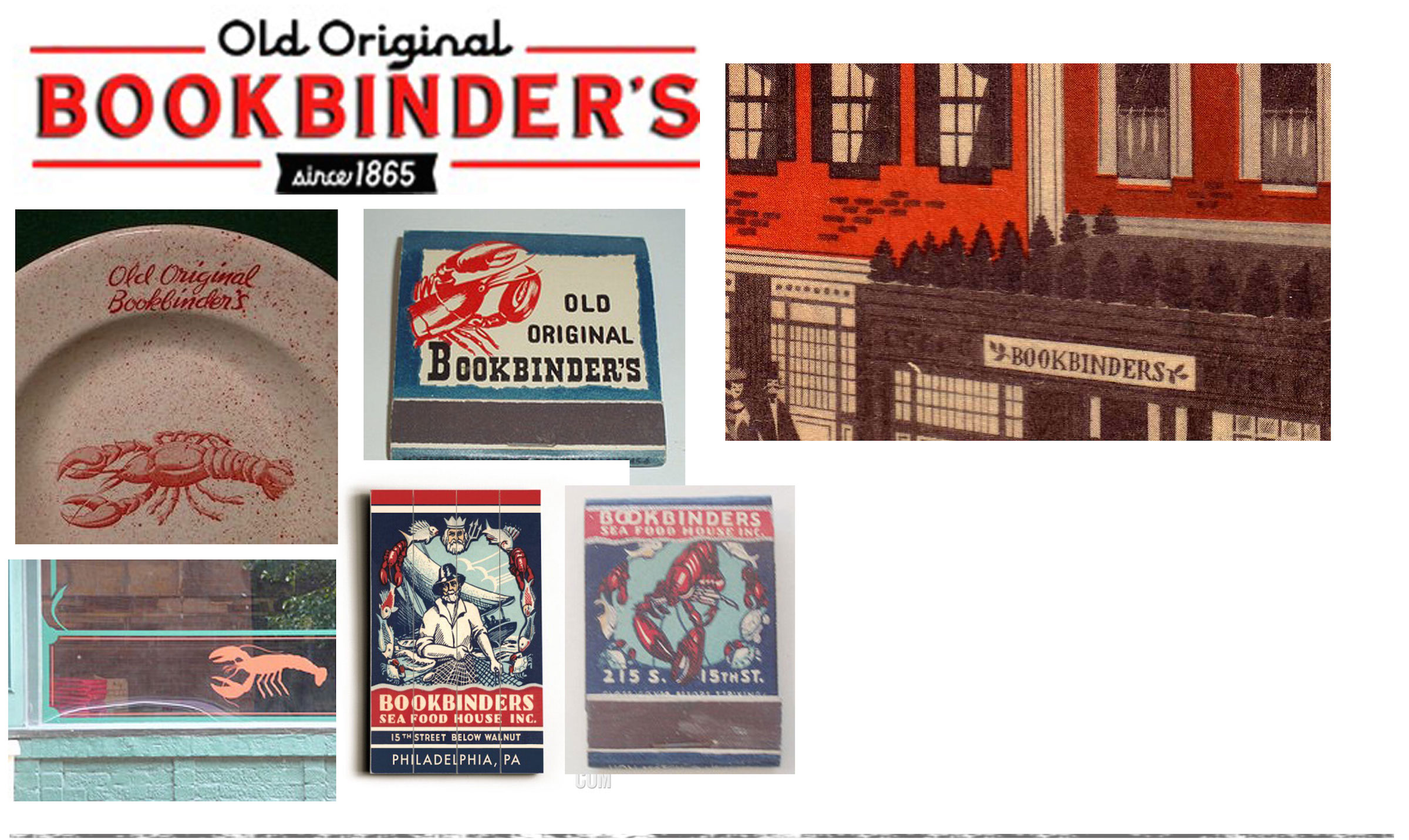
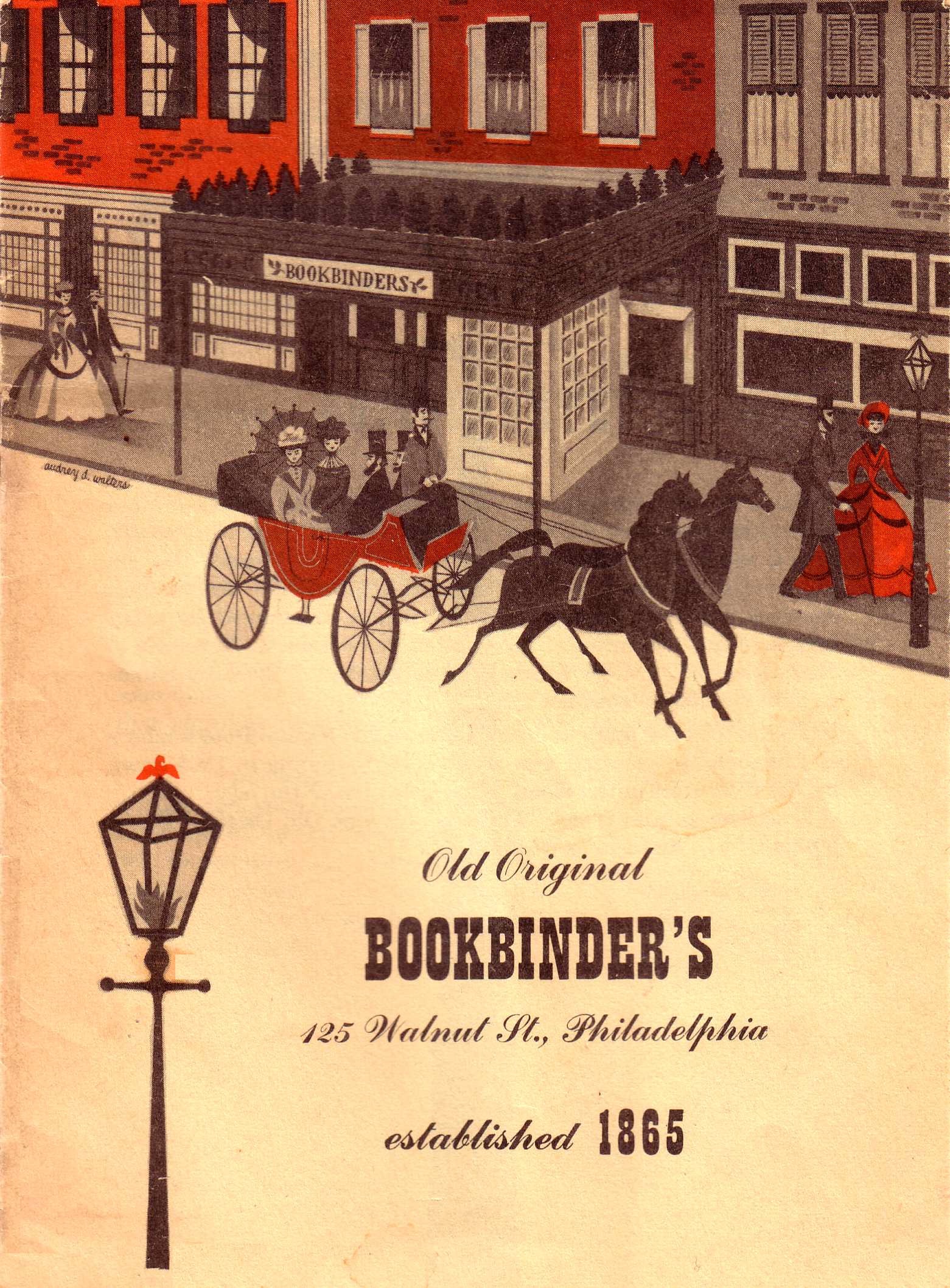
More than a sign

It is with this sentiment that I can only hope that those with whom I have done business regard my sign business. I have always maintained that my customers, though their goal is obviously attaining a finished product from my hand, receive much more from me. The process of any given commission has as much to do with the “experience” as it does the “product”. To this thought, I feel it important to state that it’s the diversity of experiences encountered with my customers that makes me want to continue doing what I do. Who on earth would ever want to reproduce a limited number of museum quality signs, over and over? While I do indeed enjoy a degree of the inevitable monotony that accompanies this gig, it is the colorful people who commission work from me who make the work exciting and rewarding.

Why my work is different than other "sign painters"

1. Communication

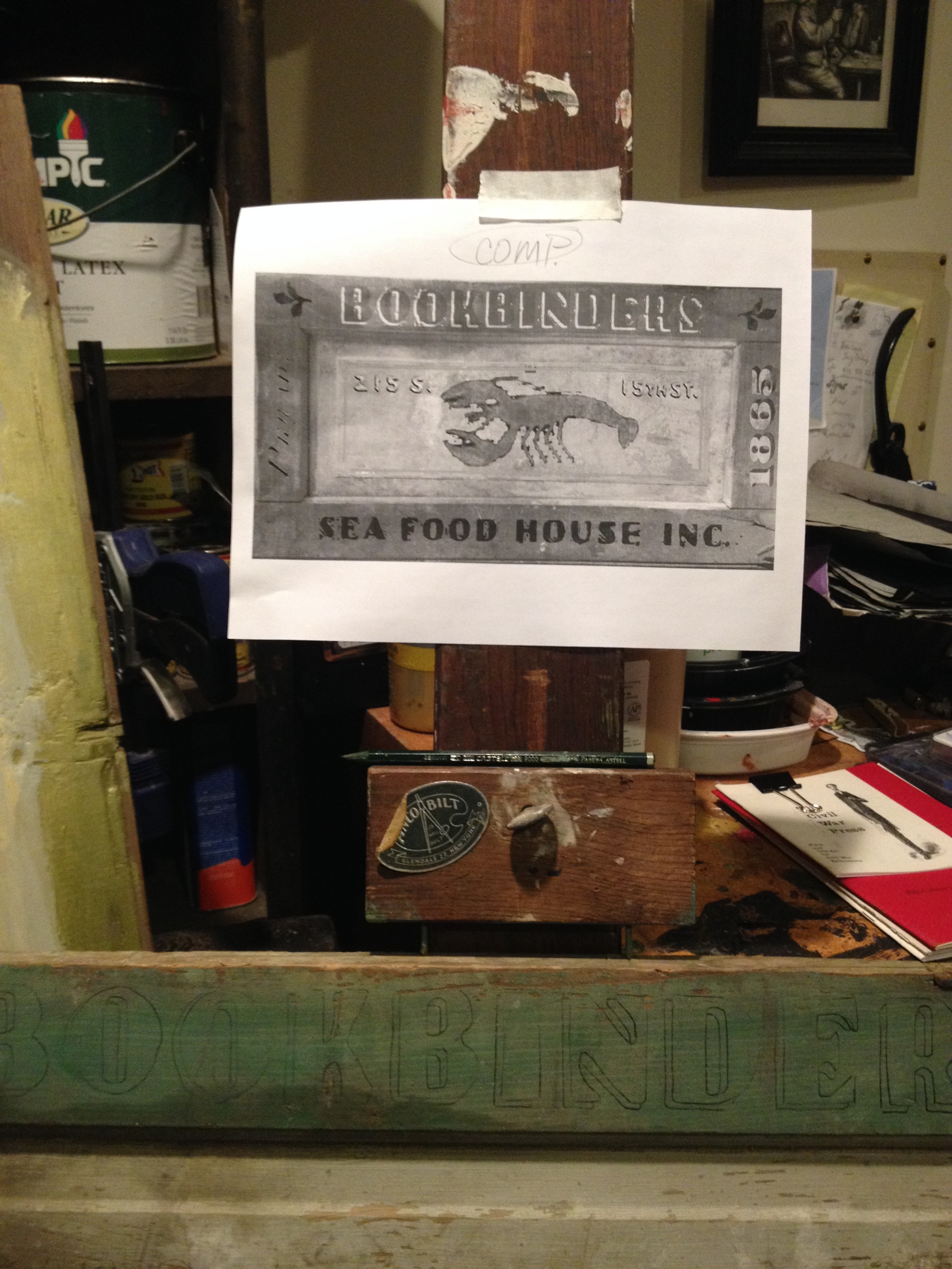
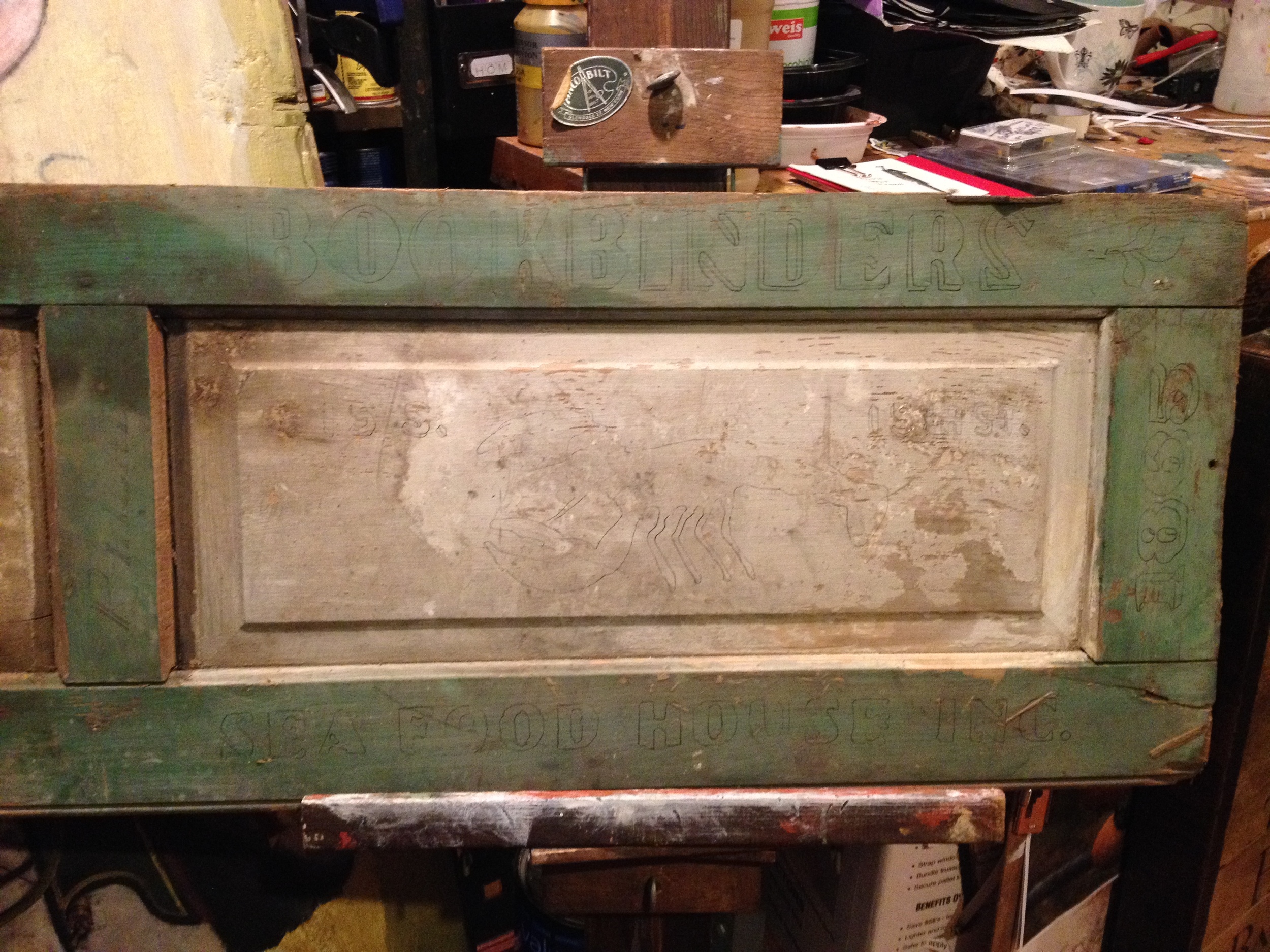
Some of the things that I do to ensure that my customers a positive experience have to do with communication. Especially with custom work, it is critical that I communicate via email or phone – in order to establish a common understanding of the desires and expectation for a given job. Throughout the process of sign creation, I find it helpful to provide regular progress updates – many times in a visual form. Technology certainly makes this effort much more efficient and effective.

Maintaining a healthy dialogue throughout the process is essential to providing my customers with a work of art that is not only satisfactory, but exemplary with respect to their original expectations. Sometimes a batch of pictures will more clearly illustrate my progress; Other times, a short video clip taken with my handy-dandy iPhone will serve to convey the status of a particular job. Ultimately, the last thing I would want to happen is for a customer to anxiously walk their package into their home, open it up and remain surprised by something that was less than impressive and / or something that was not reflective of the commission they called for.

Stay tuned for a second edition to this series on "Customer Service". In the next post, I will reveal the second point which I feel distinguishes my work from any other sign painters.

A Philadelphia Treasure, Bookbinder's Seafood House

In the spirit of the upcoming July 4th holiday, a time in which all good Americans pause to celebrate the remarkable independence that so powerfully set our nation apart from our European motherland. Such independence is felt no stronger than in the aptly-deemed "city of brotherly love". Yes, the great city of Philadelphia - "Olde City, Philadelphia" to be rather specific - resonates with the echoes of our founding fathers.

Olde City, Philadelphia

Olde City, Philadelphia

If you haven't visited Olde City, you are really missing out. Just stop and take a moment to observe. The internal energy one experiences in this great city seems to reaffirm the suspicion that these great citizens are still heeding Benjamin Franklin's encouragement and hope for the American citizenry... To apply oneself towards the pursuit of happiness.

Within the junction of 5th & Market Streets, one can peer through the glass encasement in their efforts to capture a glimpse of the famous Liberty Bell. Just across Market Street, a priceless, unobstructed front-on view of Independence Hall can be appreciated. This ancient building remains one of the greatest icons associated with the birth of our great nation - its symmetry reminding us of the objectivity and equality of mind in which our Constitution's framers aimed to maintain, despite such tumultuous circumstances and uncertain times facing them.

The Liberty Bell

The Liberty Bell

Independence Hall

Independence Hall

In our modern day, few working cities maintain such a pure, uncompromising agenda for reflecting their Colonial aesthetic. Olde City, despite the inevitable dash of neon and intermittent office high rise sprinkled here and there, leaves very little to our imaginations as to, say, what Ben Franklin may have seen in his day. Yes, there is that awkward sound caused by wide, rubber tires traversing the rough and irregular surface of these gorgeous cobblestone streets; However, the sound of a horse and carriage clip-clapping through a nearby side street easily cancels this out... and, with minimal effort, we can transport ourselves back to the earlier version of this amazing, historically-rich city.

So, what does all of this have to do with my sign business? Great question. I'm proud of your reading this far! Well, as I mention in my last post, the idea of creating historical-looking signs for establishments which no longer exist really excites me. For my first example, I decided to pursue what was once a true landmark within the construct of Philadelphia restaurants - Bookbinder's Seafood House, Inc., located in Olde City at the junction of Walnut & 2nd Streets. While this is the original location, a second location was later opened in Center City (15th Street). You can learn more about the history of this restaurant here [Wikipedia entry].

The very first time I stepped foot in Philadelphia, I recall walking past this restaurant. Posted to the front of the aesthetically charming facade of this establishment was a sign, indicating it was anything but 'open for business'. Interestingly, the past decade has bore witness to several attempts to reopen the restaurant - the most recent attempt appearing to be quite substantial.

While the reopening of Bookbinder's  (A Retro Restaurant Re-imaged [Phillymag]) is a very exciting prospect for both visitors and nearby residents, my focus centers on the long legacy of the establishment - from 1865 until my first experience with this gloriously defunct facade that I recall filling me simultaneously with both nostalgia and deep sadness.

The origin of my venture began when I noticed a cool wooden panel that was propped up against a wall adjacent my easel. Recognizing its rich potential as a sign substrate, it had been recently relocated from my storage stash to the more immediate proximity within my home. A recent glance gave way to my decision to forge ahead with my idea, the one in which I would create an original tribute to what I then considered an unfortunate 'defunction' of a once glorious establishment. I was going to create a hypothetical historical sign for the Bookbinder's Seafood House... & what better time than now?!

Modest research rendered substantial amounts of visual fodder, much of which fell under the category of graphics and advertisements. Menus, newspaper flyers, matchbooks and various memorabilia... all revealed a decent degree of visual unity. Subtle variations existed within these graphics, but the bold typography, the lobster silhouette / motif, and the affinity towards the salmon / red colors punctuated by black and white accents remained quite consistent. The numerous photographs found in my quest enriched the visual experience, most of which reflected the notion that this restaurant was endeared by both blue collar and the more affluent patrons. Many of the photographs tend to feature the decades of the 70s and 80s... the result, a true "vintage" aesthetic in the truest sense of the word.

My visual fodder - garnered from my visual research

My visual fodder - garnered from my visual research

My goal was to take the best from my visual fodder and synthesize them into a harmonious composition. After importing the picture of my wooden panel into Photoshop, I began building the composition over top. The central panel motif seemed perfect for the red lobster silhouette, common to almost all Bookbinder graphic material. Historically speaking - simple, large, bold motifs have traditionally found their way into the sign compositions of most establishments, serving their timeless role as a concise, democratic beacon to any and all who set gaze their way. In this case, there is no mistaking the probability that this big red lobster would indicate something other than hot, fresh, delicious seafood.

The bold typography for the upper and lower horizontal frame / molding was garnered from two different matchbox designs. The framework surrounding the inner panel's perimeter was inspired by a photograph depicting the restaurant's exterior window structure and design - the beautiful intermingling of both teal and salmon pinstripes. The ivy sprigs which flank the upper left and right corners of the sign have their origins in an illustrated graphic that depicts the restaurant's facade. In this illustration, a large, horizontal sign is shown secured in an overhead position, within the structure of the restaurant's bump-out / entryway. A close examination of this illustrated sign reveals these ivy sprigs, elements that I haven't found elsewhere in "Bookbinder-world".

References to the two locations have been incorporated into the sign, as are both the "PHILAD-A." and the business's date of establishment, 1865. Here is this digital composition, as it stands today (below). Bear in mind that this digital sketch is rough and merely serves the purpose of getting a sense of what works and what doesn't work, visually.

I will be revisiting the composition and tweaking things here and there. Then, once I am content with how it looks from this "sketch form", I will proceed to execute the "real sign" using paint. These updates will be included, so stay tuned!

-Andy

My digital comp / sketch, to date

My digital comp / sketch, to date

Update: Saturday, July 16

I have managed to squeeze in some small sessions on this, here and there - in between my present commissions. Not one to articulate every step (for fear of keeping some of my trade secrets safe), I have snapped a few process pictures involved with the actual creation of this sign.

As you can see here, the digital composition established was printed out and used to mark-out the general elements on the physical substrate. These serve as reference marks (guides) for me during the painting process.

Once I am satisfied with the overall layout in pencil, my attention is turned to the medium of paint. For this particular signboard, I felt it extremely important to honor the existing surface patina of the panel. In order to maintain the beauty of what only time could produce, I applied the paint in a very light-handed manner. Had I laid the paint on thickly and then later relied on subtractive measures, such as sanding or chipping to create an aged finish, the results would have (more than likely) caused irreparable collateral changes to the existing surface surrounding the lettering and images.

I'll provide one trade secret - used on some occasions and only employed when it fits. It fit here. In order to gain a time-eroded finish, I applied a "tacky masking agent" to specific areas of the painted surface. As long as the paint had thoroughly dried, this technique worked wonderfully. By applying various degrees of pressure to this "mask", and then lifting (again, to various degrees and angles), I was able to subtract subtle pieces of the painted design.

The result is reflective of a physical surface that has been susceptible to the gentle chipping, flaking and fading that accompanies the test of time.  Yet, it is important to understand that the overall integrity of the image remaining is stable. The trick here is to apply this masking technique as timely as possible. For example, attempting to lift-off of the same sign a couple of days after it had been painted would not yield the same results; The paint would have created a solid bond to the surface and to its neighboring paint molecules.


Links for further exploration:

Google search – “Bookbinders Seafood Philadelphia”
https://www.google.com/search?q=bookbinders+seafood&hl=en&biw=1280&bih=634&site=imghp&source=lnms&tbm=isch&sa=X&ved=0ahUKEwiM35i5zMvNAhWMPj4KHSMrB4EQ_AUICigD#hl=en&tbm=isch&q=bookbinders+seafood+philadelphia&imgrc=6vkuM6otKOFHBM%3A

This link explains the second Bookbinder’s venue, opened on 15th Street
Philaphilia (blog) - Old-Ass Building of the Week, November 14th (2011)
http://philaphilia.blogspot.com/2011/11/old-ass-building-of-week-november-14th.html