Sign, Sign, Everywhere a Sign

So, what exactly has Andy been up to these days?

Okay, while I realize that I hadn’t updated this blog in over a year’s time, I had anticipated popping just a few odds and ends in a post and call it a “potpourri”. After scrolling through my photo reel, I realized that I had better adjust my expectations. This year has been stuffed to the gills with events, both sign related and in terms of life events. So, I thought it more appropriate of me to share a bit more with you all. What you see is but a mere sampling of the bigger picture, but it will at least reflect some color.

To all of my dear customers, Thank You! Whether it be patiently awaiting the completion of a commission or two or having been forced to work through my erratic emailing habits, etc. you have all nonetheless felt the wrath of my ADHD and the effects of my crazy year. Your support and understanding… all of it… I appreciate it very, very much.

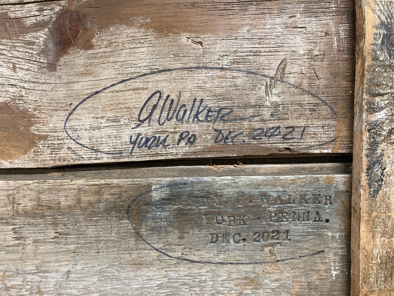
The Walker Family (December, 2021)

This year involved many ups and downs. Losses and frustrations… certainly. Yet, milestones and rewards were there in spades. Teaching both high school and college level art is demanding, especially coupled with the ever changing nature of our nation’s health crisis. In spite of the many challenges that were faced daily in education, I can say that some of them most rewarding moments were had with several of my students. Helping my students has always been the true reason for my choice to become a teacher.

My family is healthy and our times together a true blessing. In the words of Zac Brown, “I have everything I need, and nothing that I don’t.” <<< That may have been the first time I quoted a country artist, but the statement' is definitely applicable. We have blessed in so many ways.

Merry and Bright

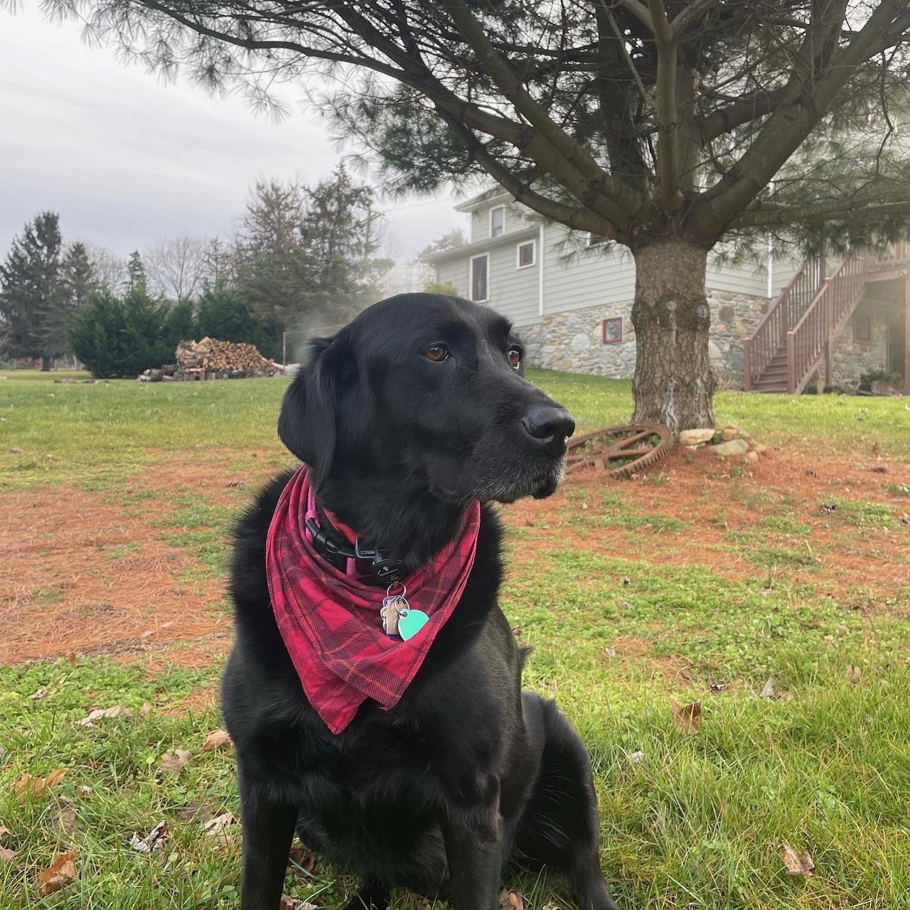
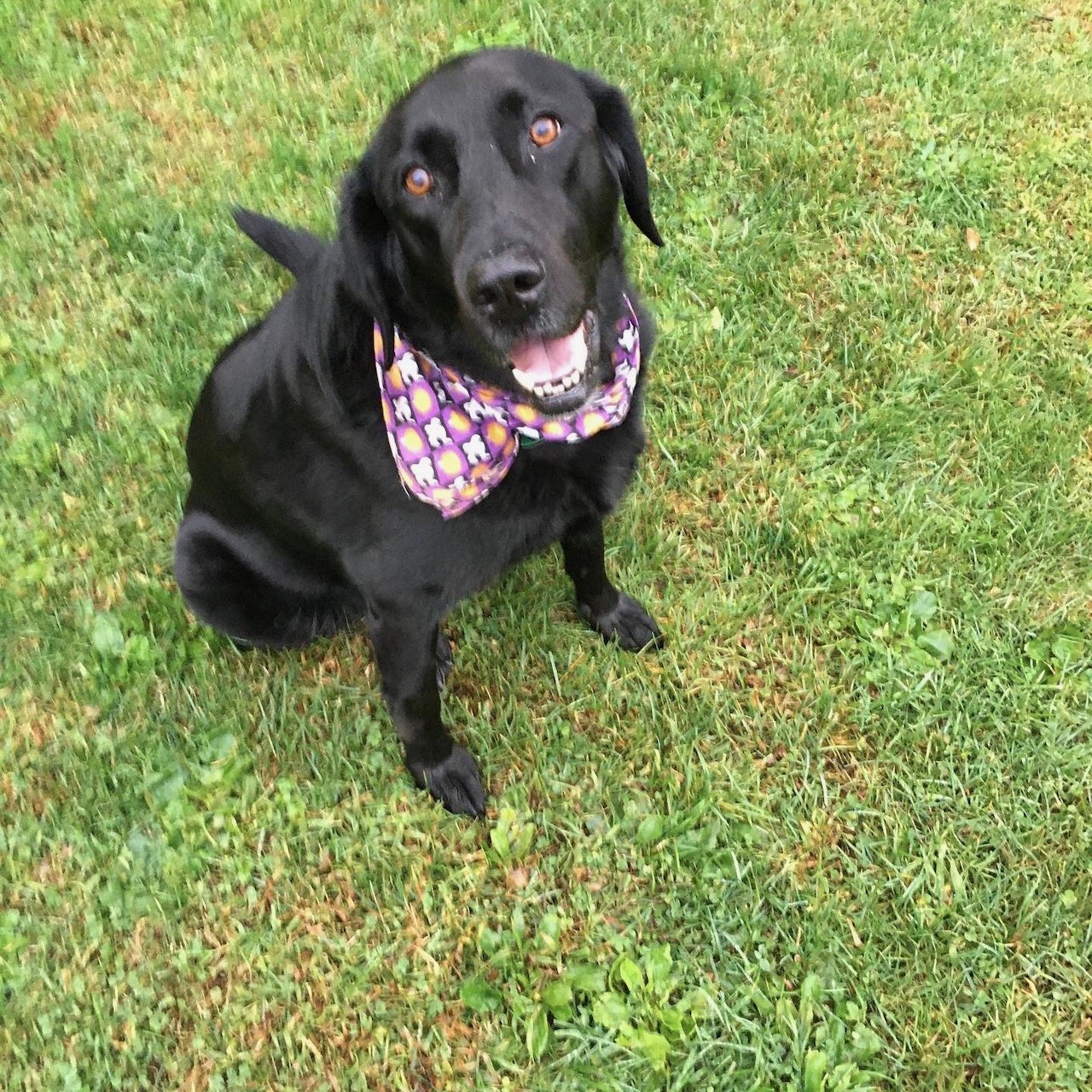
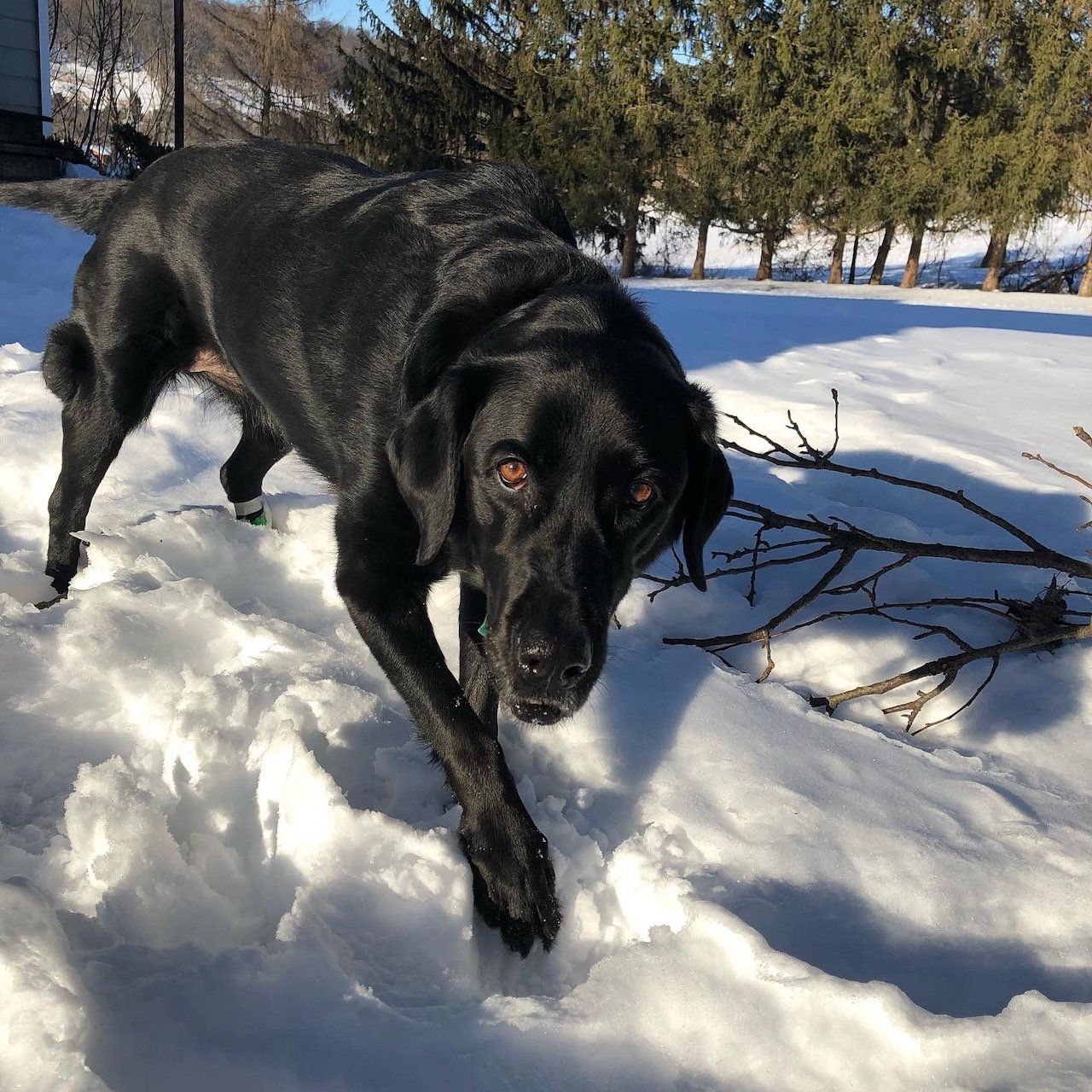
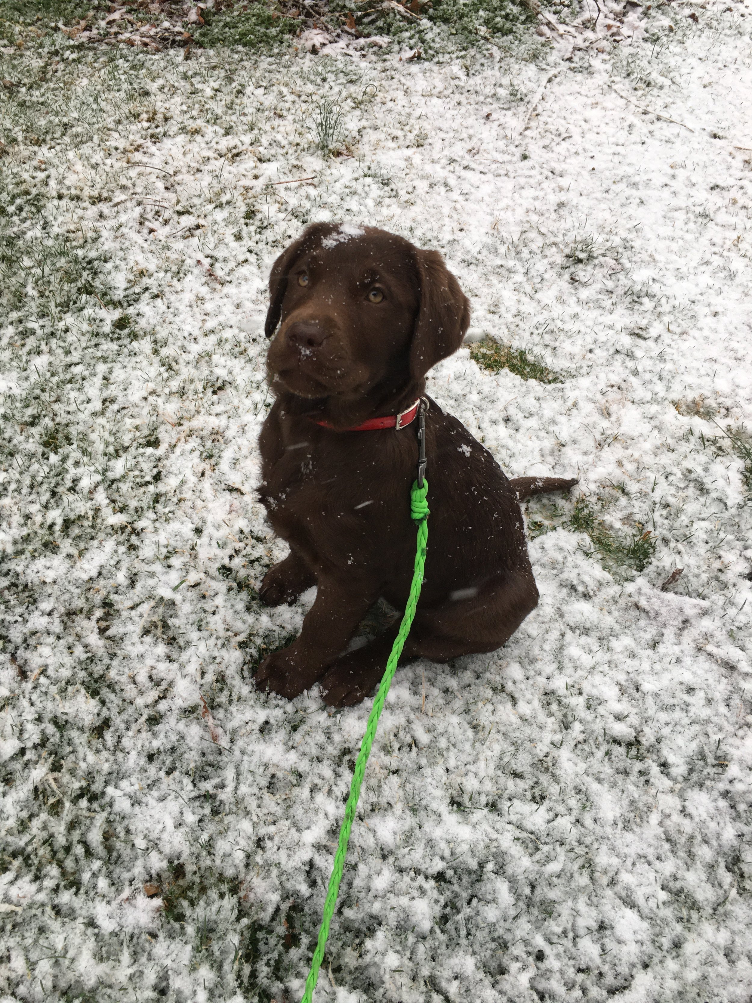
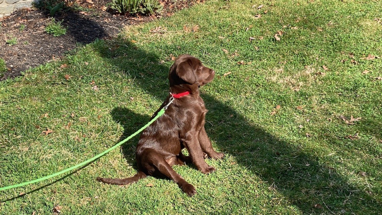
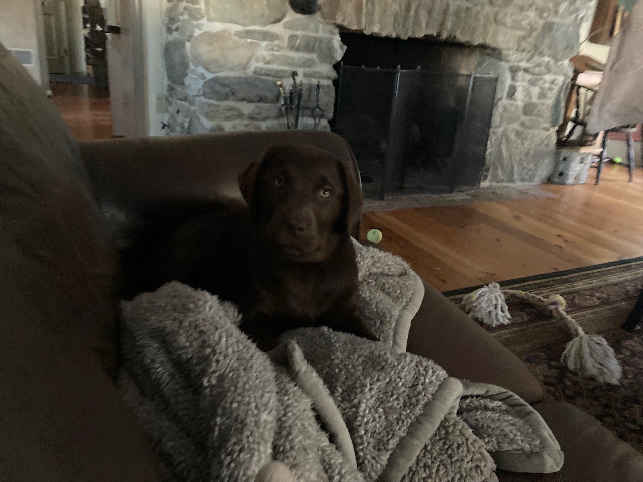
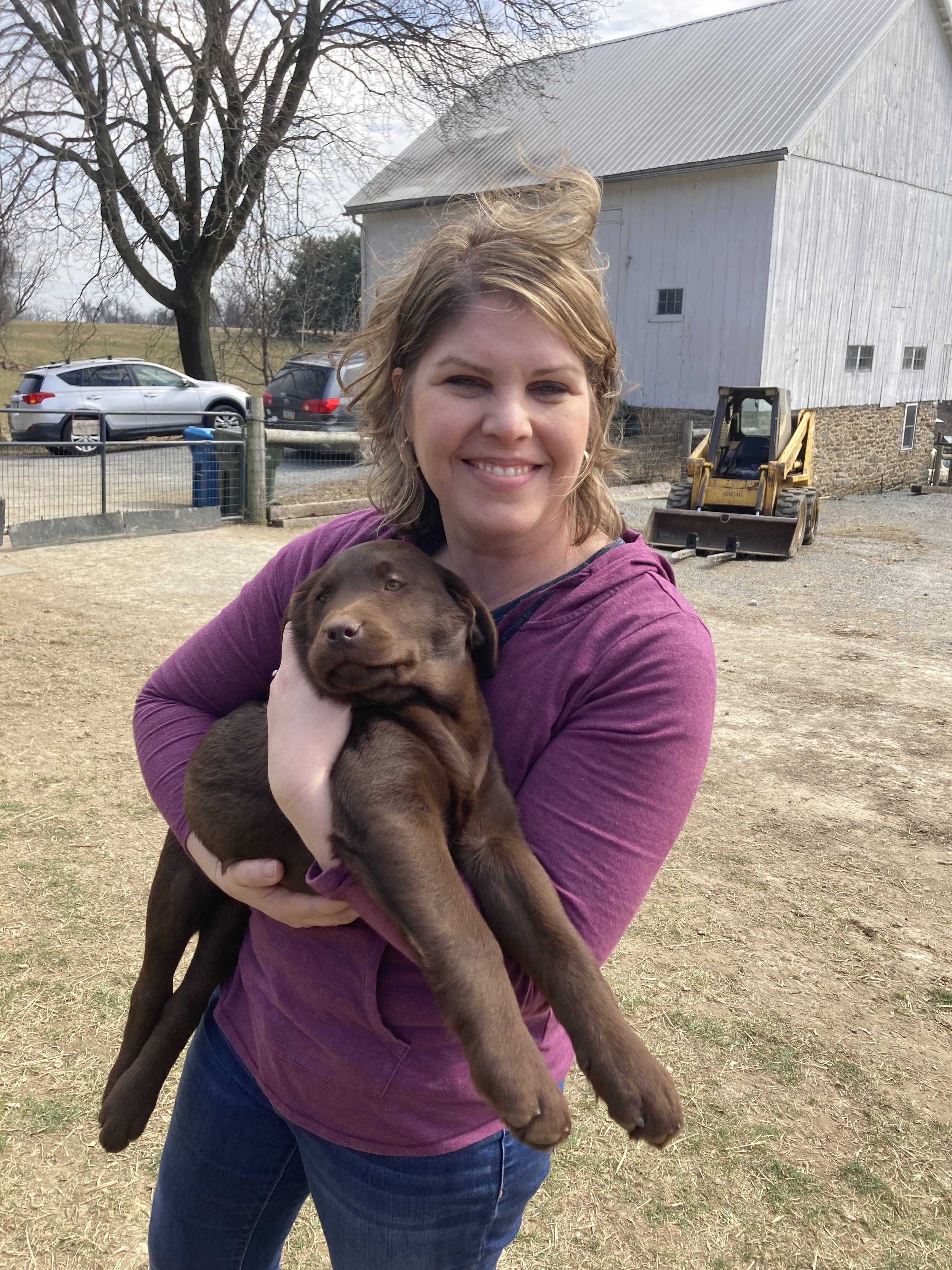
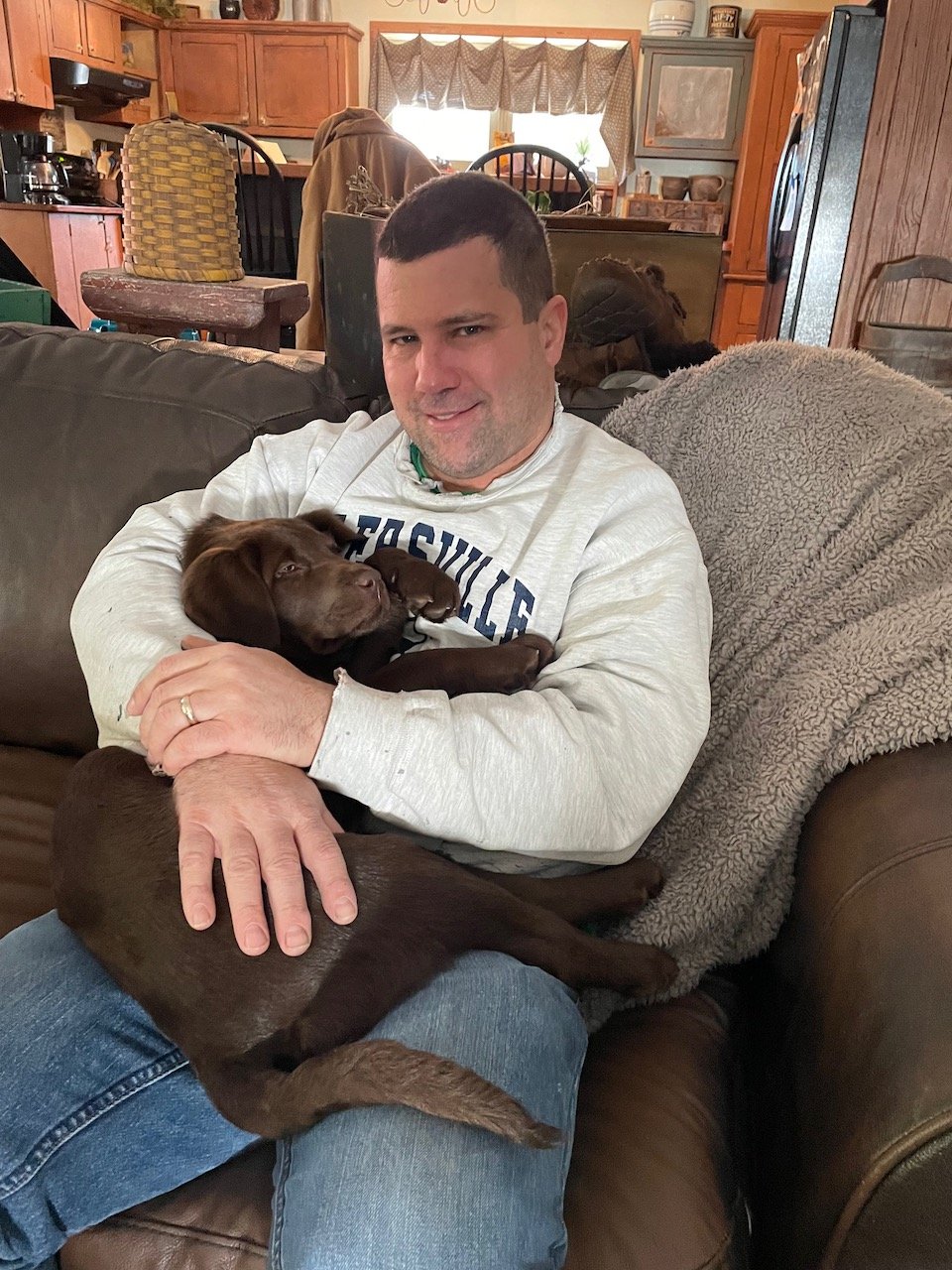
So, in this year, our family experienced the passing of our loyal and ever loving black lab Merry. When she left us, we were left with a terrible void and feelings for longing that only dog lovers can understand. In no time at all, along came an opportunity to take in this another creature… a little squirt named Sophie. While nothing in the world can replace our special Merry, this cute little chocolate lab has done a terrific job channeling all of our family’s attention her way. It’s hard to believe that such a little fuzzball can get into so much trouble; Similarly, it is amazing to witness just how quickly this small brown puppy grew into the bruiser that she has become today! Like all dogs we have known, Sophie too has a keen taste for smoked meat.

The Passing of a Giant

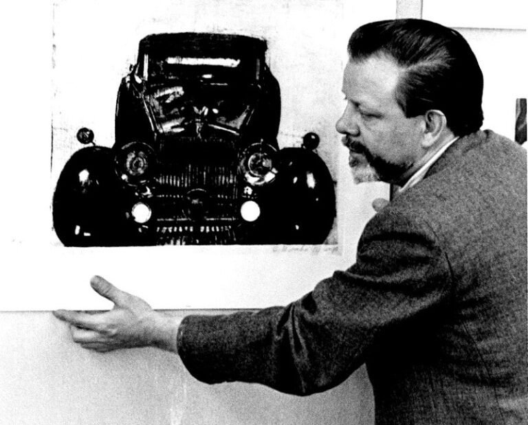
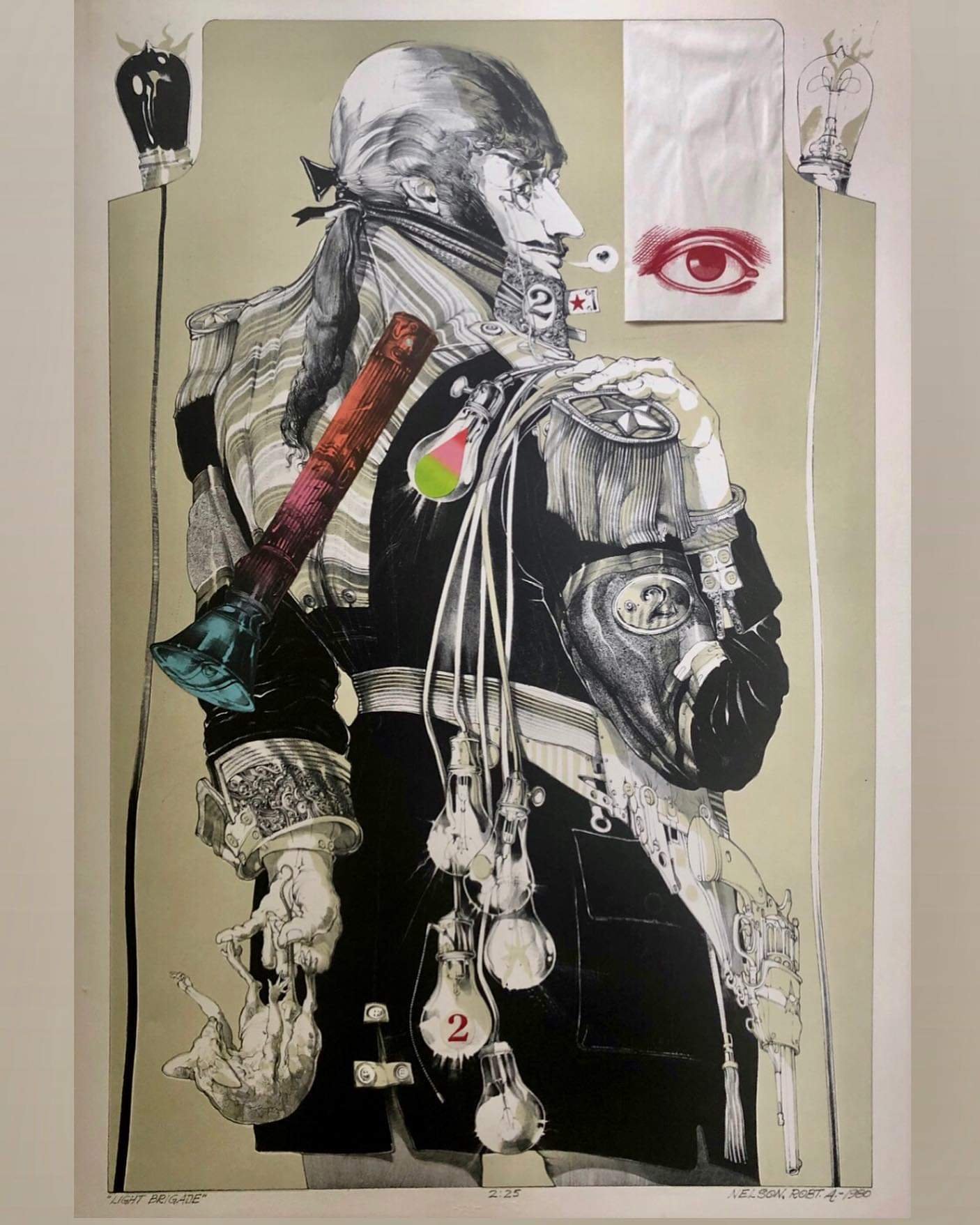
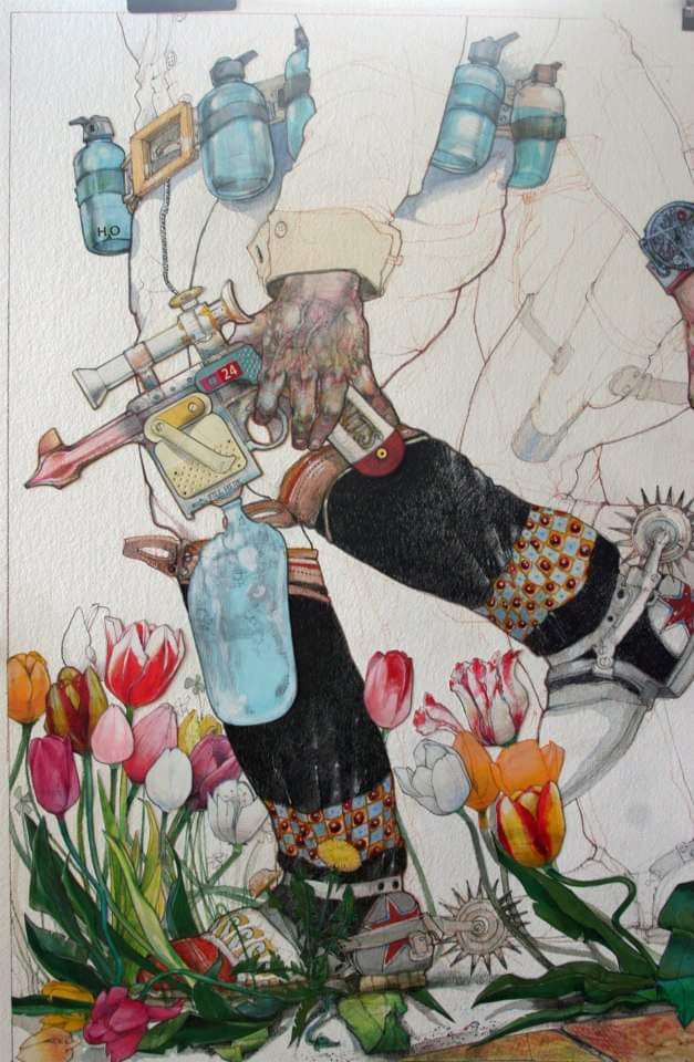
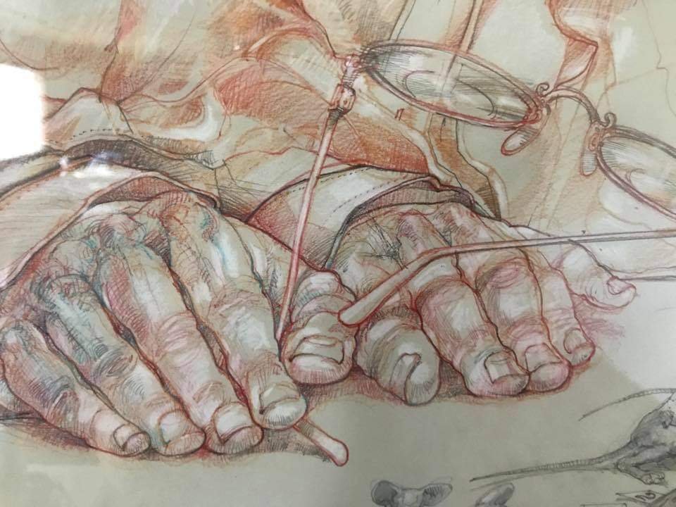
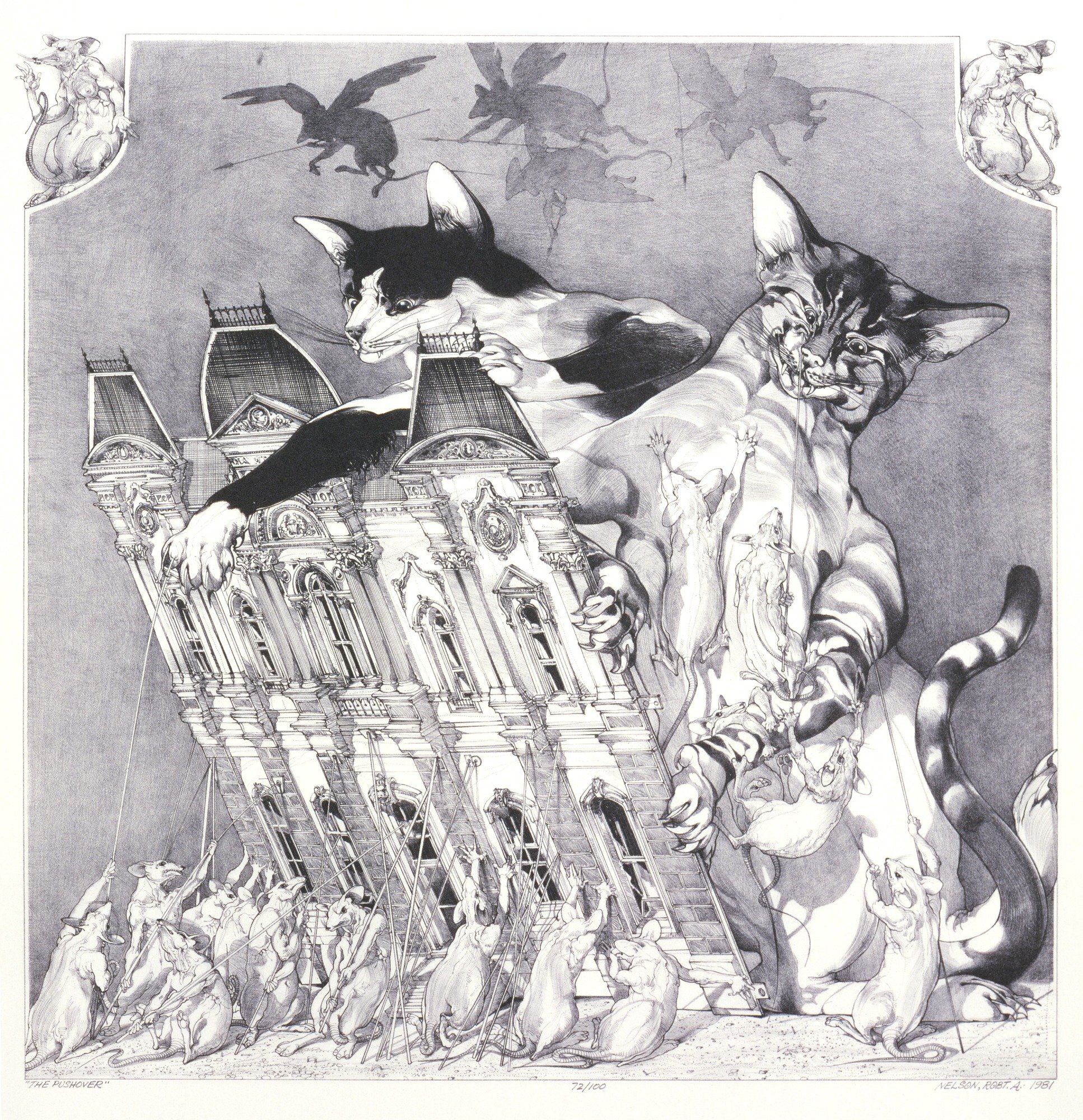
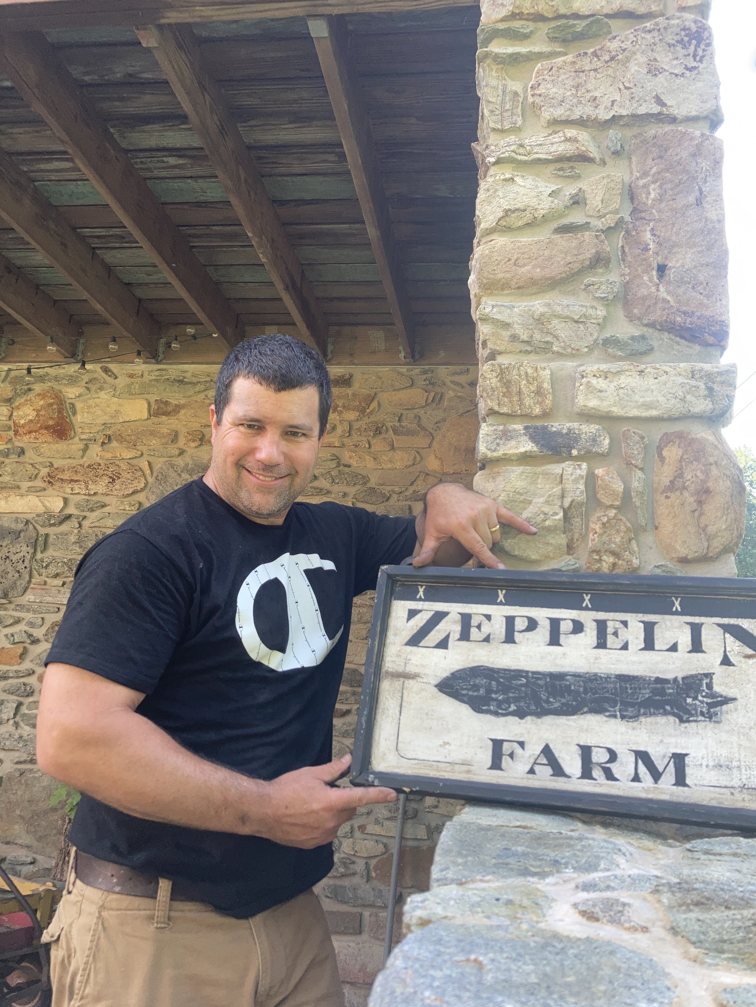
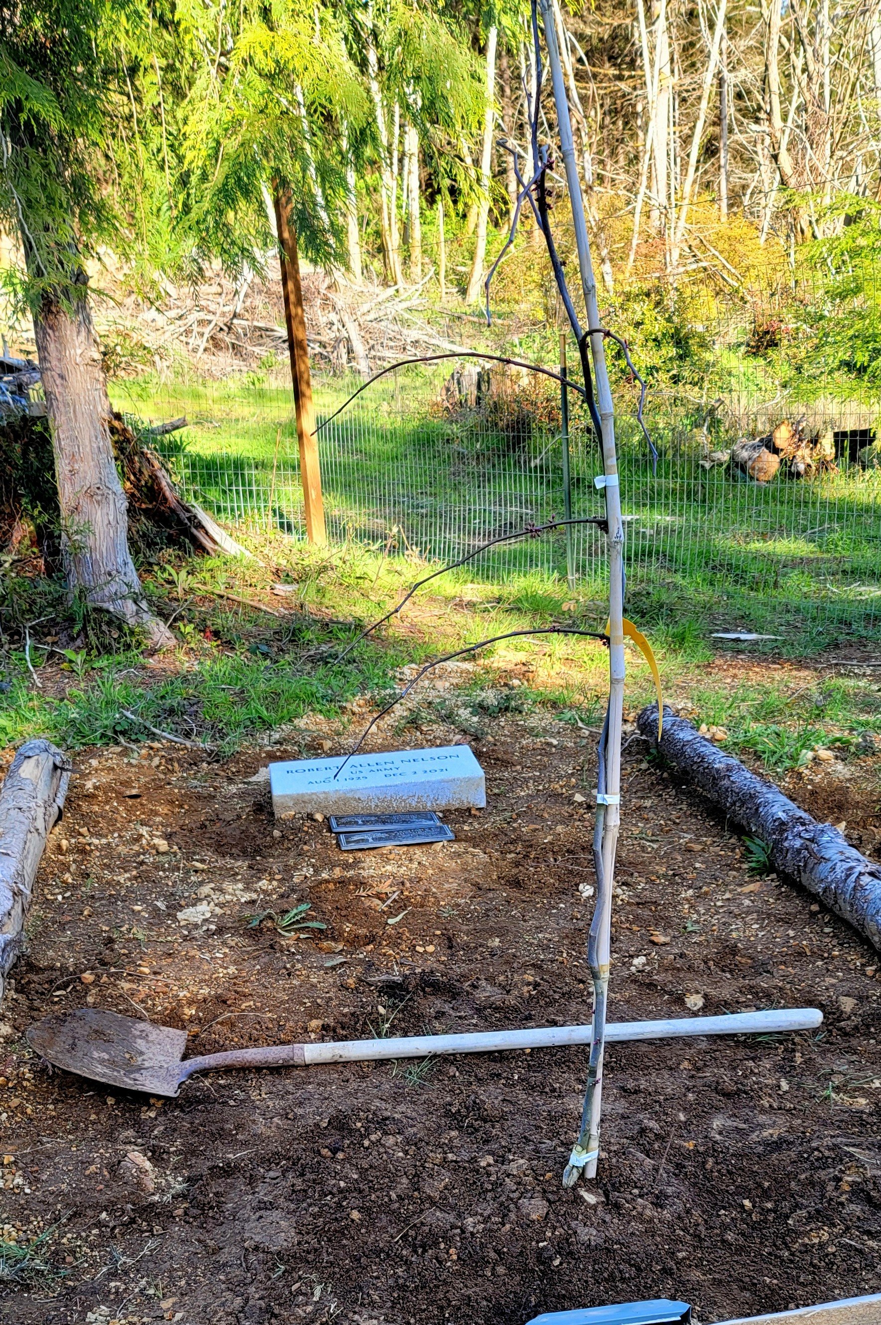
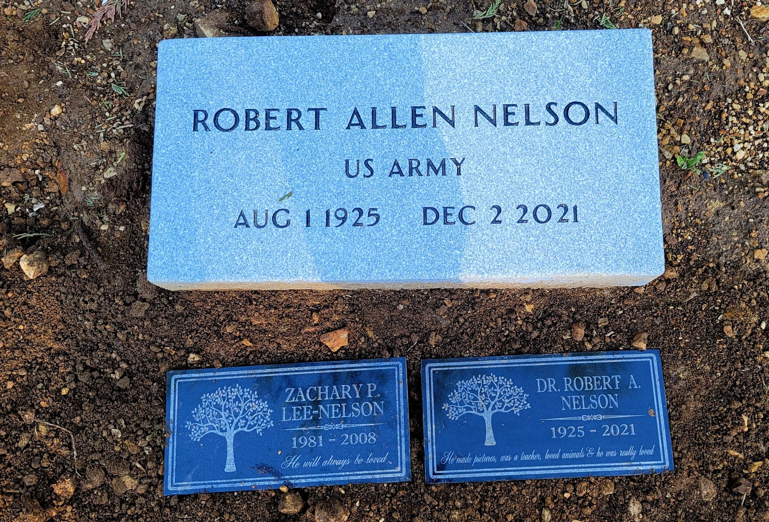
Another substantial loss occurred at the tail end of last year year. Although a ‘sign blog’ is hardly the context to share such information, I feel it necessary, on account of the degree in which this individual influenced me artistically. The world lost a great man when Dr. Robert A. Nelson passed onto the “Great Art Studio in the Sky”. As an undergrad, I was honored to have been a student under Nelson’s tutelage. The talent possessed in this man was unmatched and most certainly will remain so for a long, long time. After retiring from college level instruction in 1997, Nelson continued (voraciously, I might add) to produce art each and every day. At age 95, this much was true. My collection of Nelson’s art will never fully rate at a comprehensive level, as I simply cannot acquire enough of it for my satisfaction (although my budget determines the rate and extent to which the collection develops).

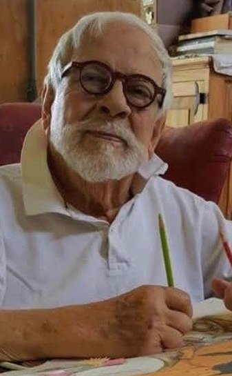
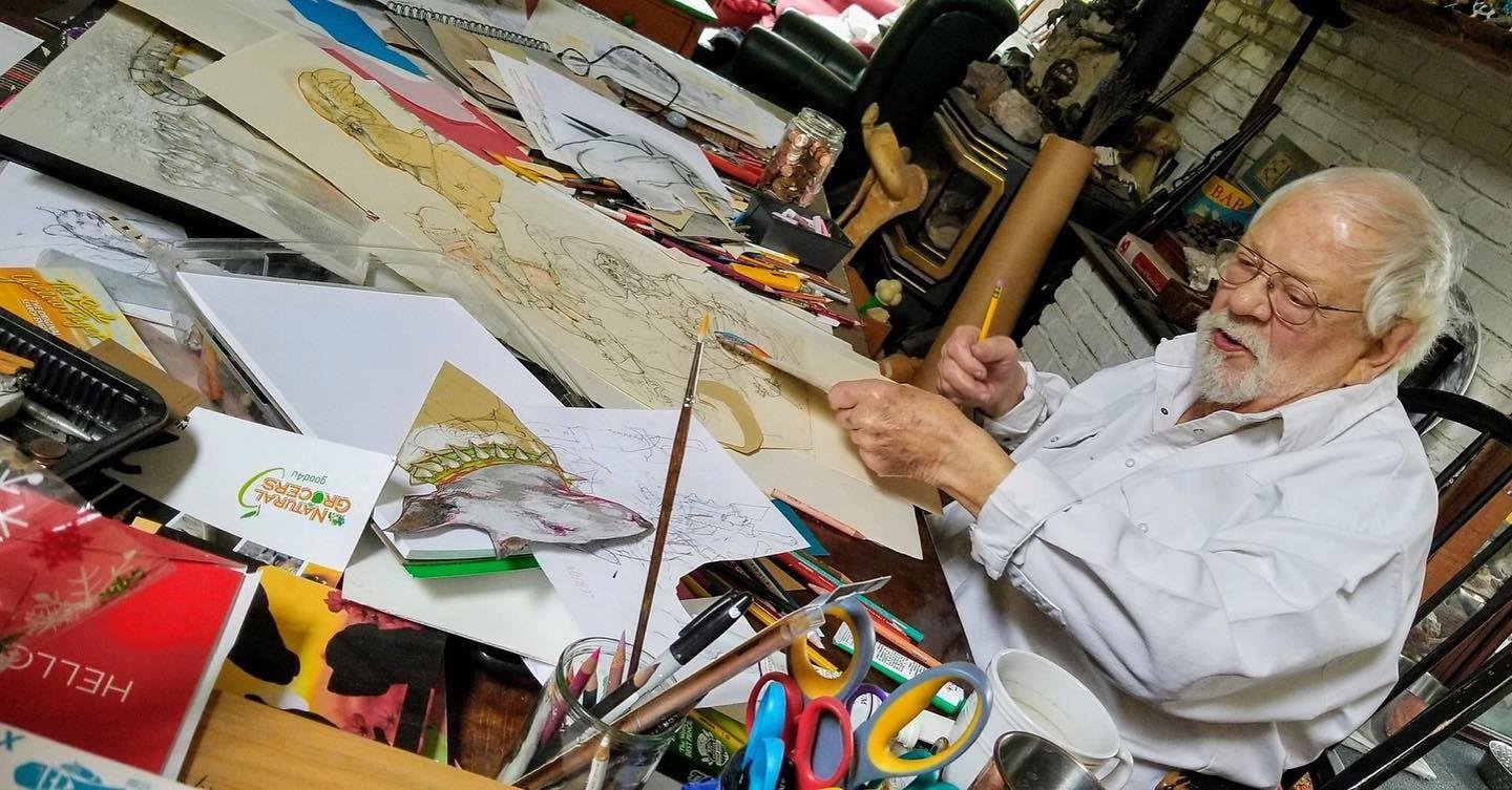
Anyone who knew this man would attest to his abounding talent and his generous personality. Those who took the time to know him well most certainly have respect for what he taught and practiced. They would know that Nelson held close to these things: 1) Drawing is a skill that demands practice; 2) Animals are to be respected and cared for; 3) Be original (Borrow, but do not breath with someone else’s aesthetic lungs); 4) Look to the past… the great masters are still worthy of examination and study; 5) Draw; 6) Draw; 7) Draw…

I was honored that Robert’s wife incorporated into his gravesite a sign that I had made for them. Their property, nestled amid the gentle hills off the Oregon coast, is called The Zeppelin Farm. May the spirit of this great man rest in peace.
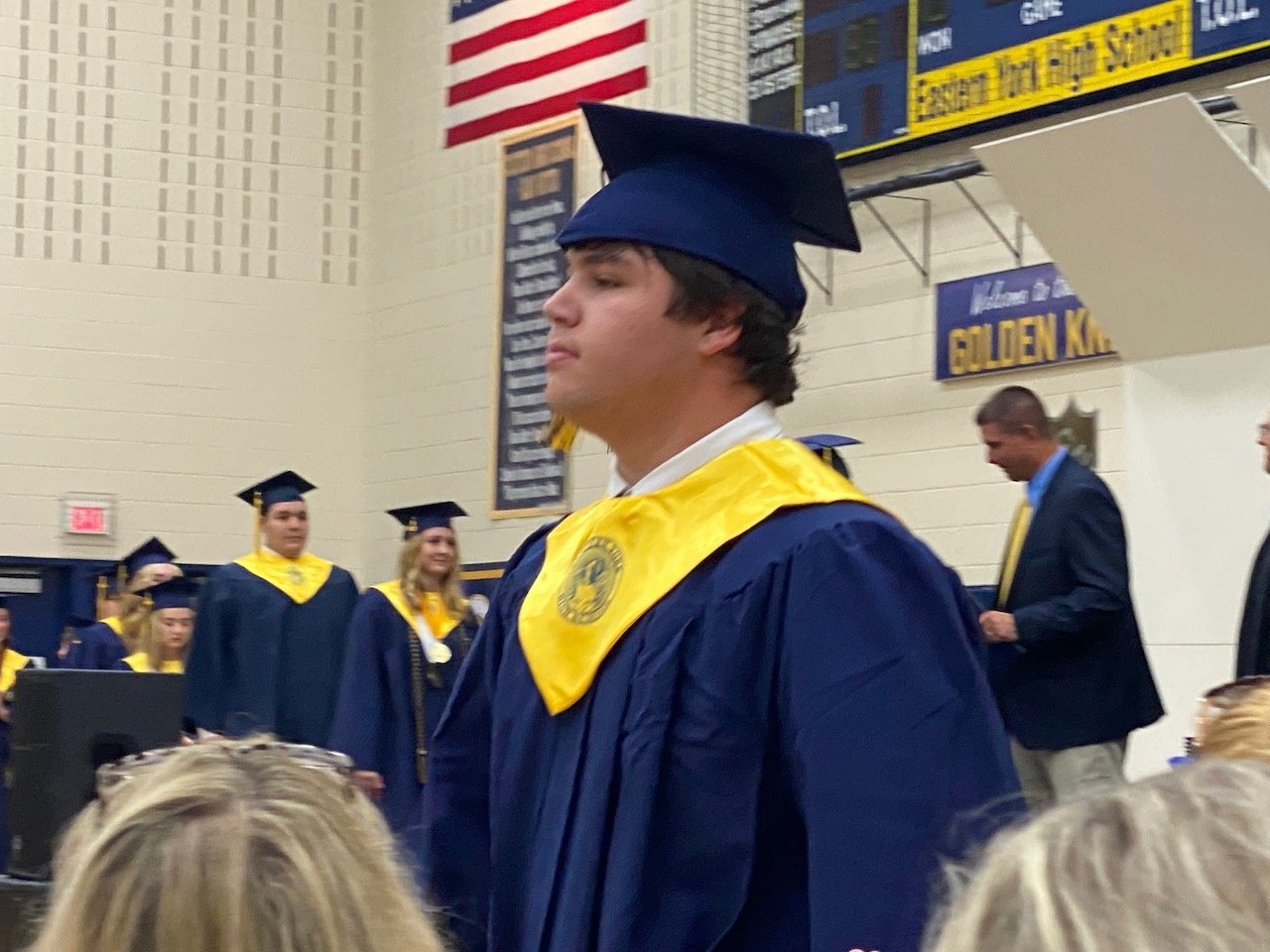
Proud Pop

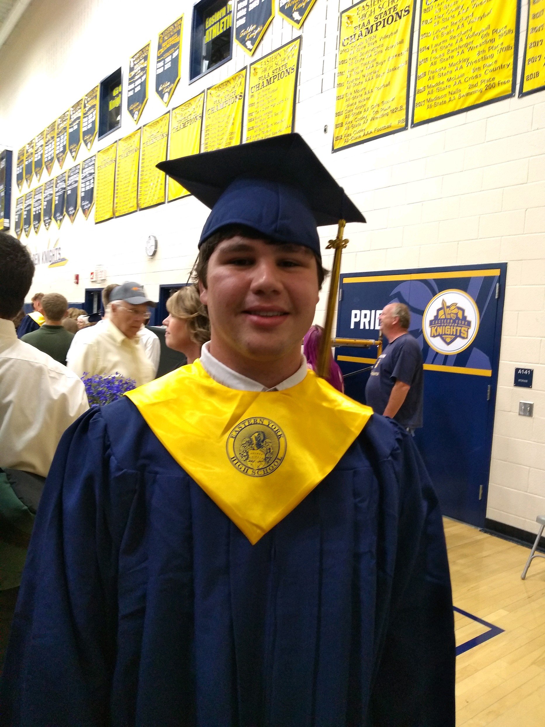
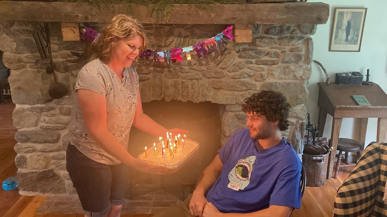
Speaking of growth and swift time, I have to pause in order to recognize the milestones in the lives of both of our boys’ lives. My oldest turned 21 years old and my youngest just graduated high school. It’s such an overused adage, but perhaps due to the power in its truth - “Boy, how time does fly!”.
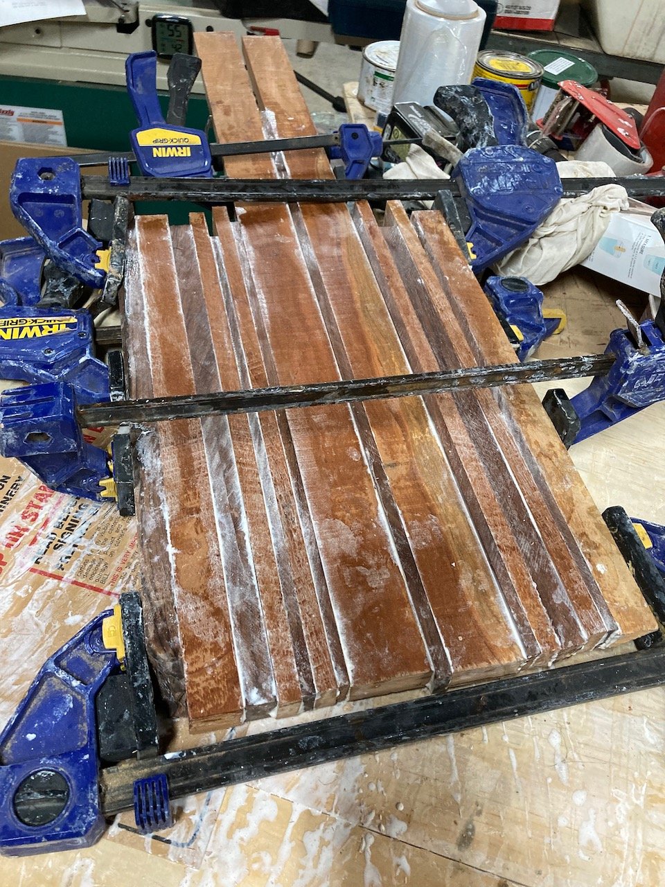
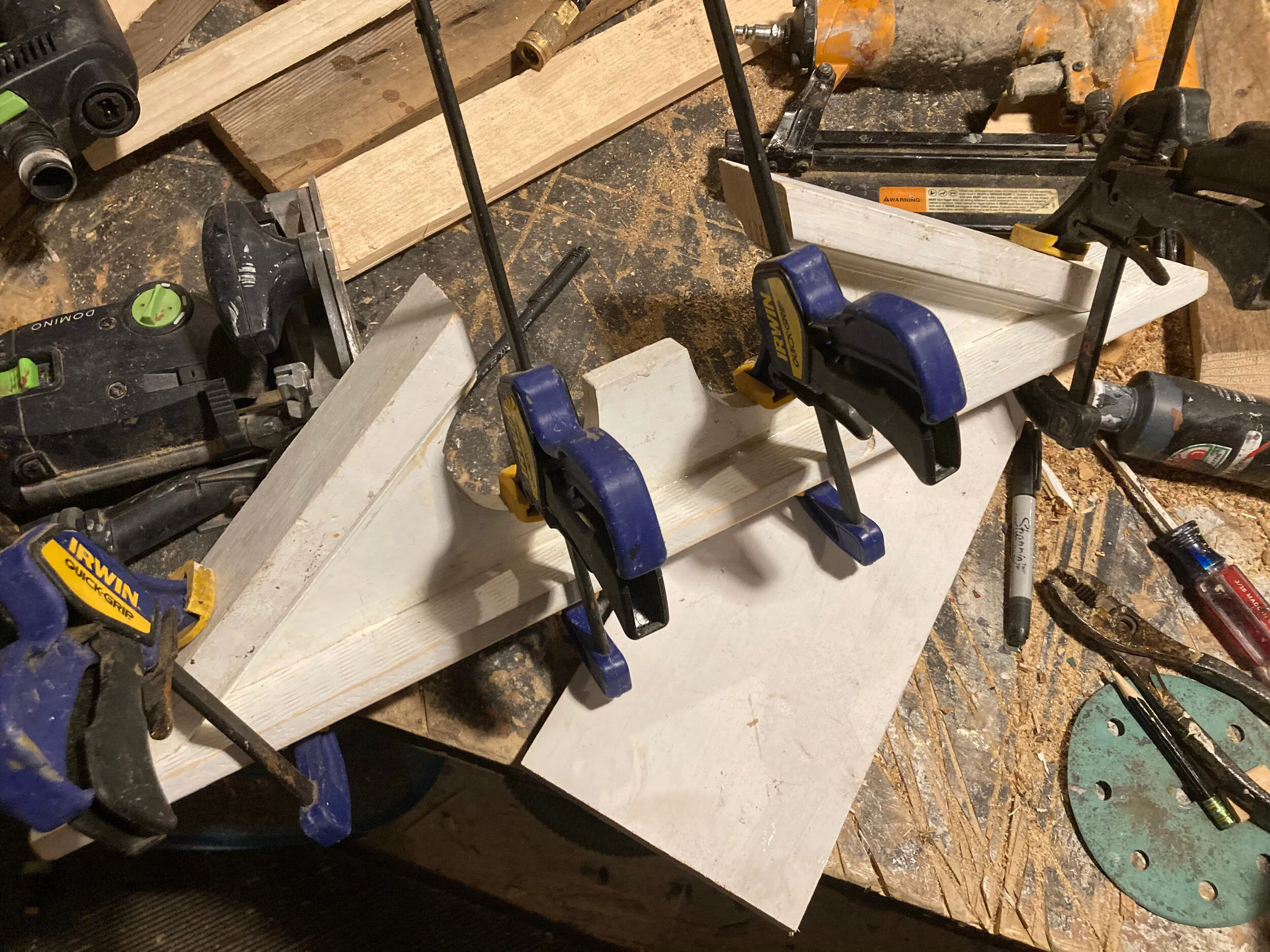
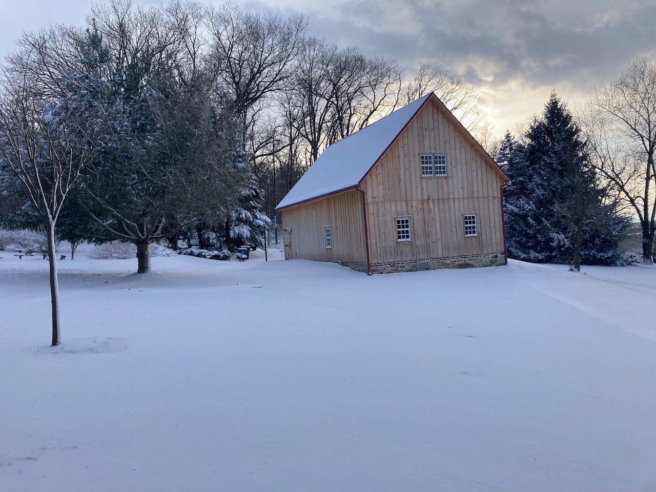
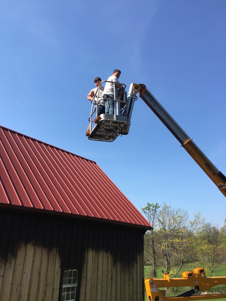
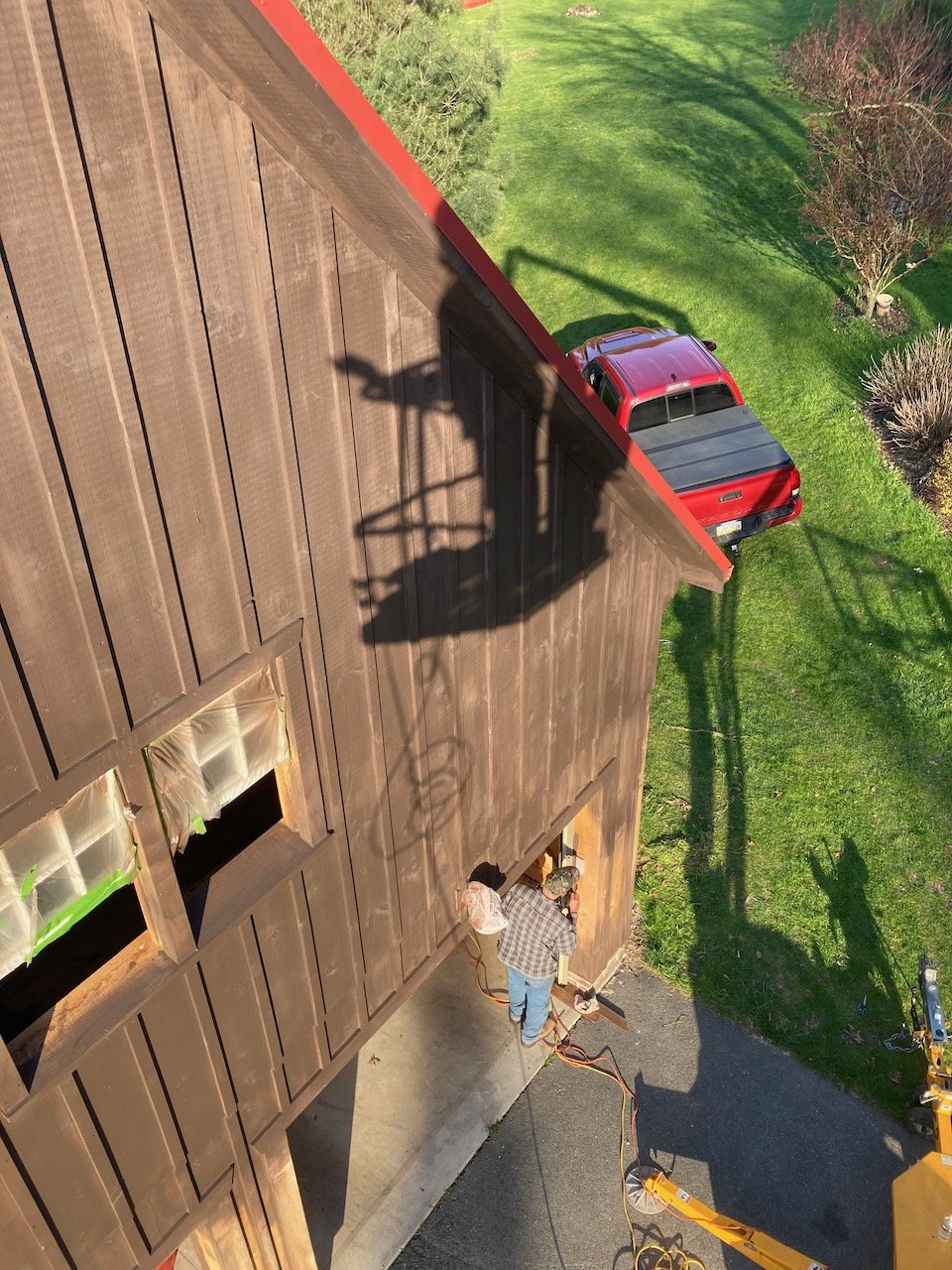
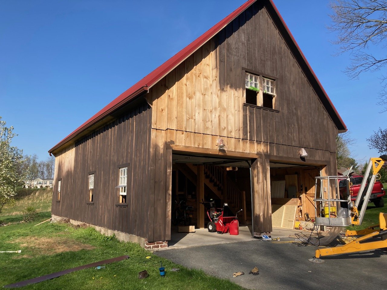
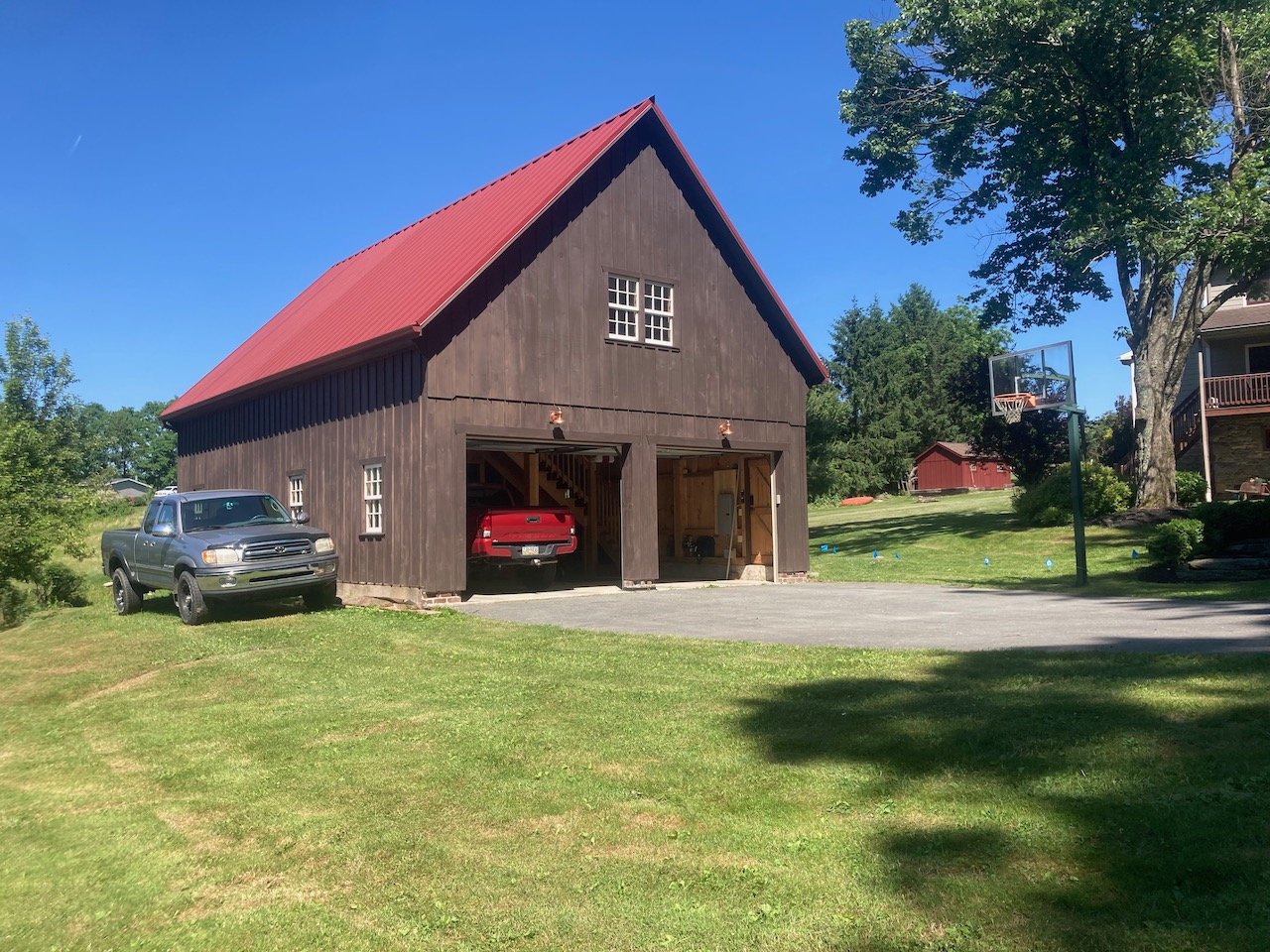
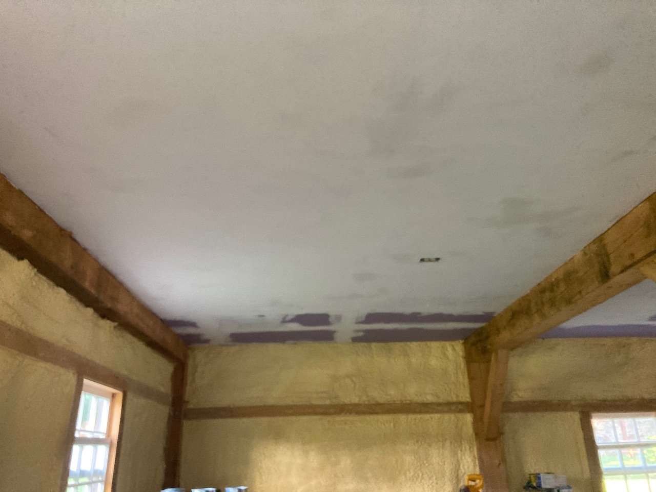
The Barn

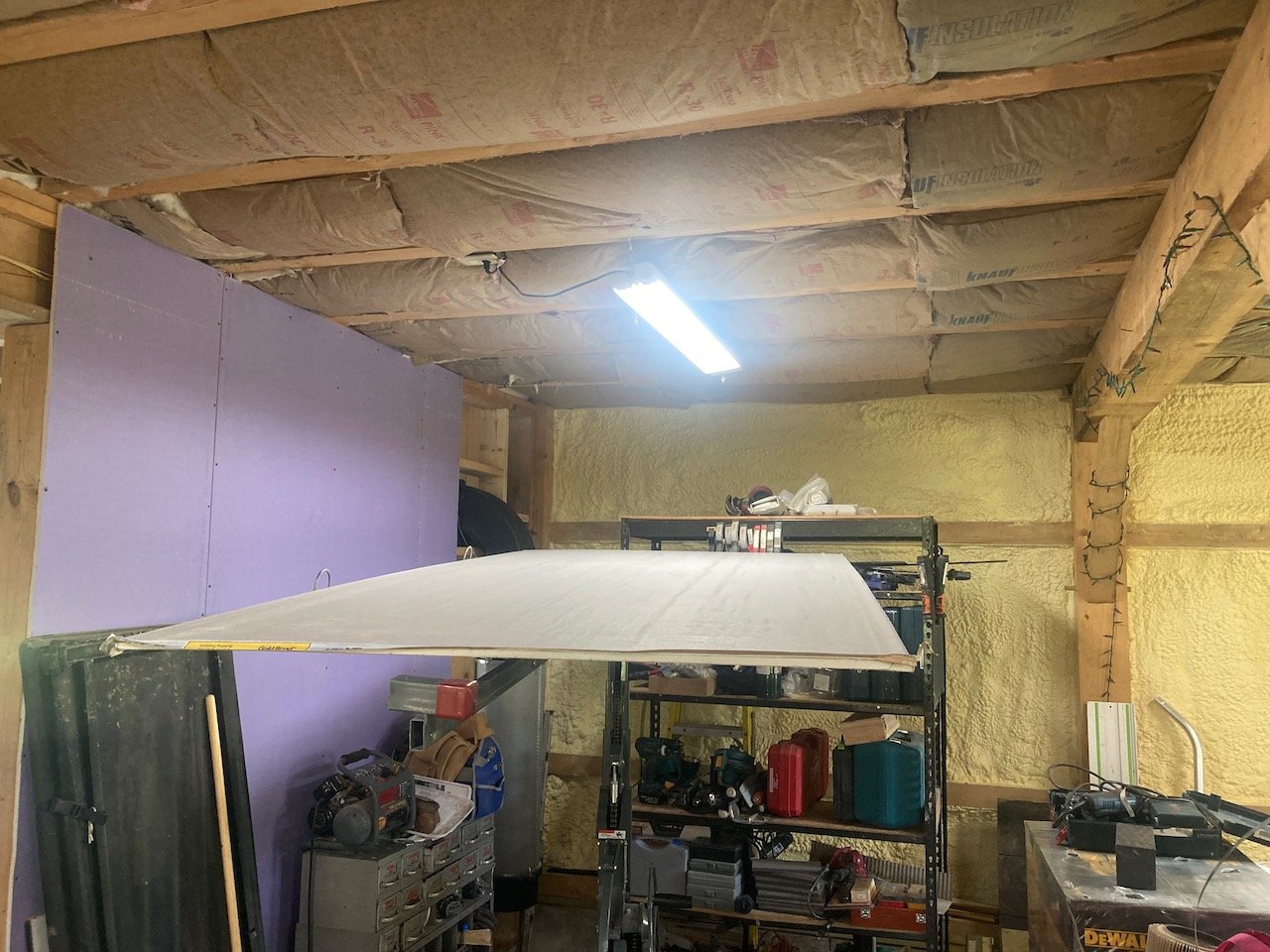
On the topic of the barn, my future workshop - Well, it has been one of my biggest chores. Trying to put a ribbon on the shop whilst fulfilling sign commissions is no easy task. I cannot shut down my sign work and devote all of my energies towards getting the shop ready for service… it simply doesn’t work that way. However, we managed to paint/stain the exterior this Spring. In addition, the Summer months provided me the time to hang a drywall ceiling and the prepare the wood that will be used for my walls. On the last note, I think it is important to elaborate (Read on / More in next section).

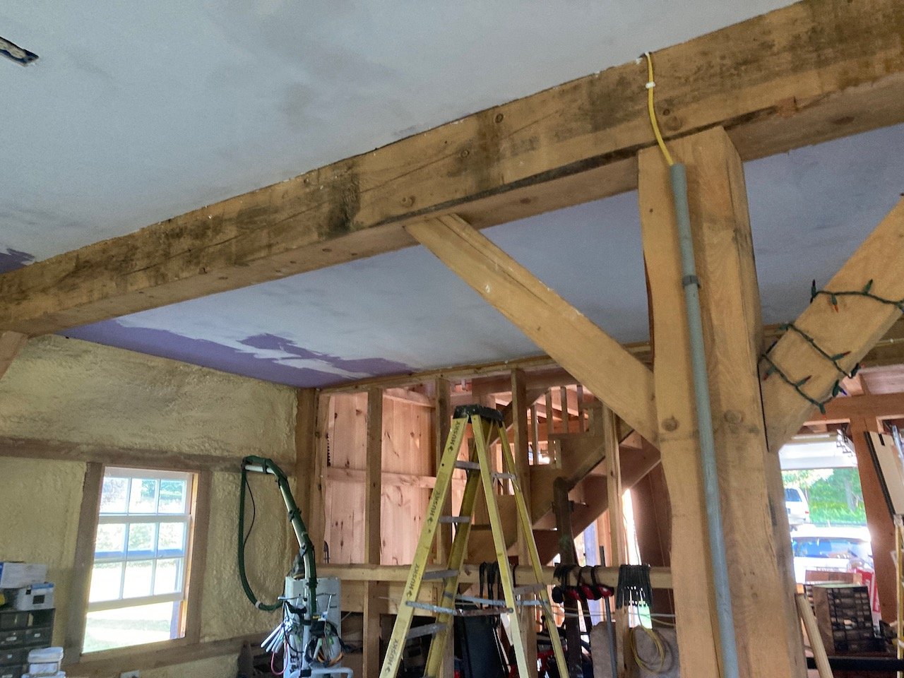
Not Just Your Run of the Mill

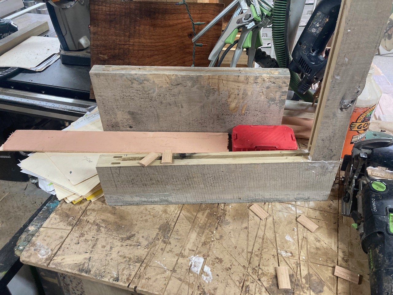
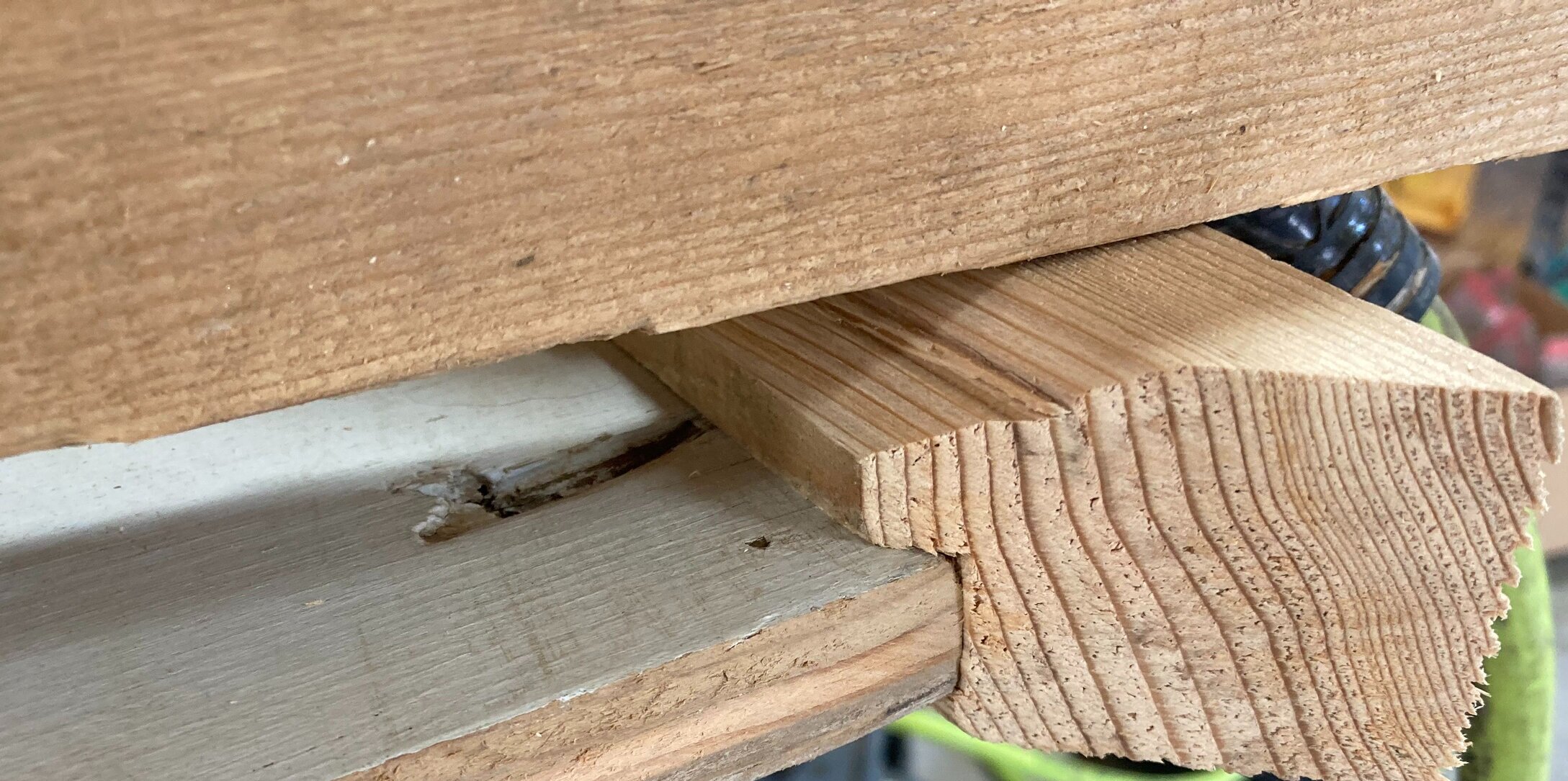
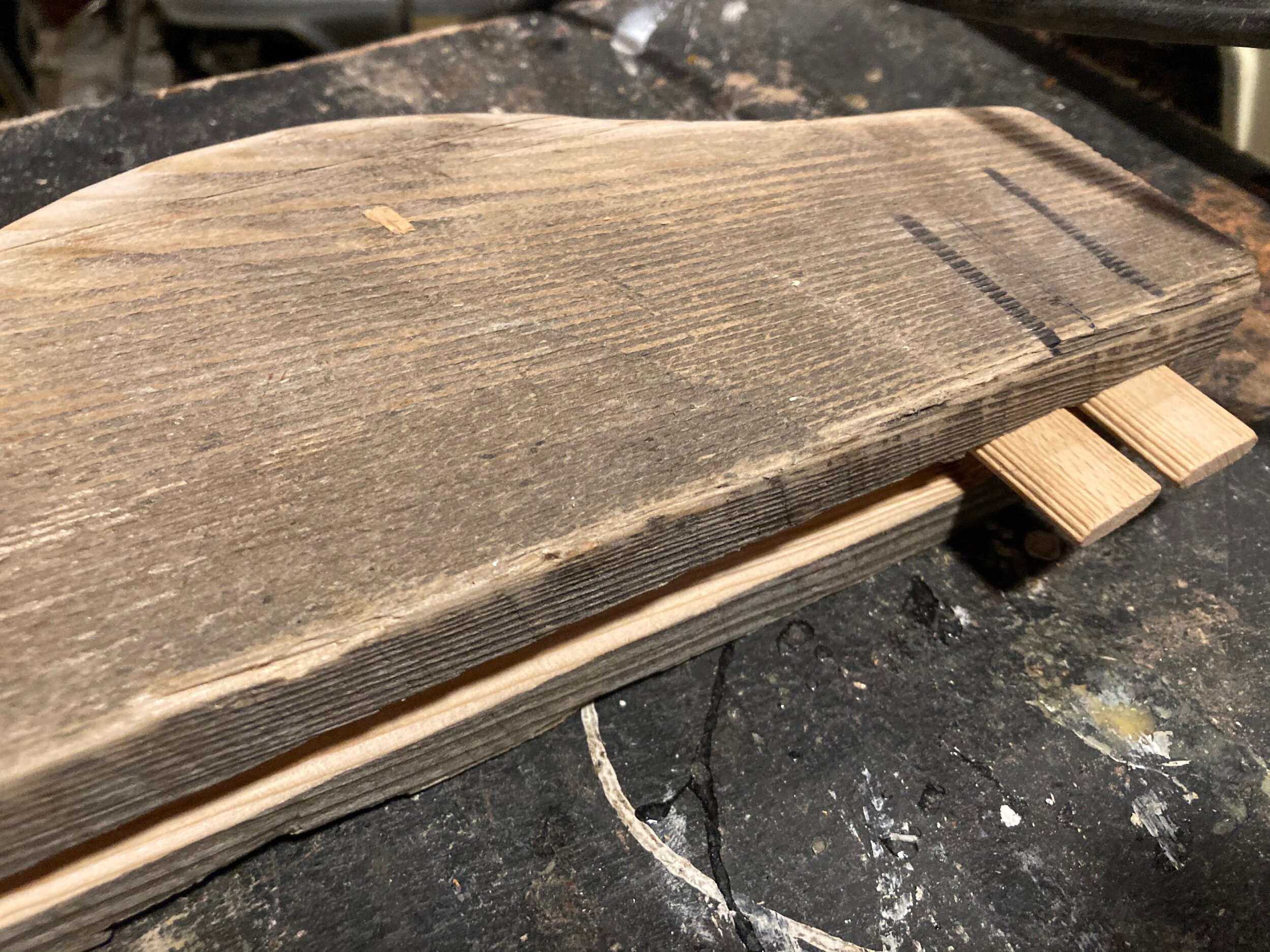
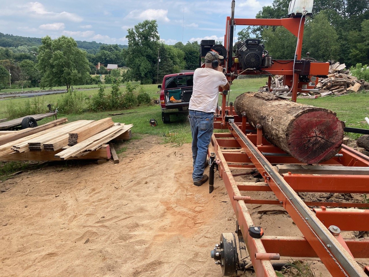
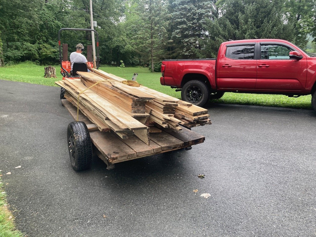
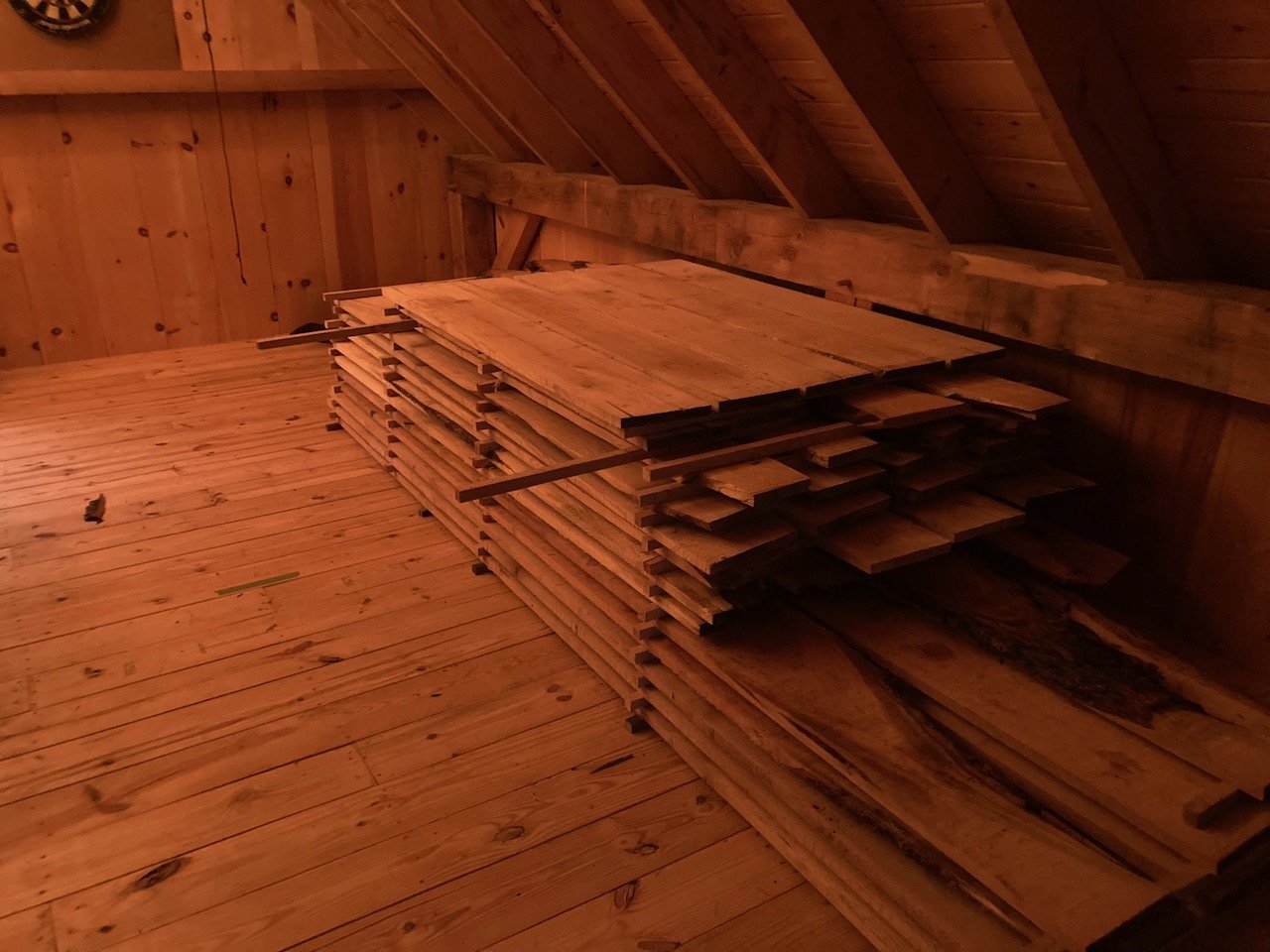
The wood that I will be using for the interior walls of my workshop is sourced from fallen trees around my house. The species are varied (cherry, oak, ash) and this variety will contribute to the charm of the workspace. Unfortunately, when wood is milled from a tree, it needs to dry appropriately, in order to maintain its functional shape. The milled boards need to be stacked (a process known as “stickering”) and stored in a manner that allows consistent airflow throughout a given year (or more). During this time, much of the chemically-bound moisture will evaporate from the planks, making them more stable when it comes time to putting them to use.

The wood smells delicious, but I need to be patient and wait out the year while the process takes place. When the time comes, I will create a lap (ship-lap) joint on each side of the boards and hang them in my shop. The mill is owned and operated by my brother and dad. Not only is it cool that the wood that will surround me will have been harvested locally, it is a huge (I mean huge) financial break for me. Sweat equity pays off here, as I can only imagine just how much hardwood planks would cost to order and ship, had it not been for my family and their good graces. Check out my brother’s business at Walker’s Milling.

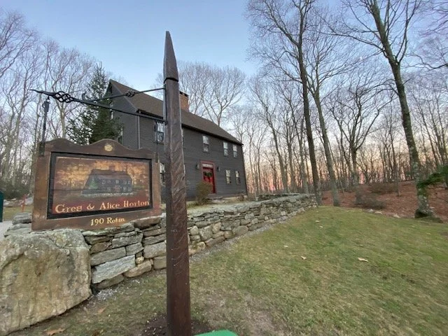
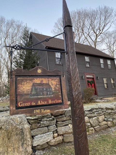
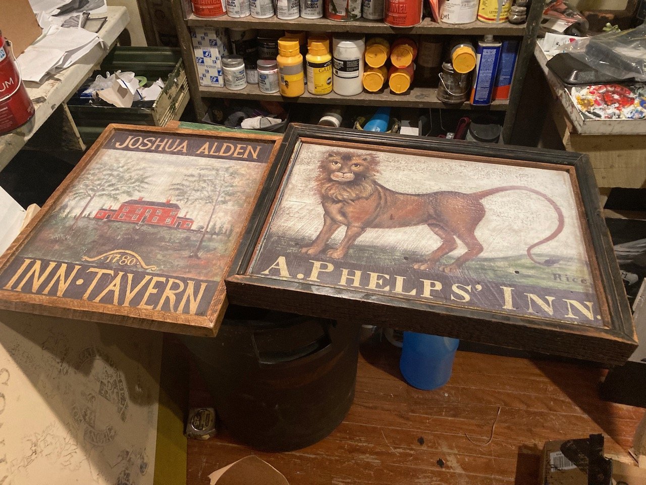
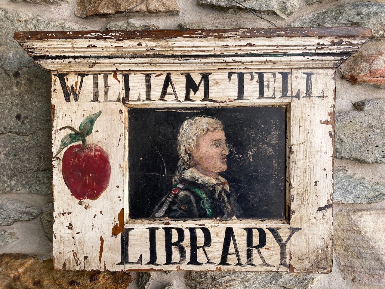
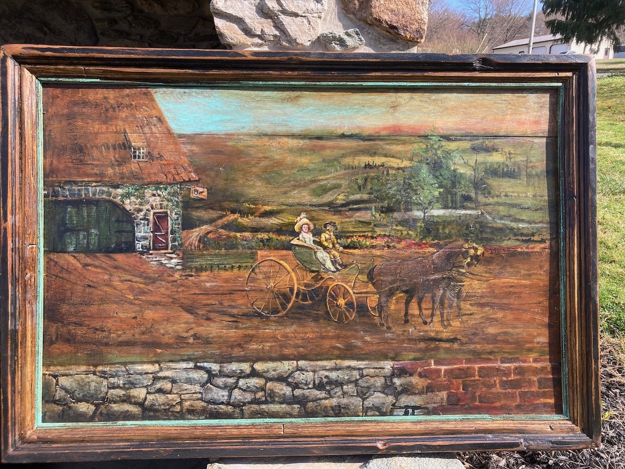
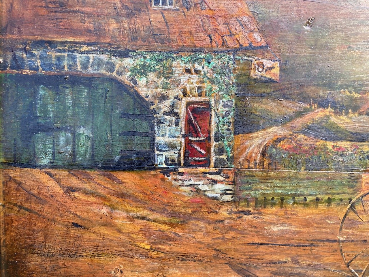
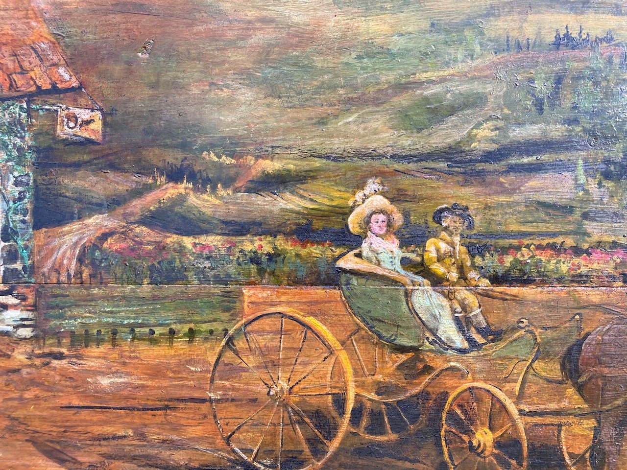
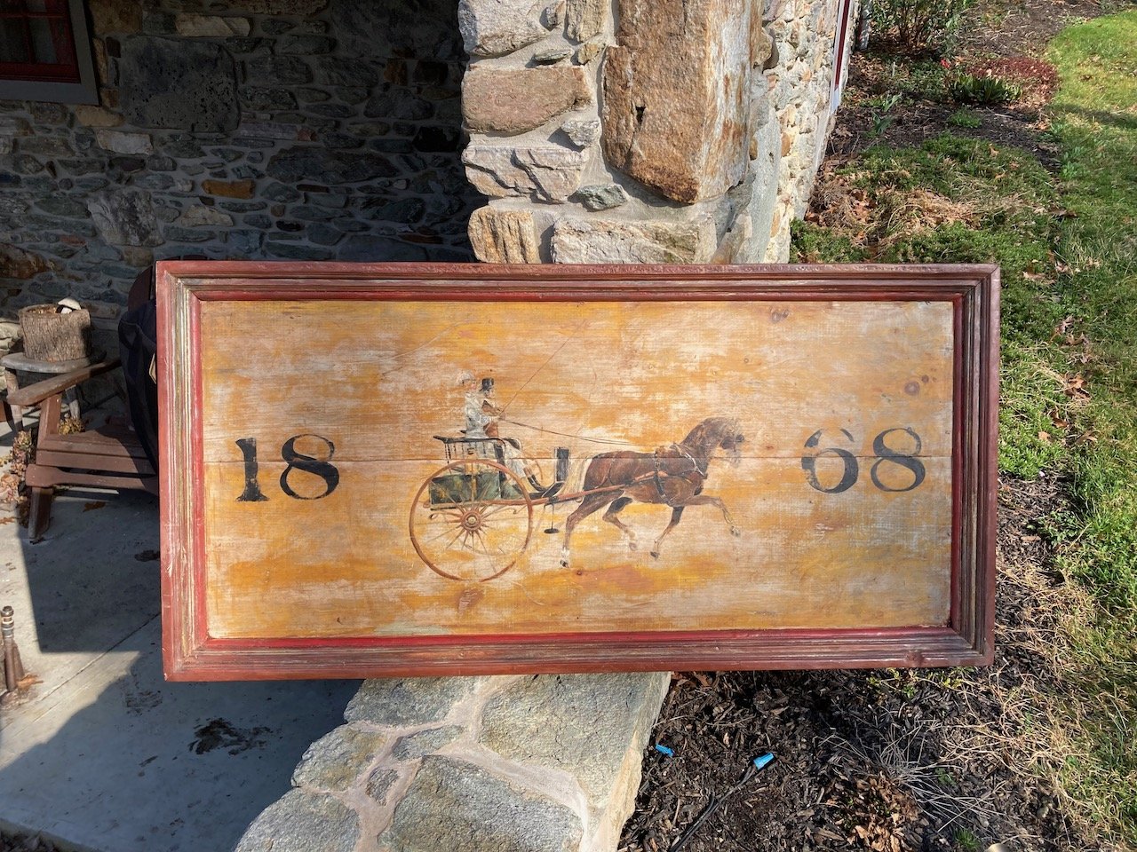
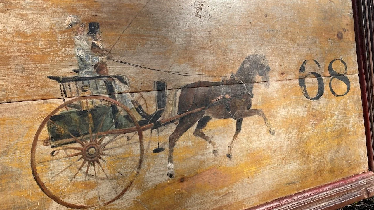
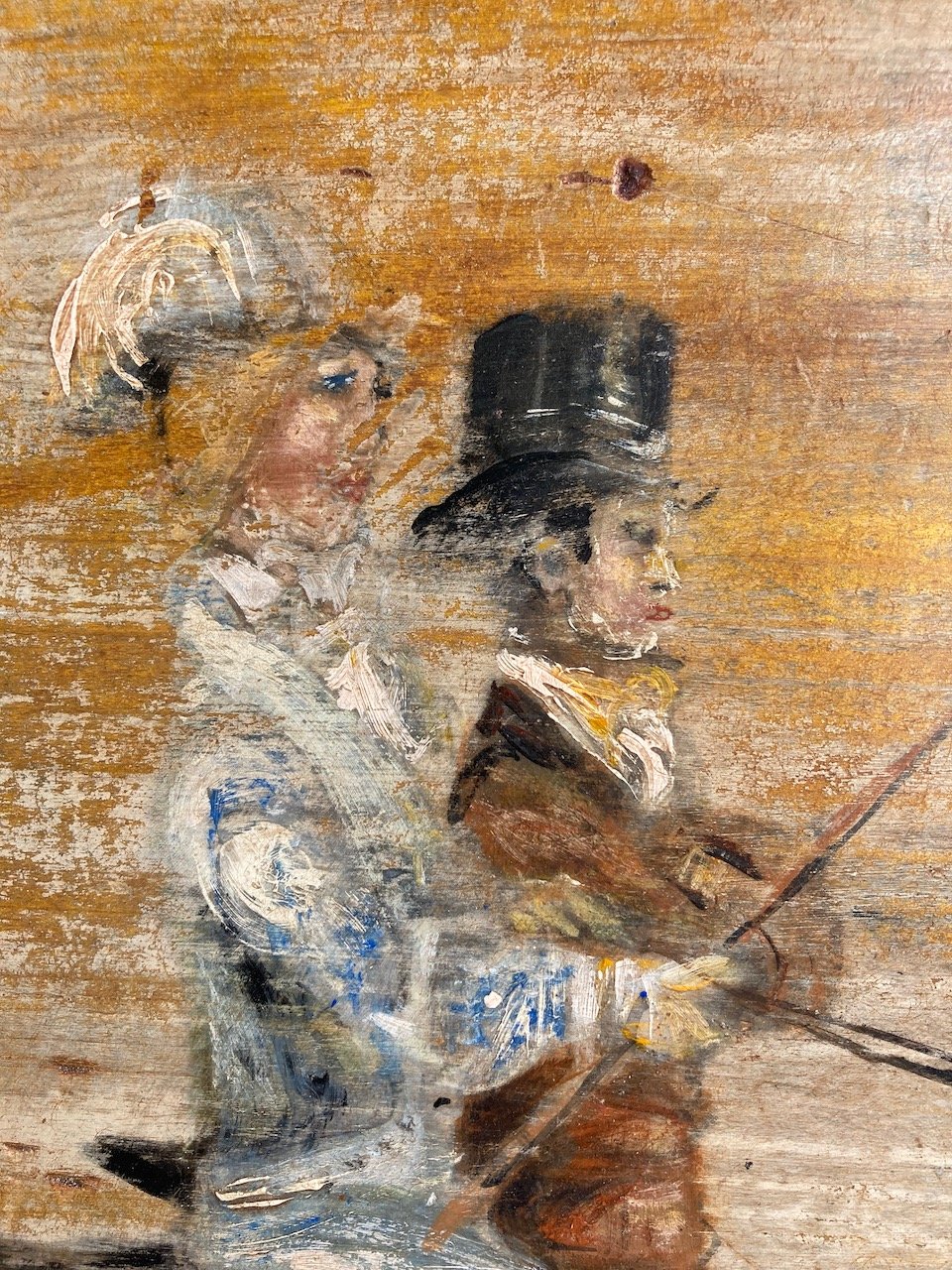
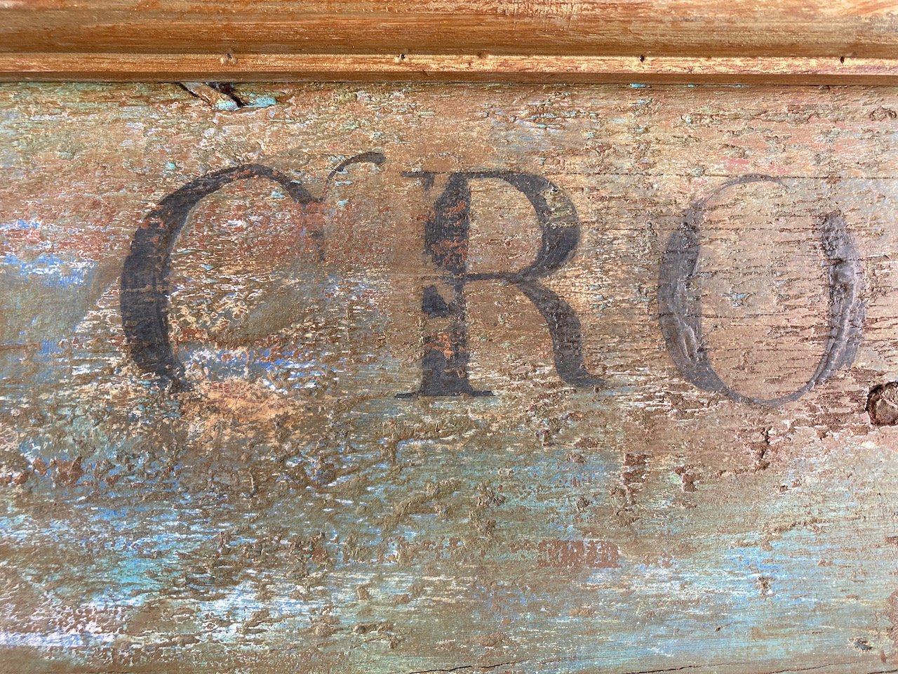
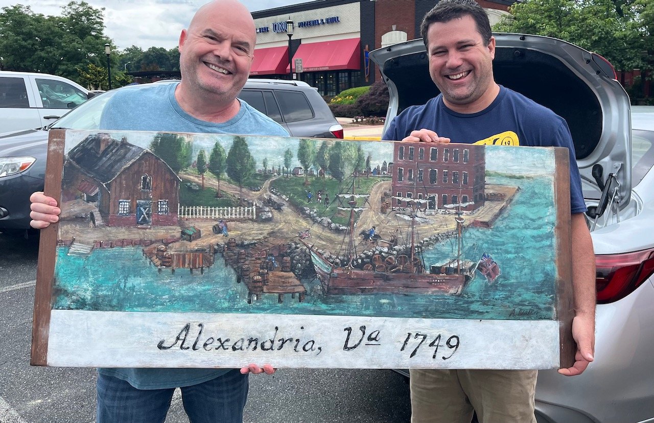
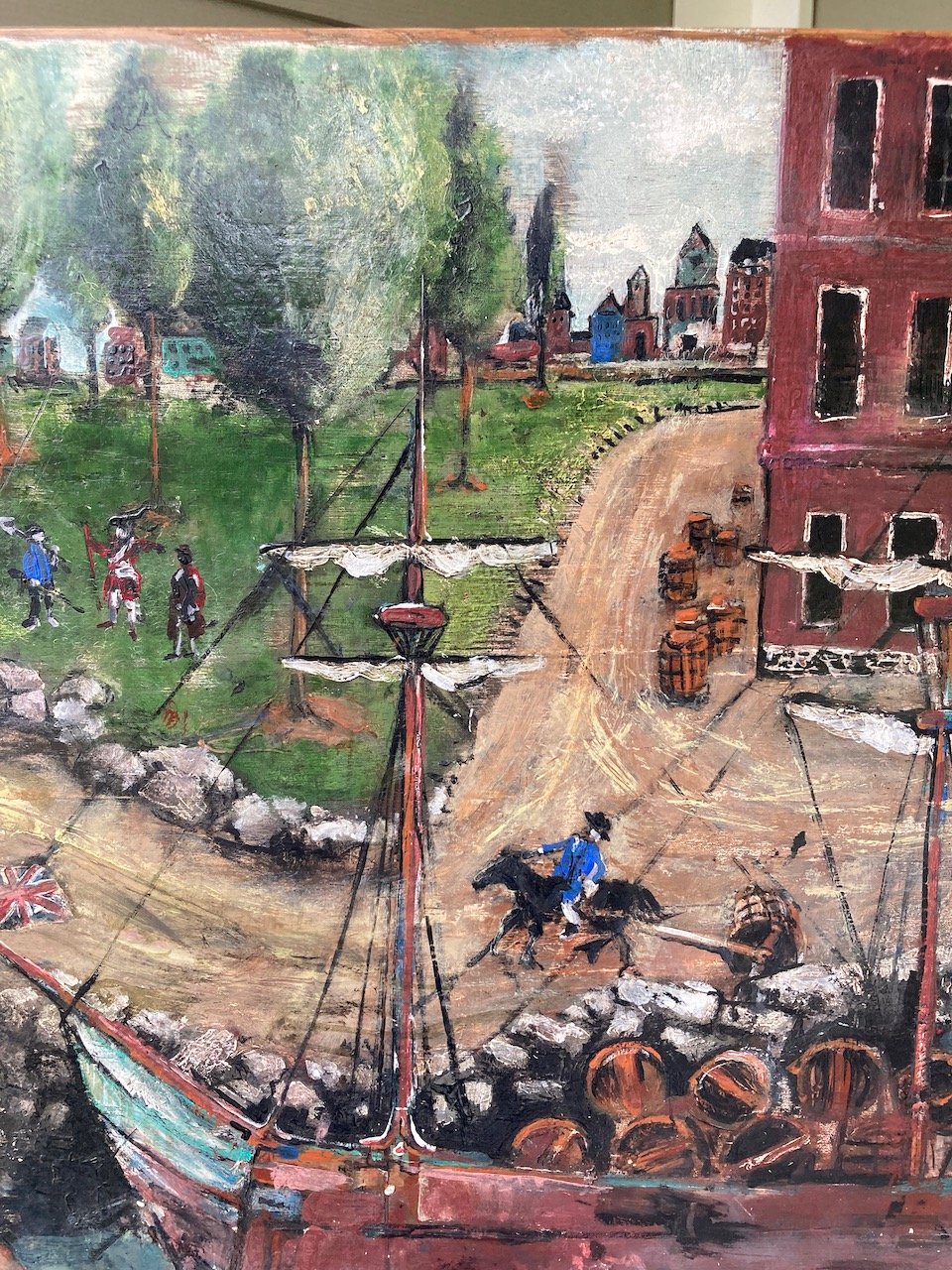
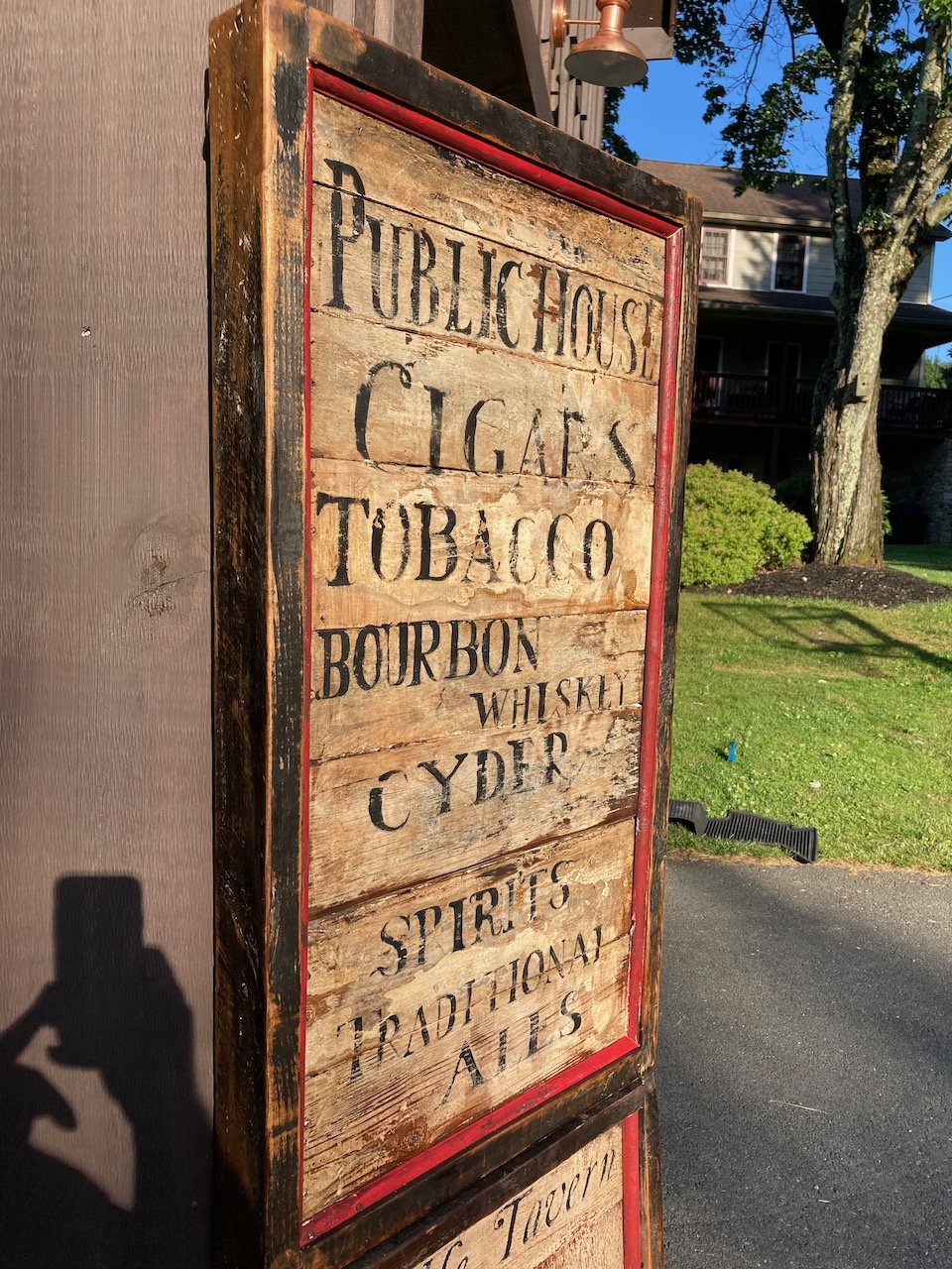
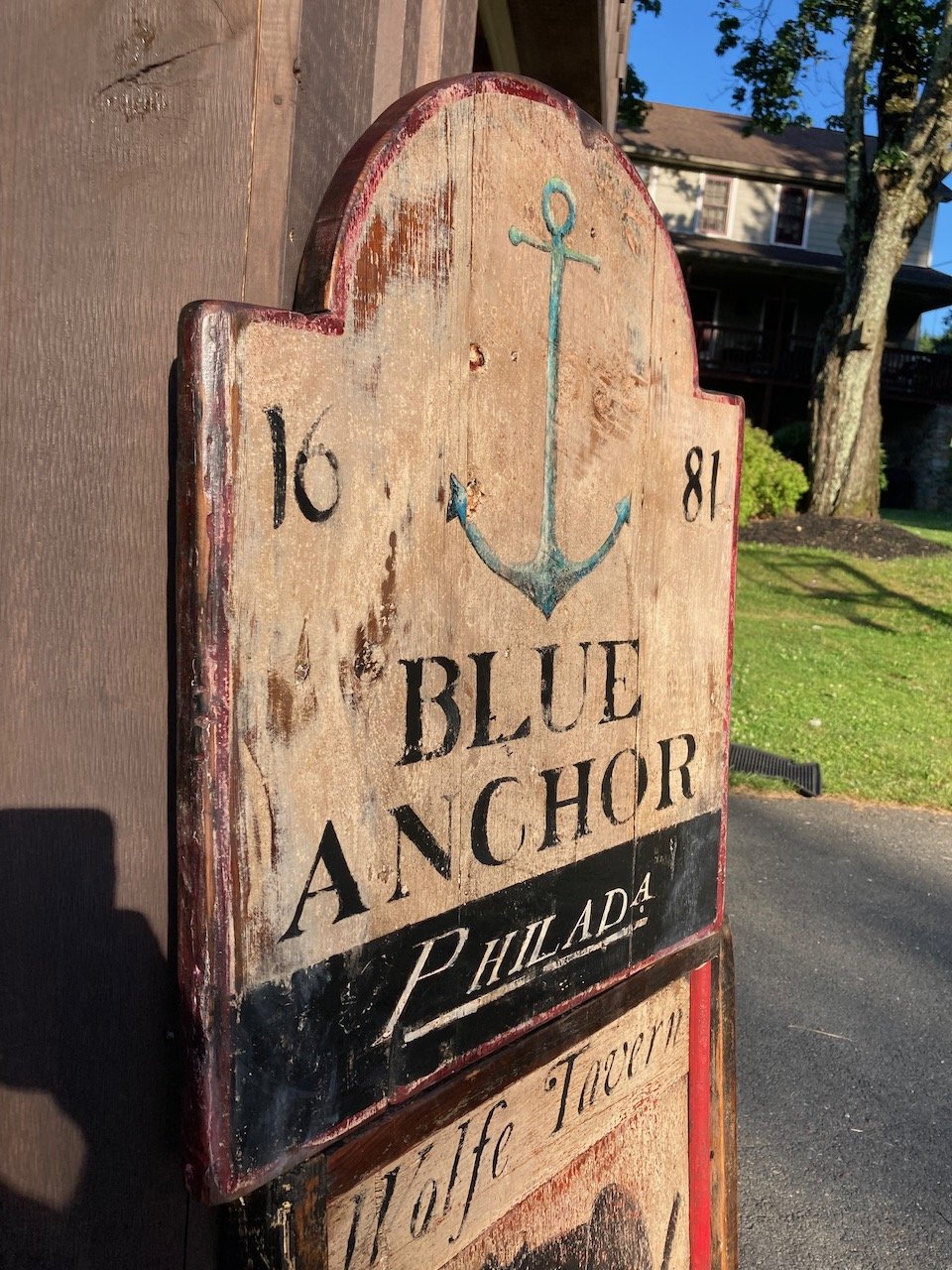
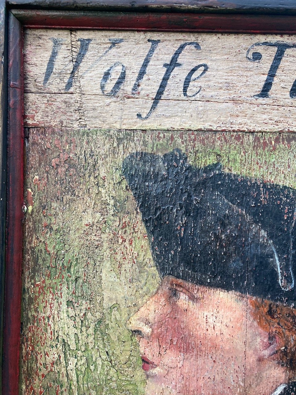
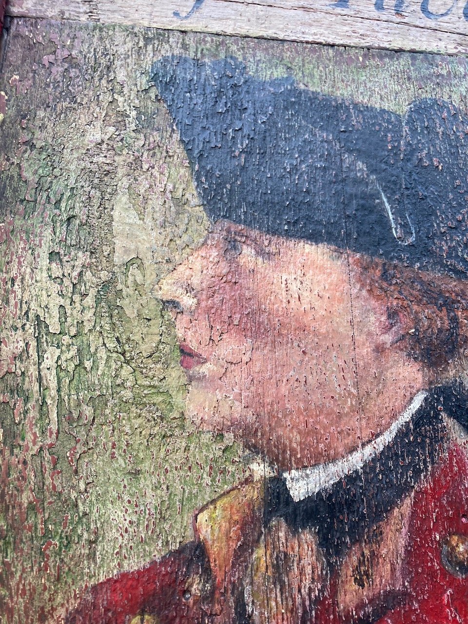
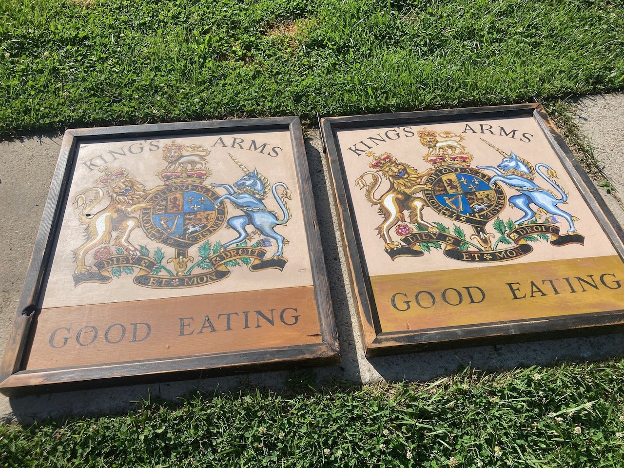
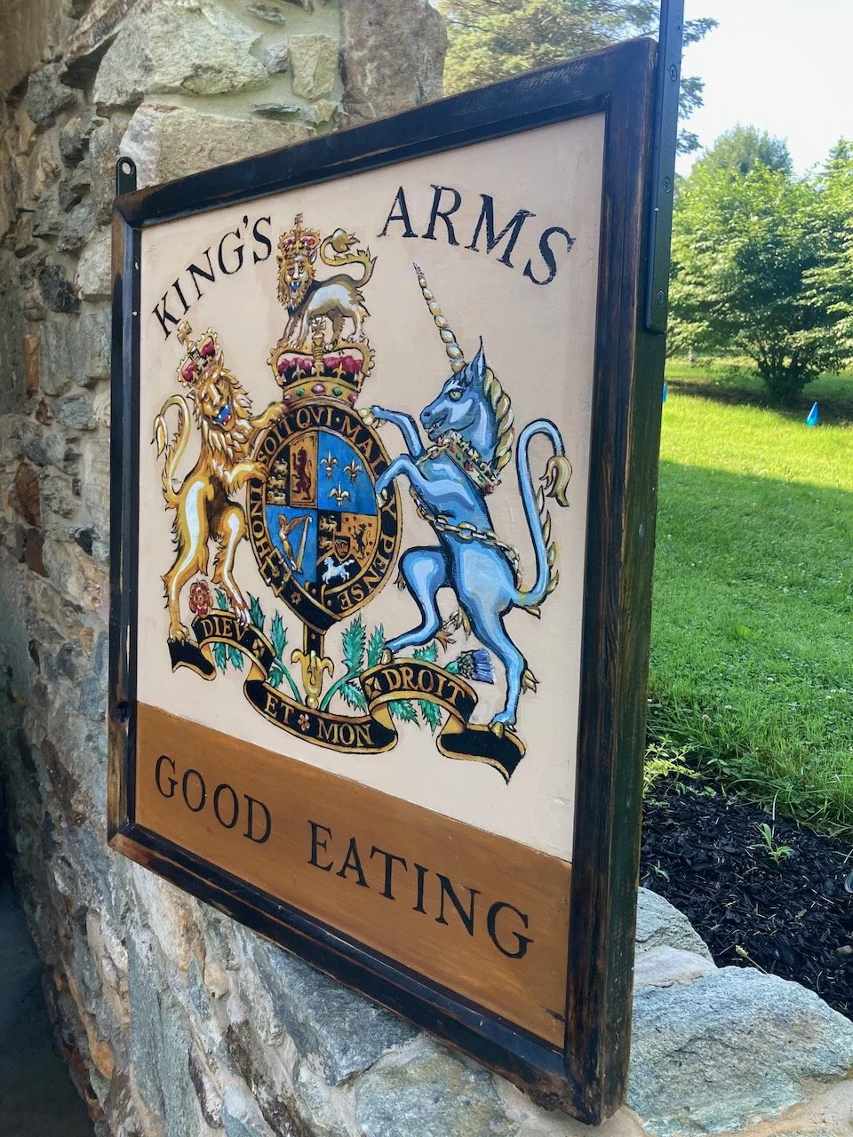
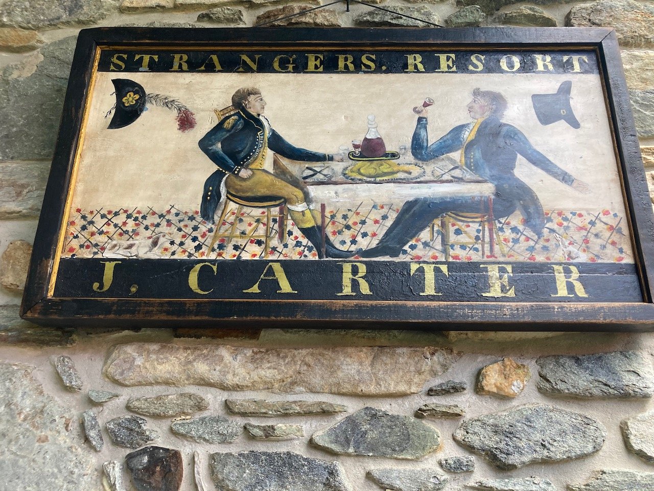
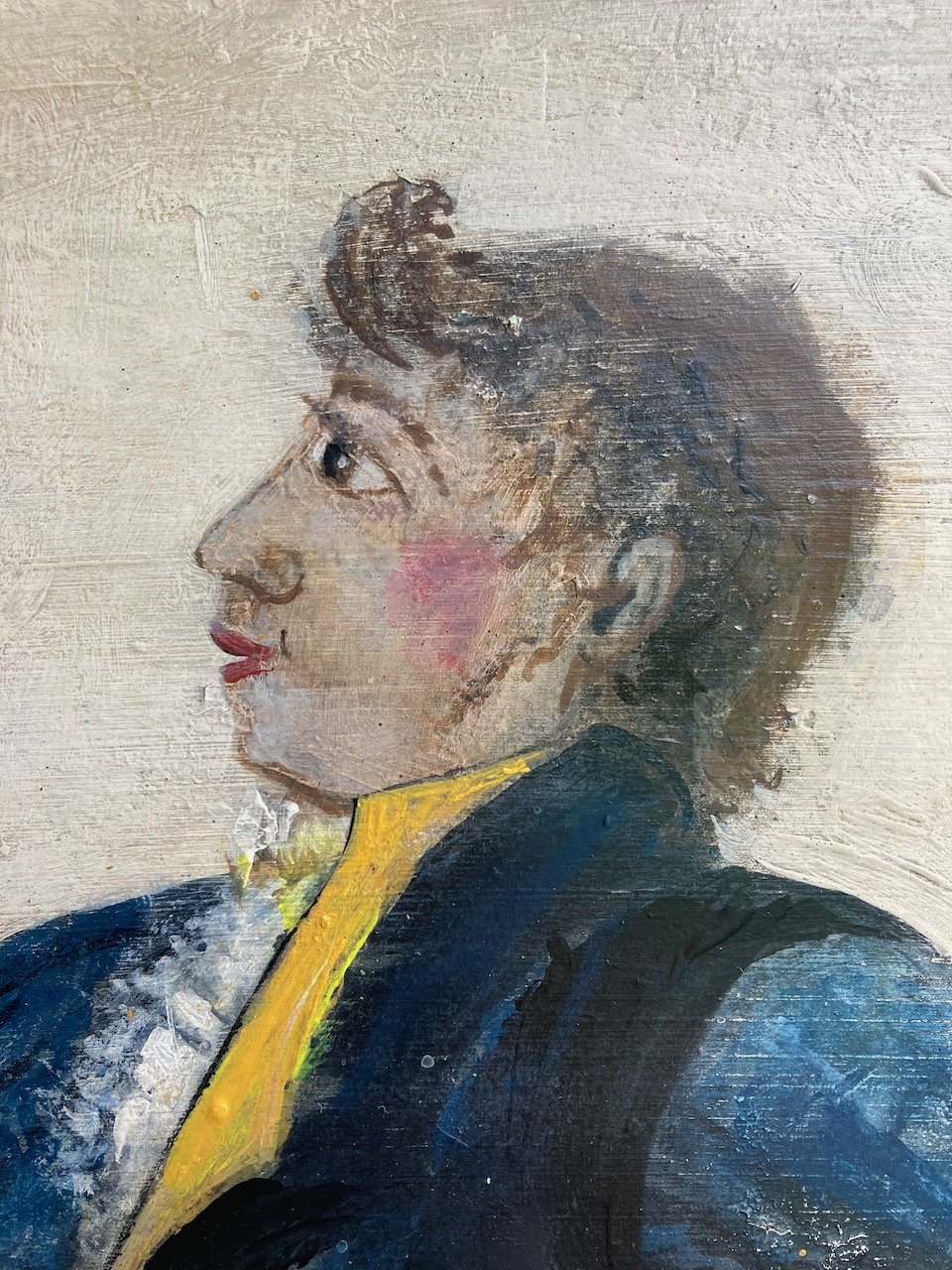
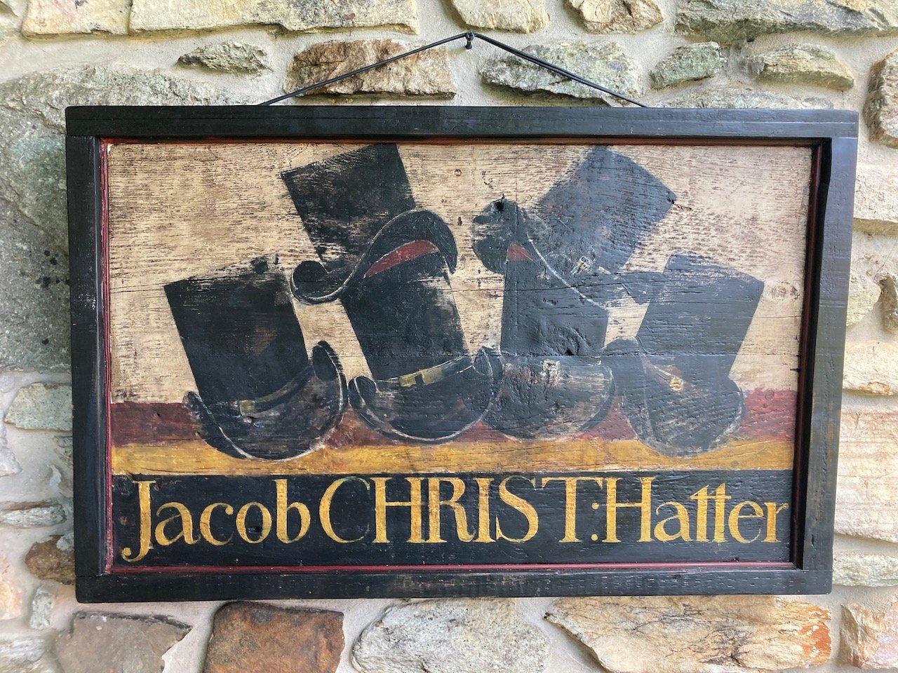
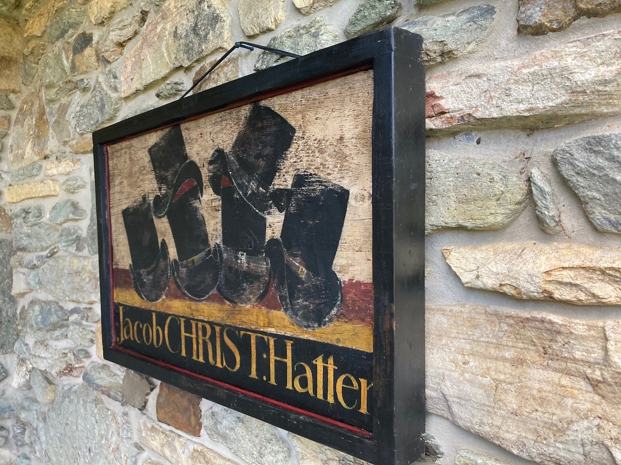
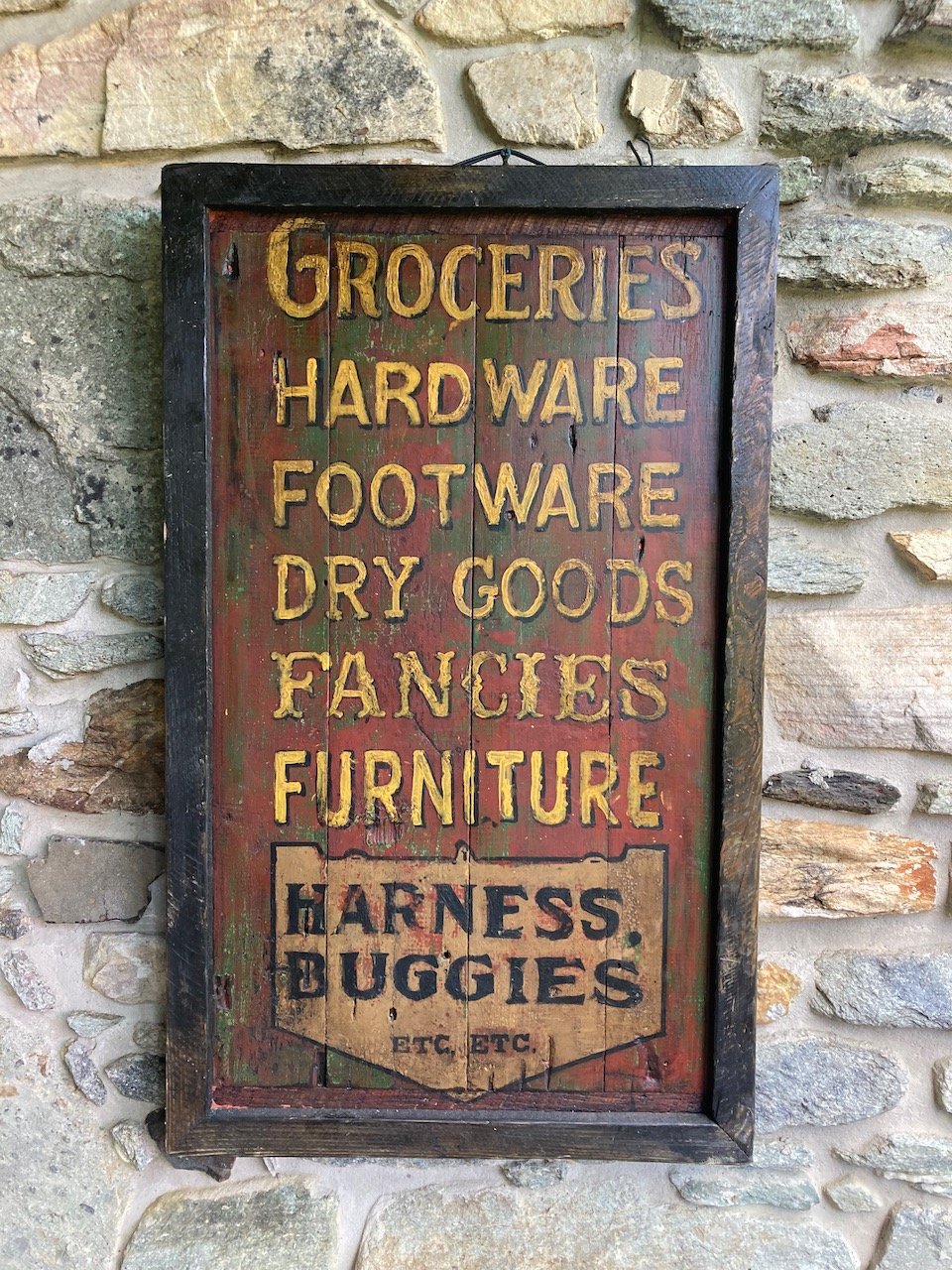
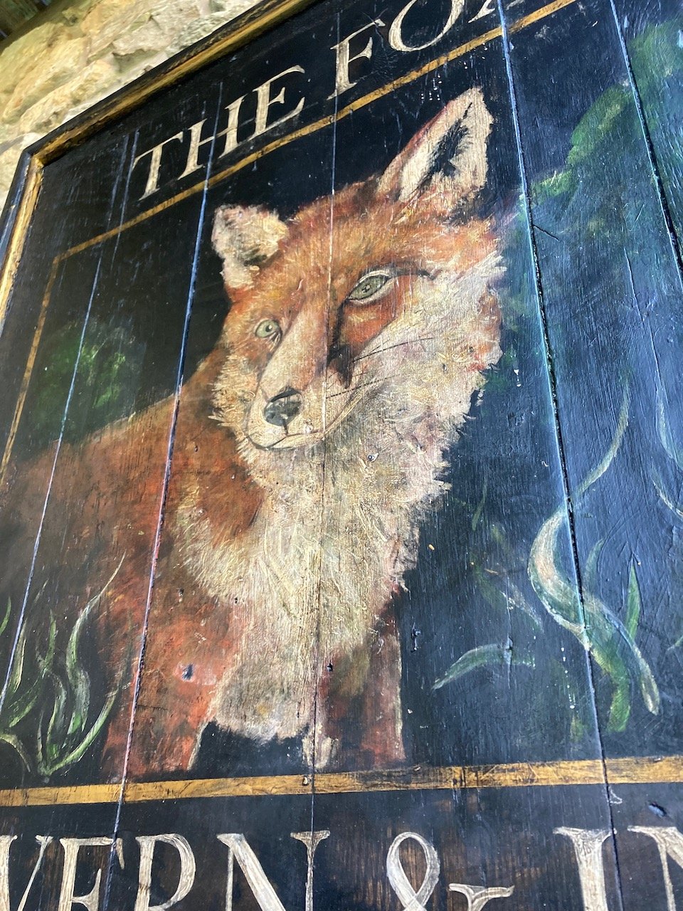
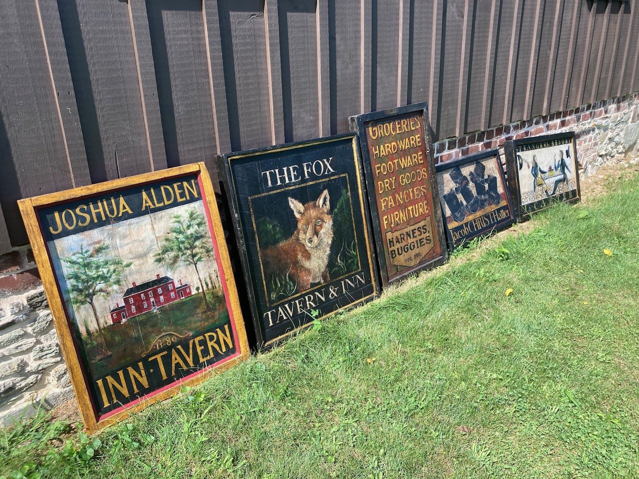
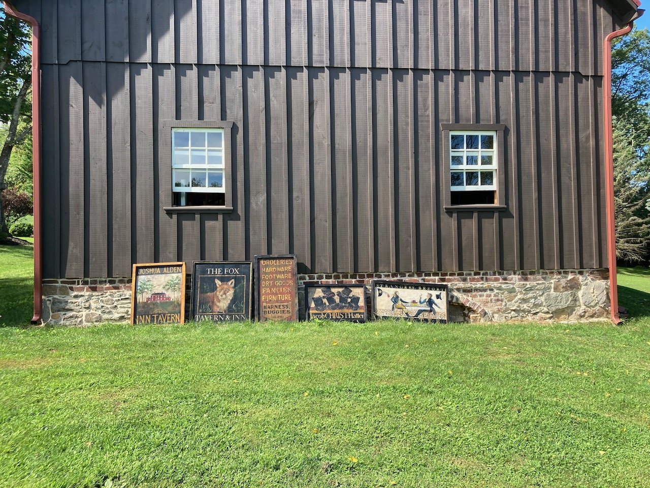
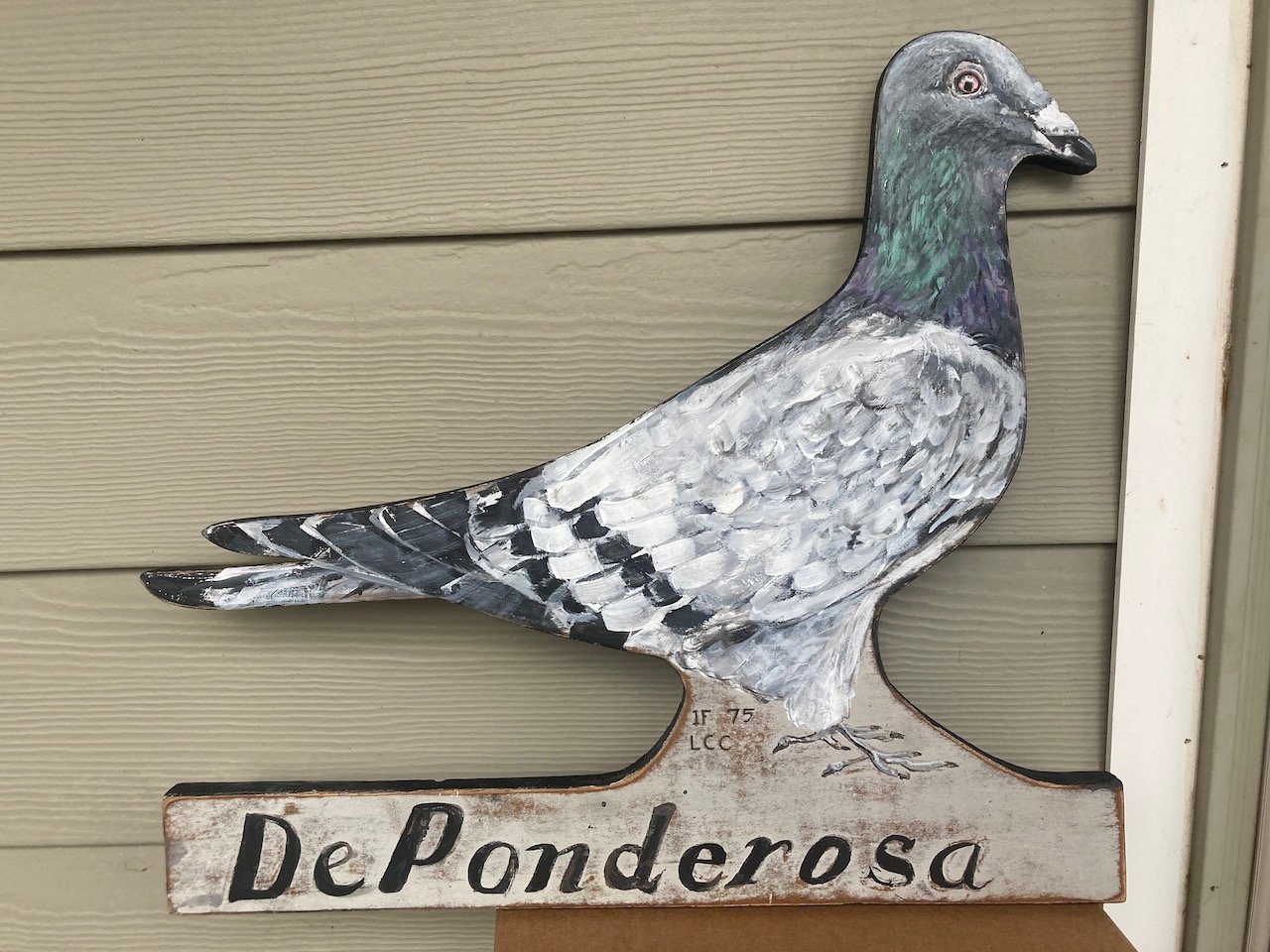
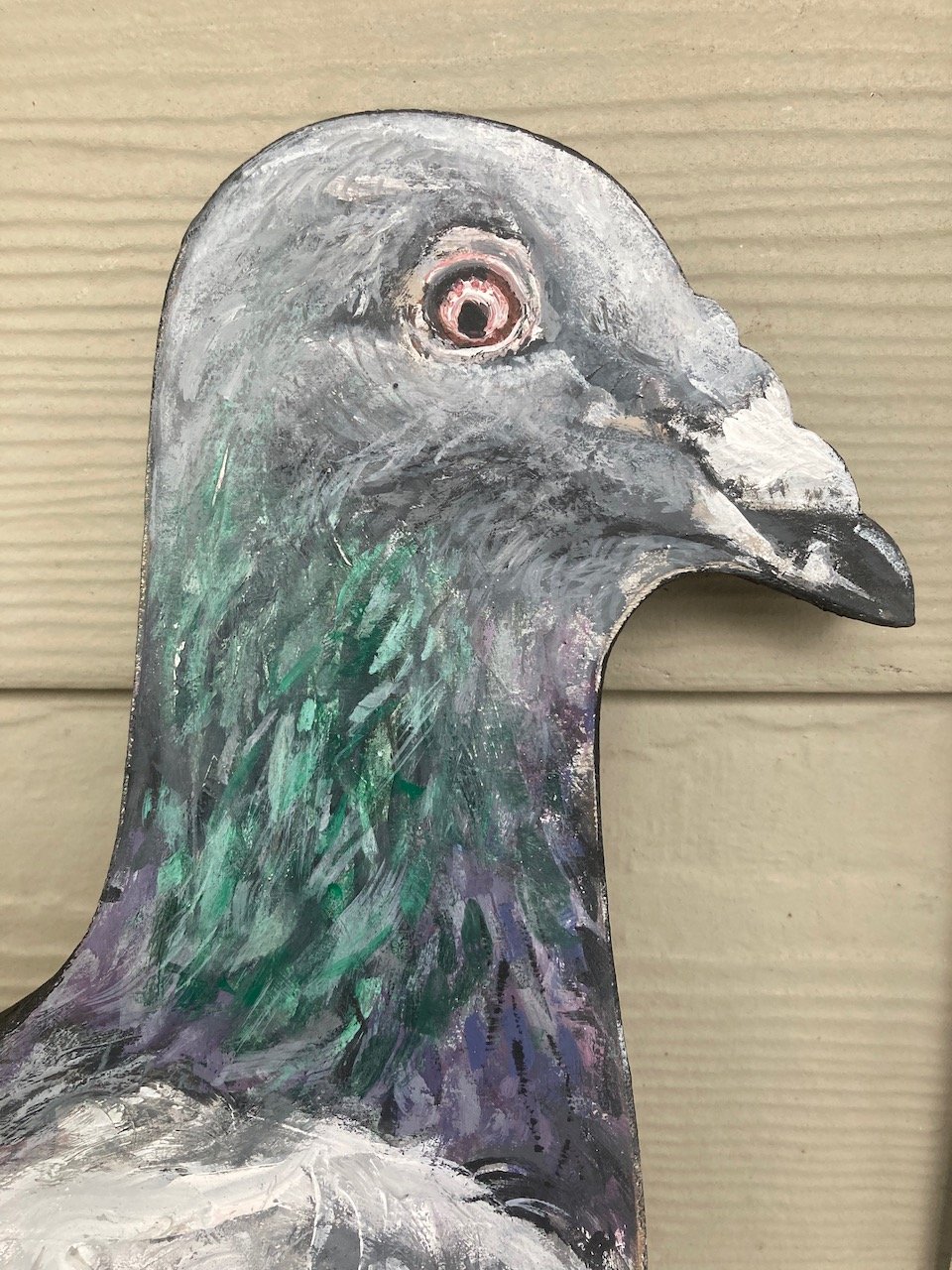
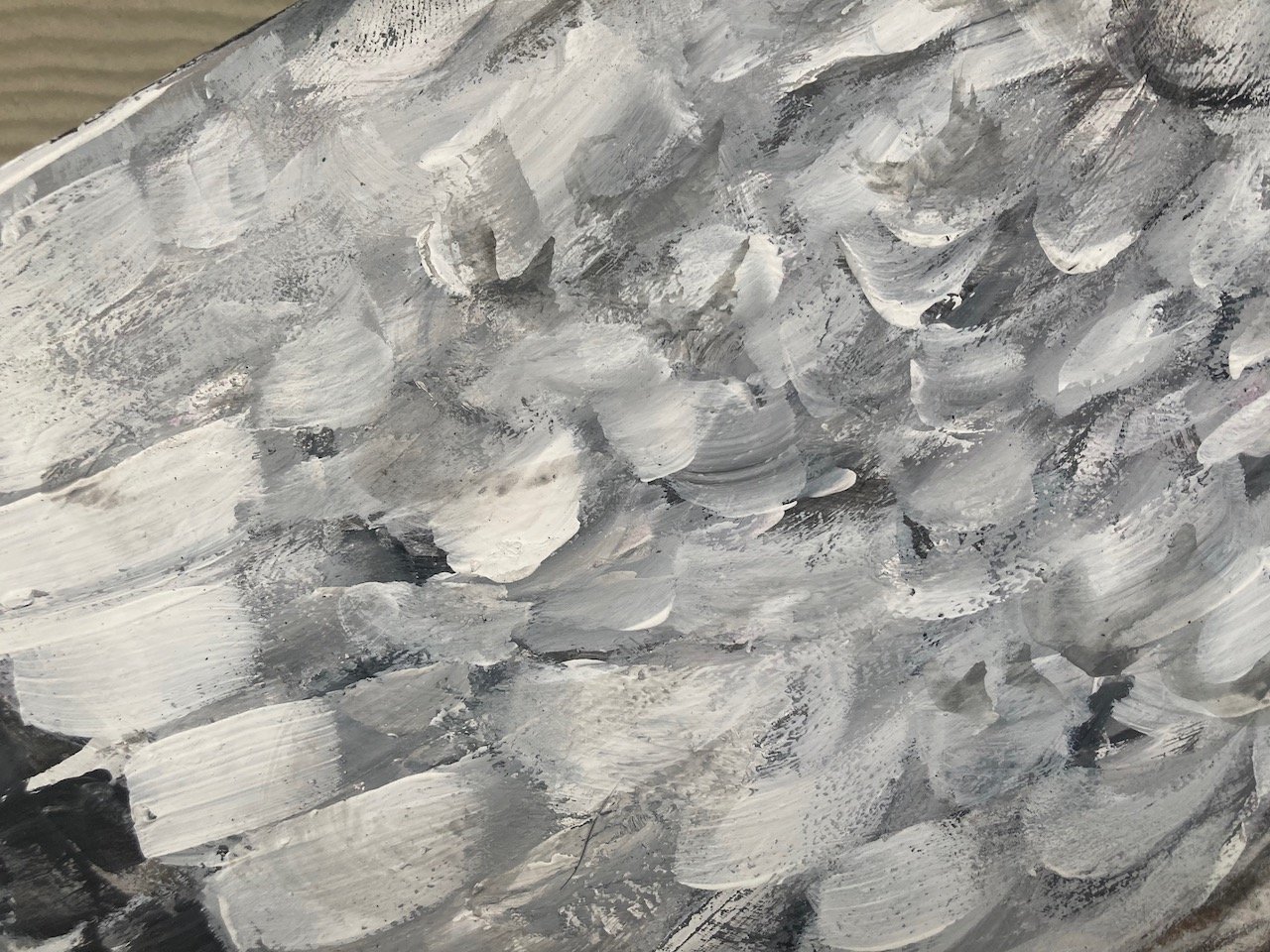
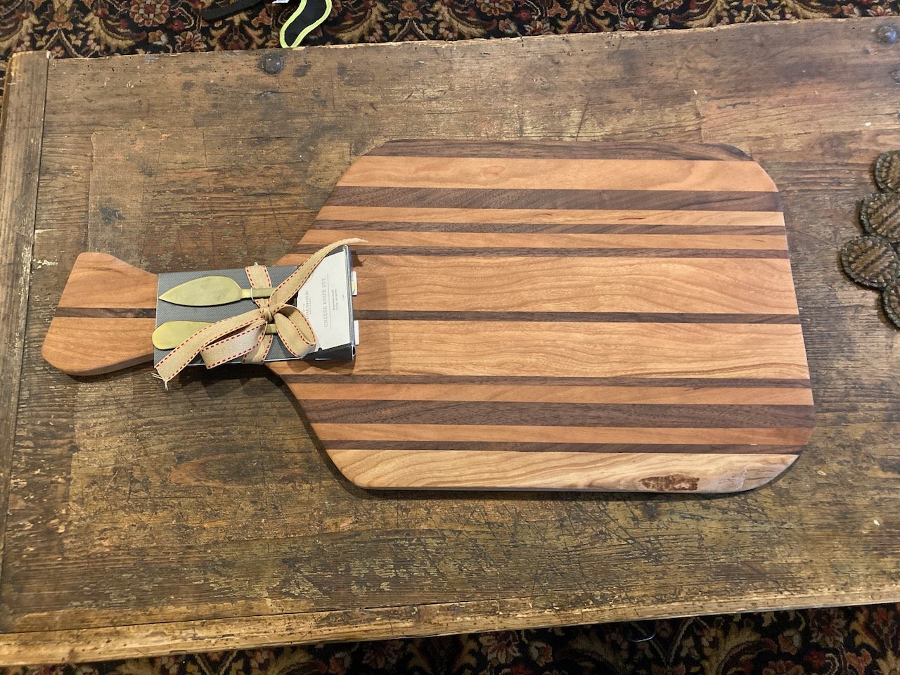
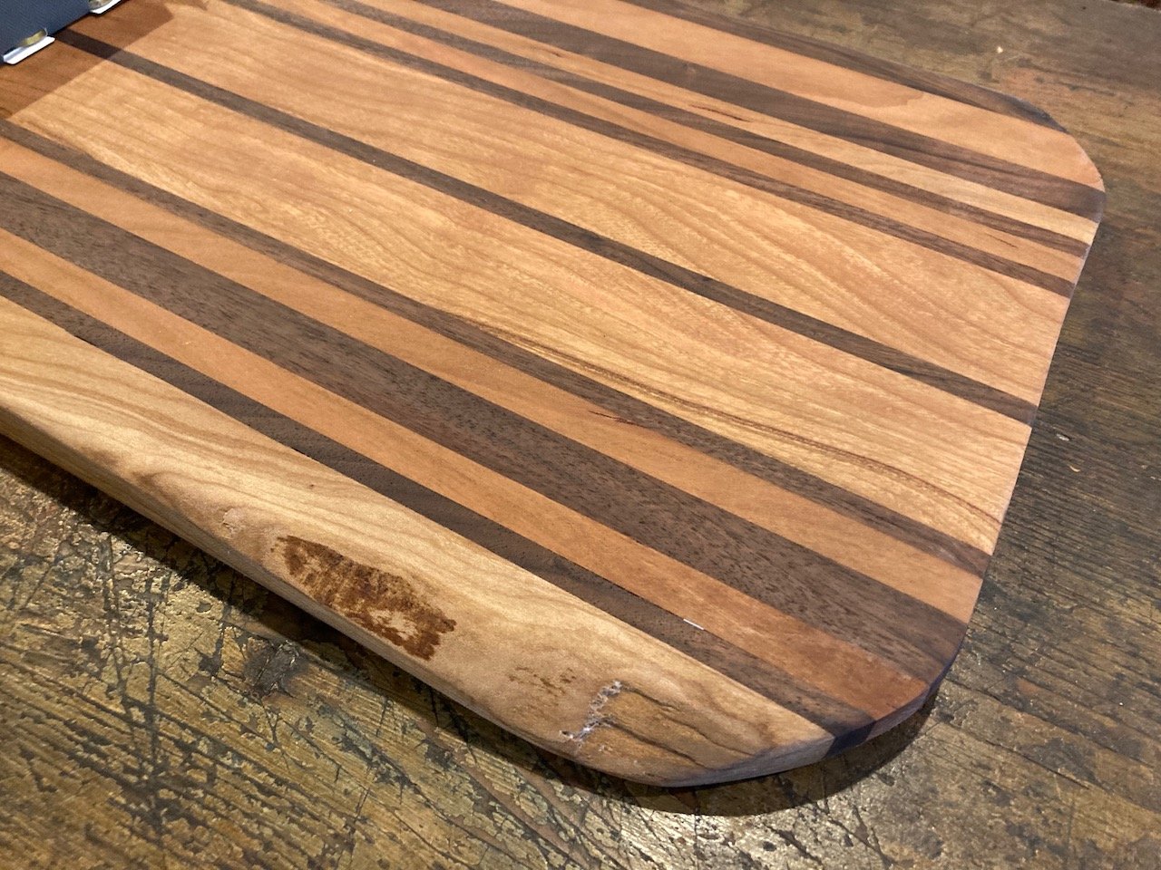
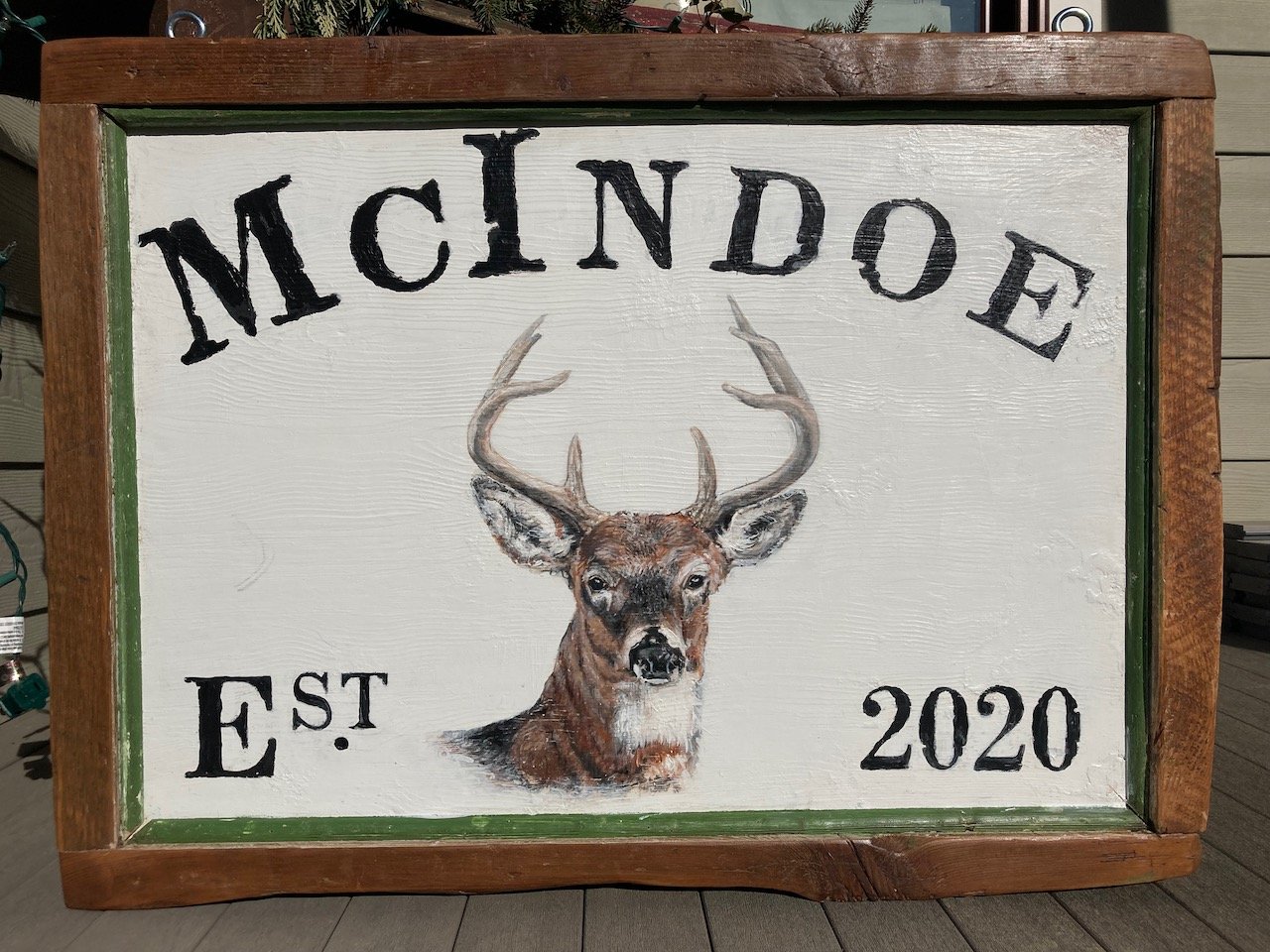
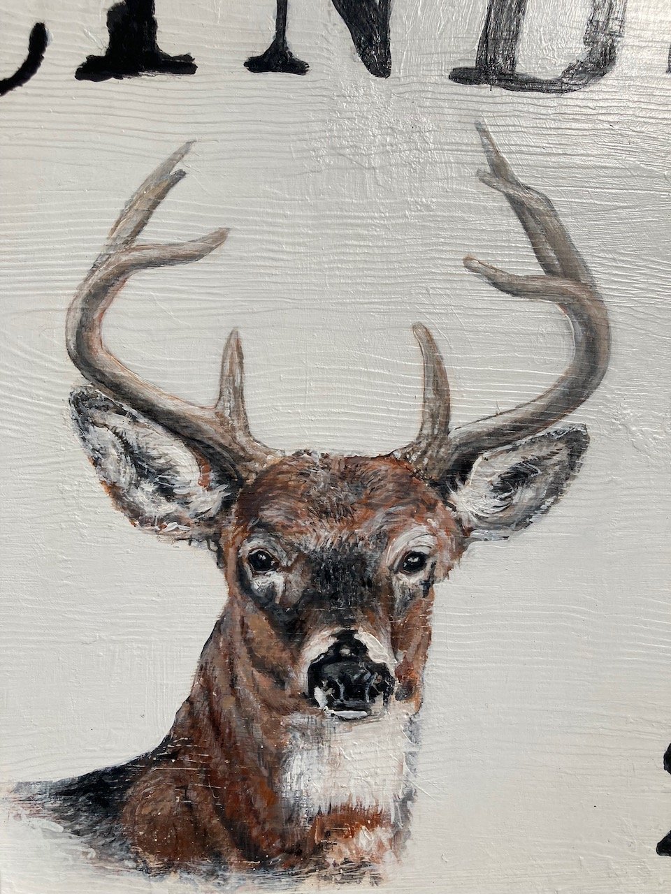
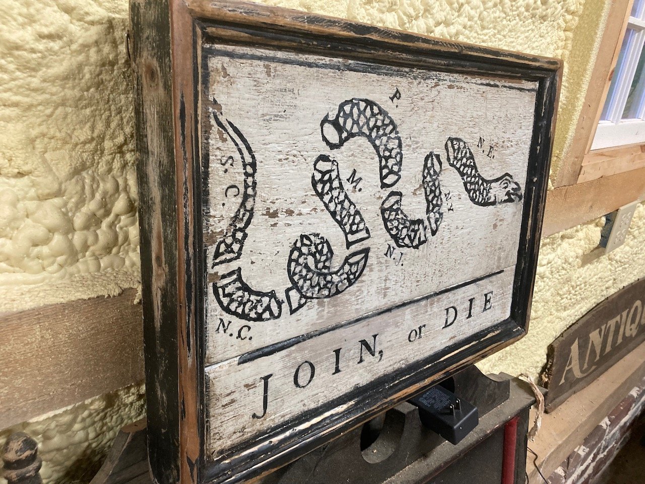
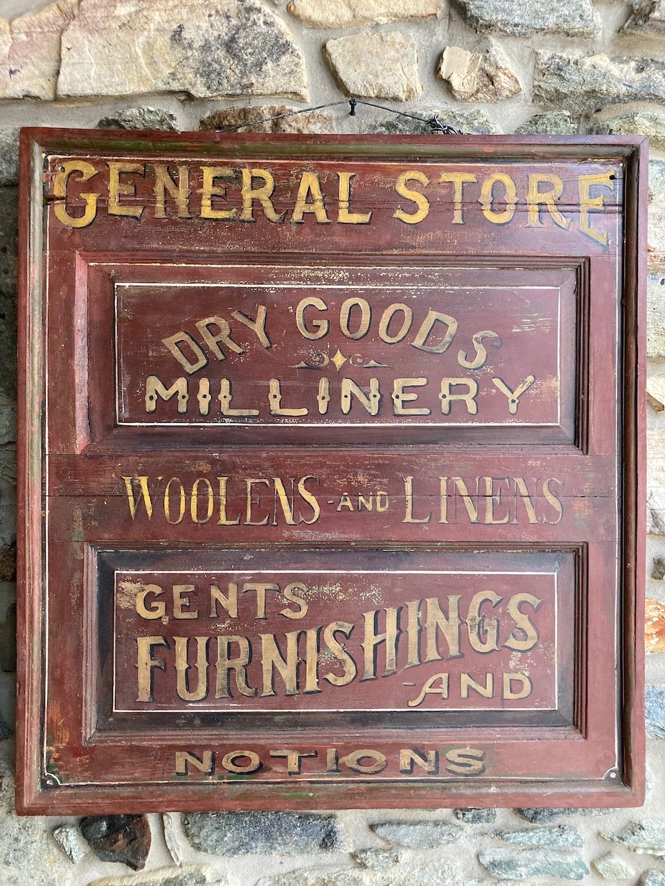
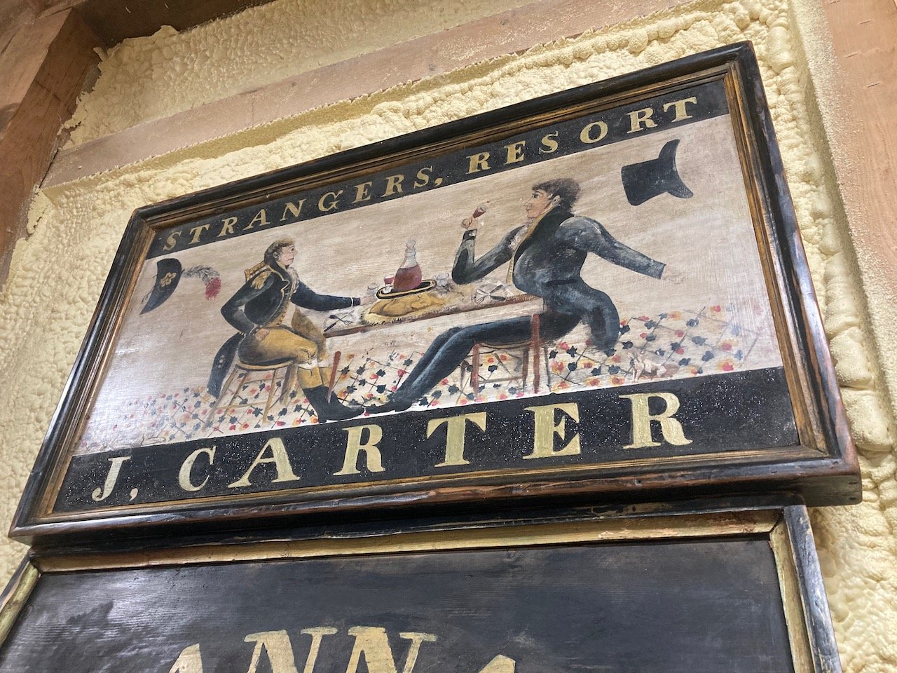
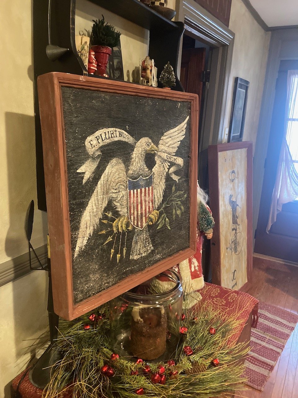
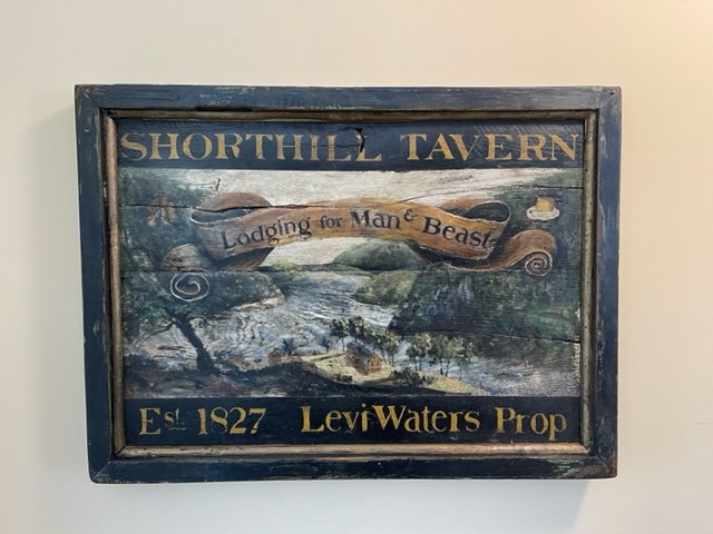
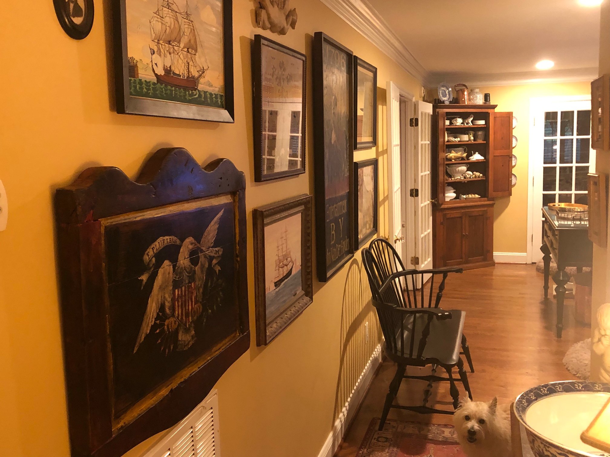
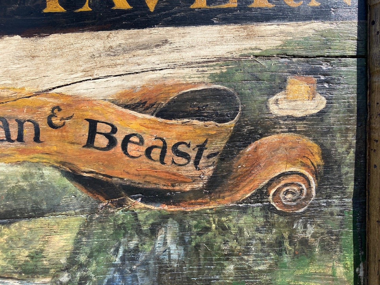
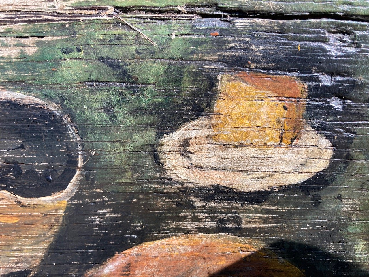
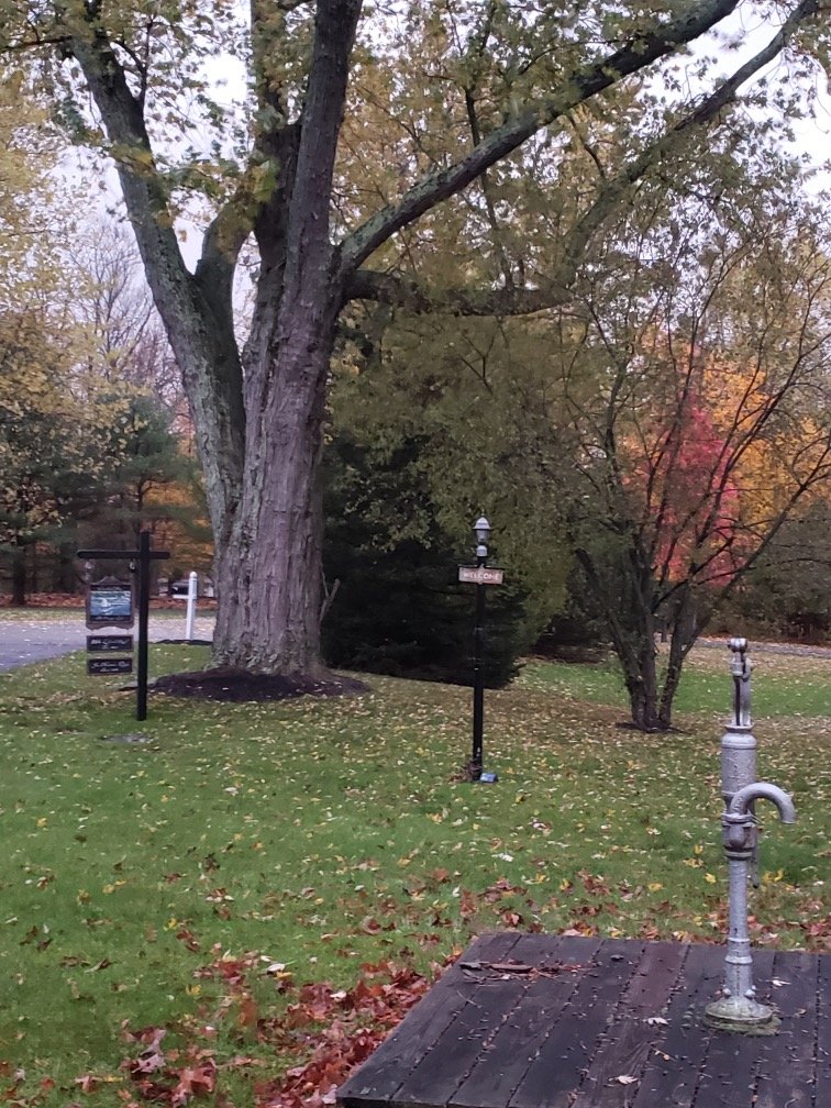
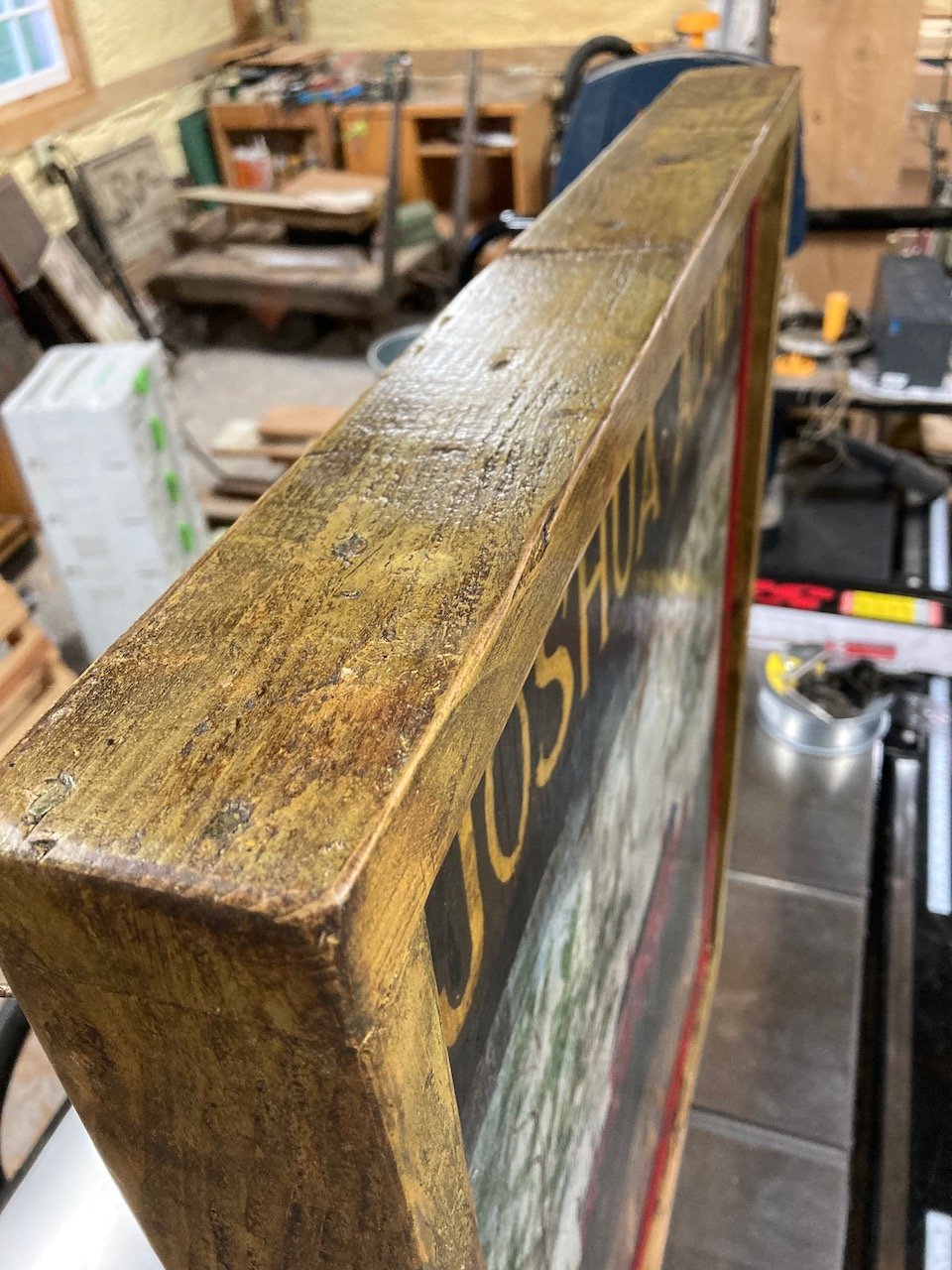
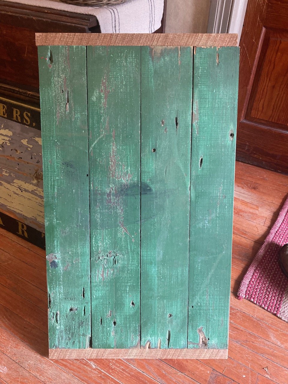
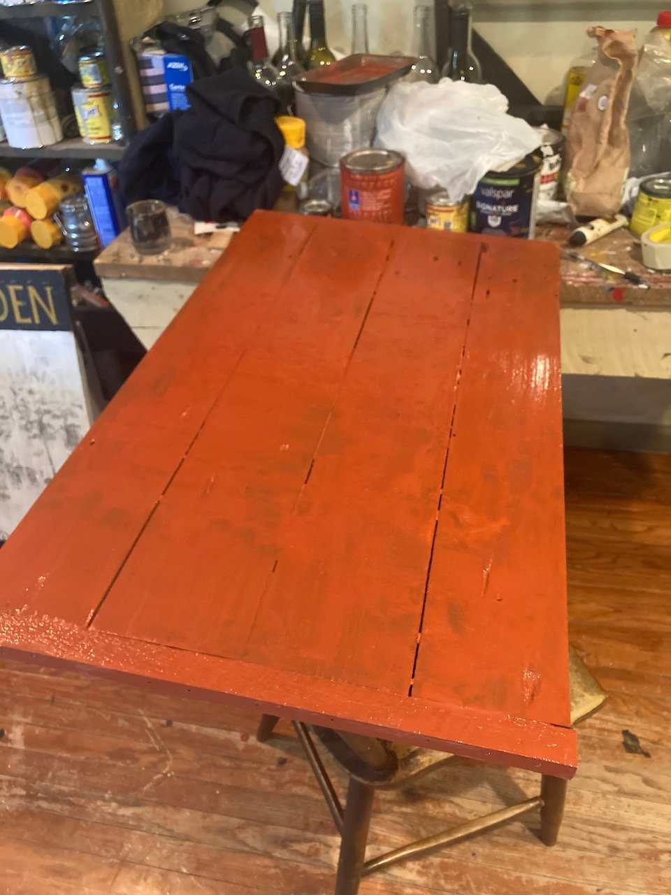
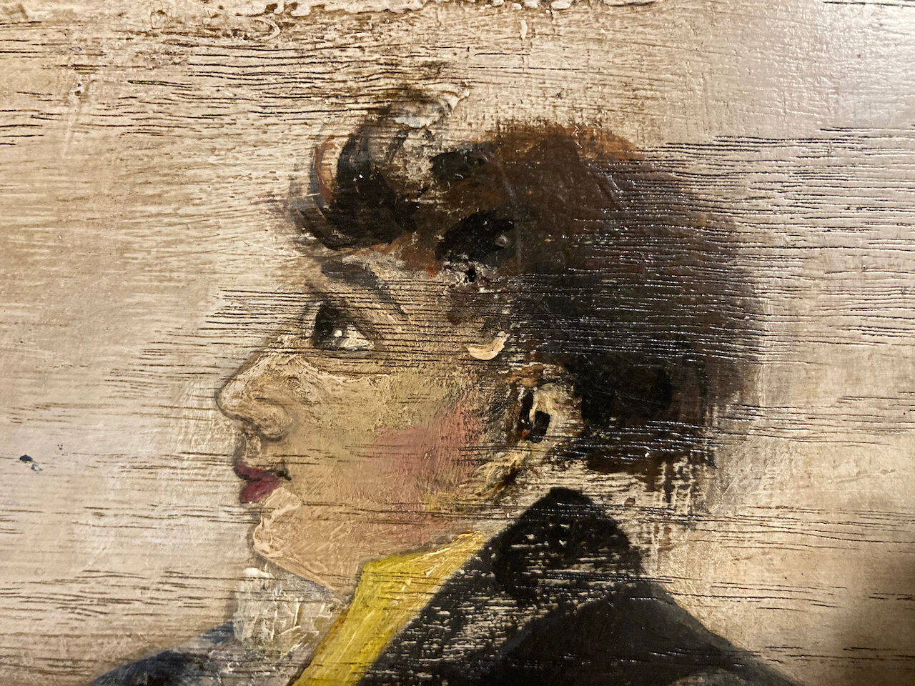
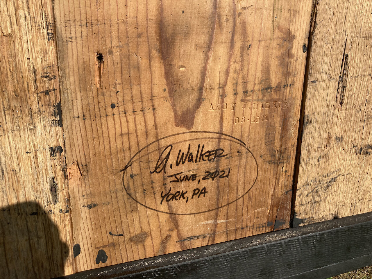
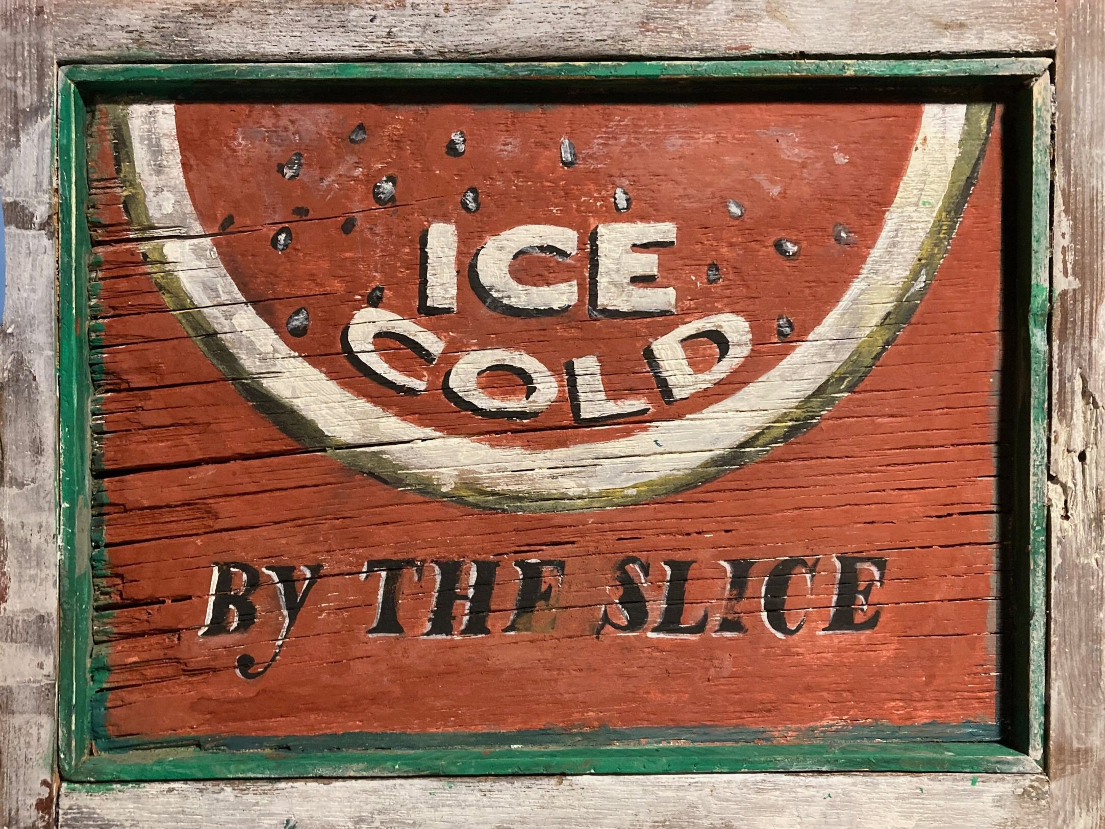
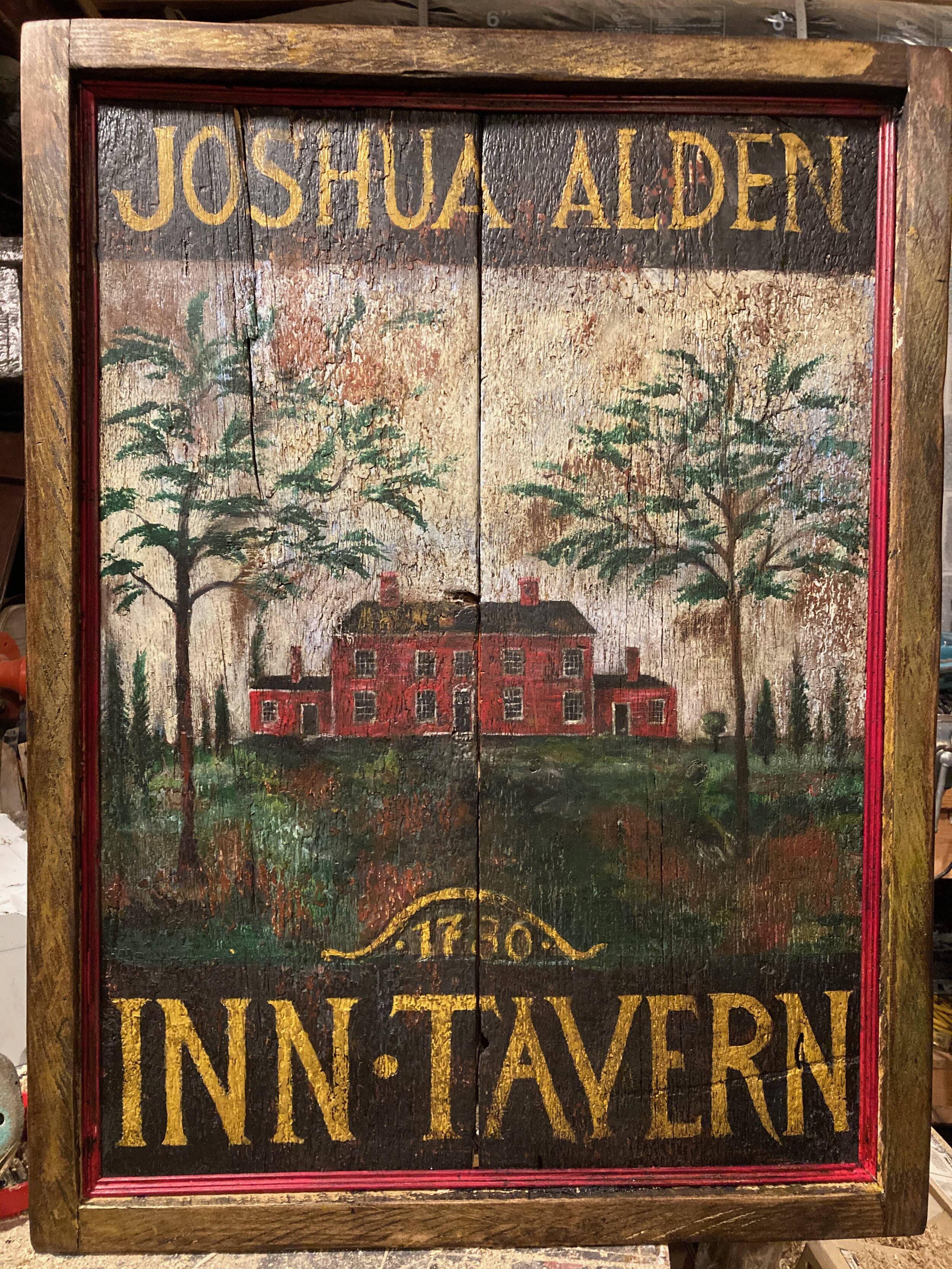
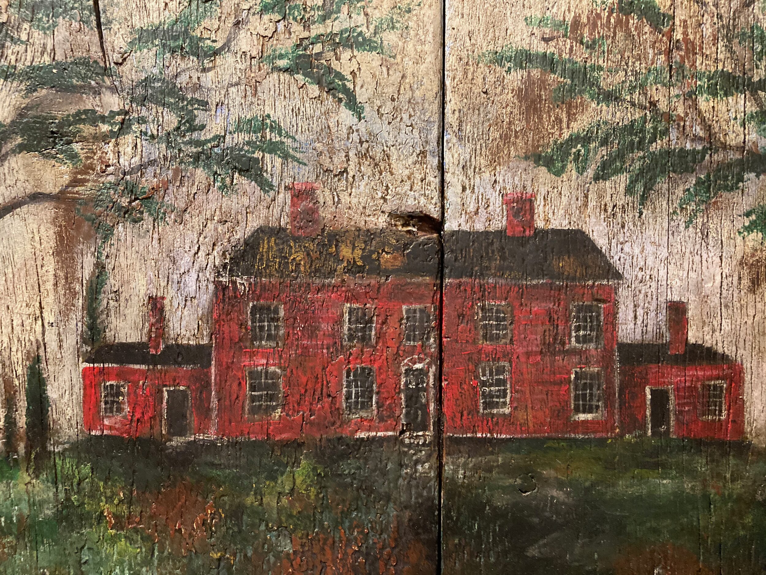
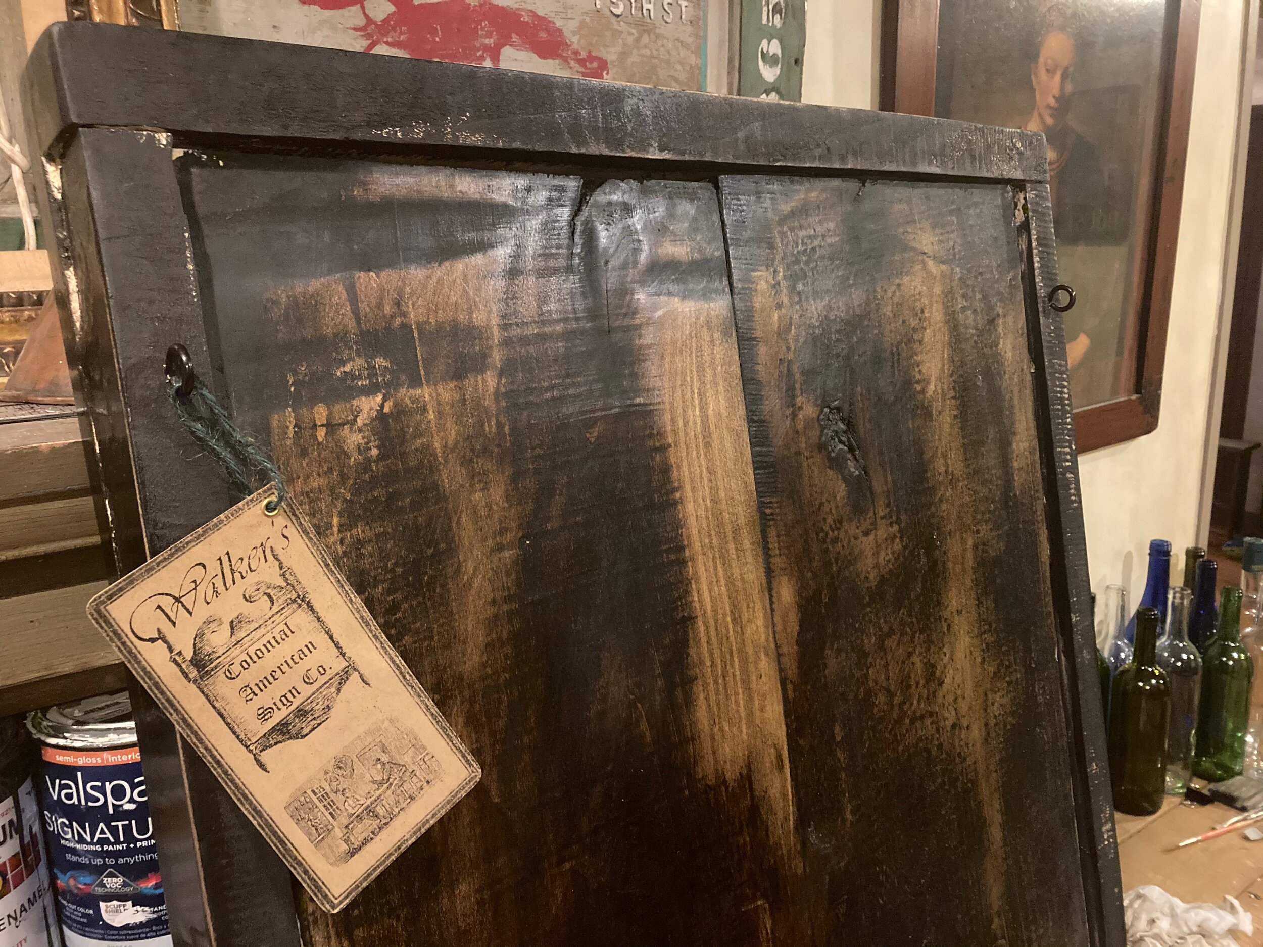
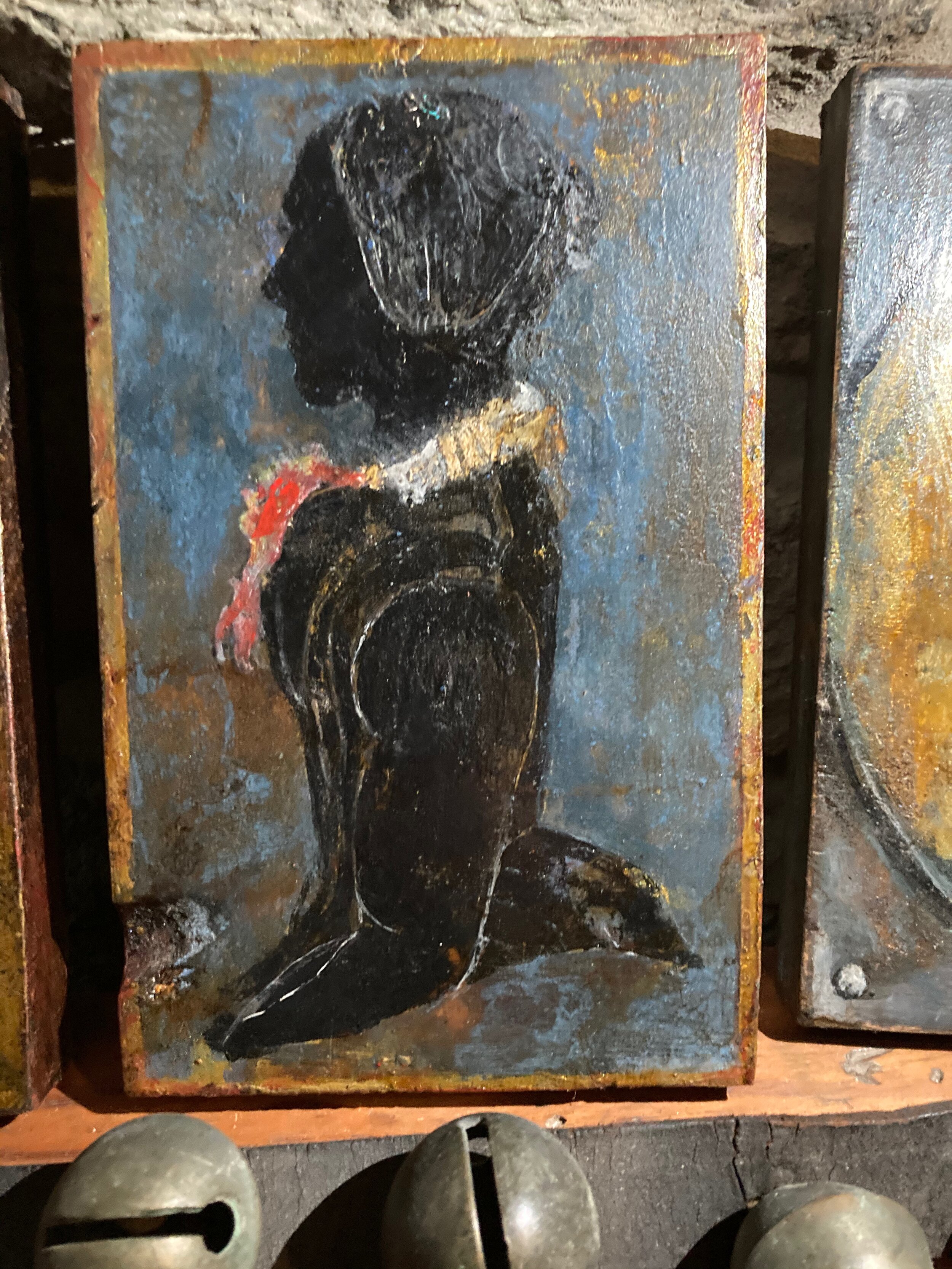
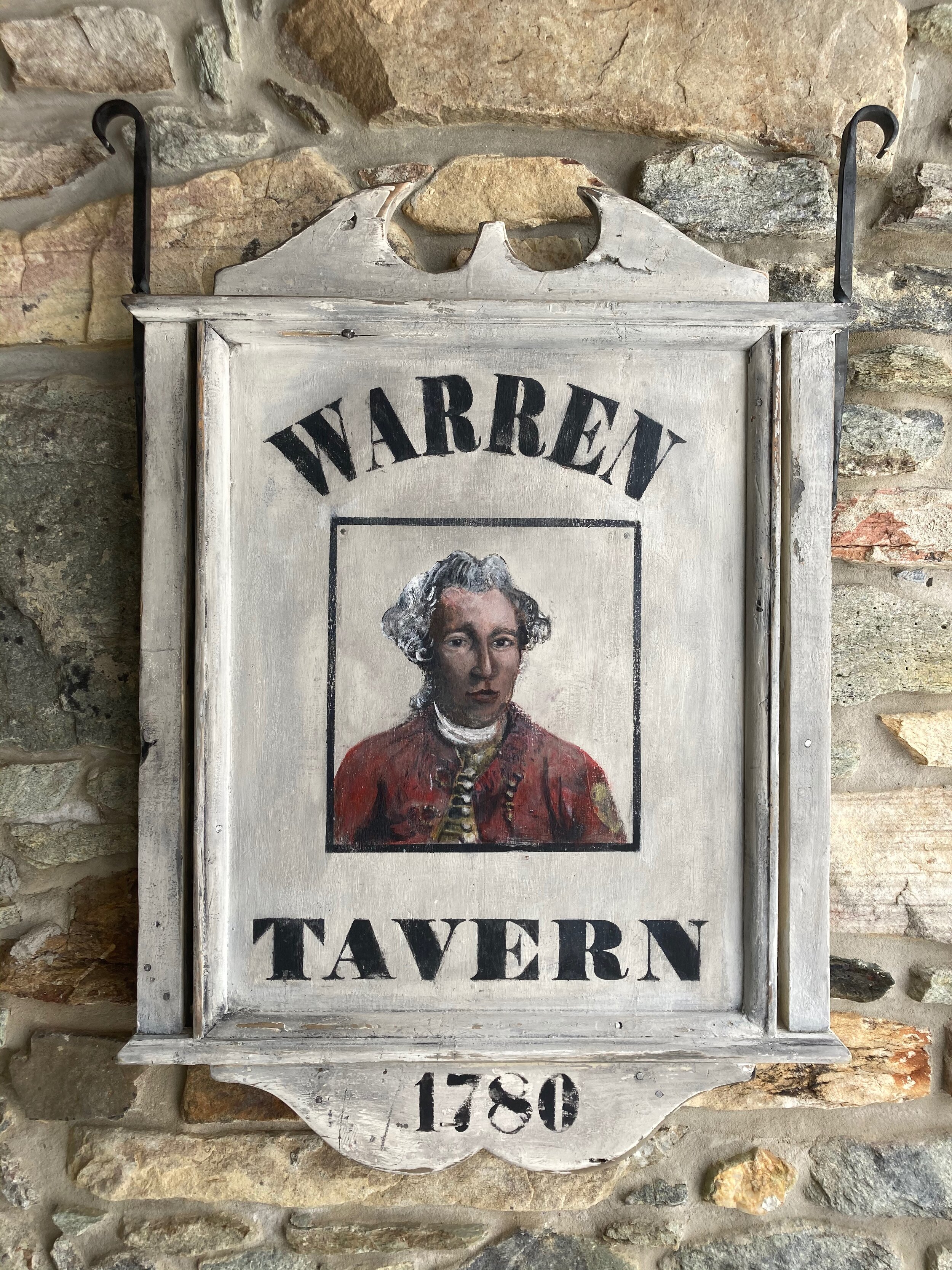
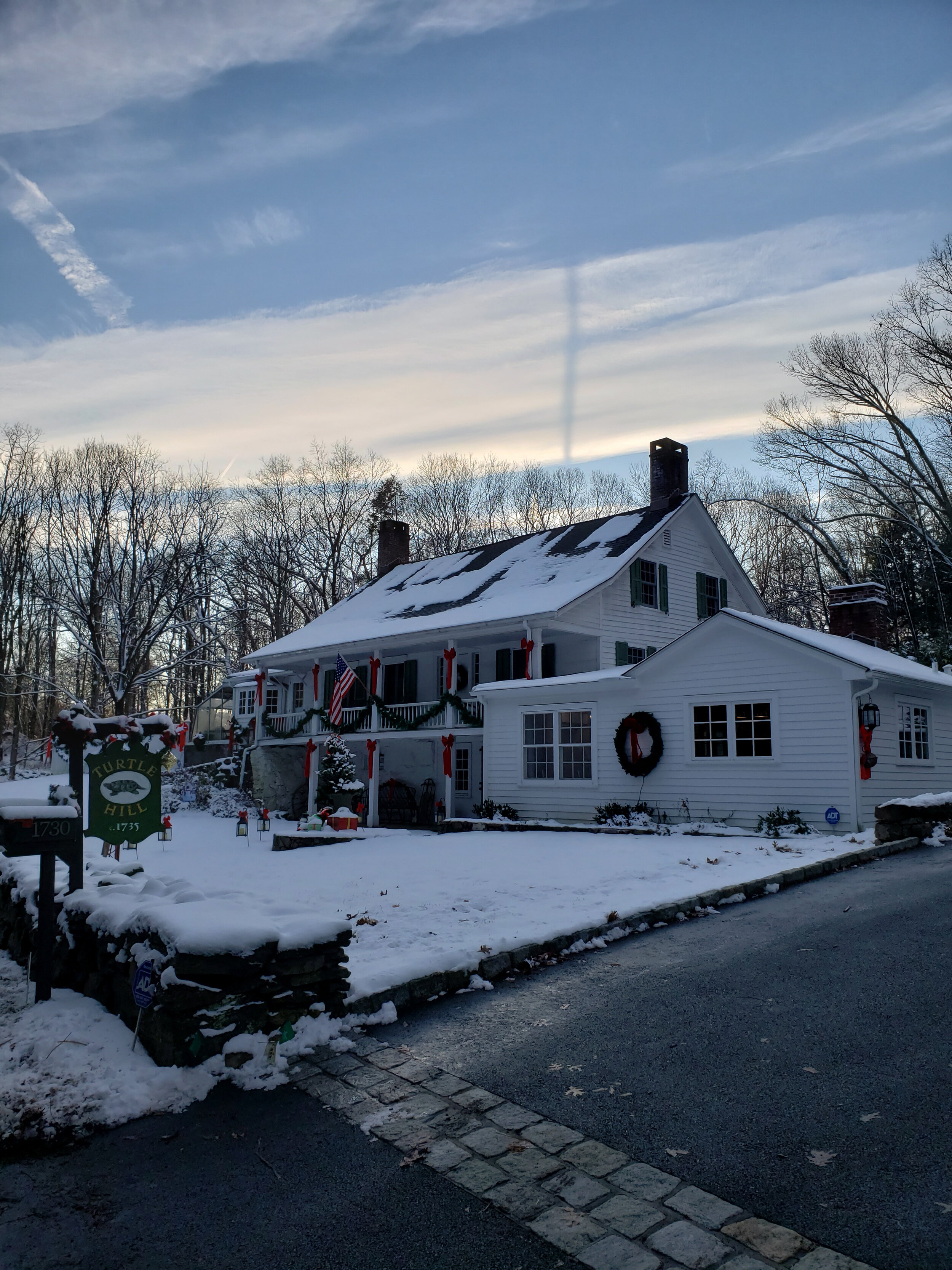
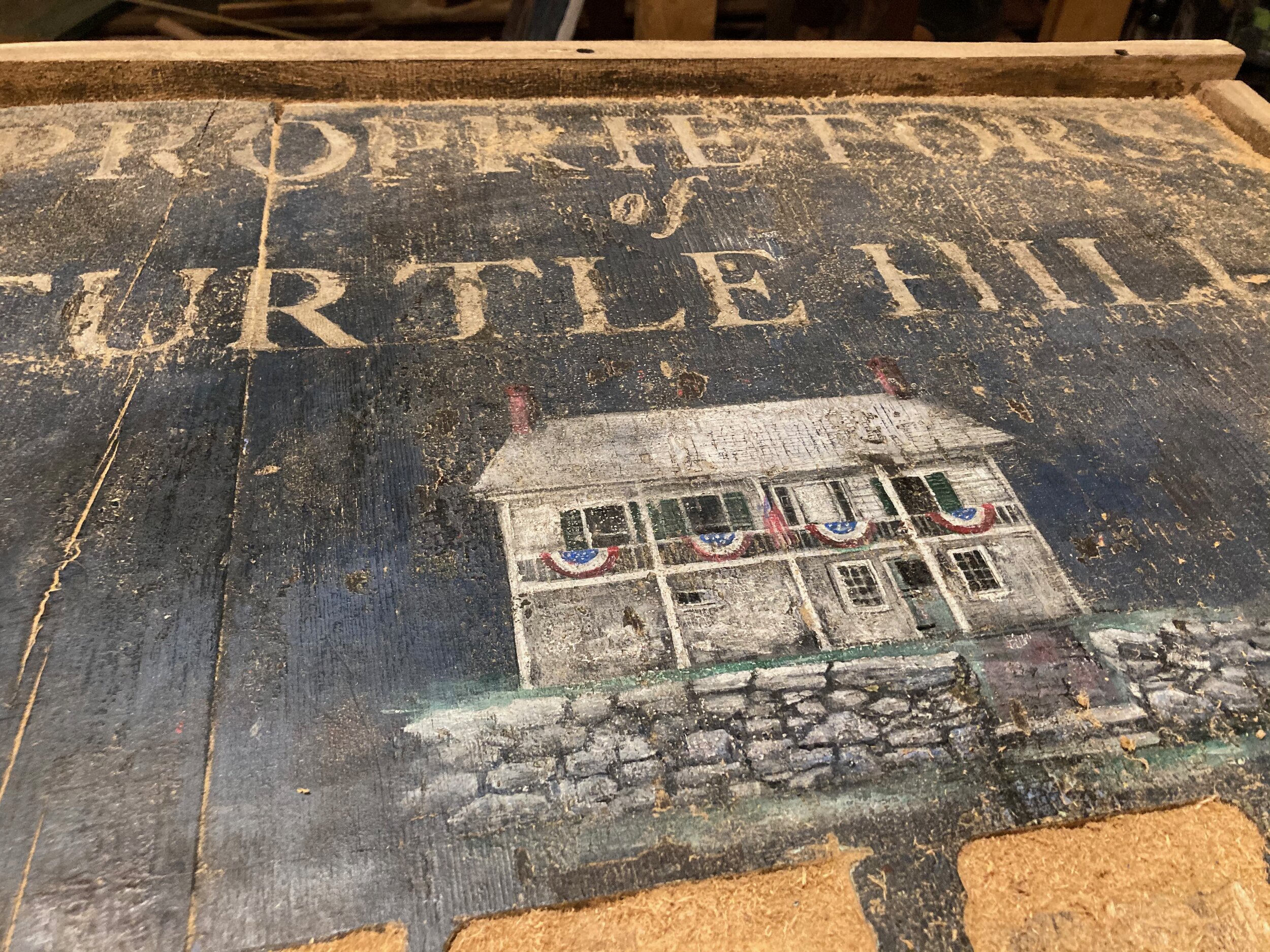
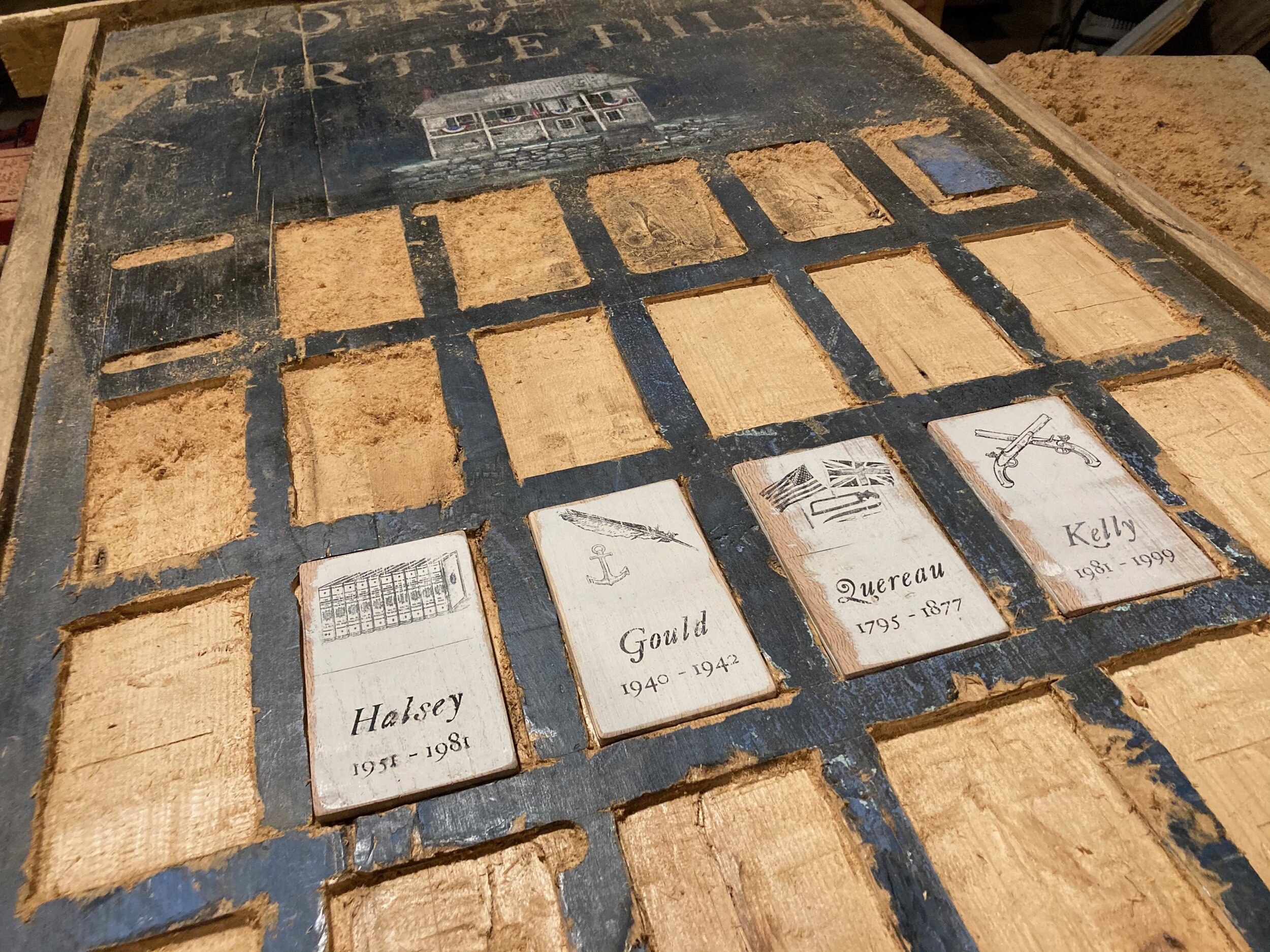
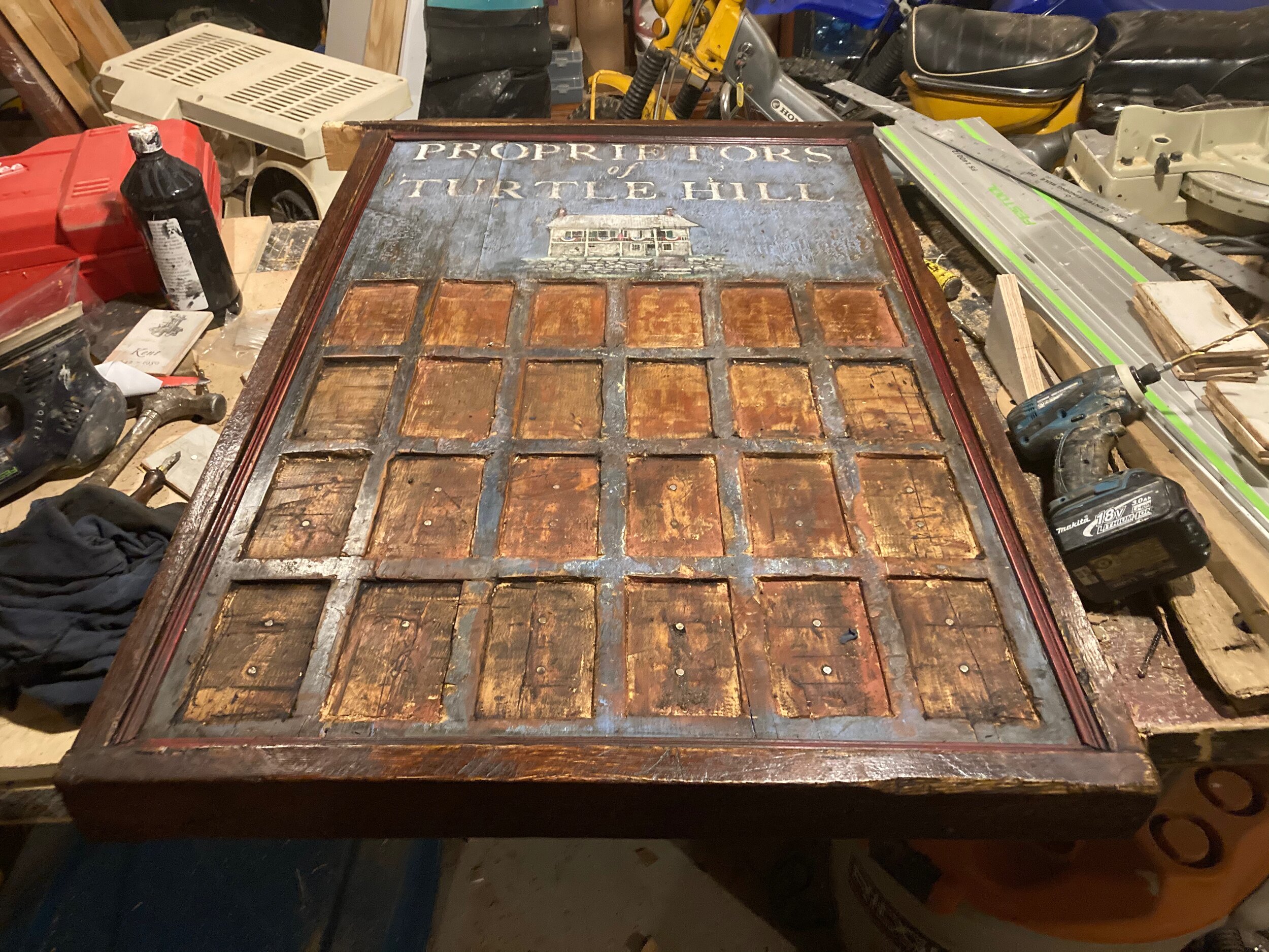
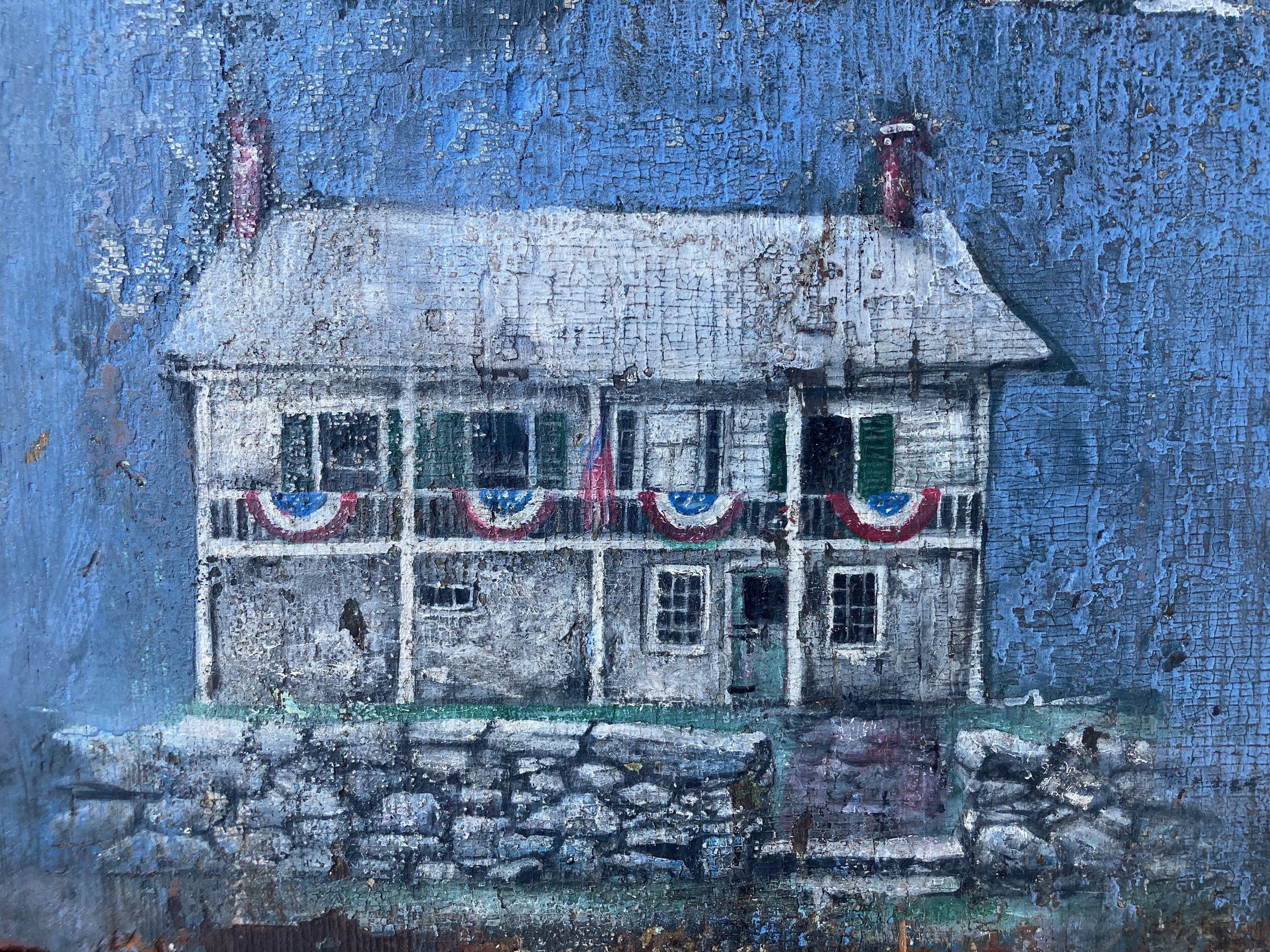
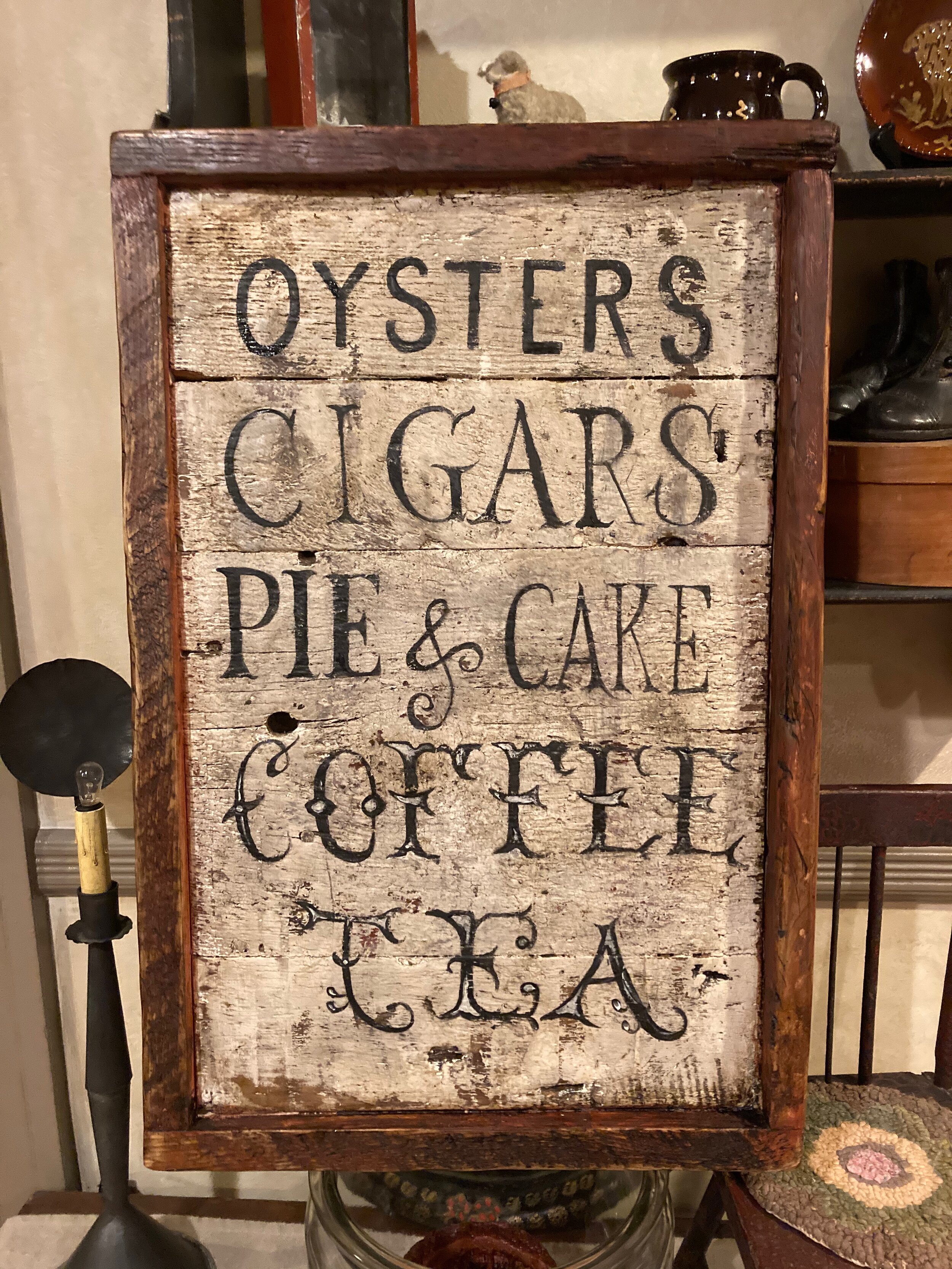
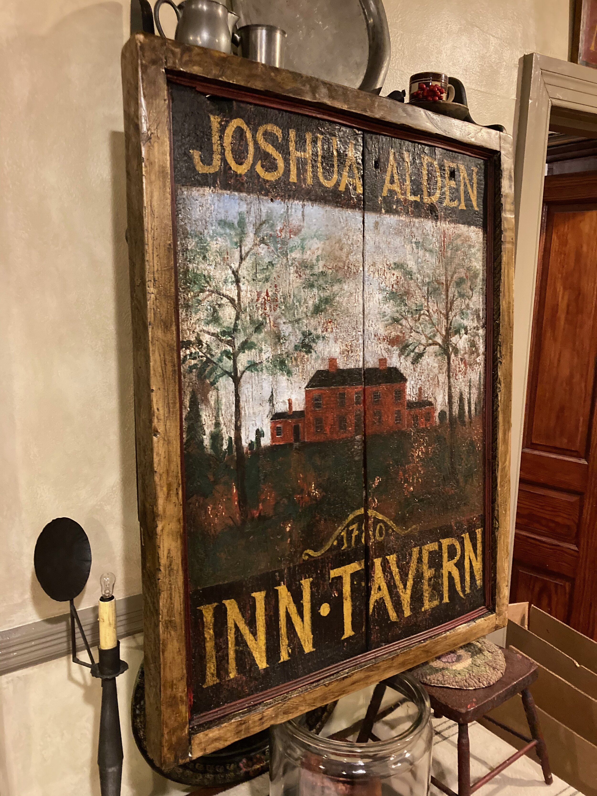
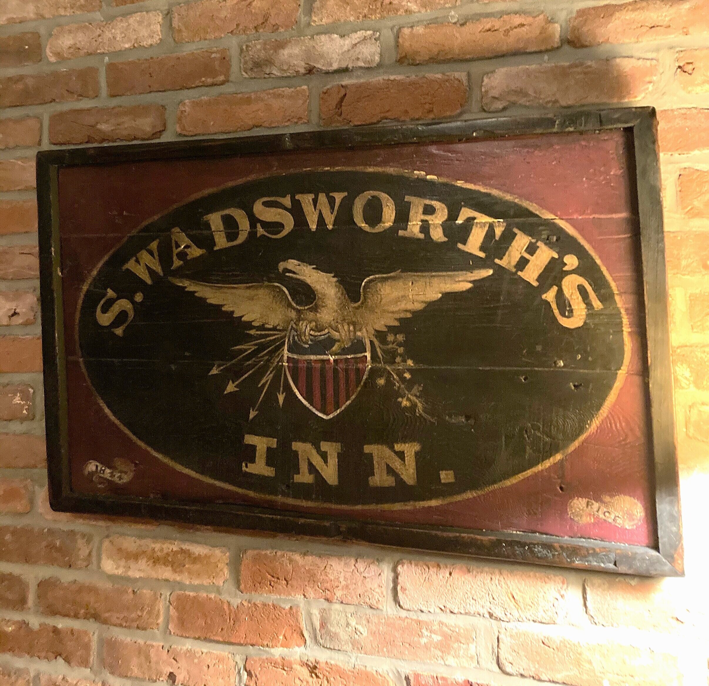
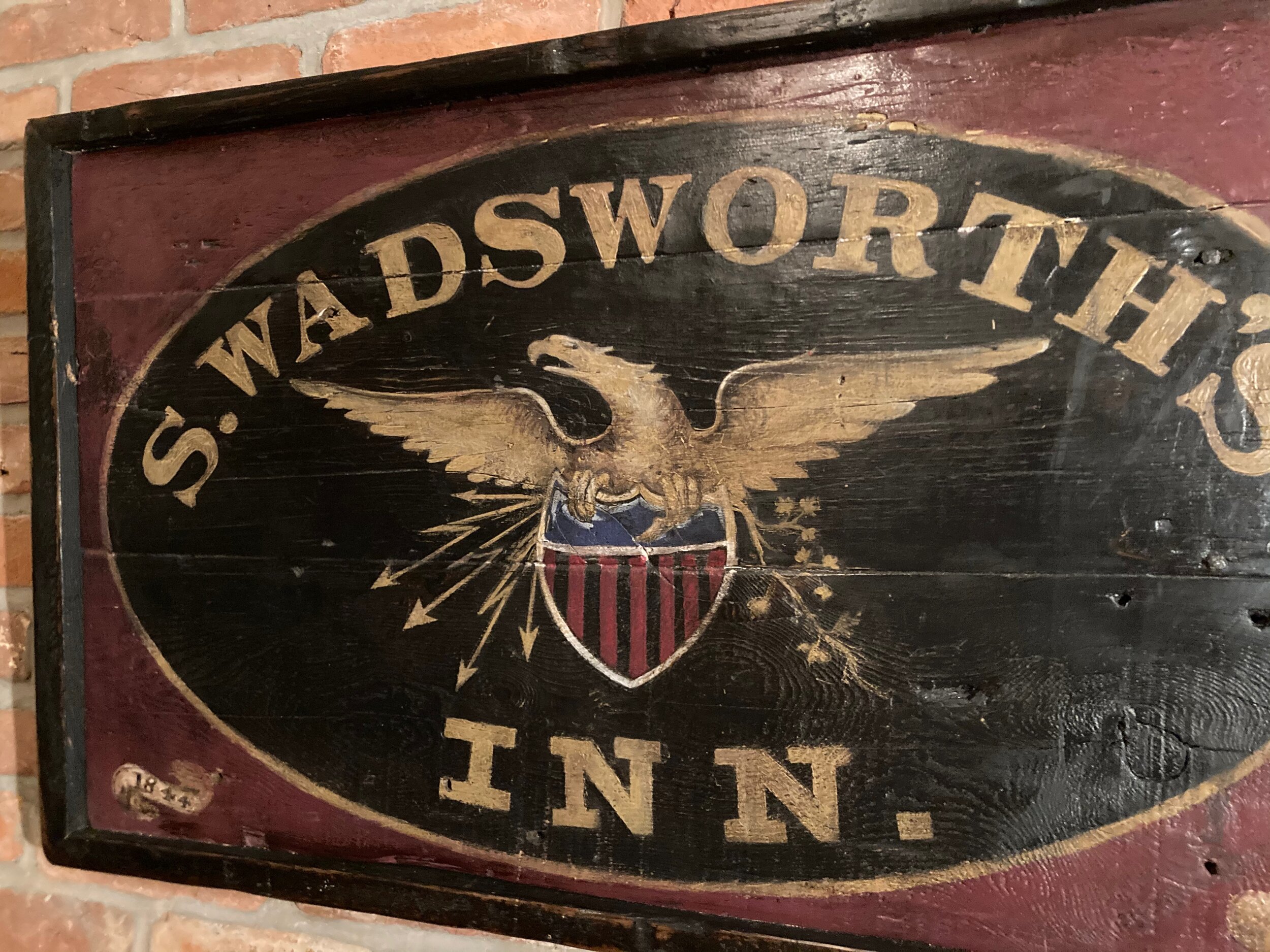
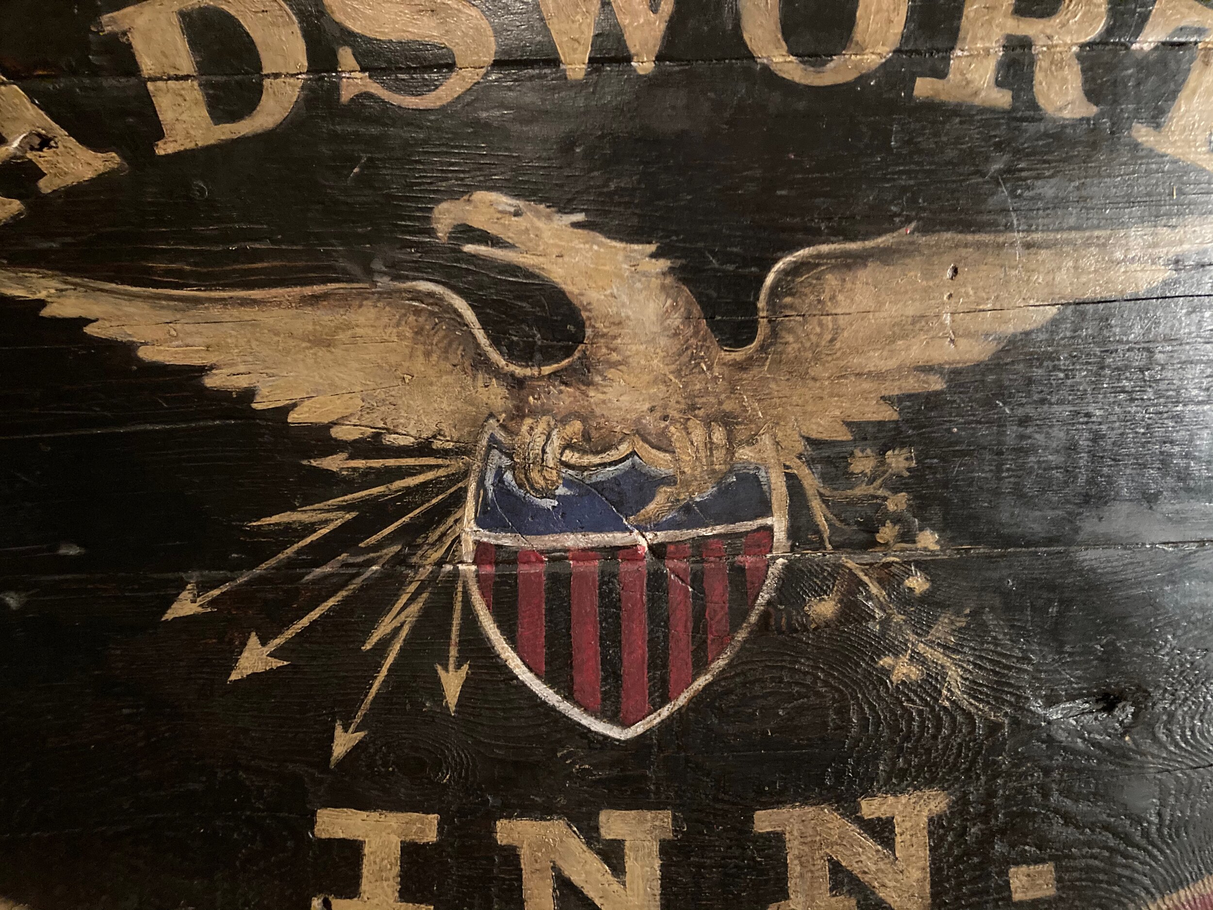
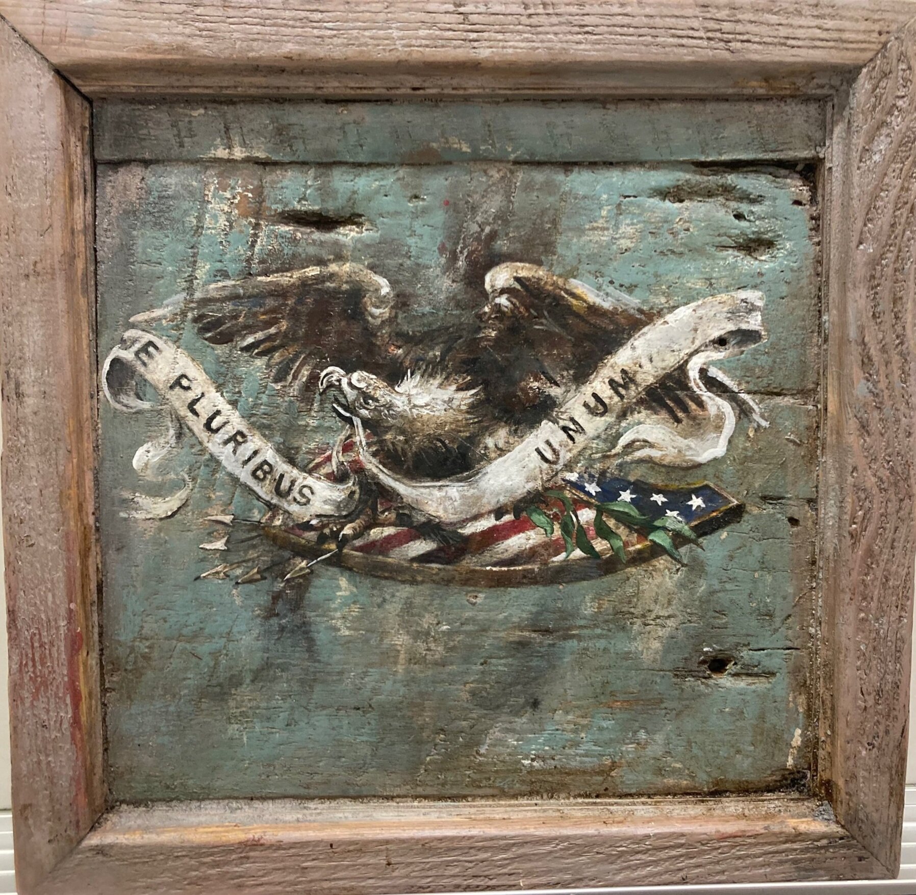
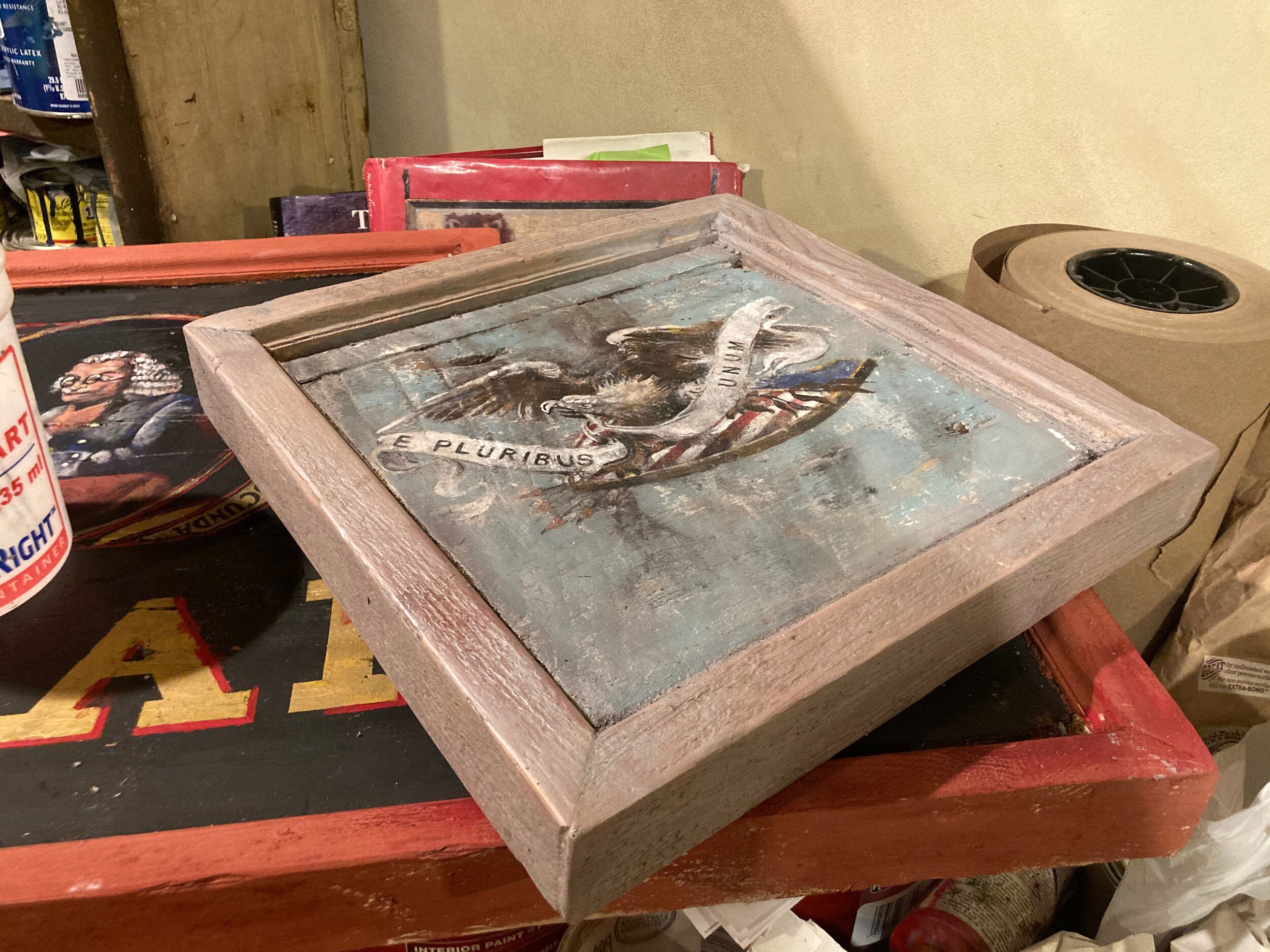
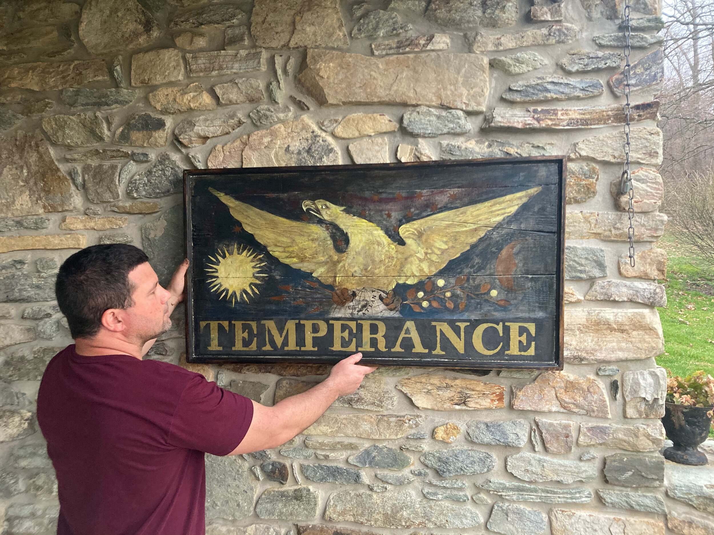
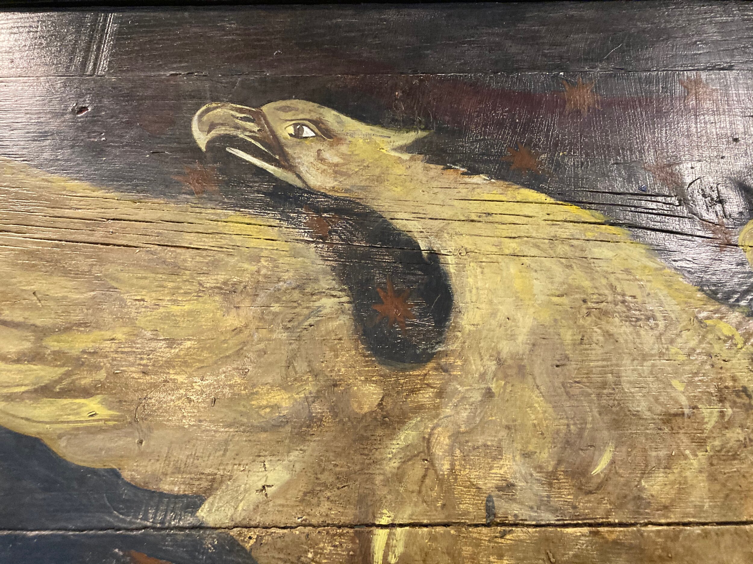
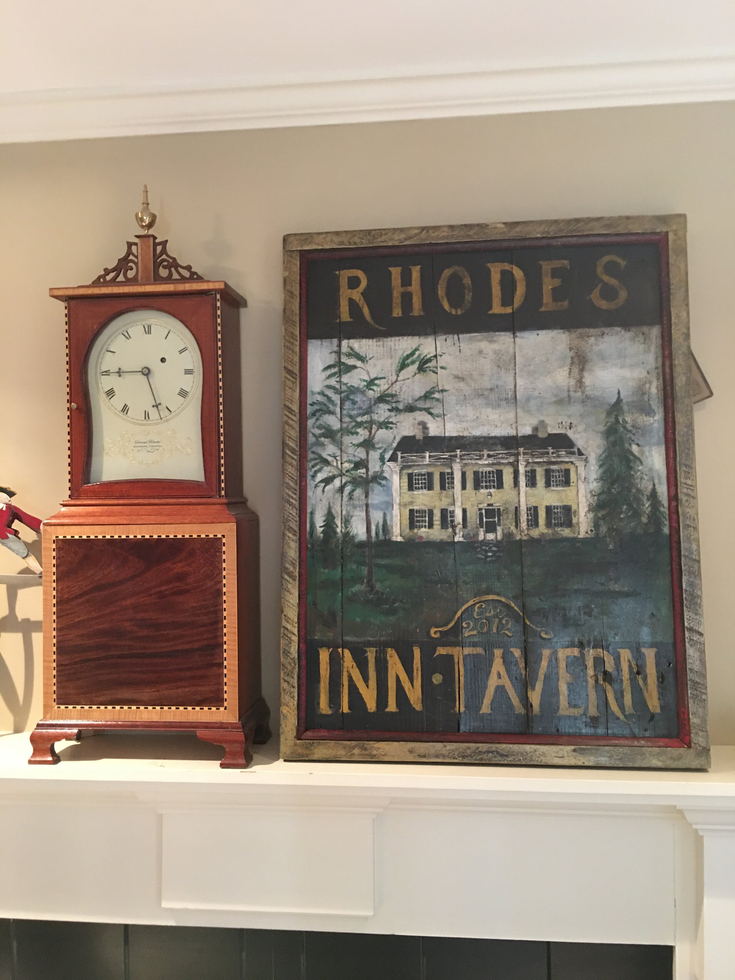
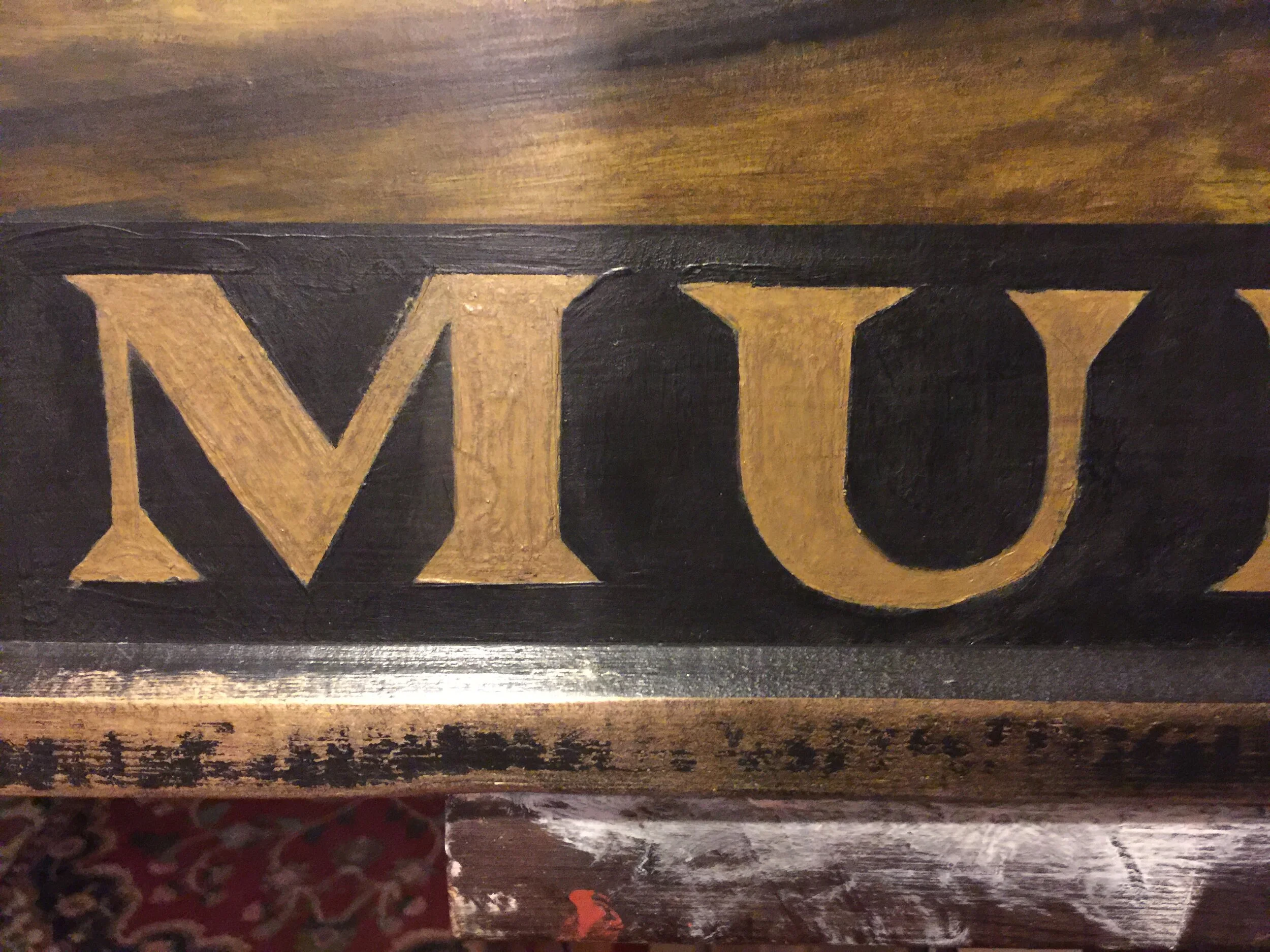
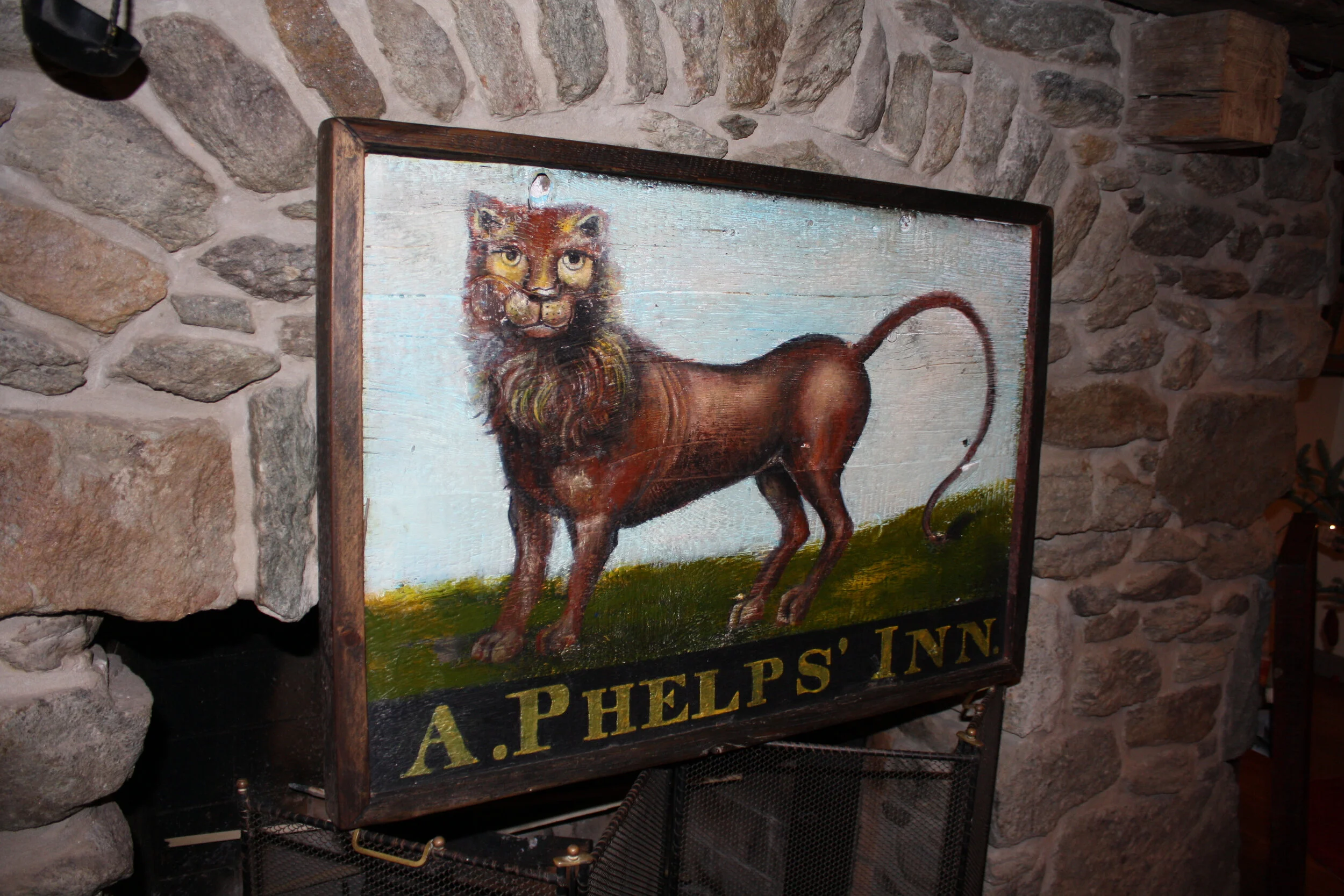
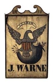
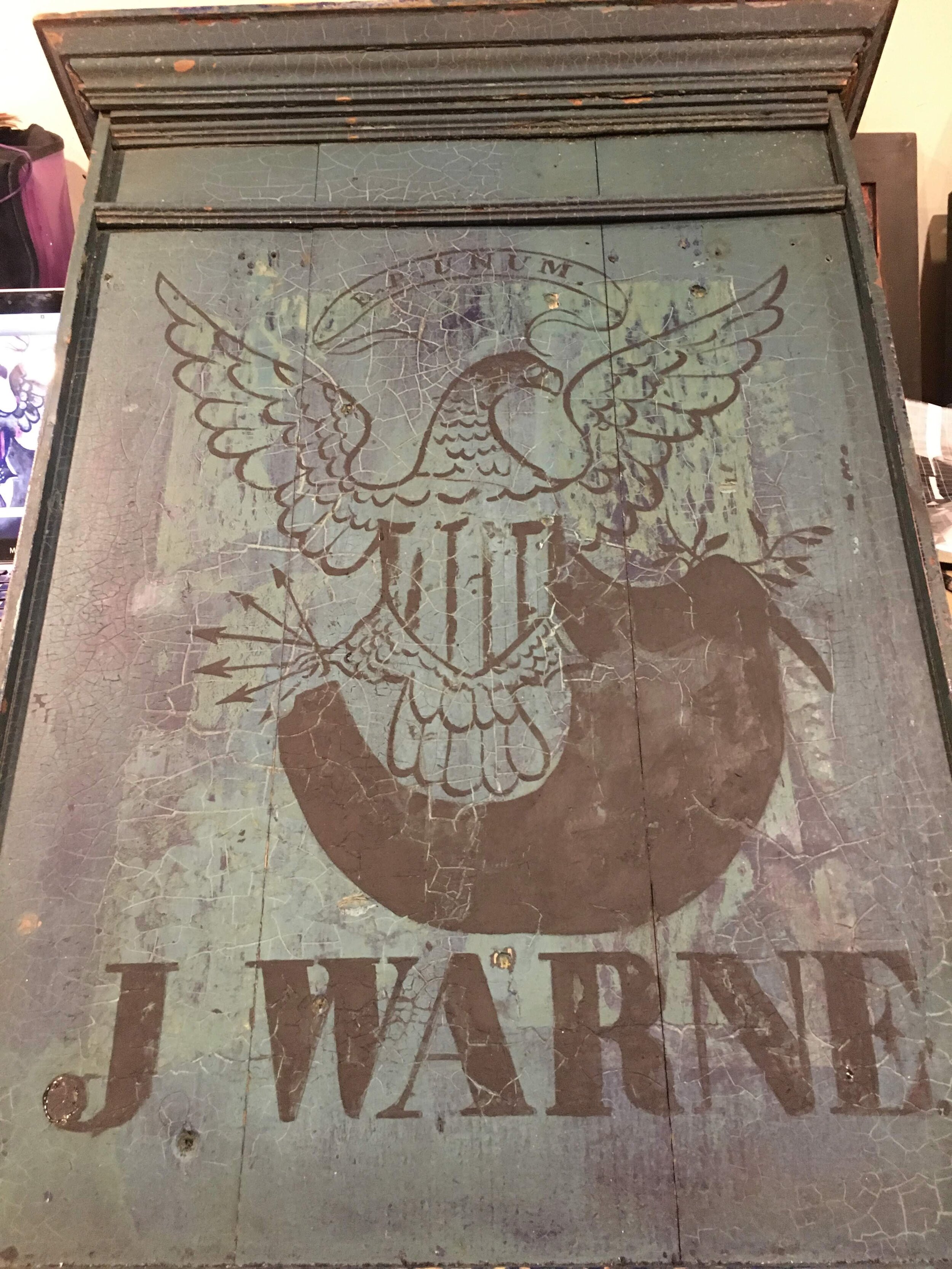
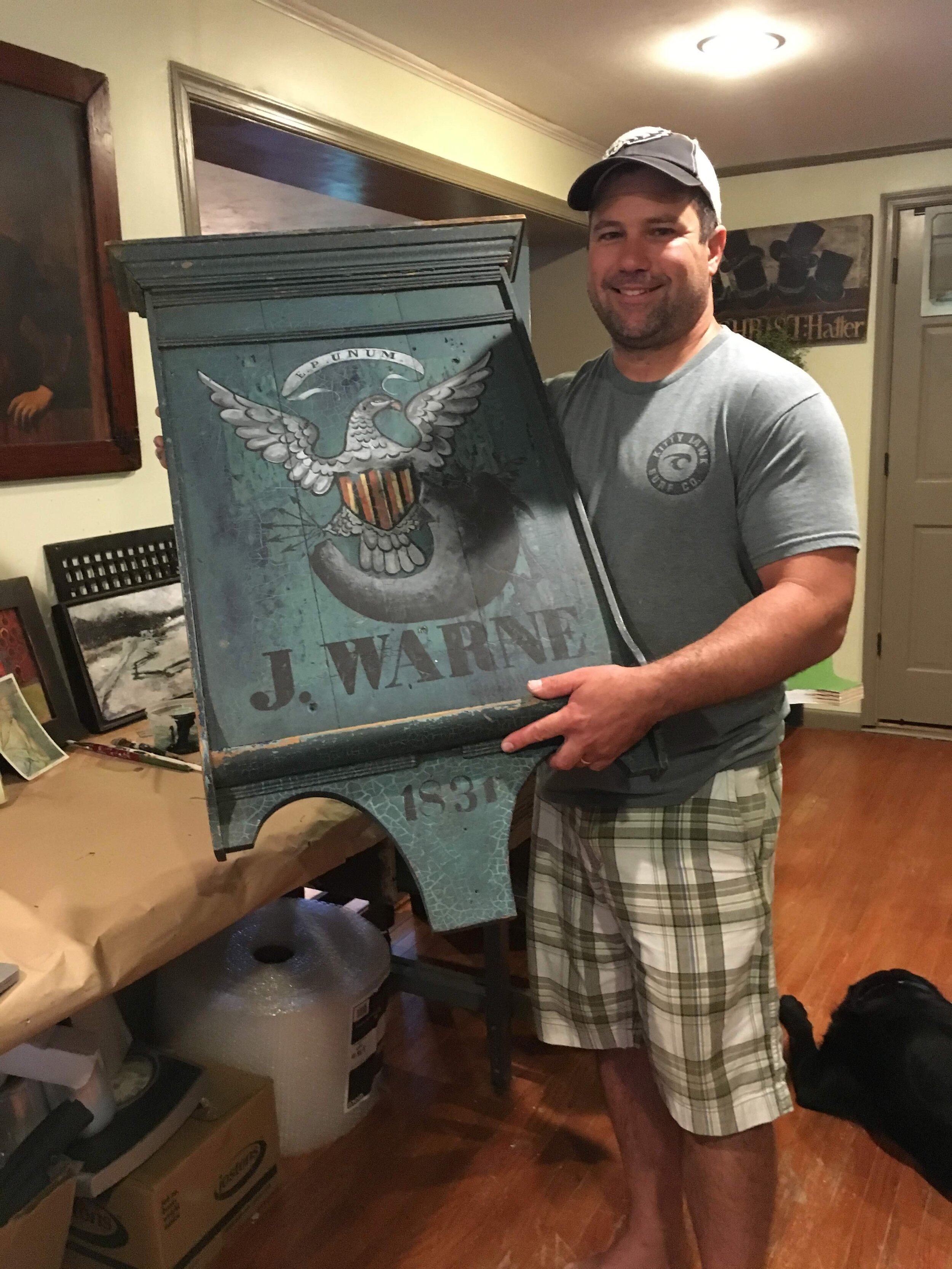
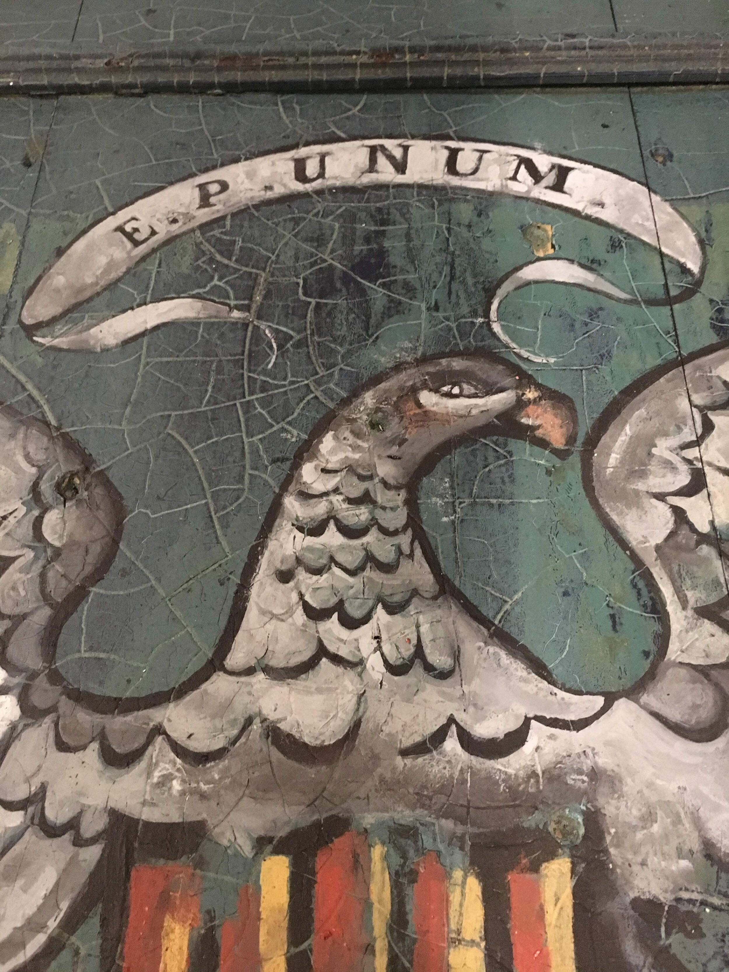
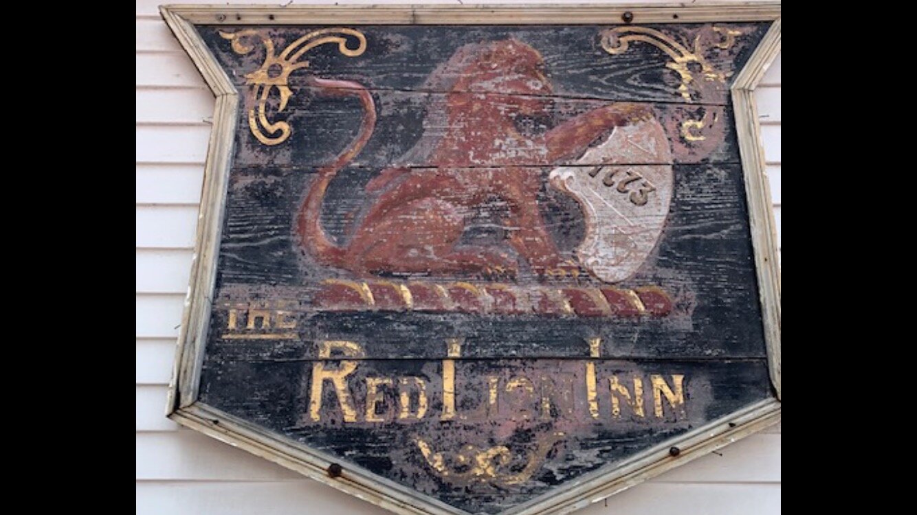
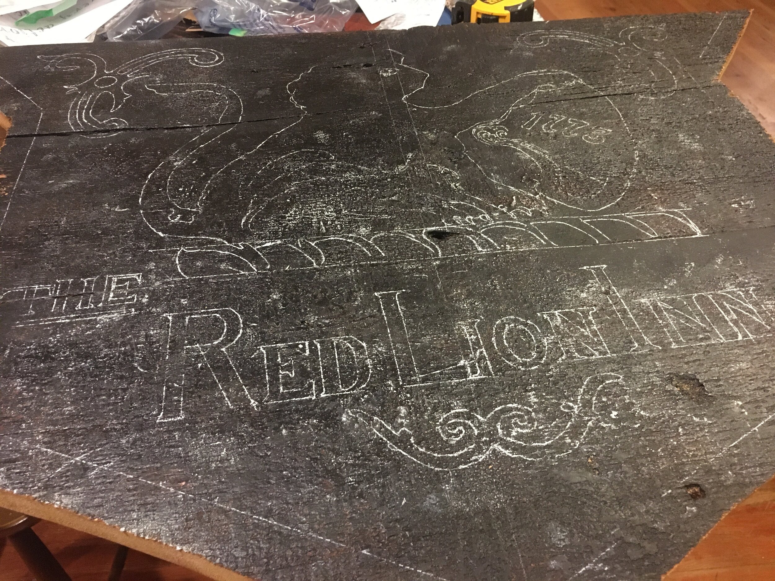
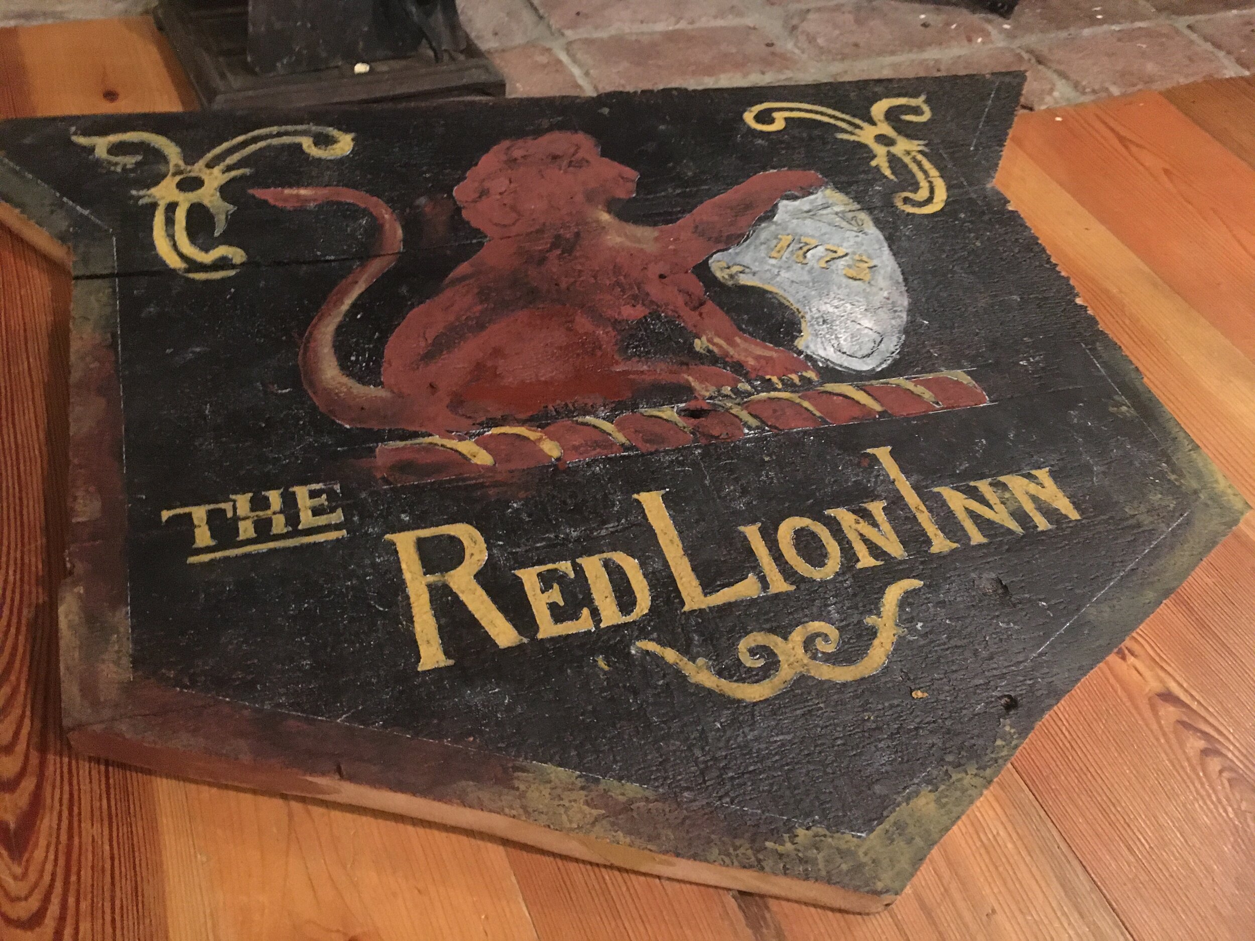
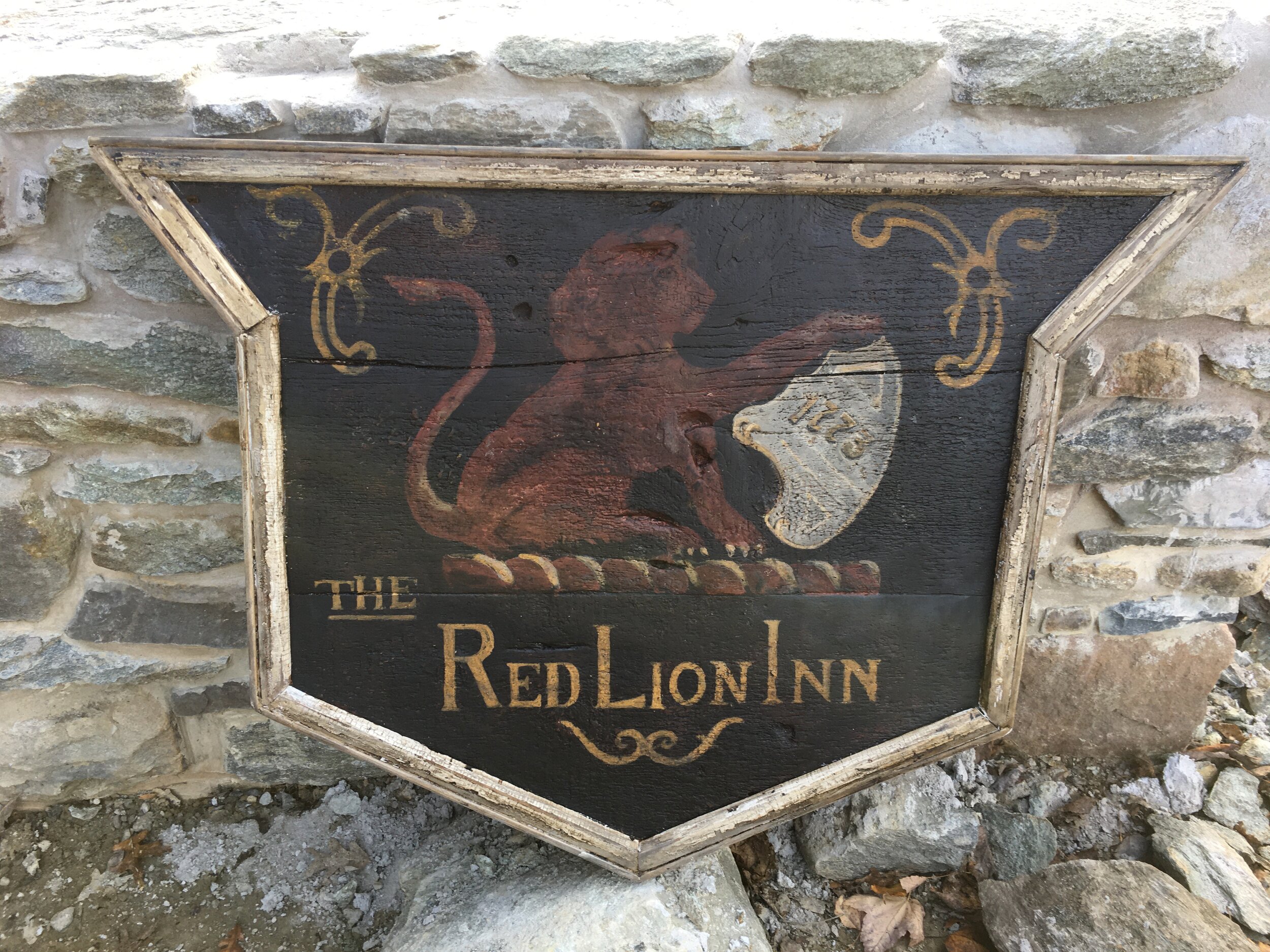
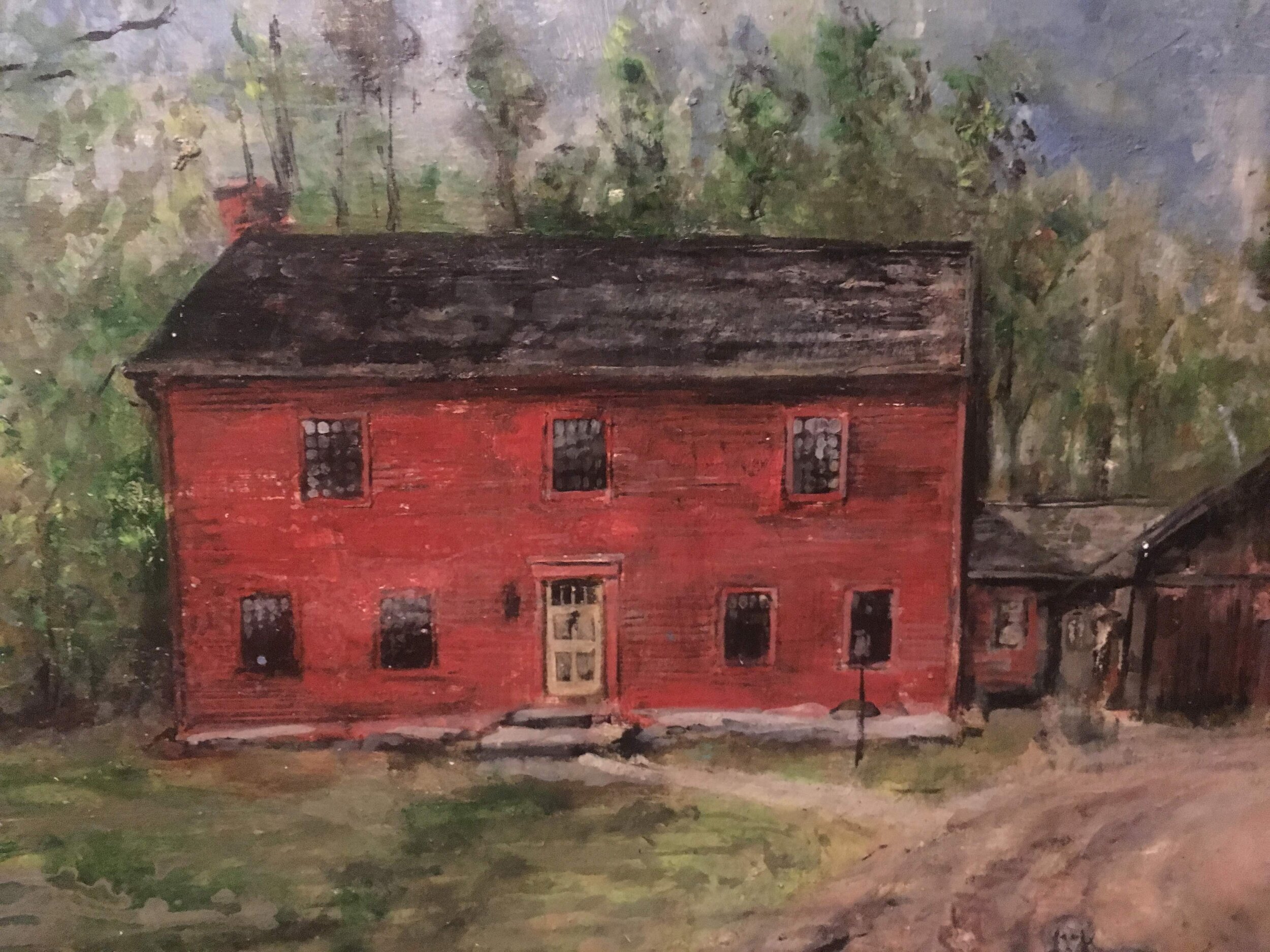
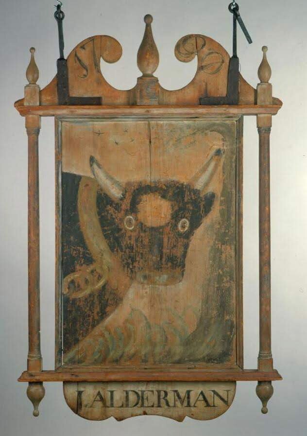
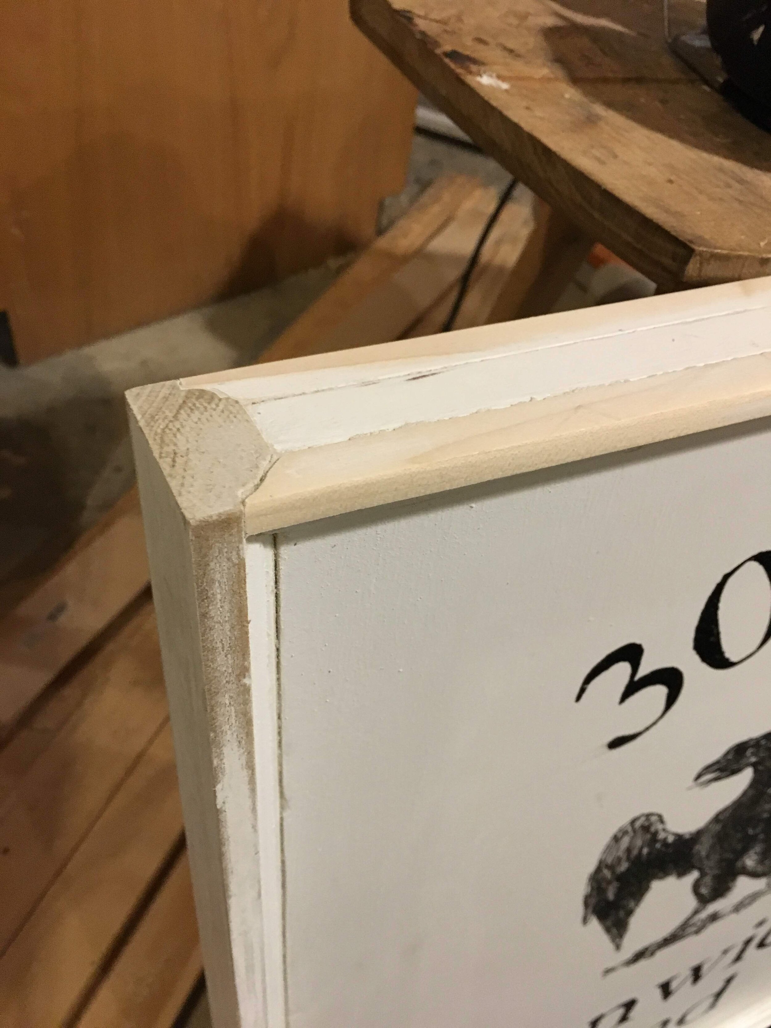
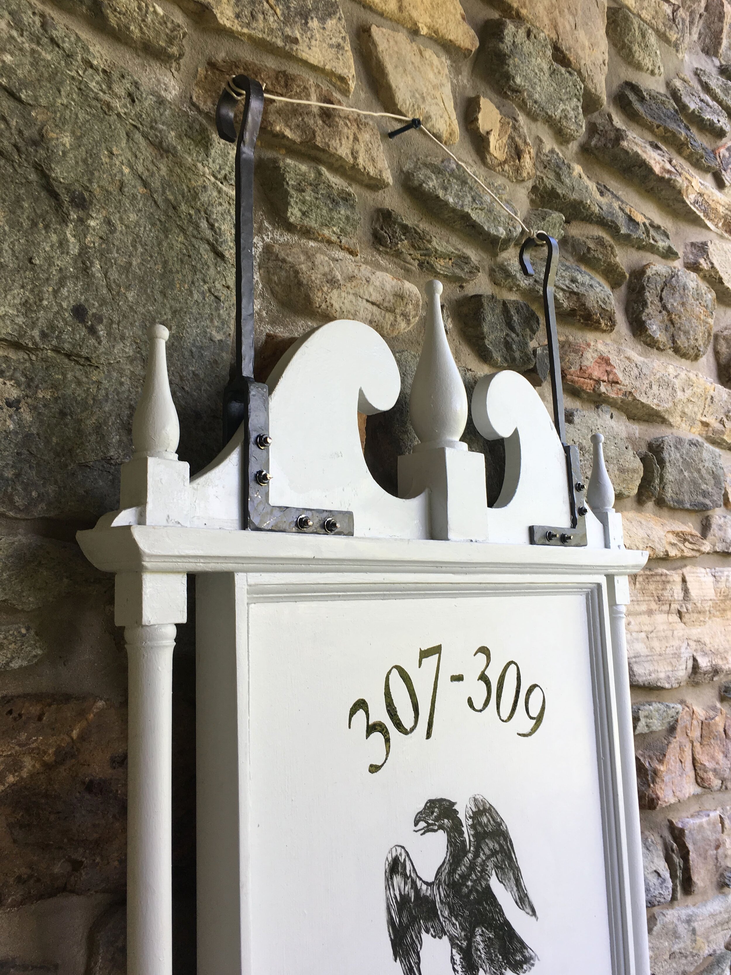
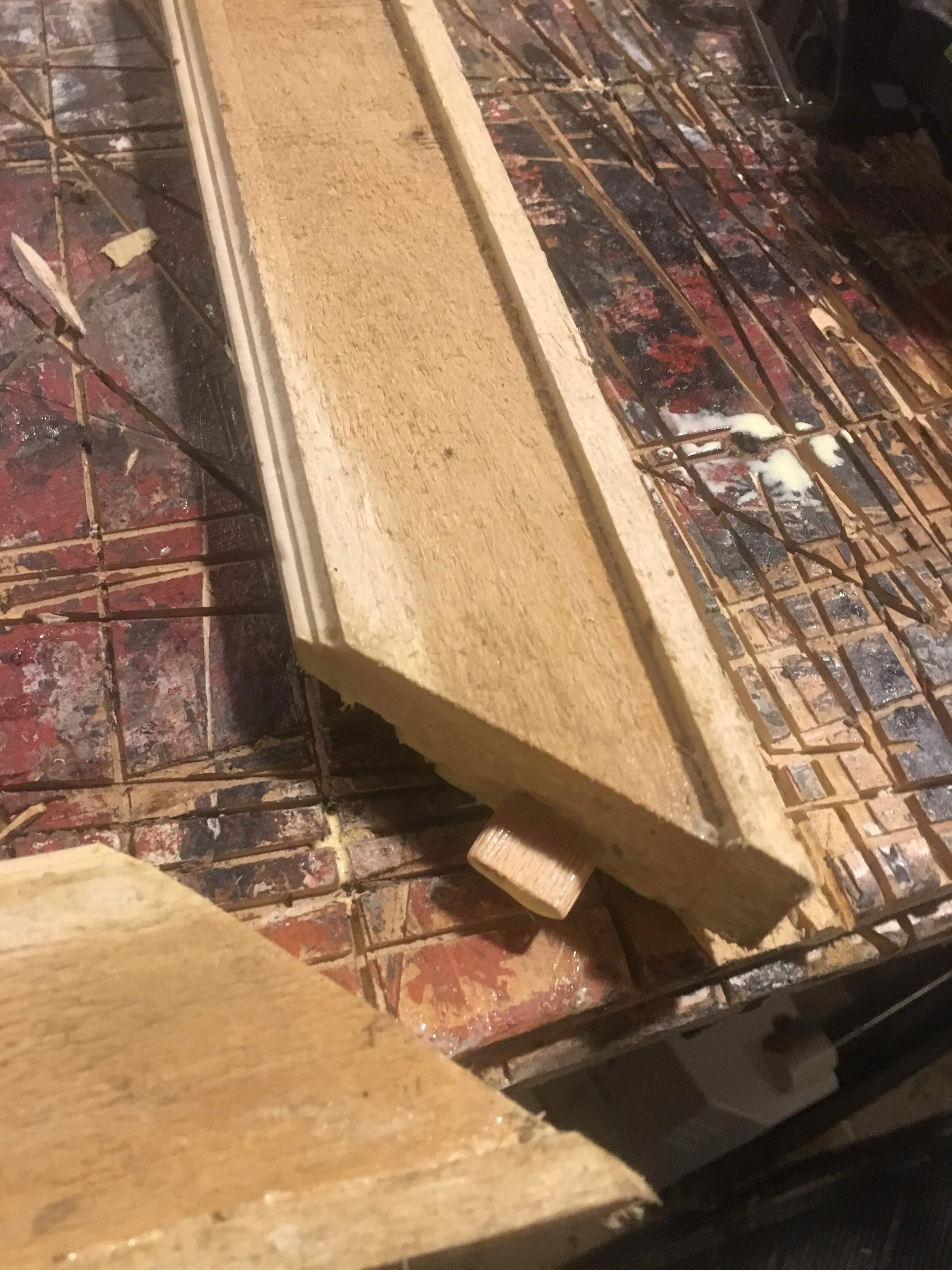
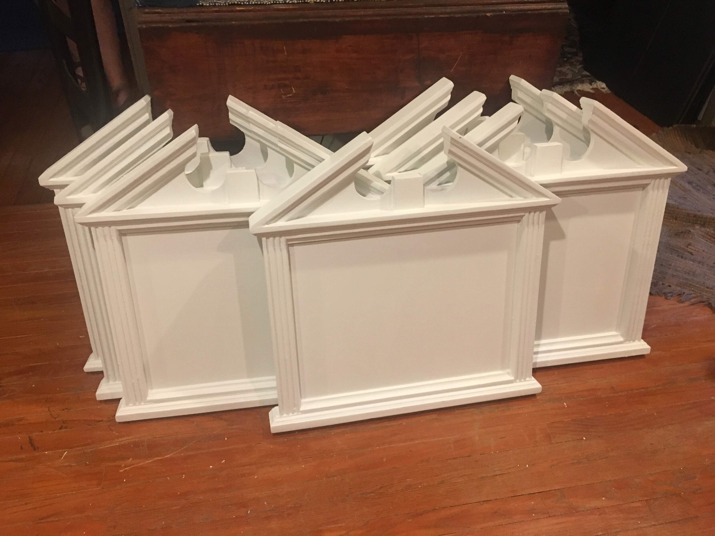
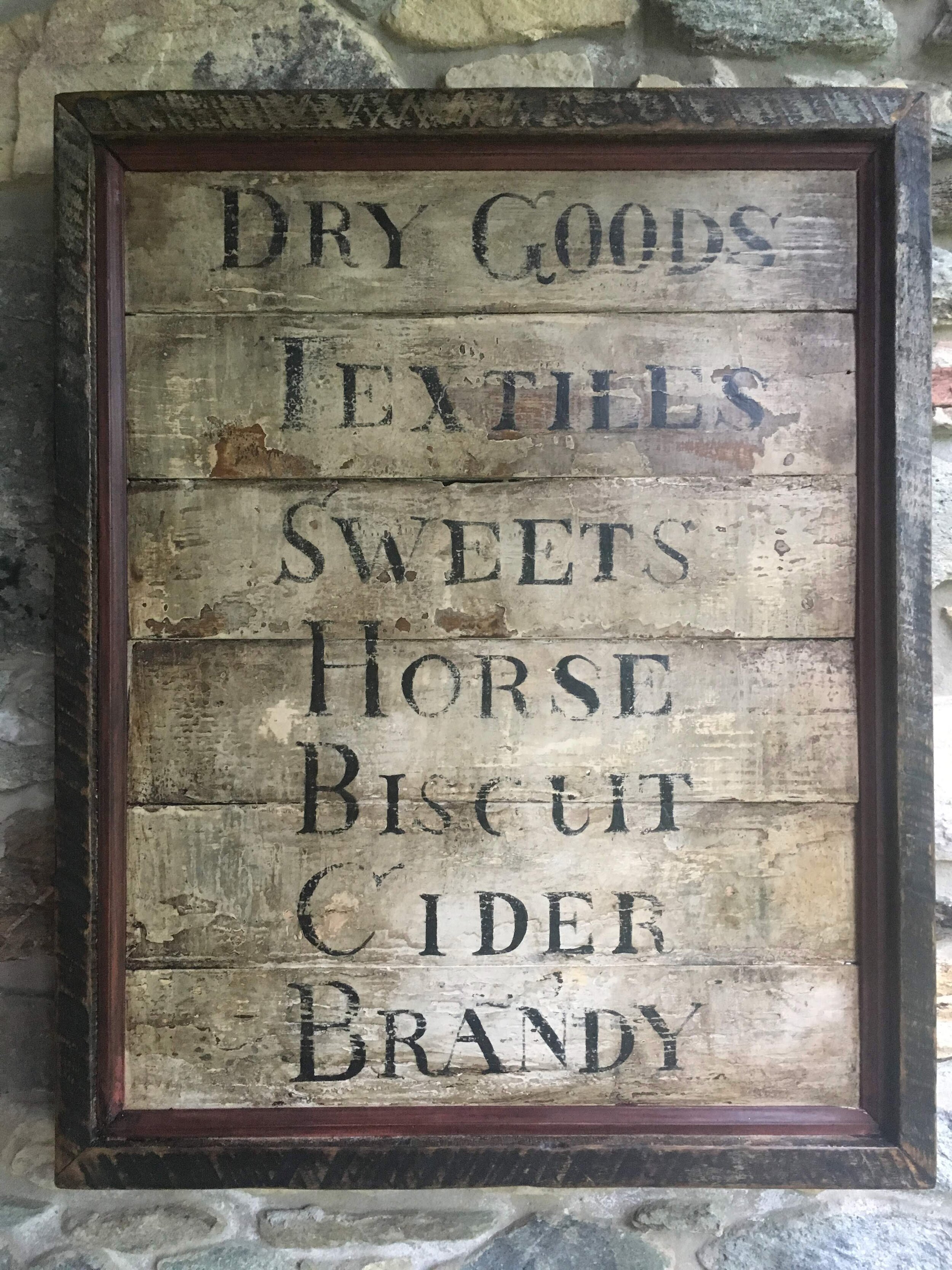
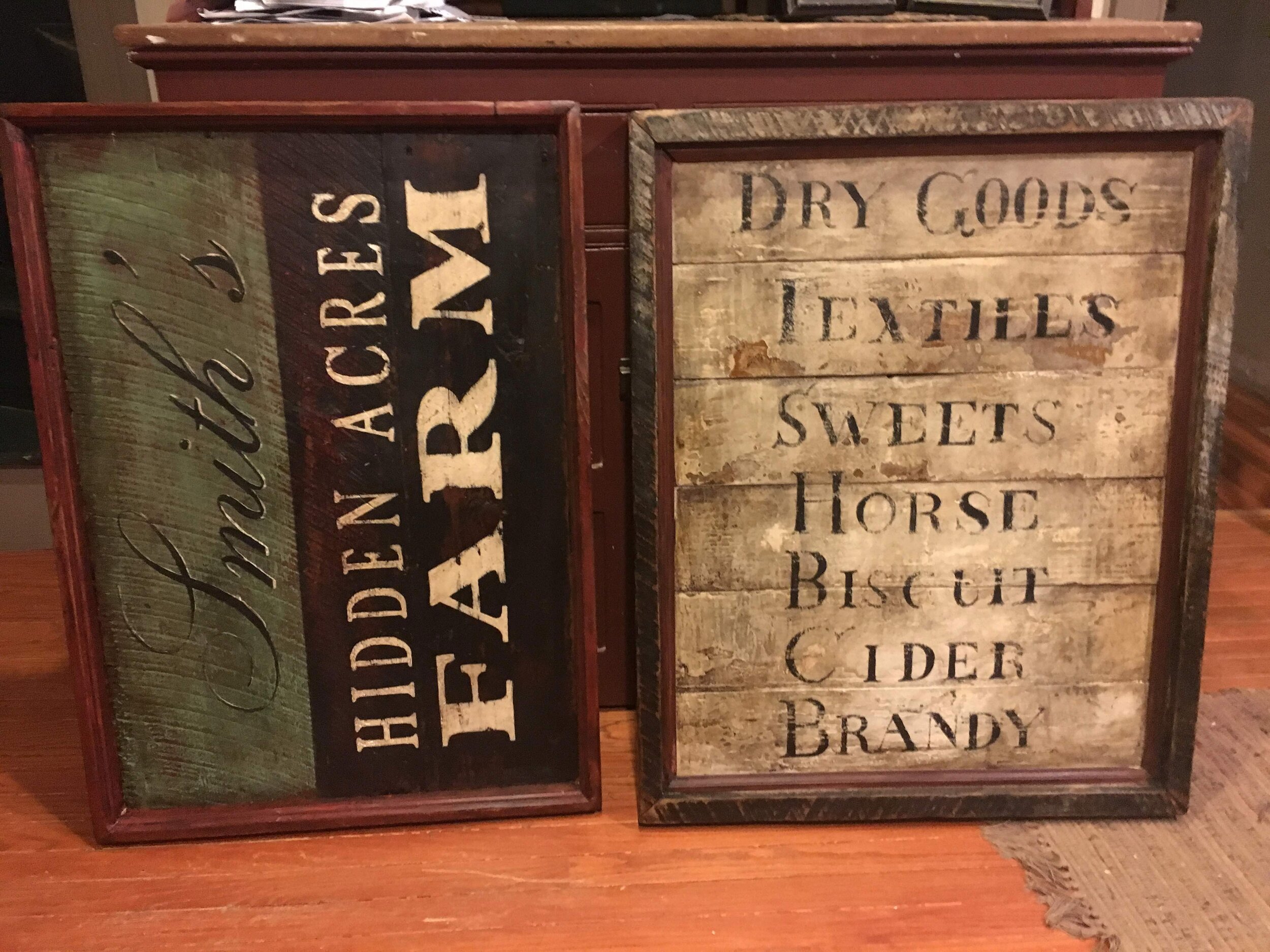
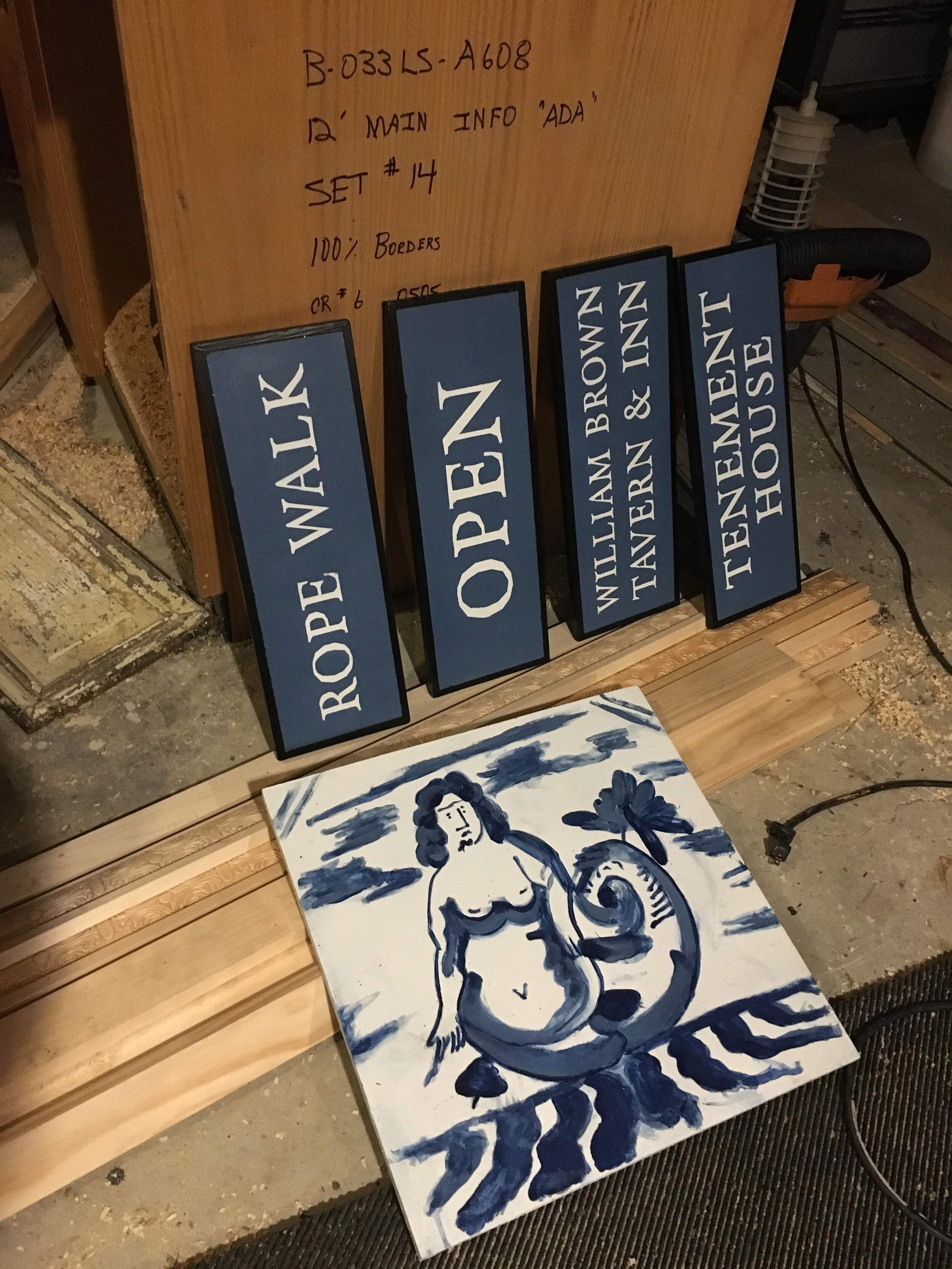
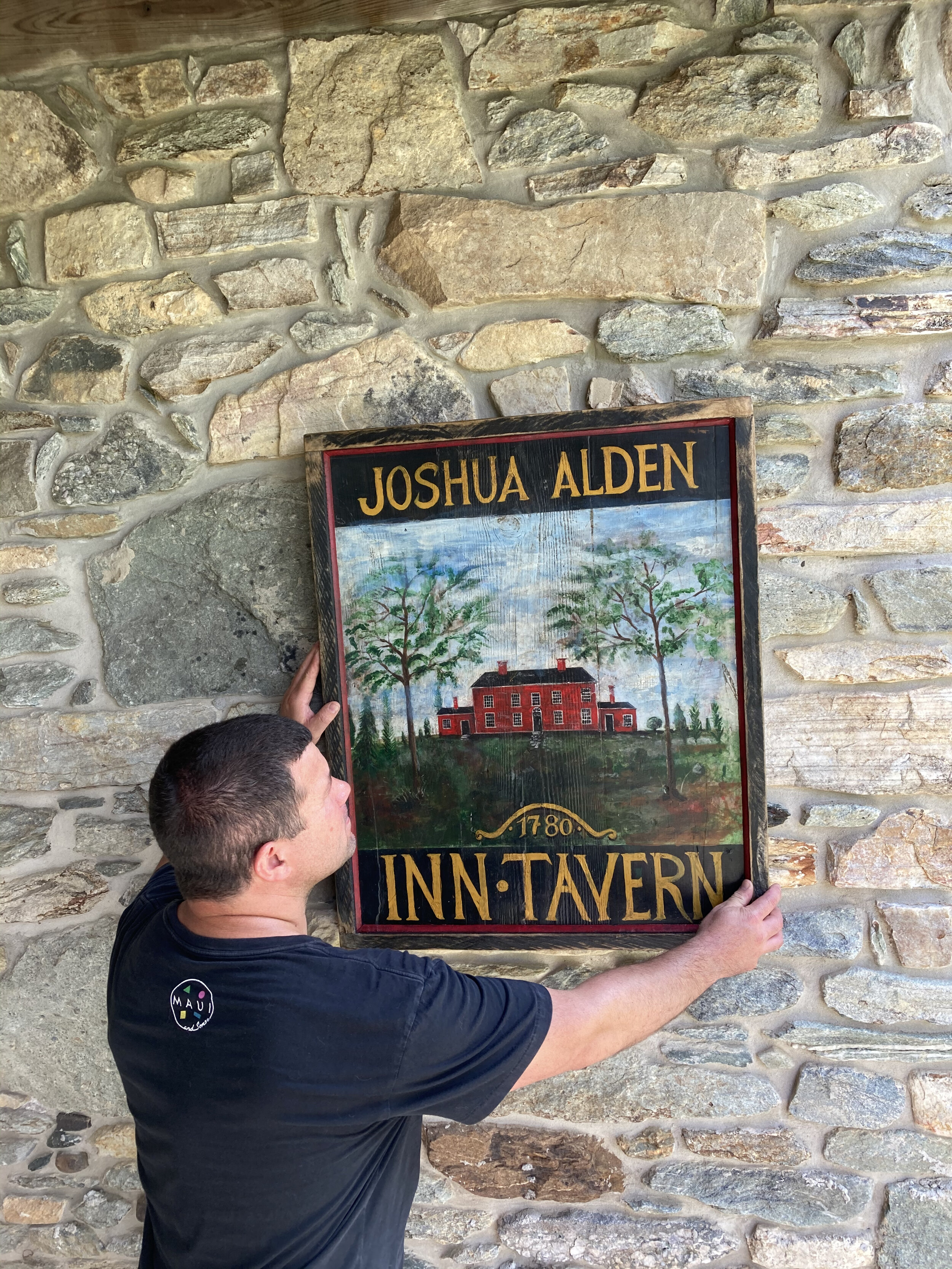
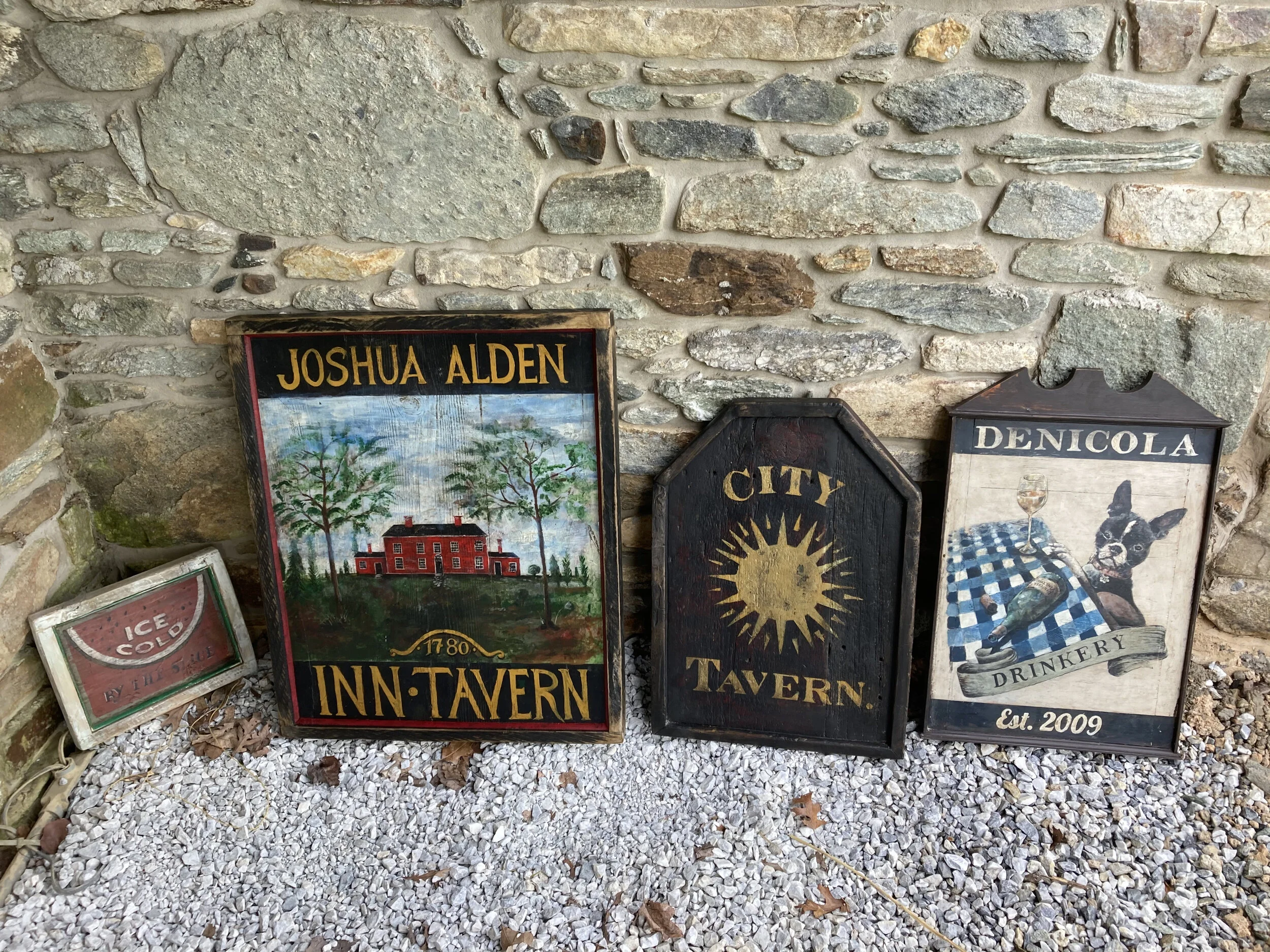
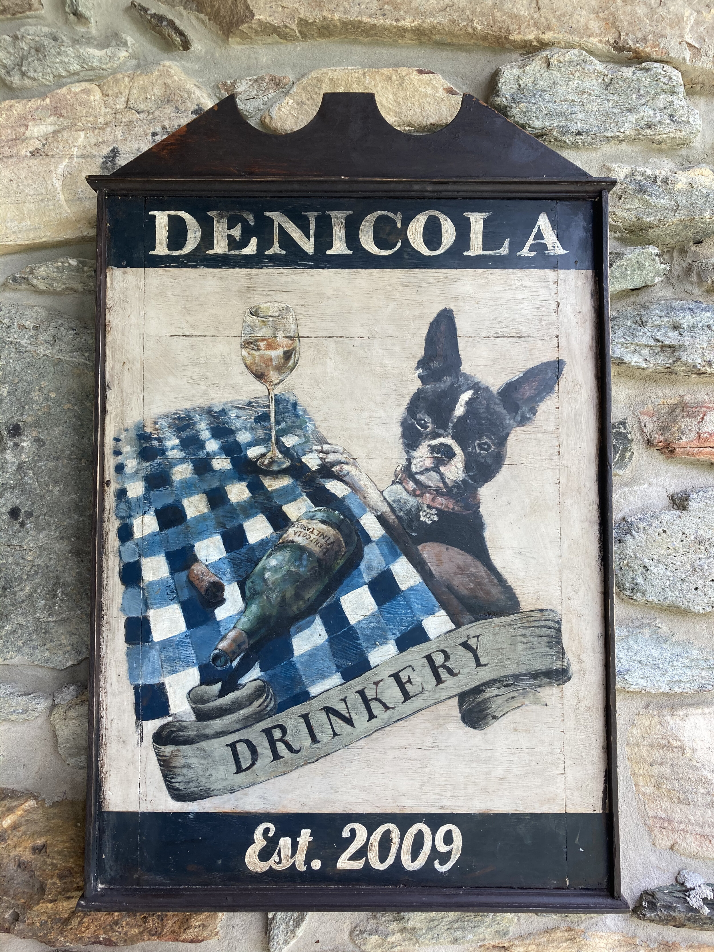
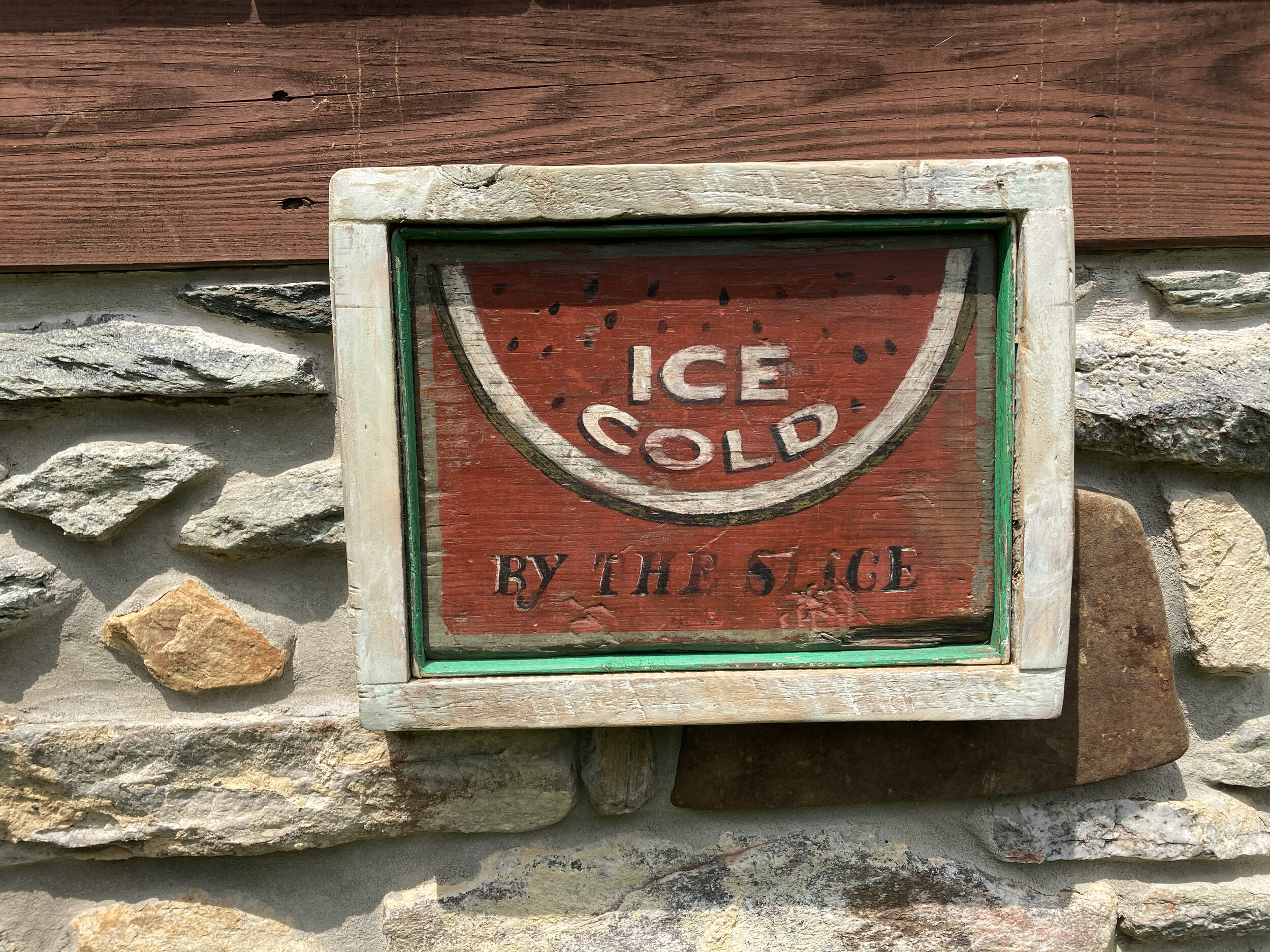
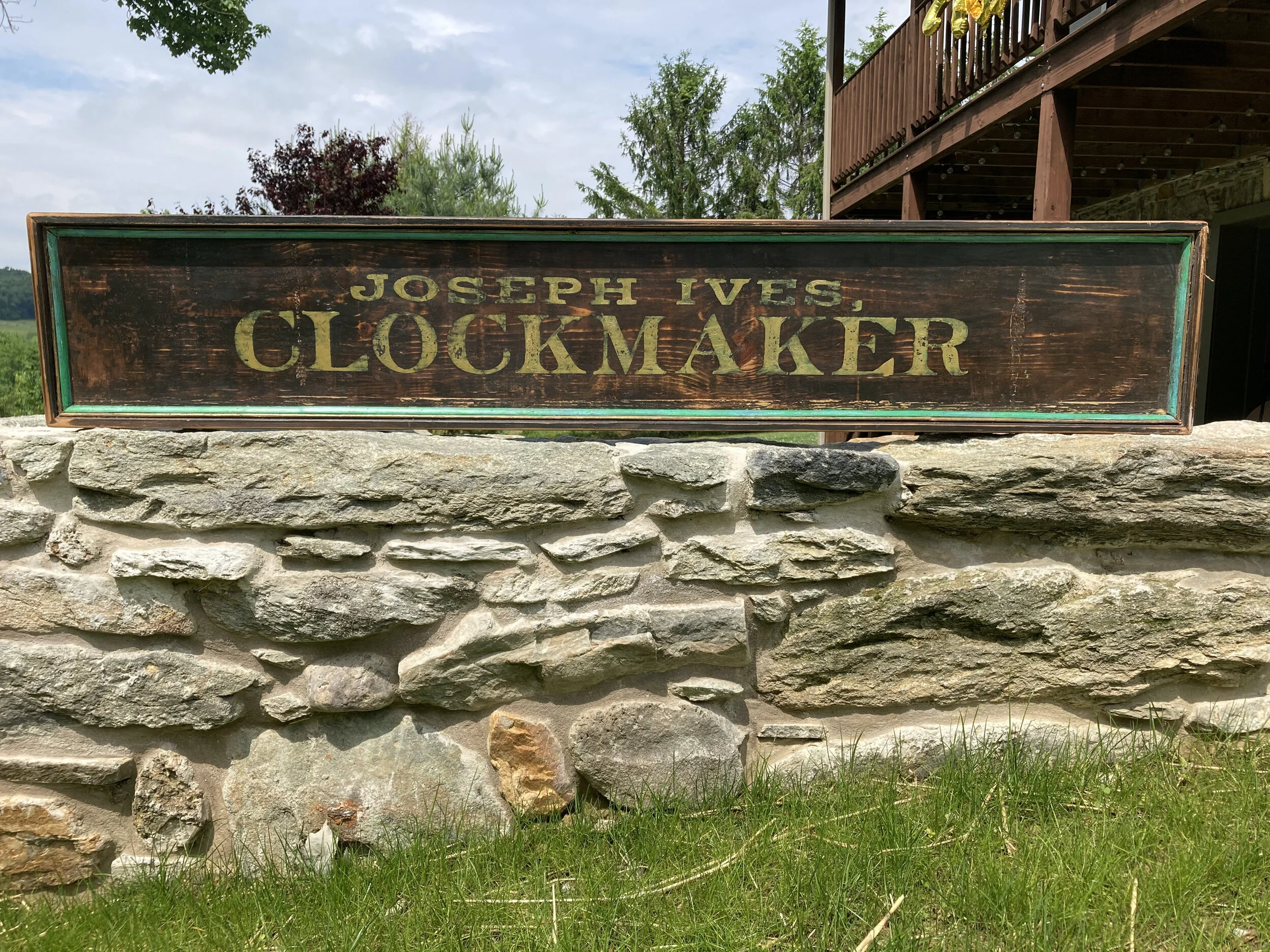
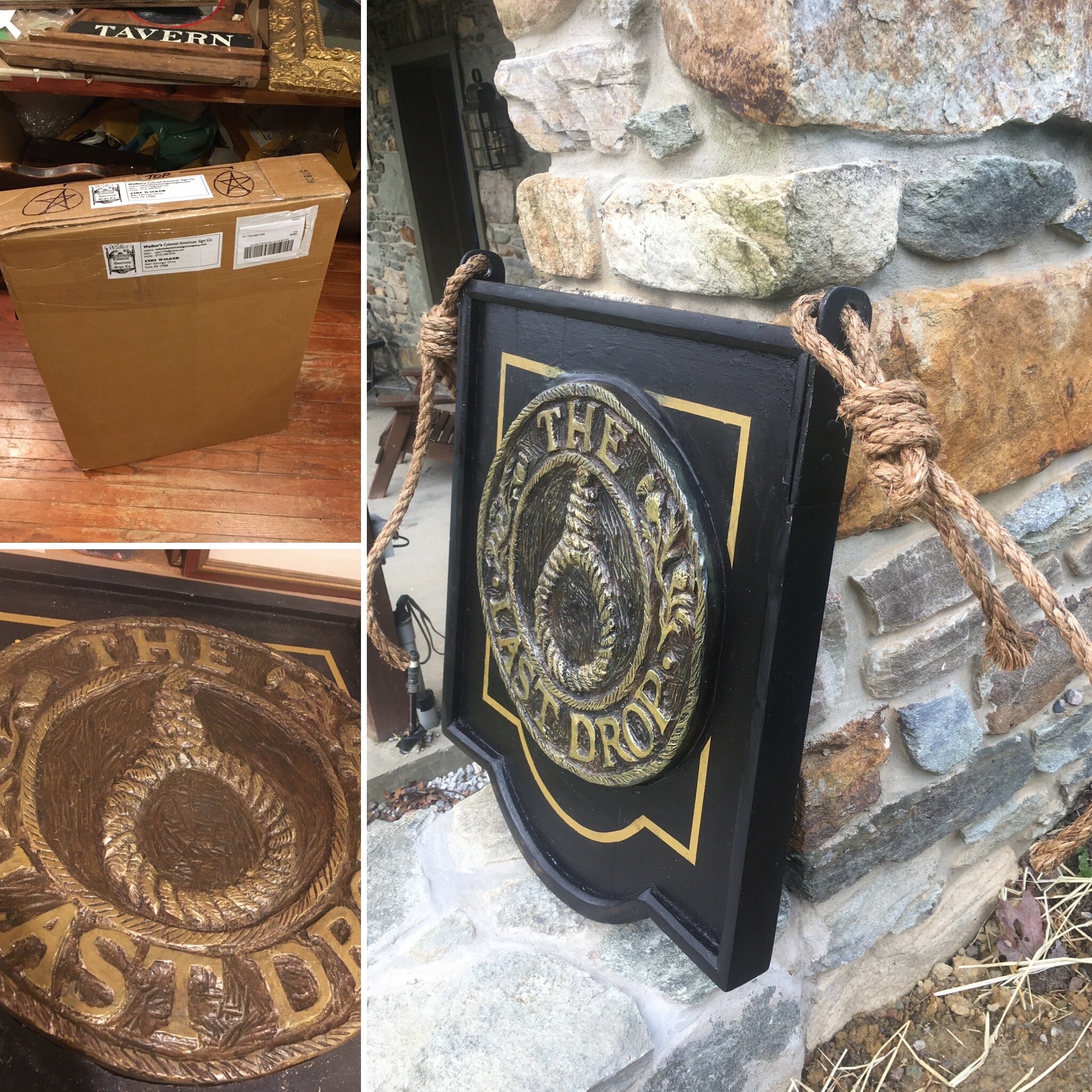
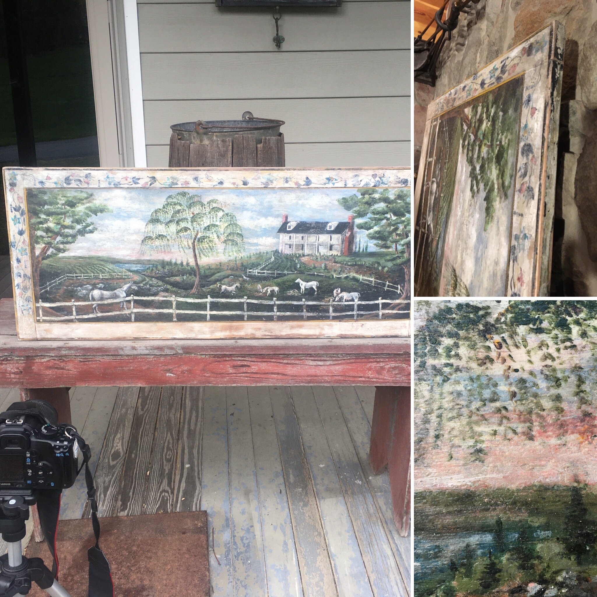
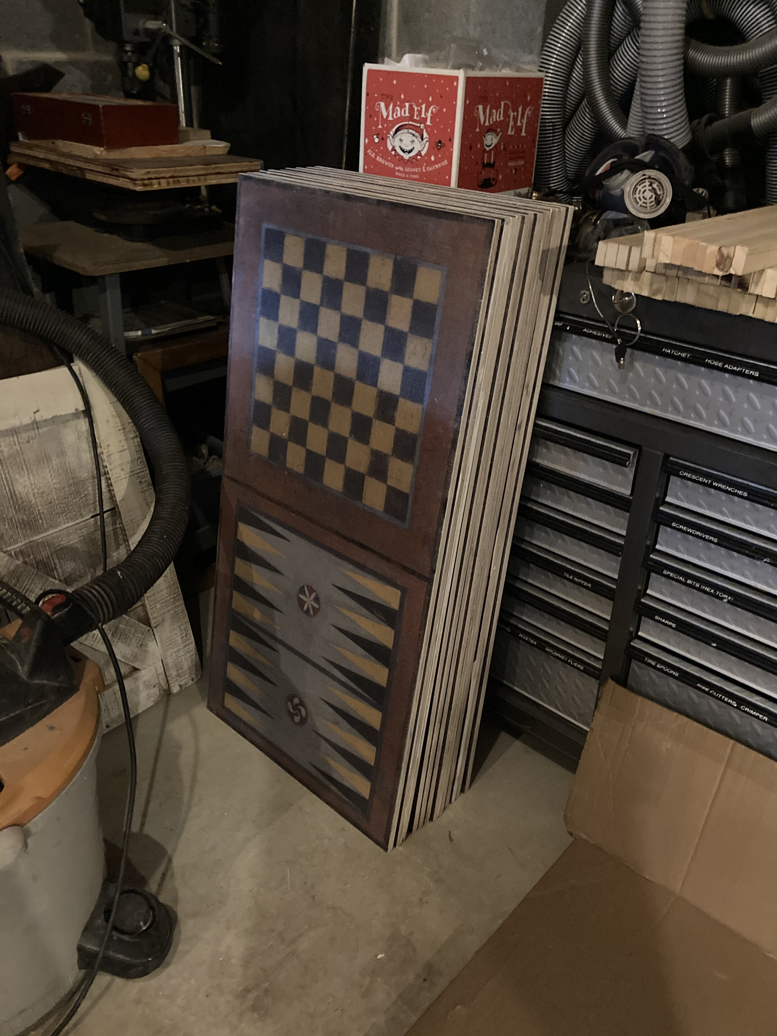
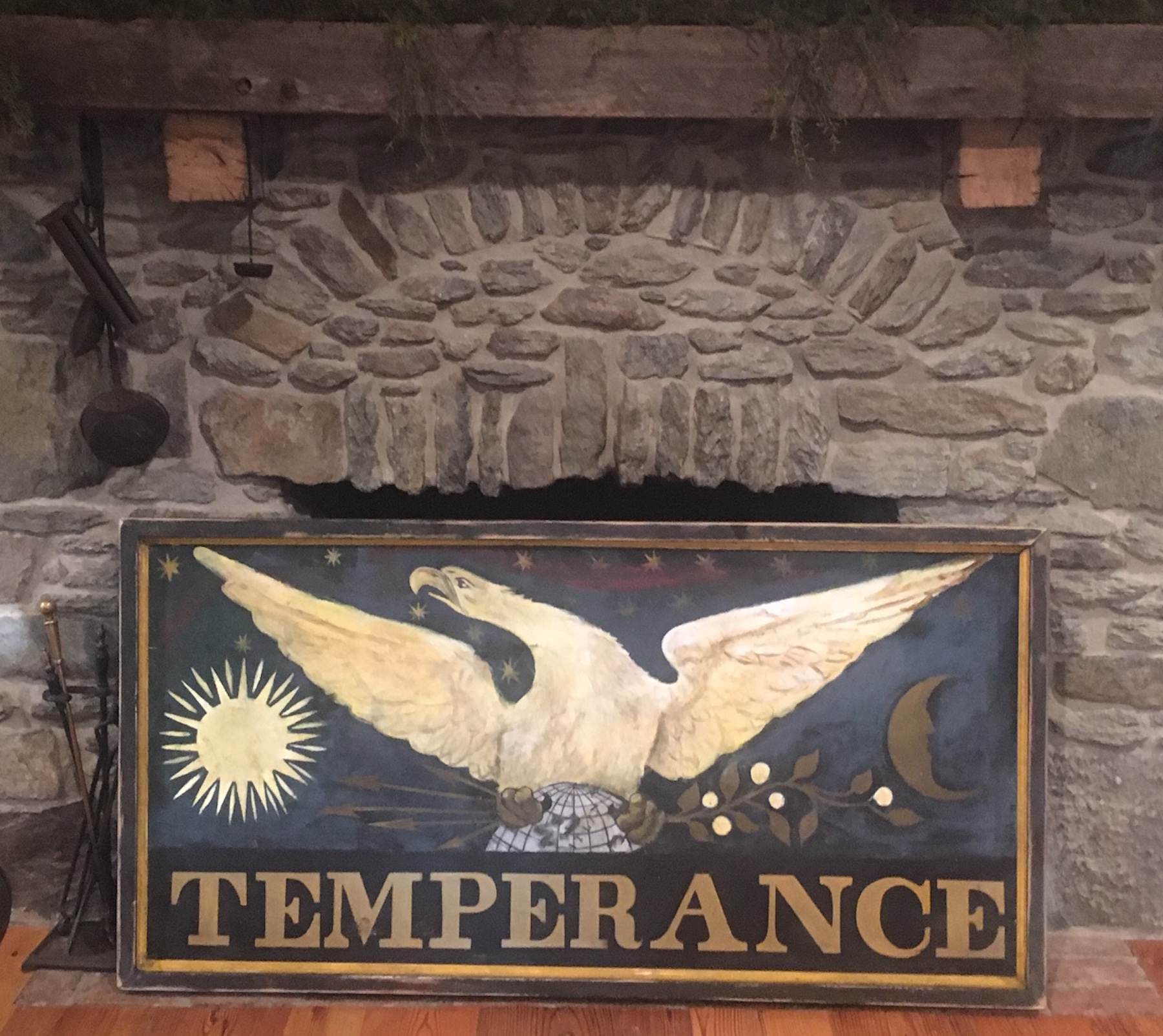
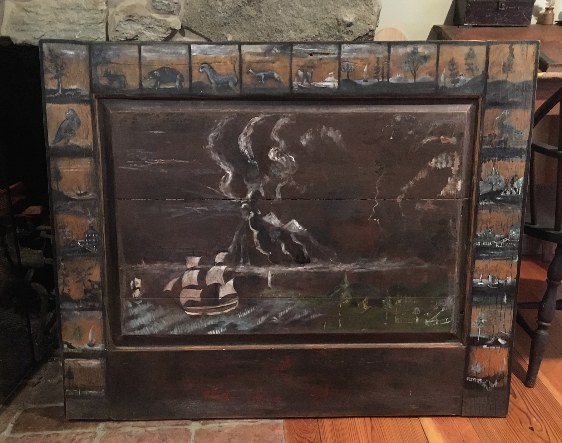
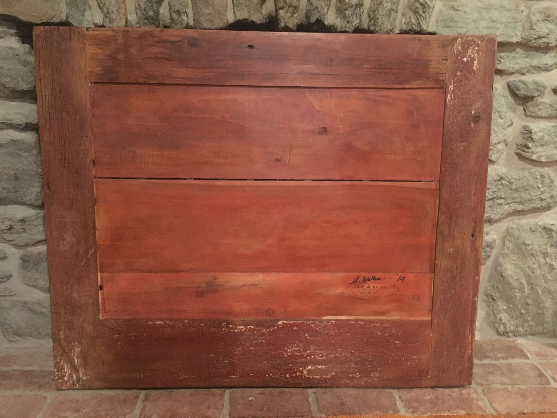
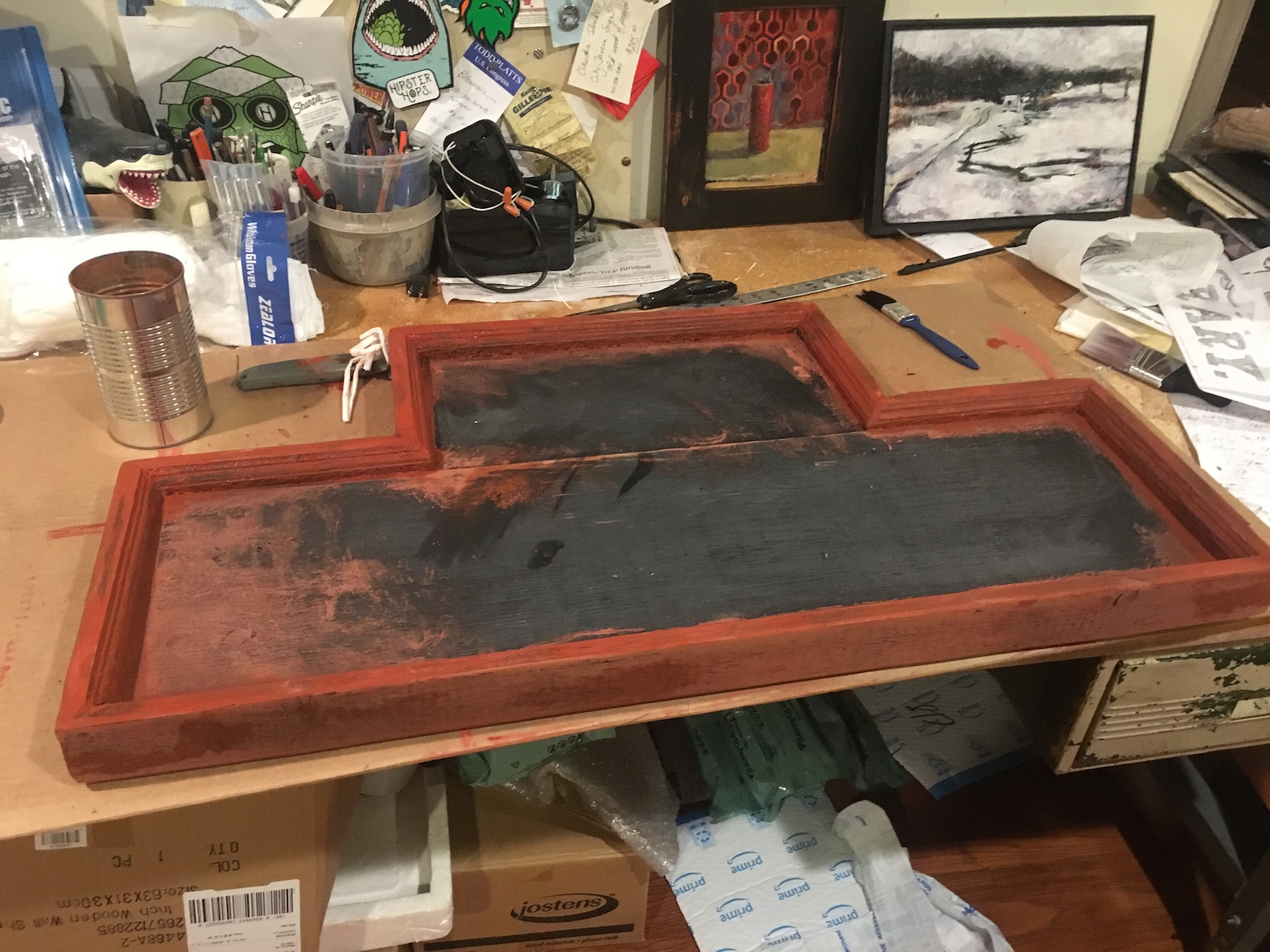
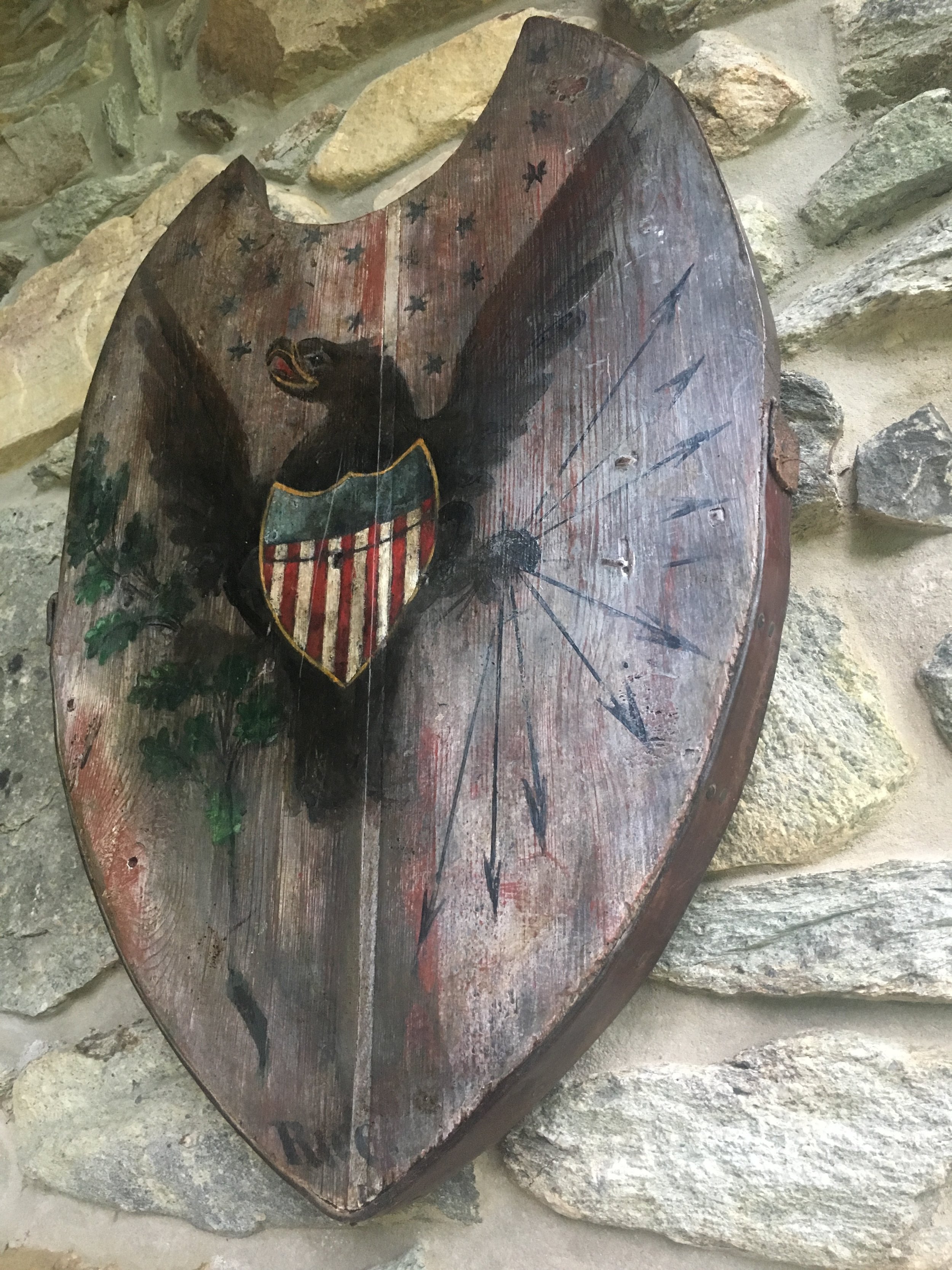
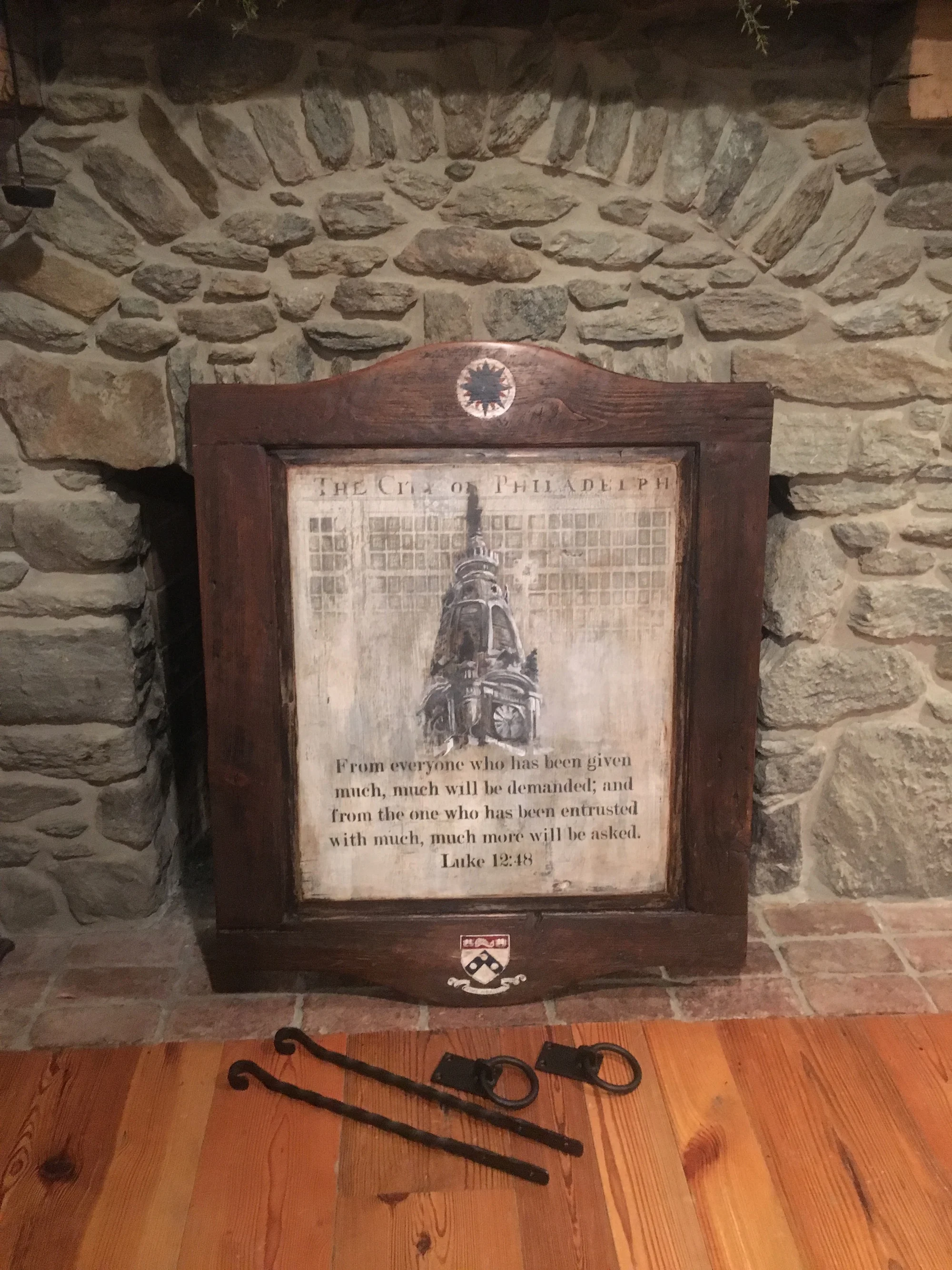
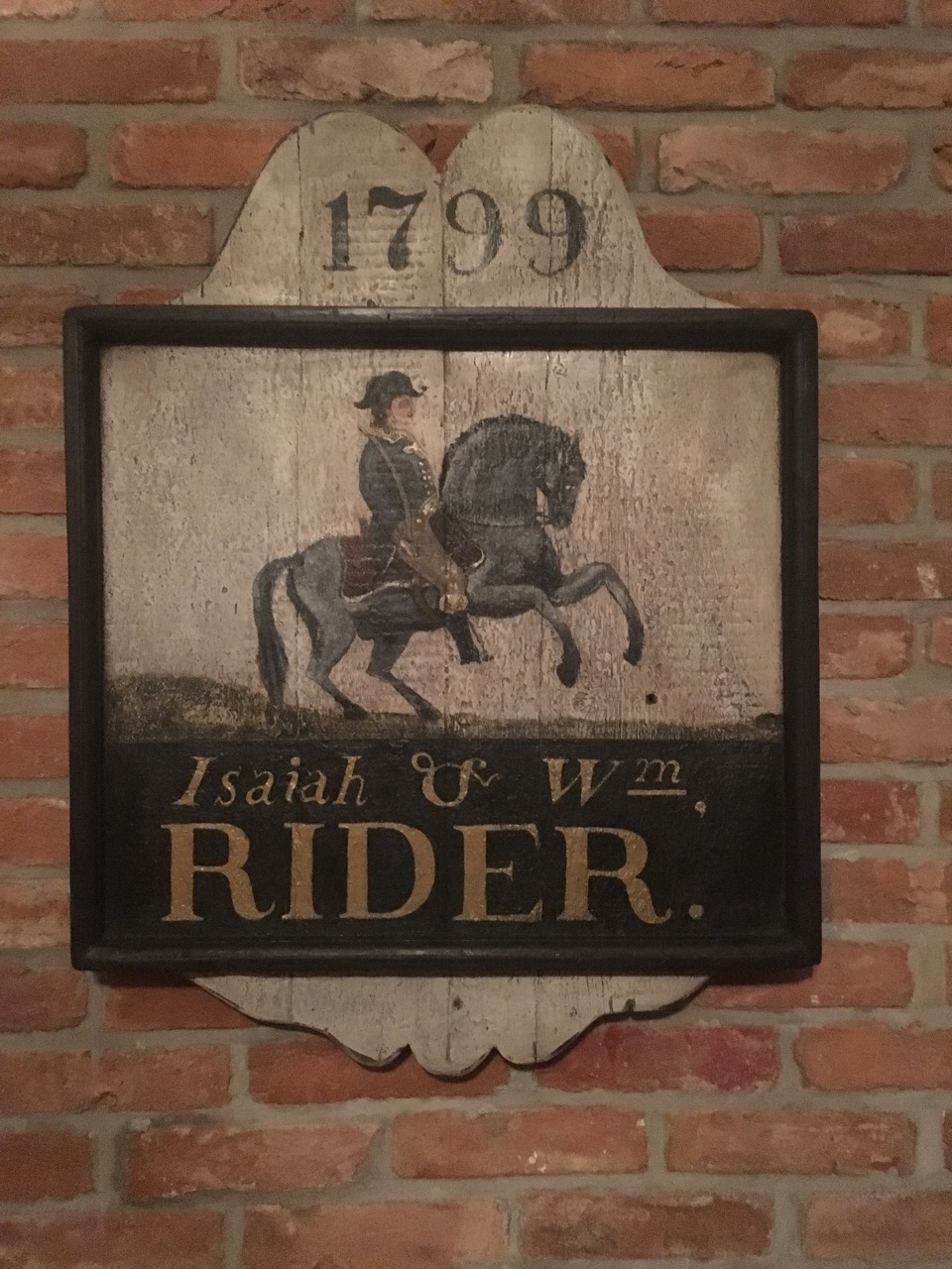
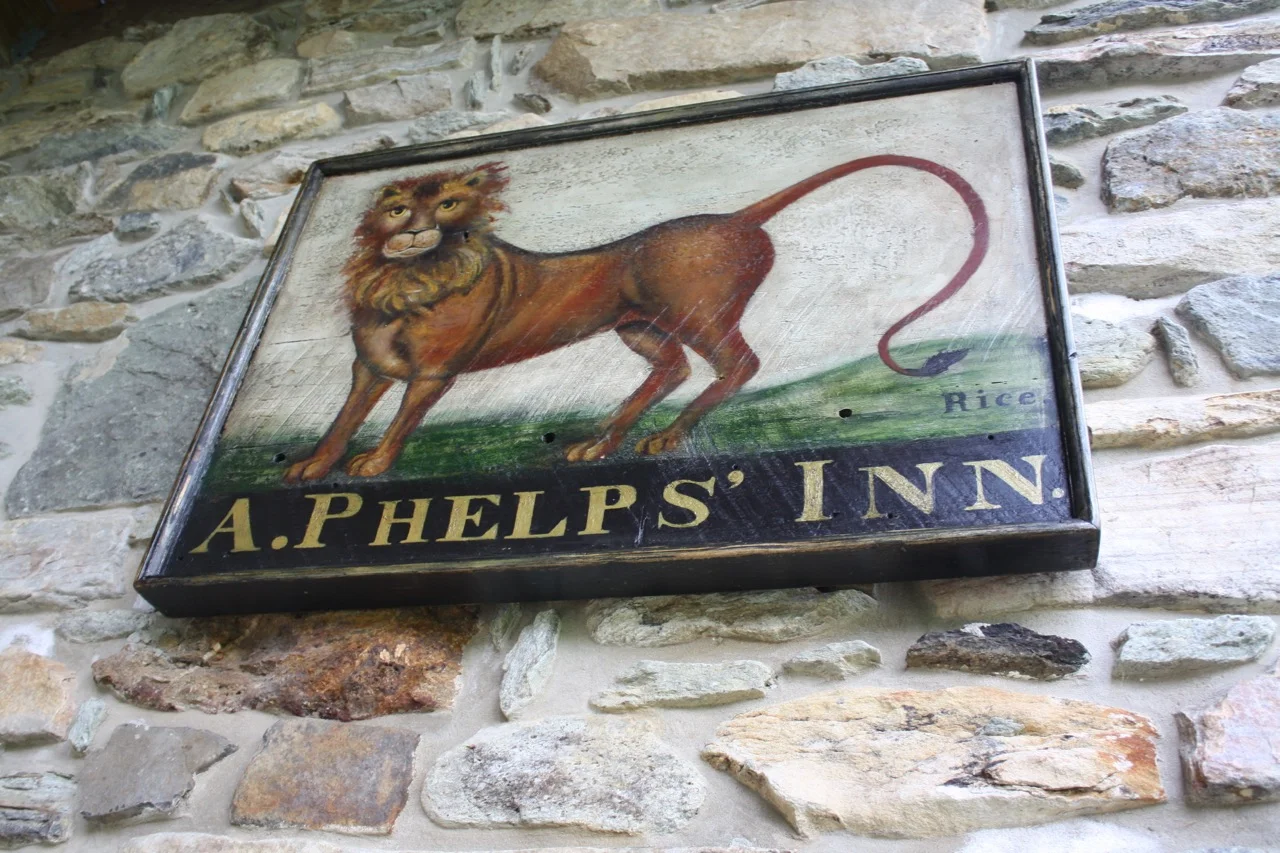
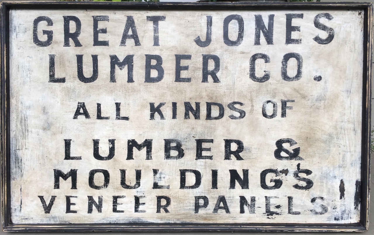
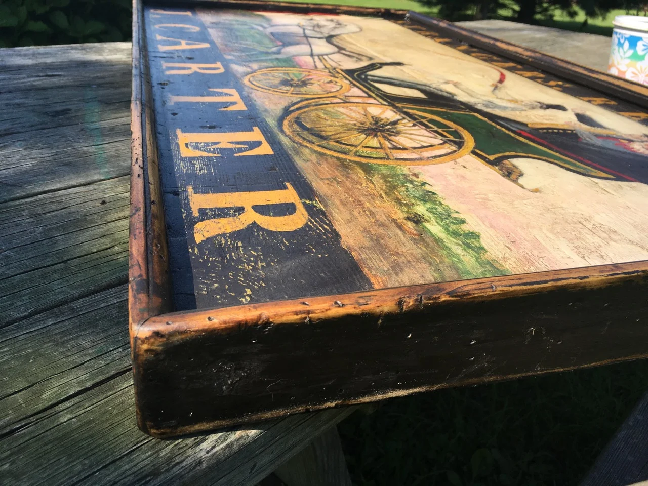
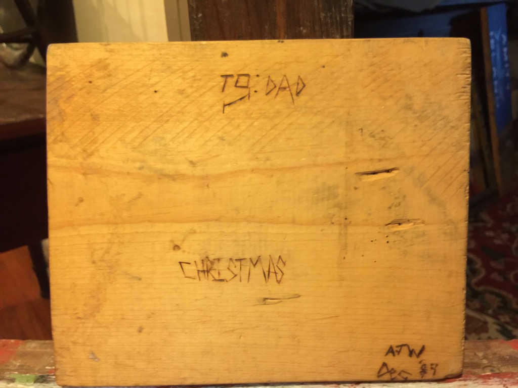
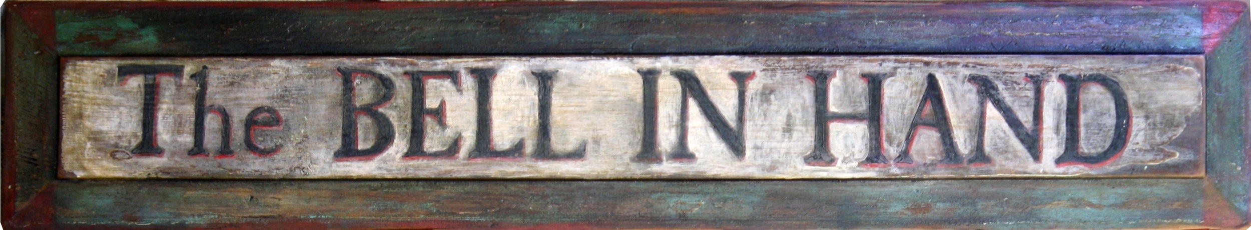
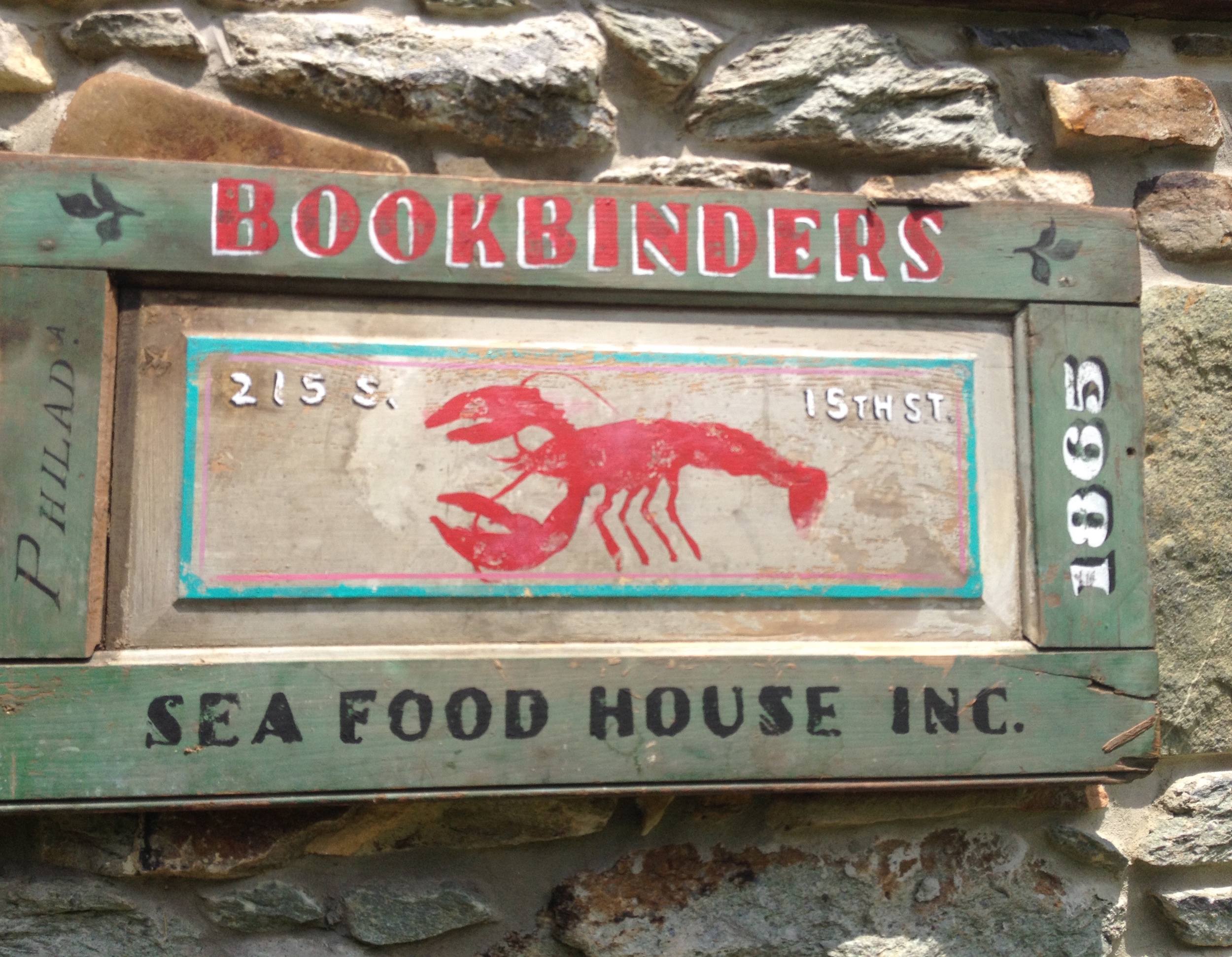
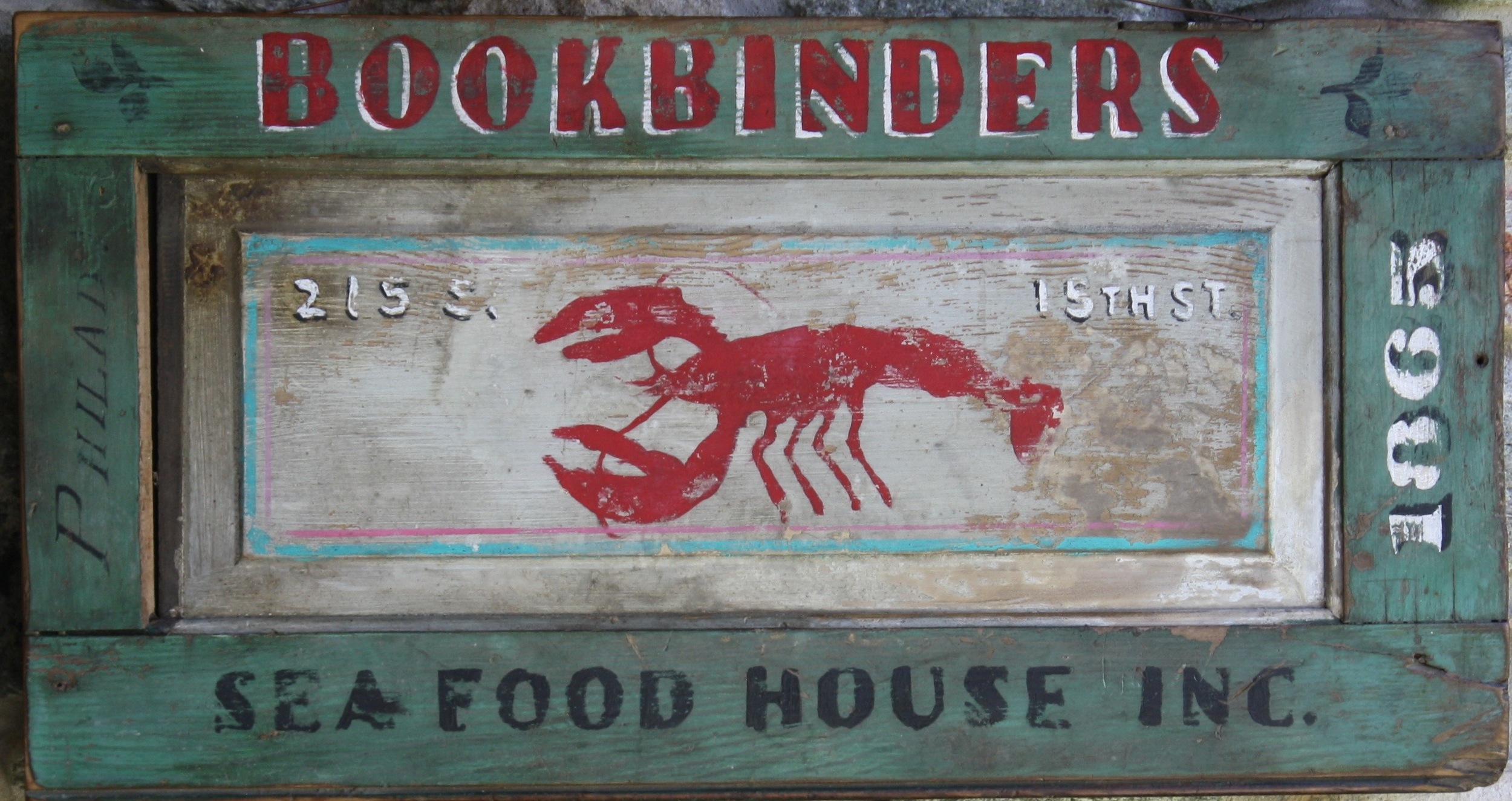
Here’s the Potpourri

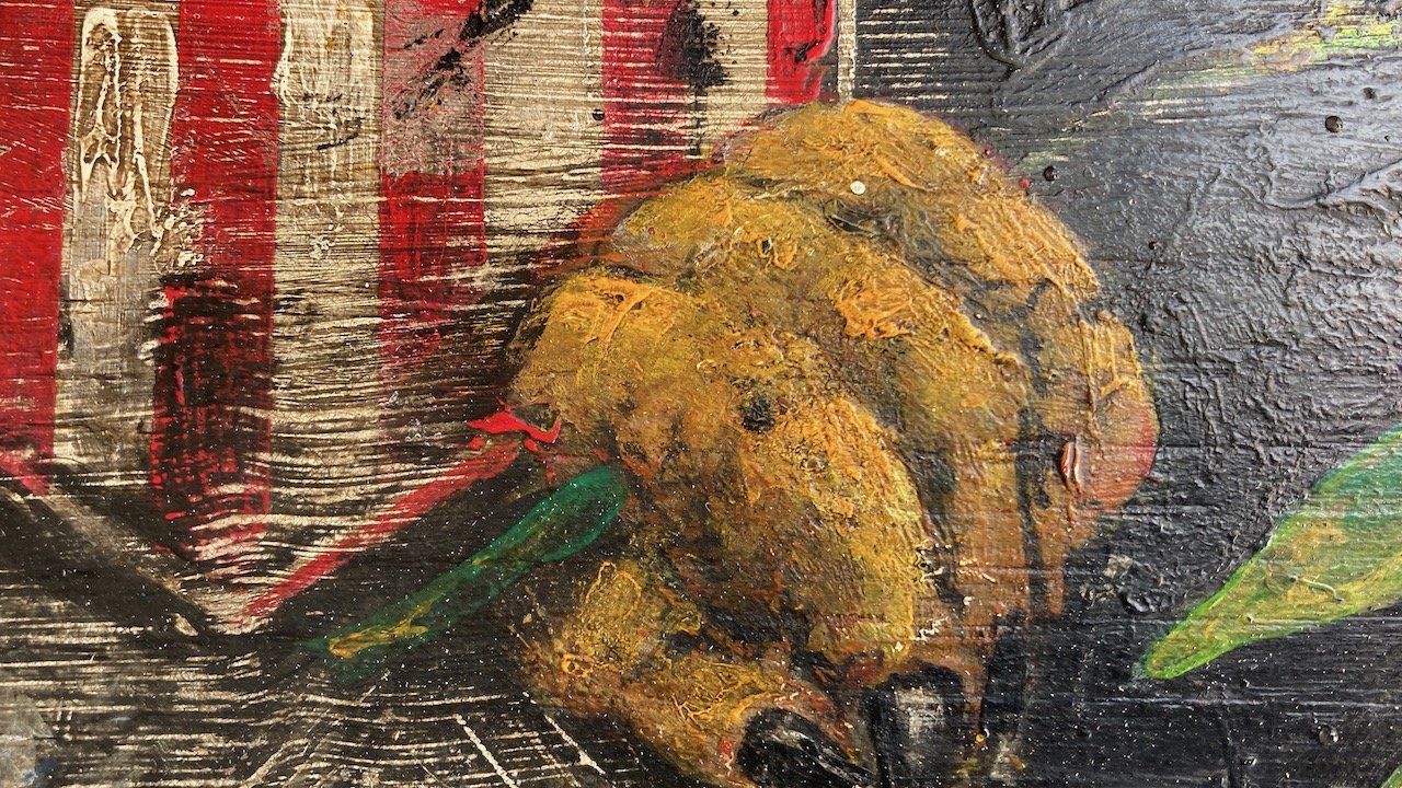
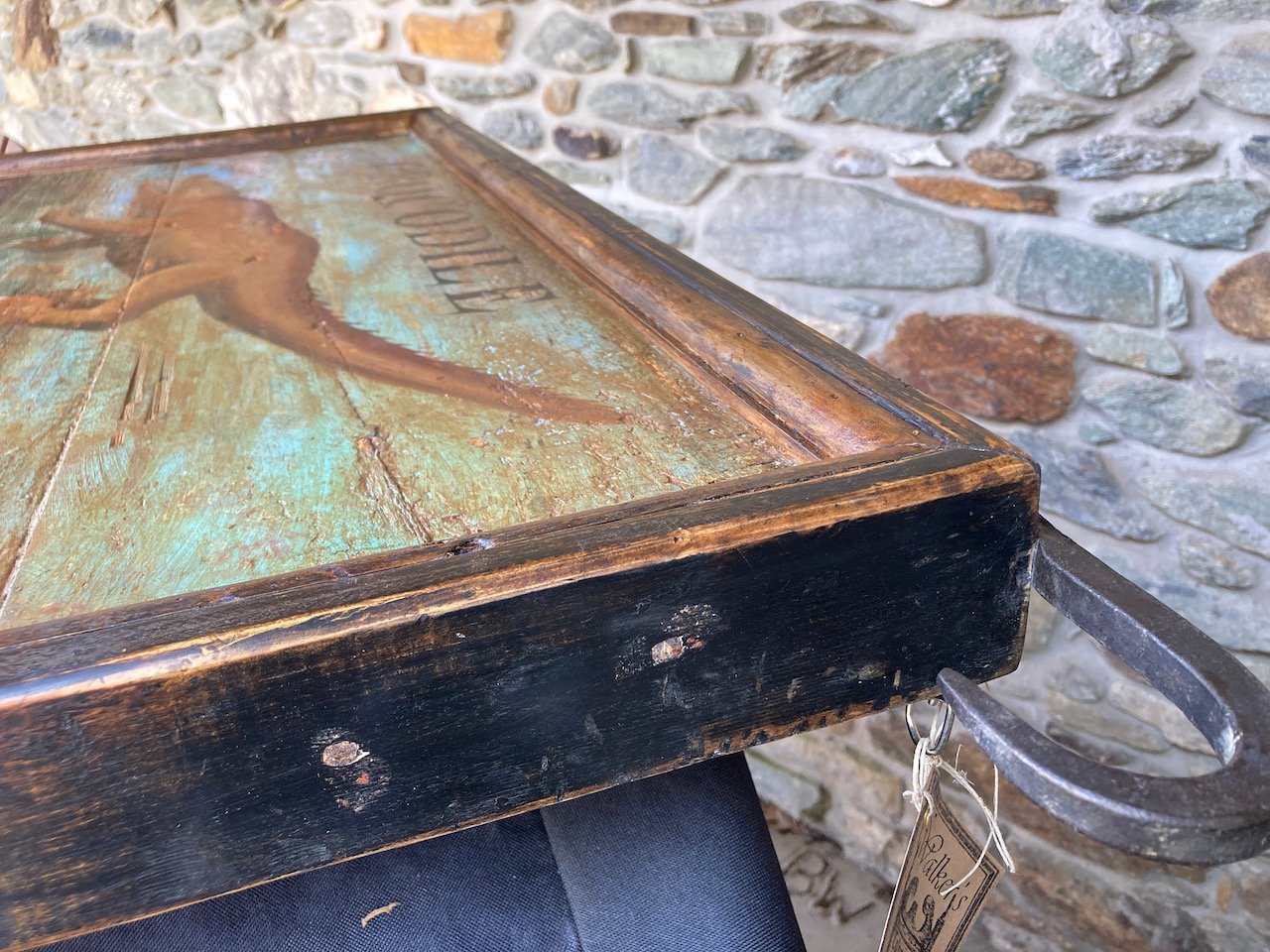
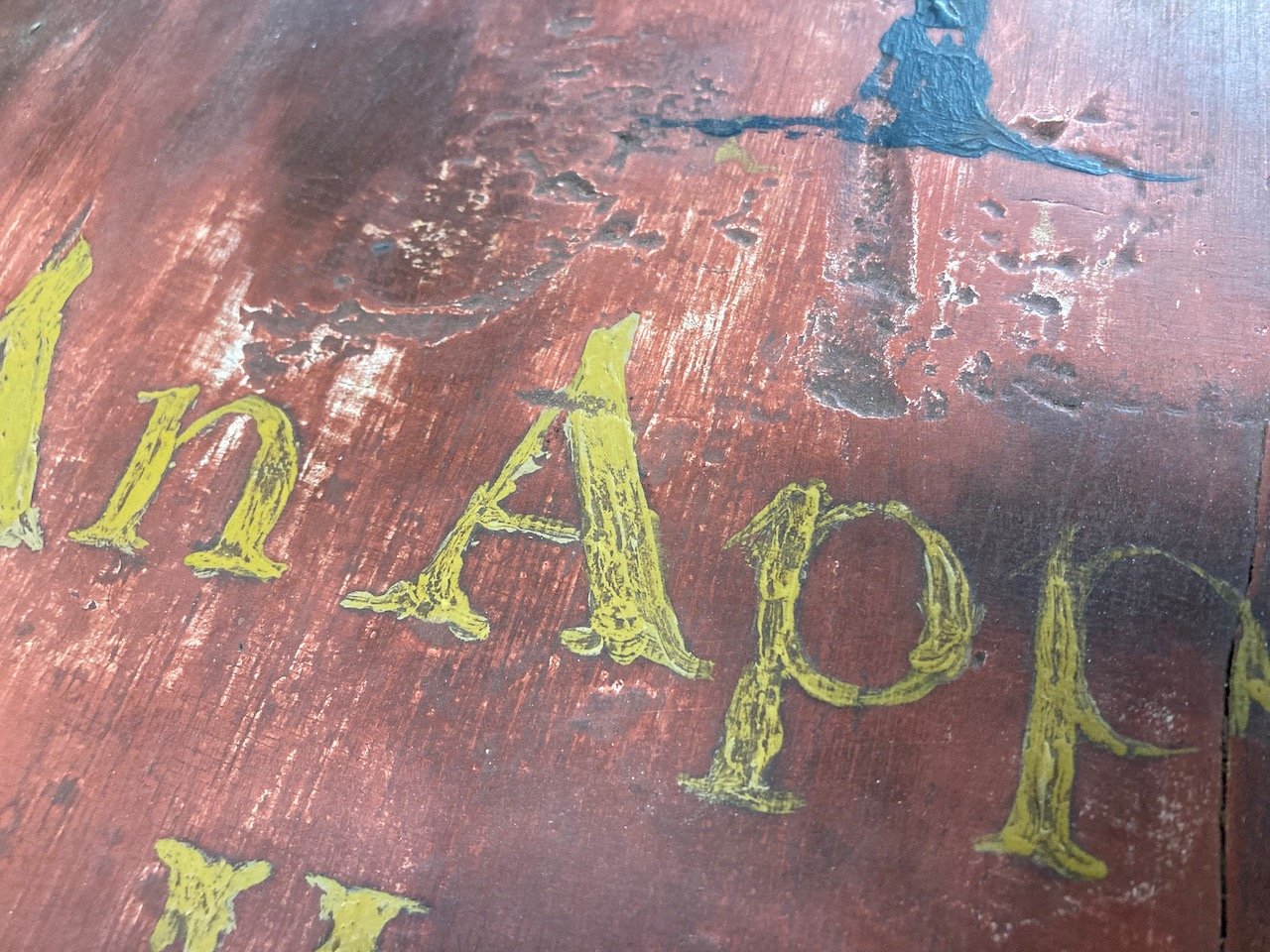
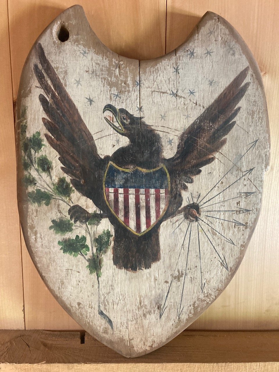
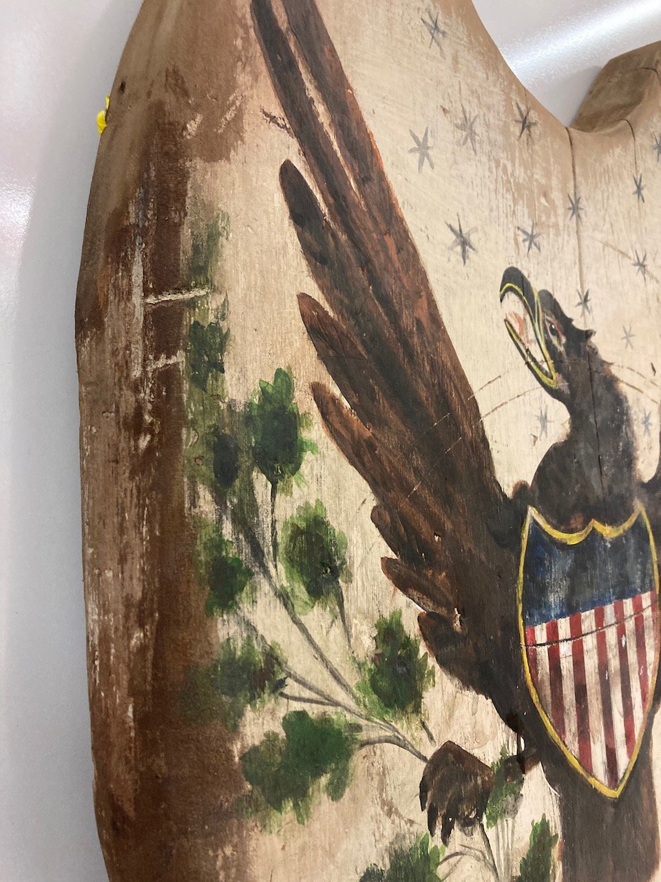
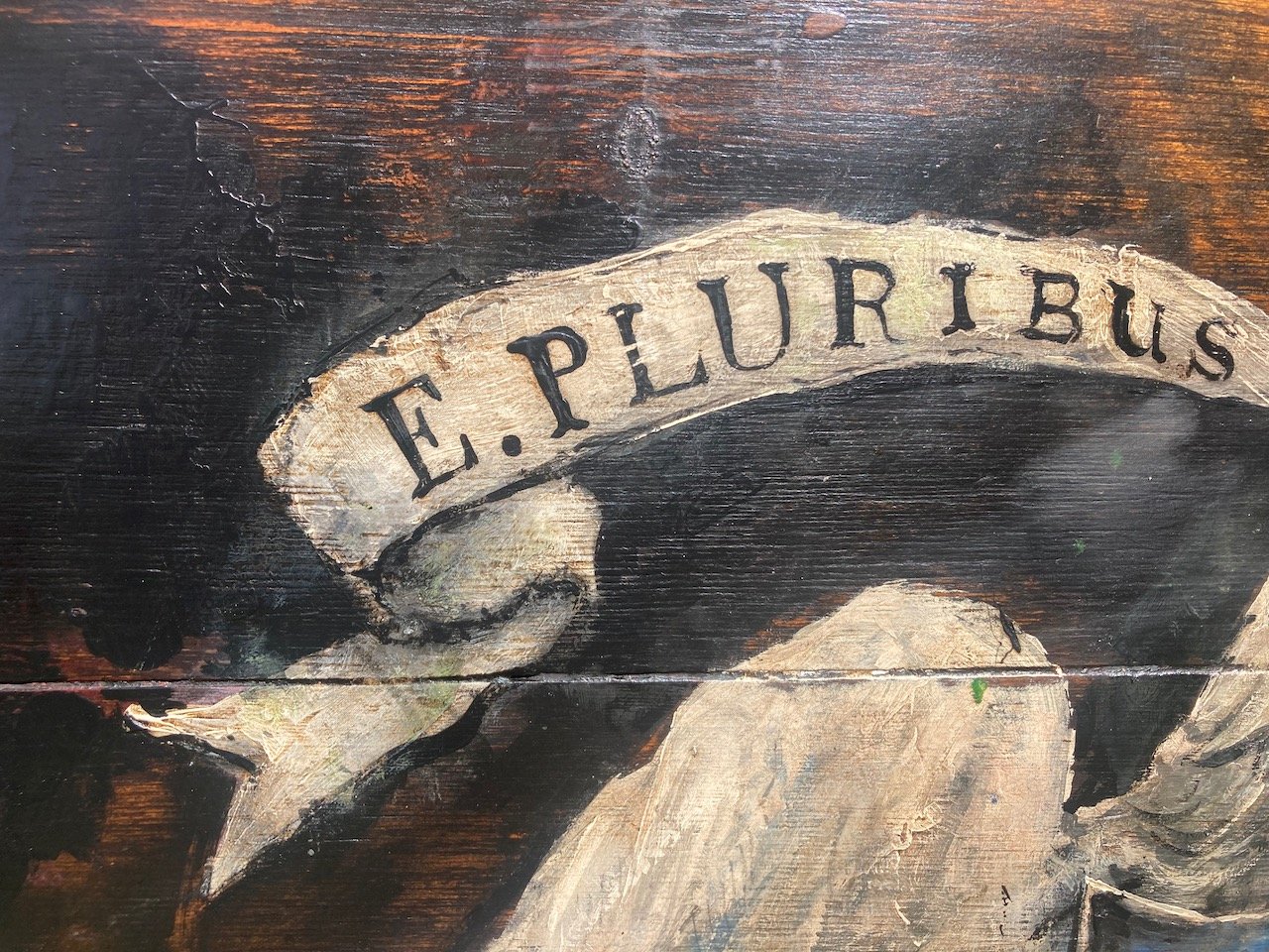
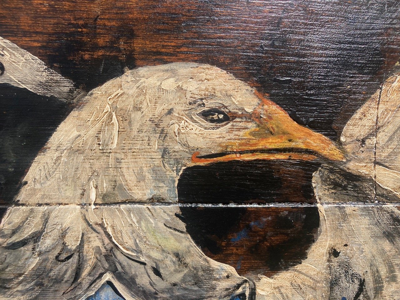
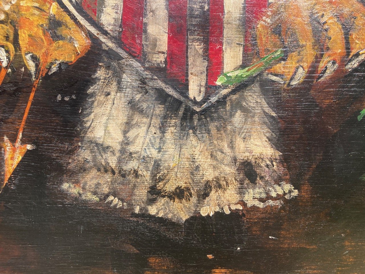
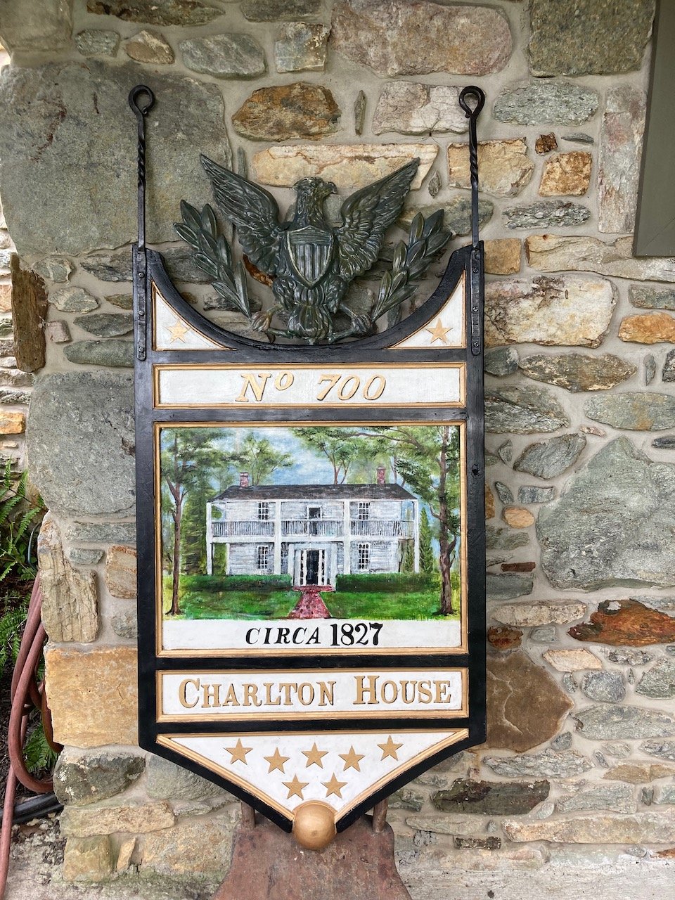
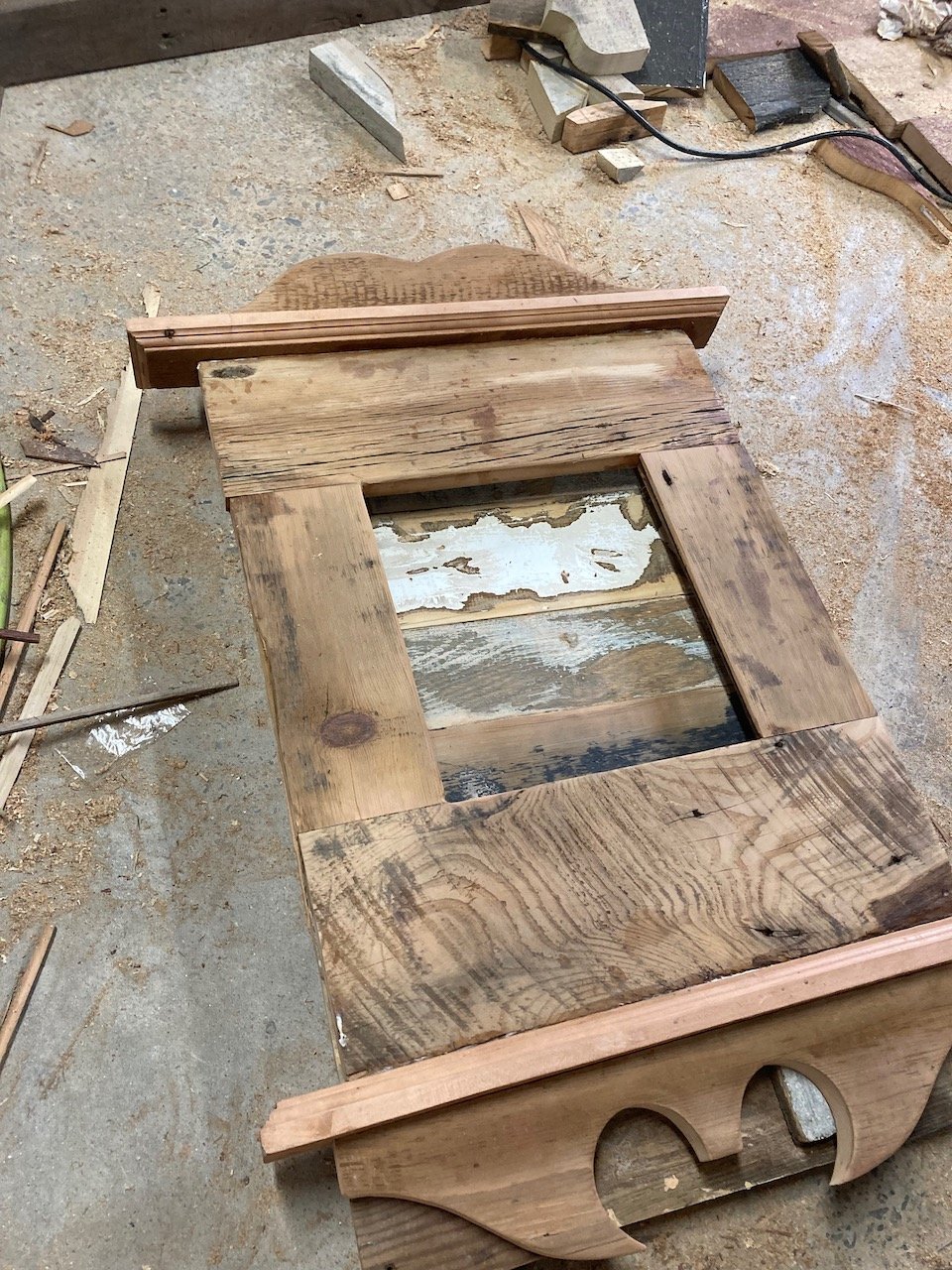
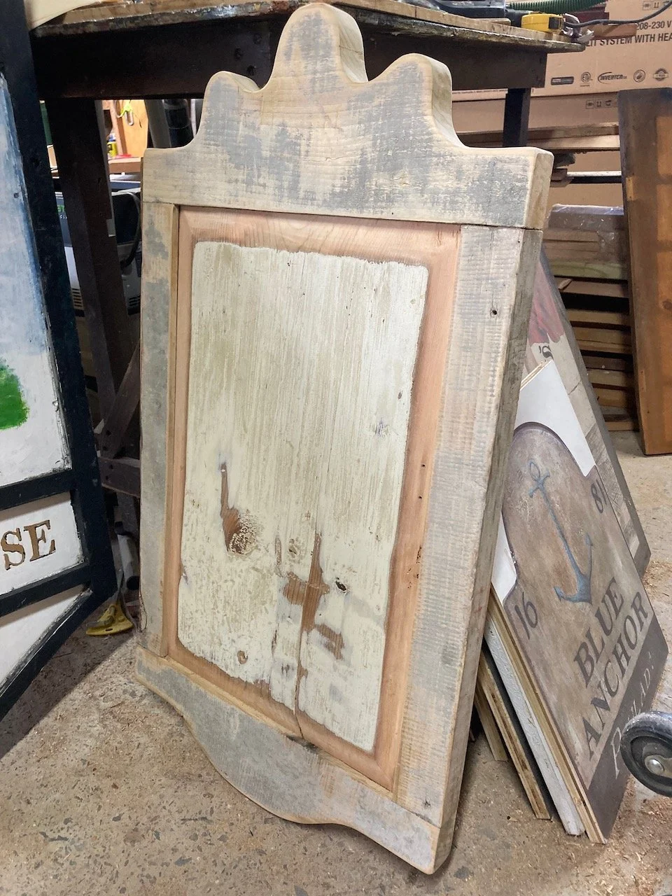
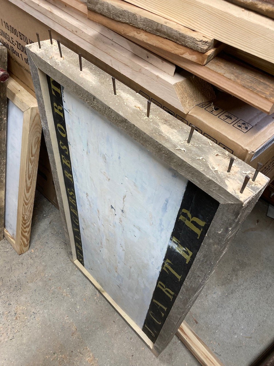
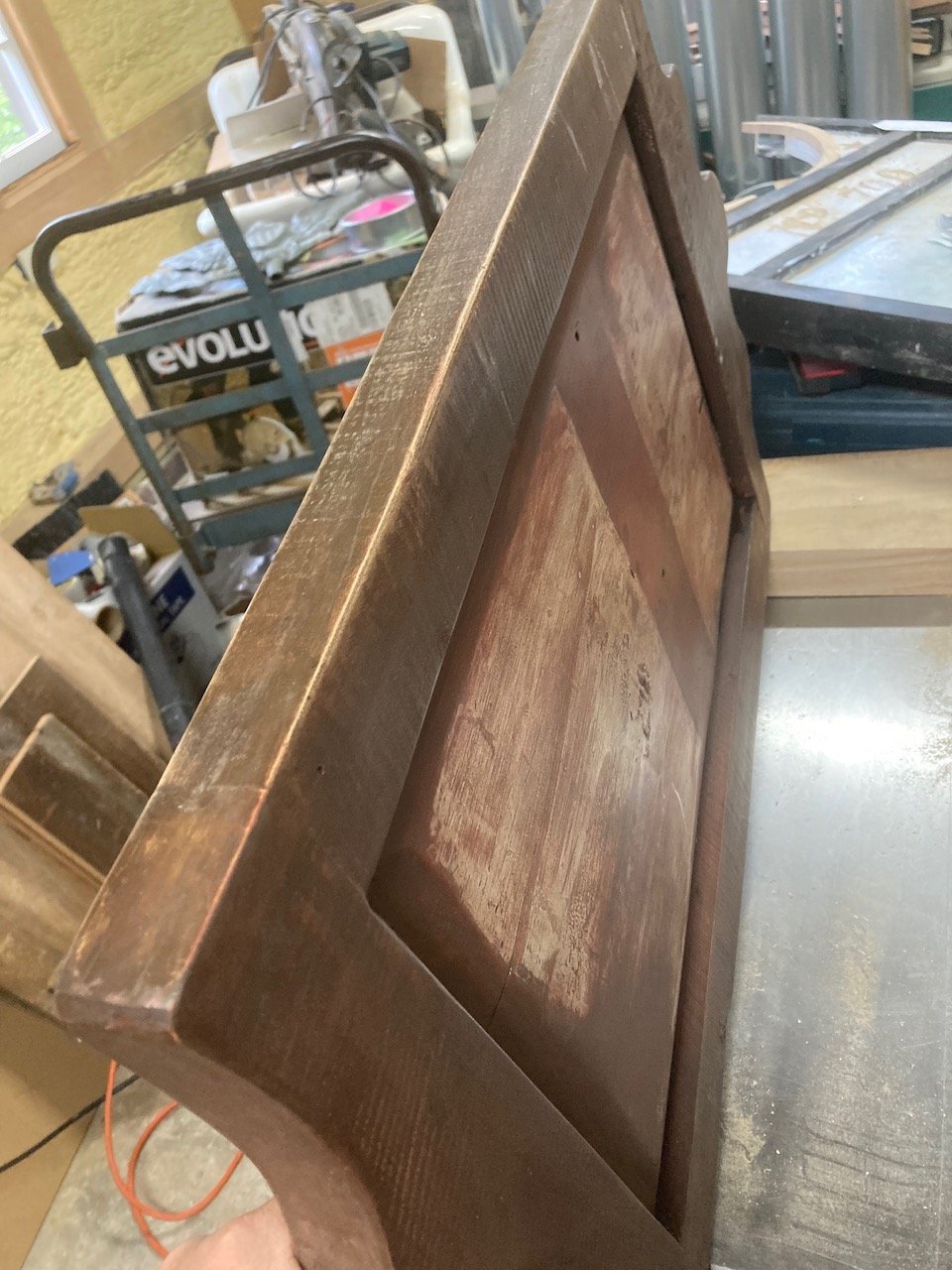
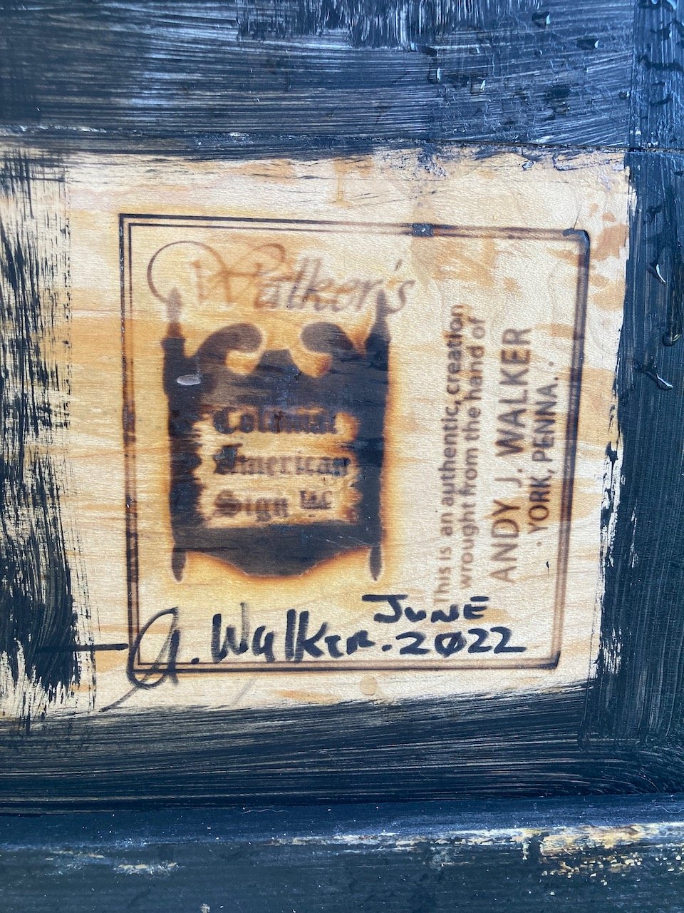
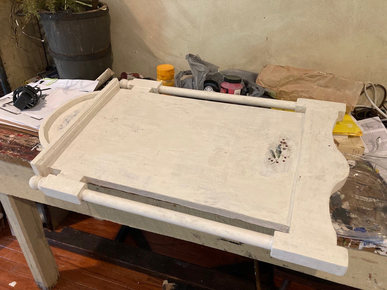
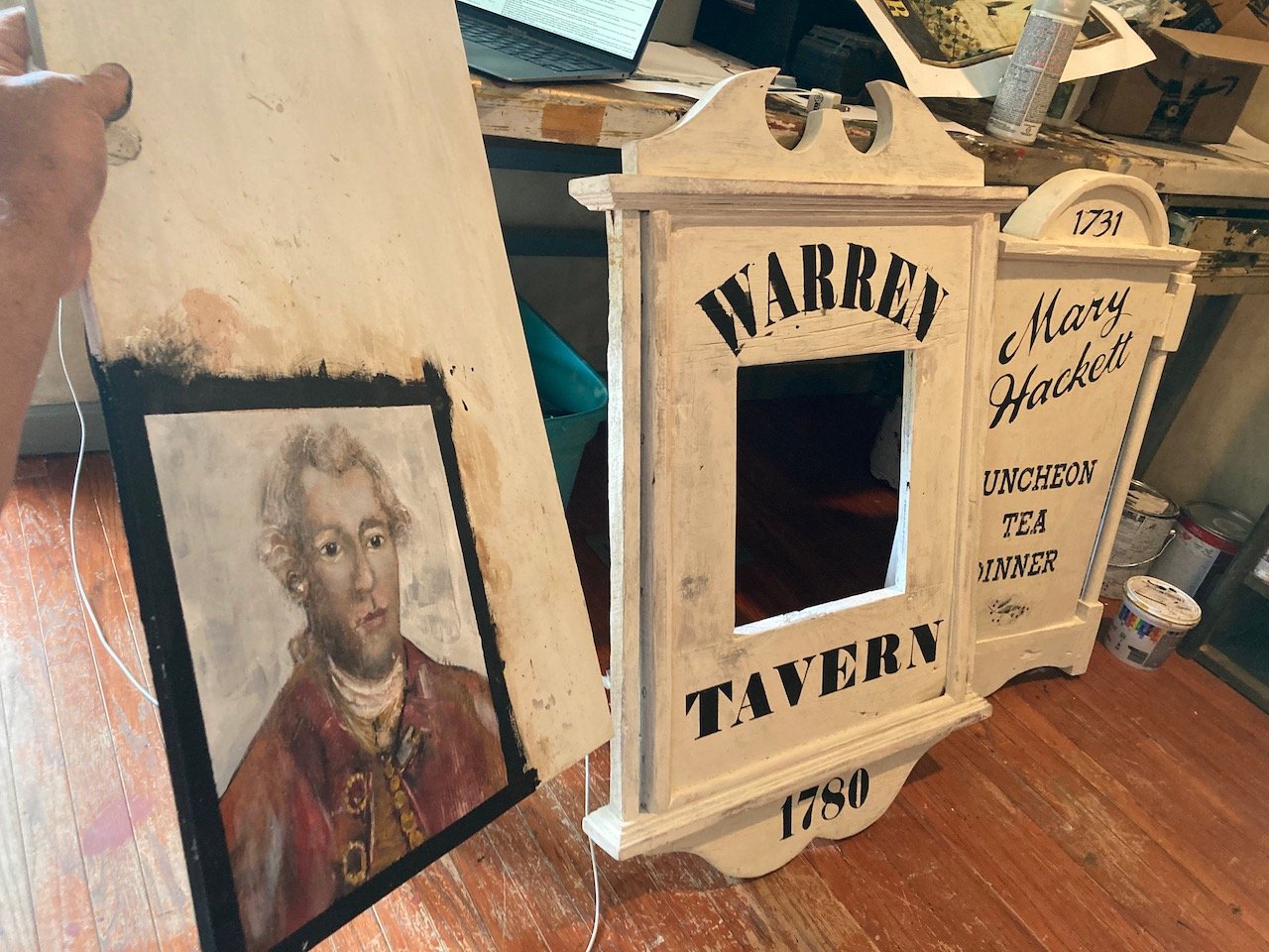
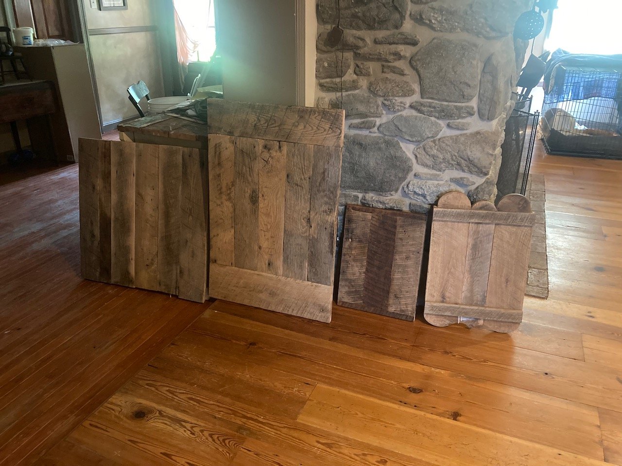
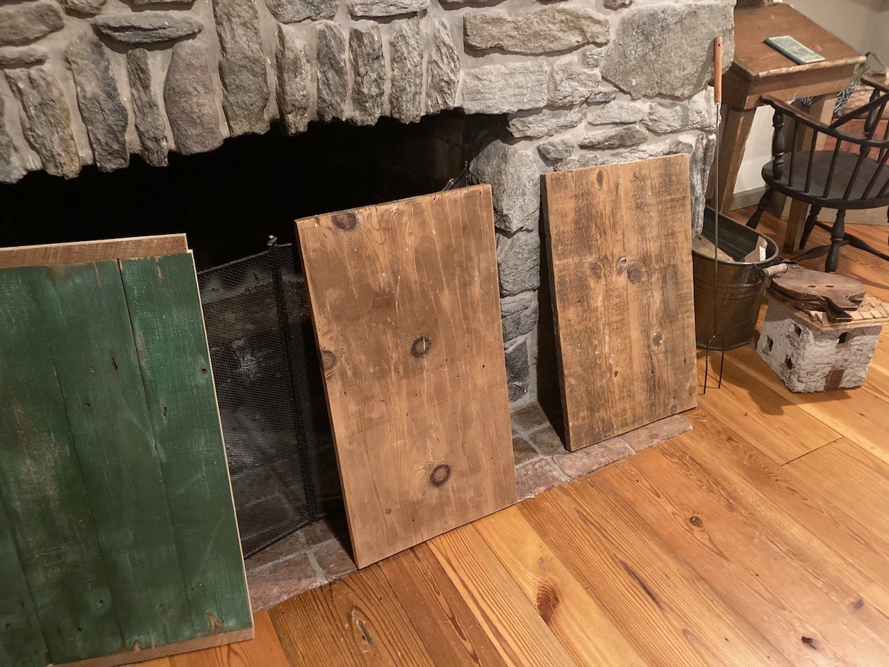
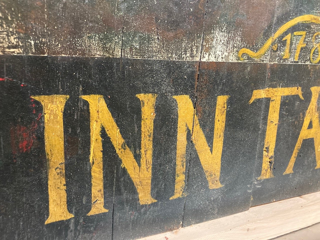
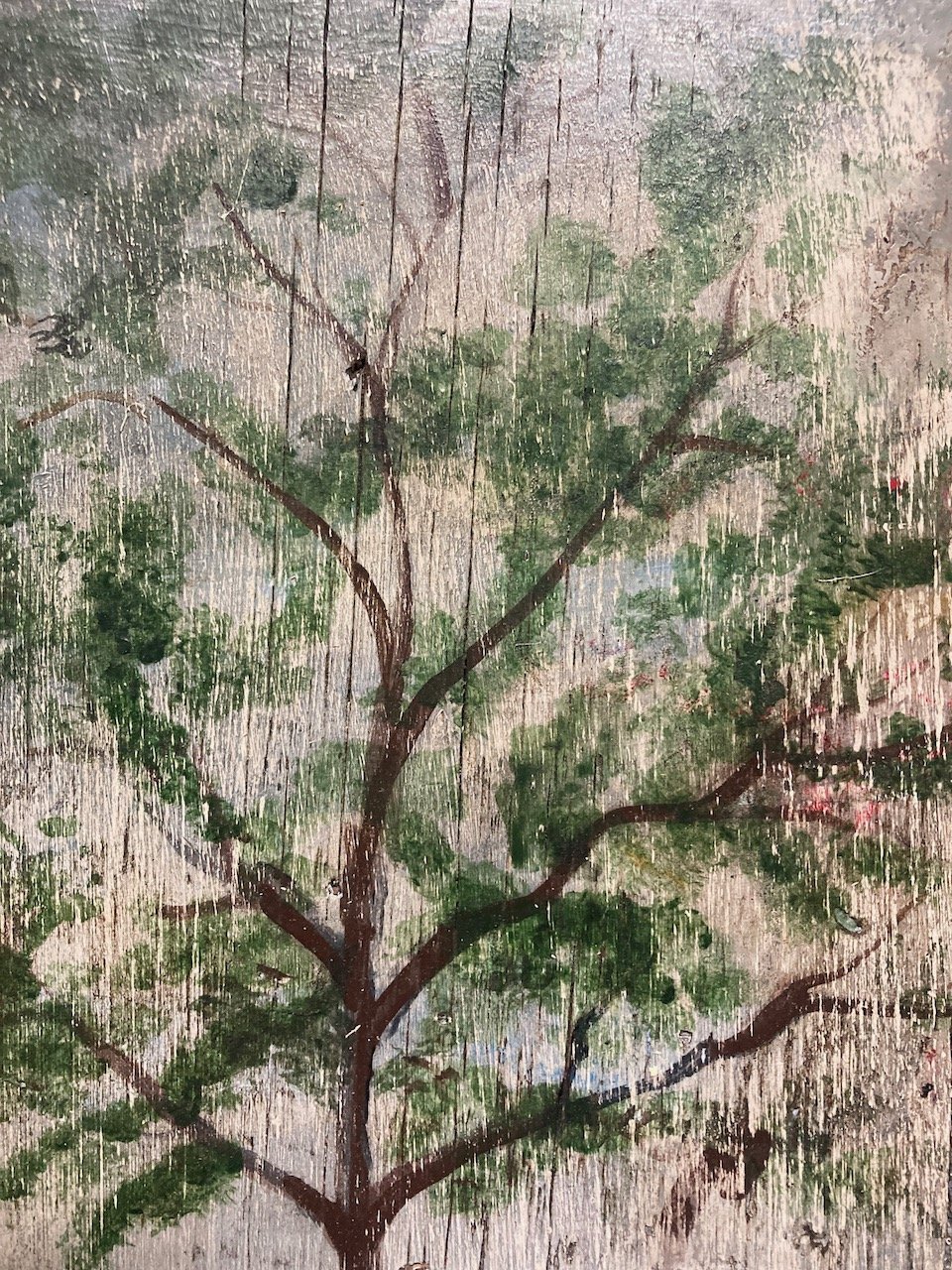
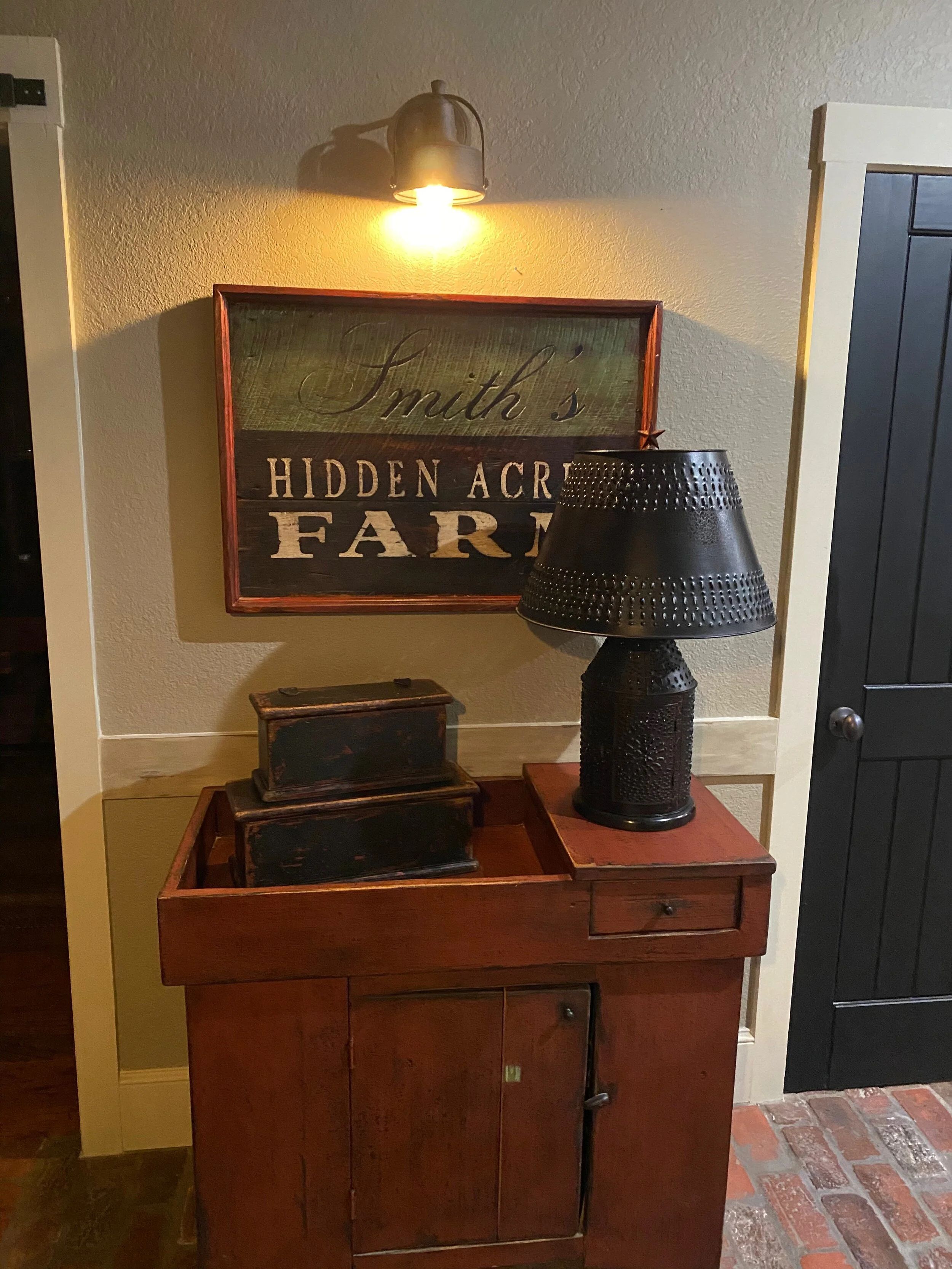
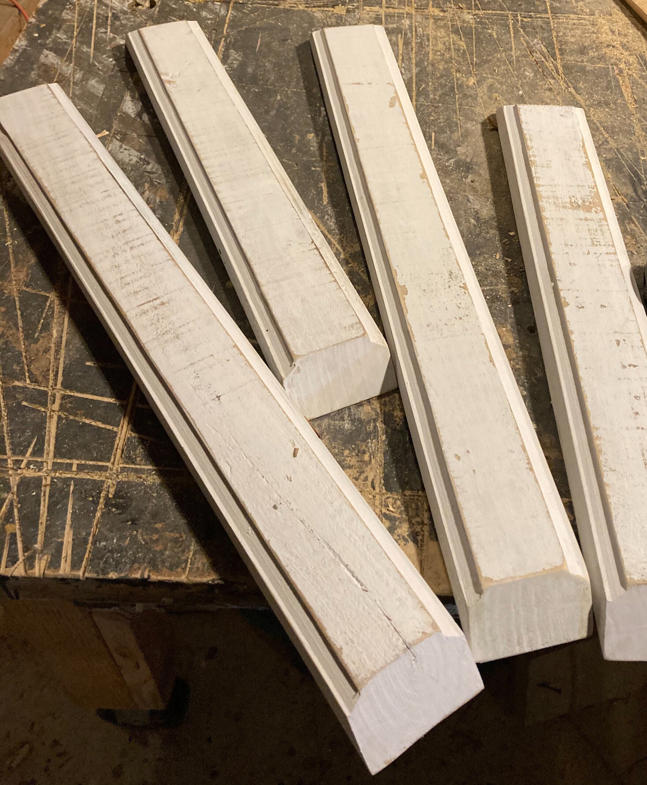
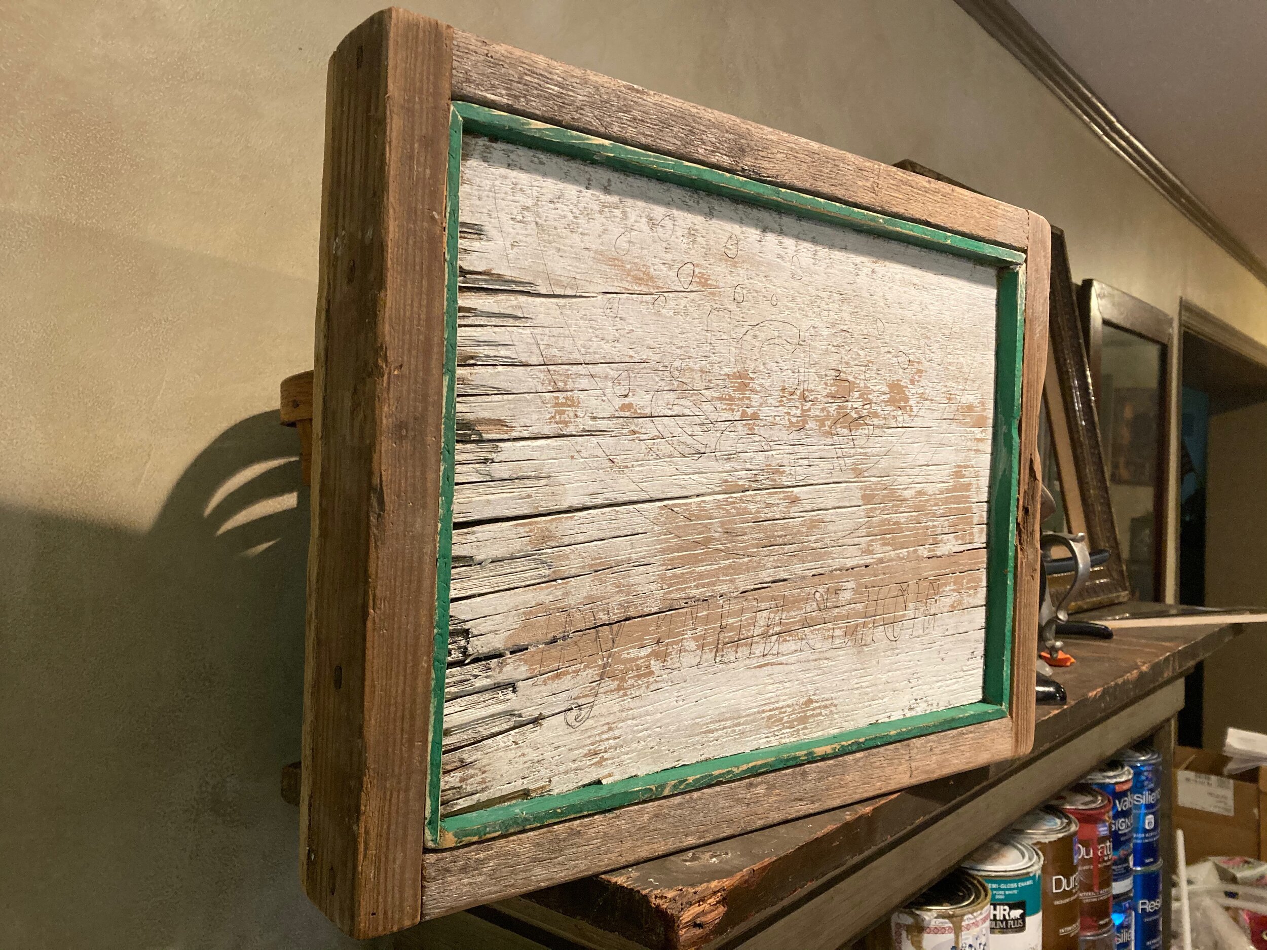
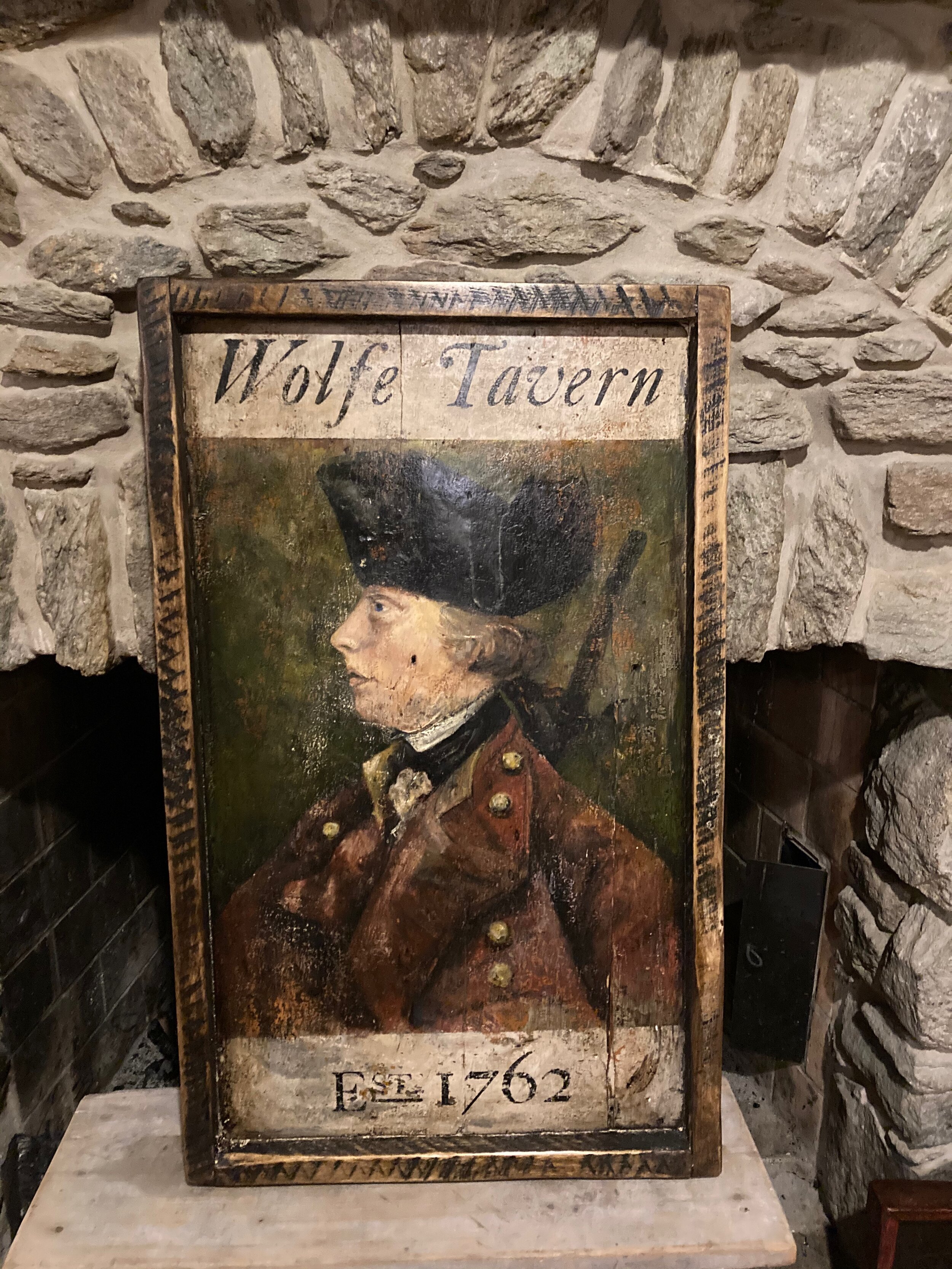
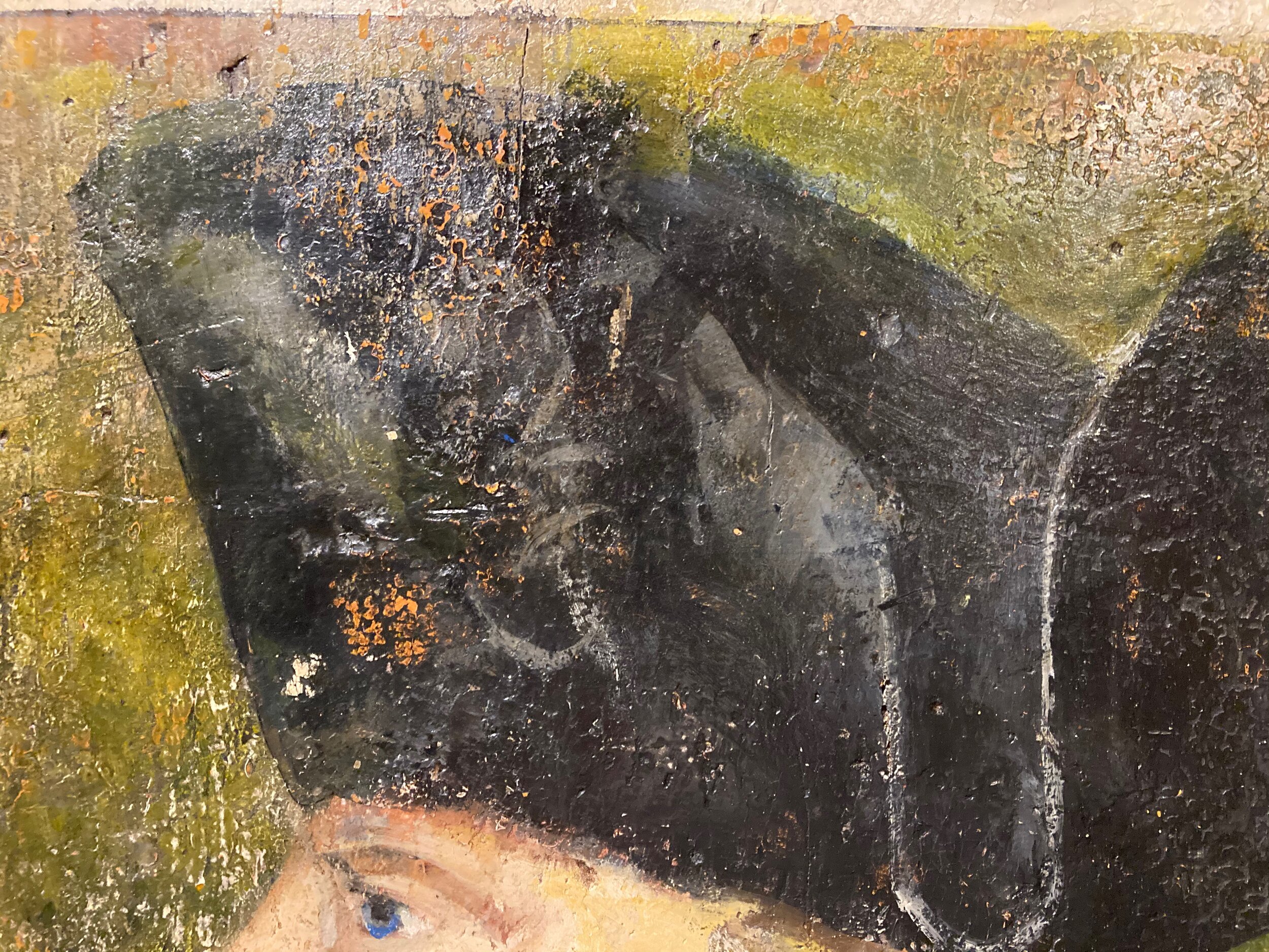
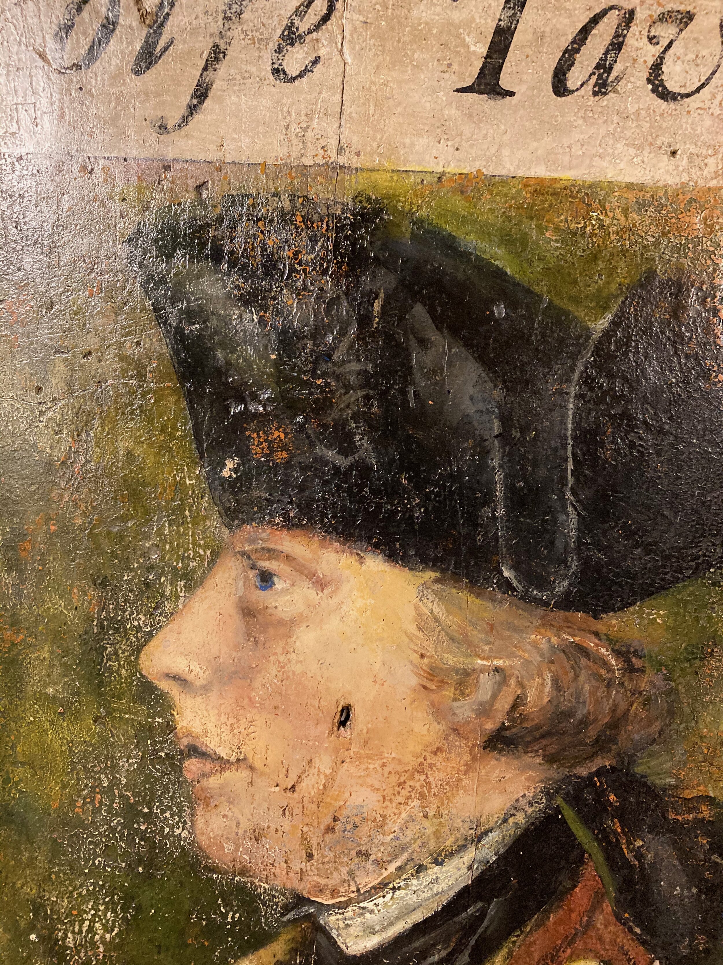
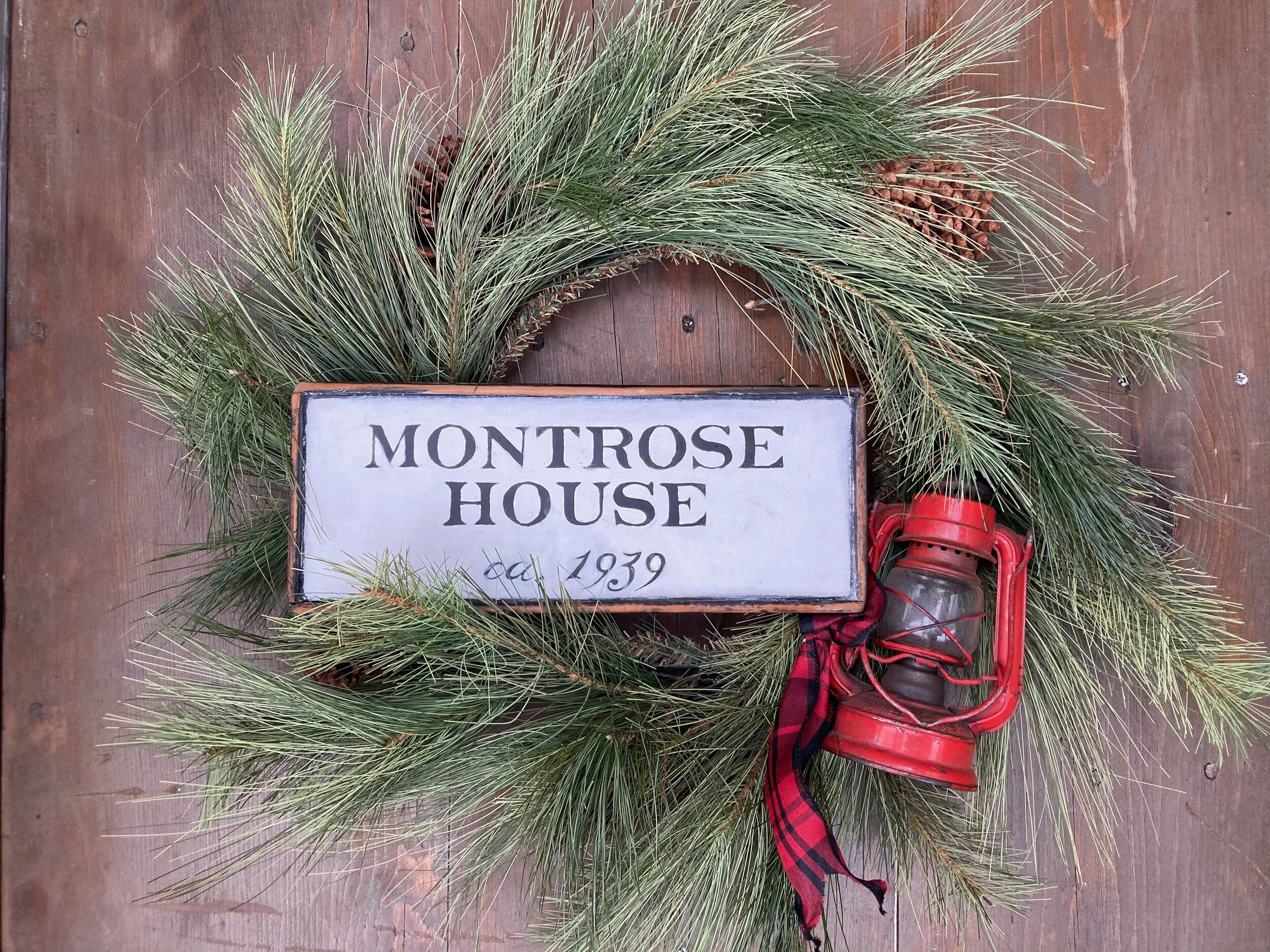
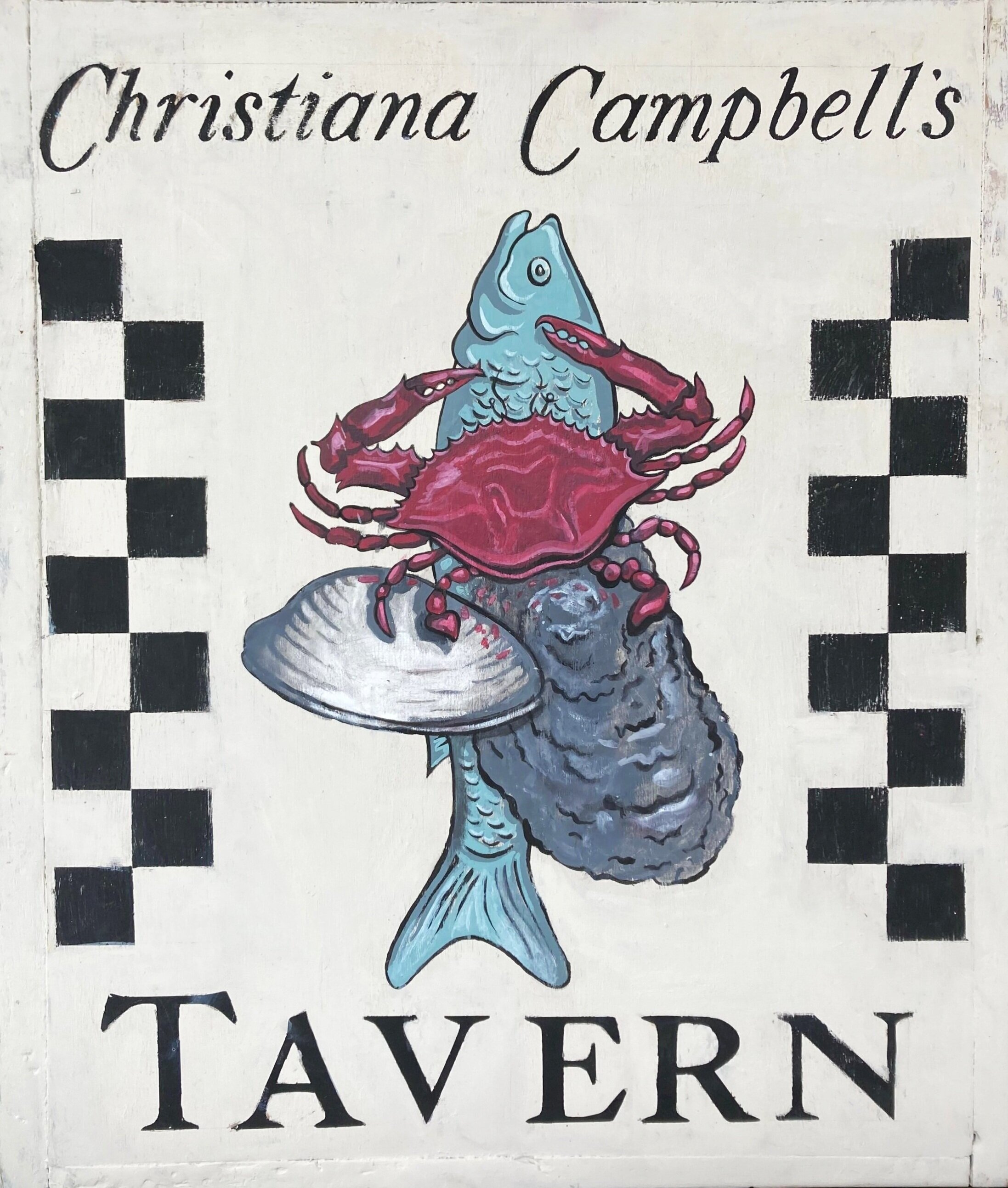
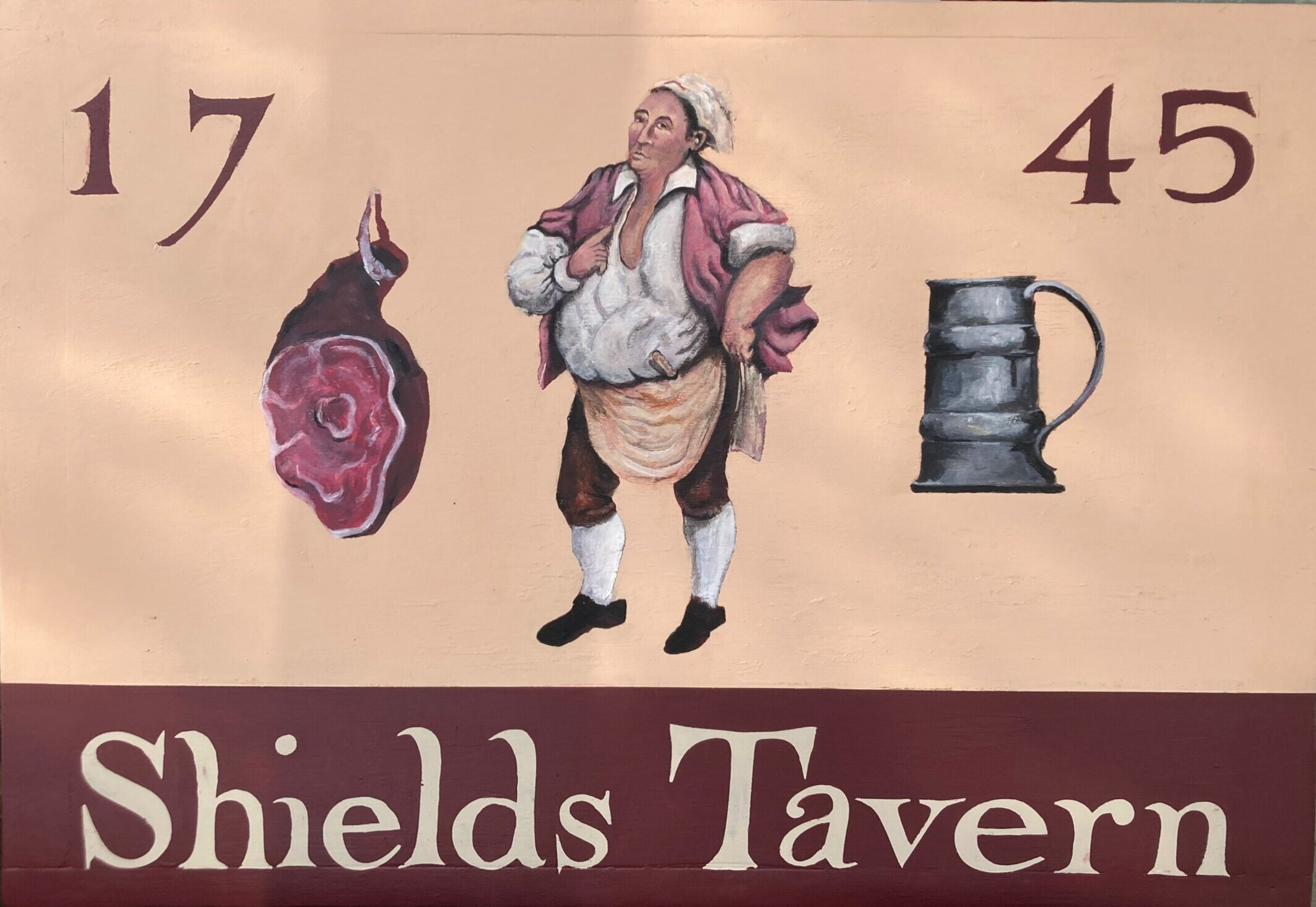
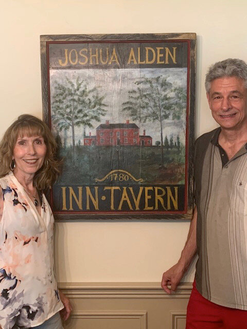
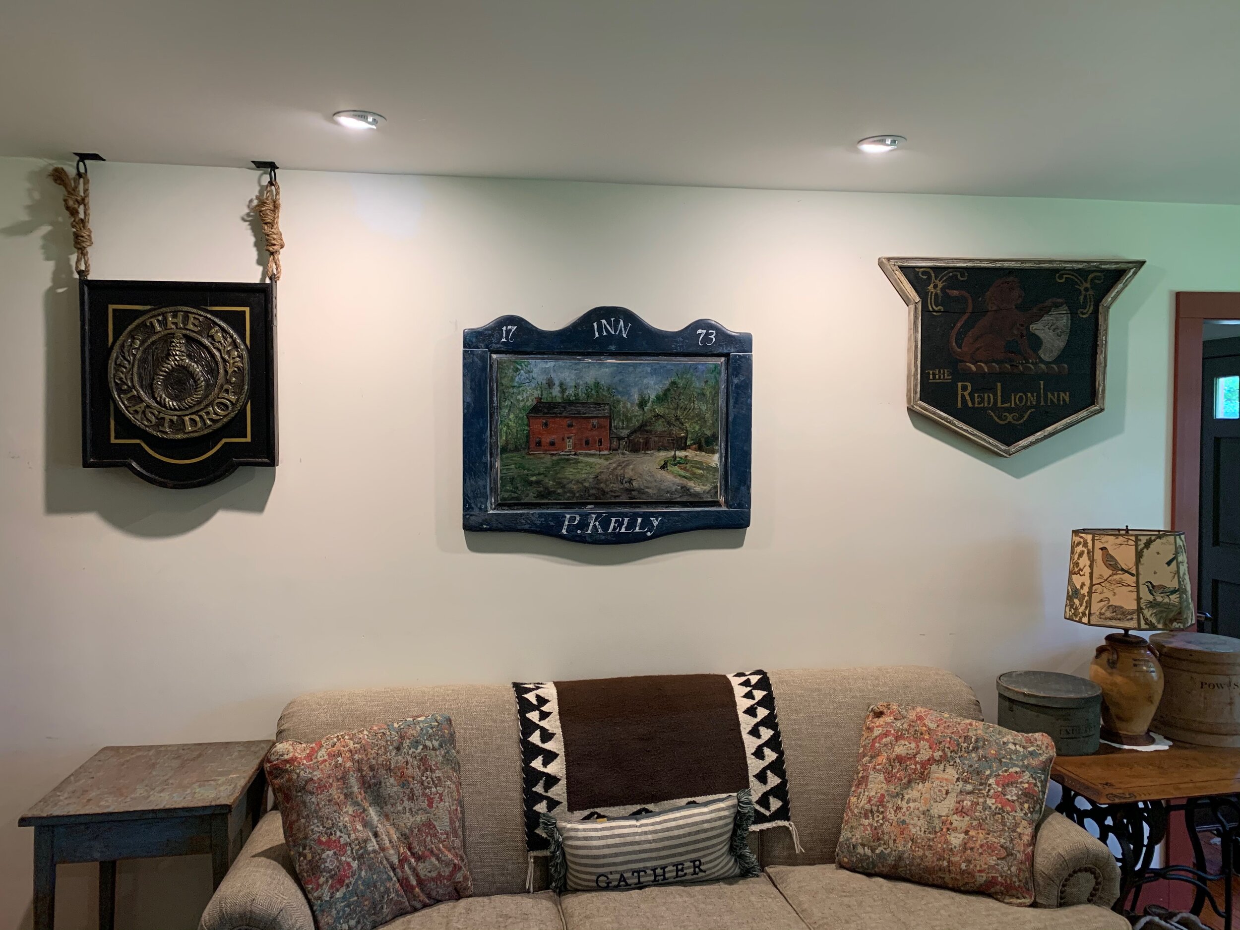
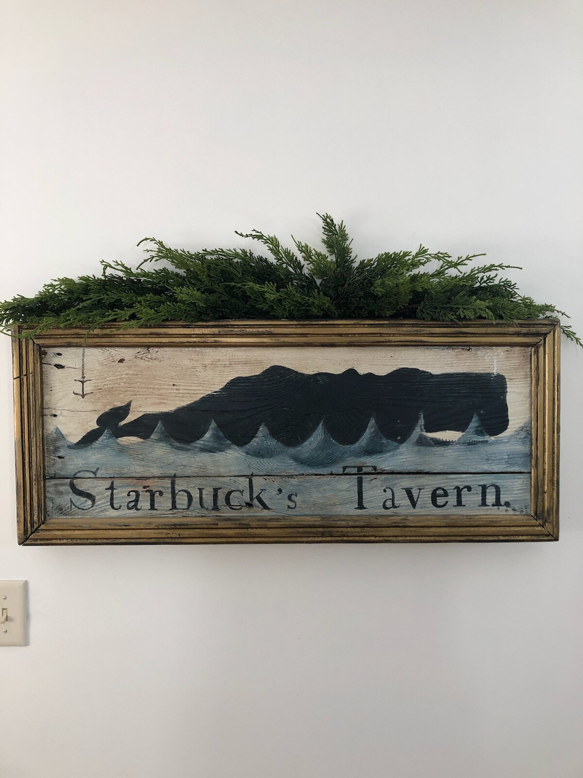
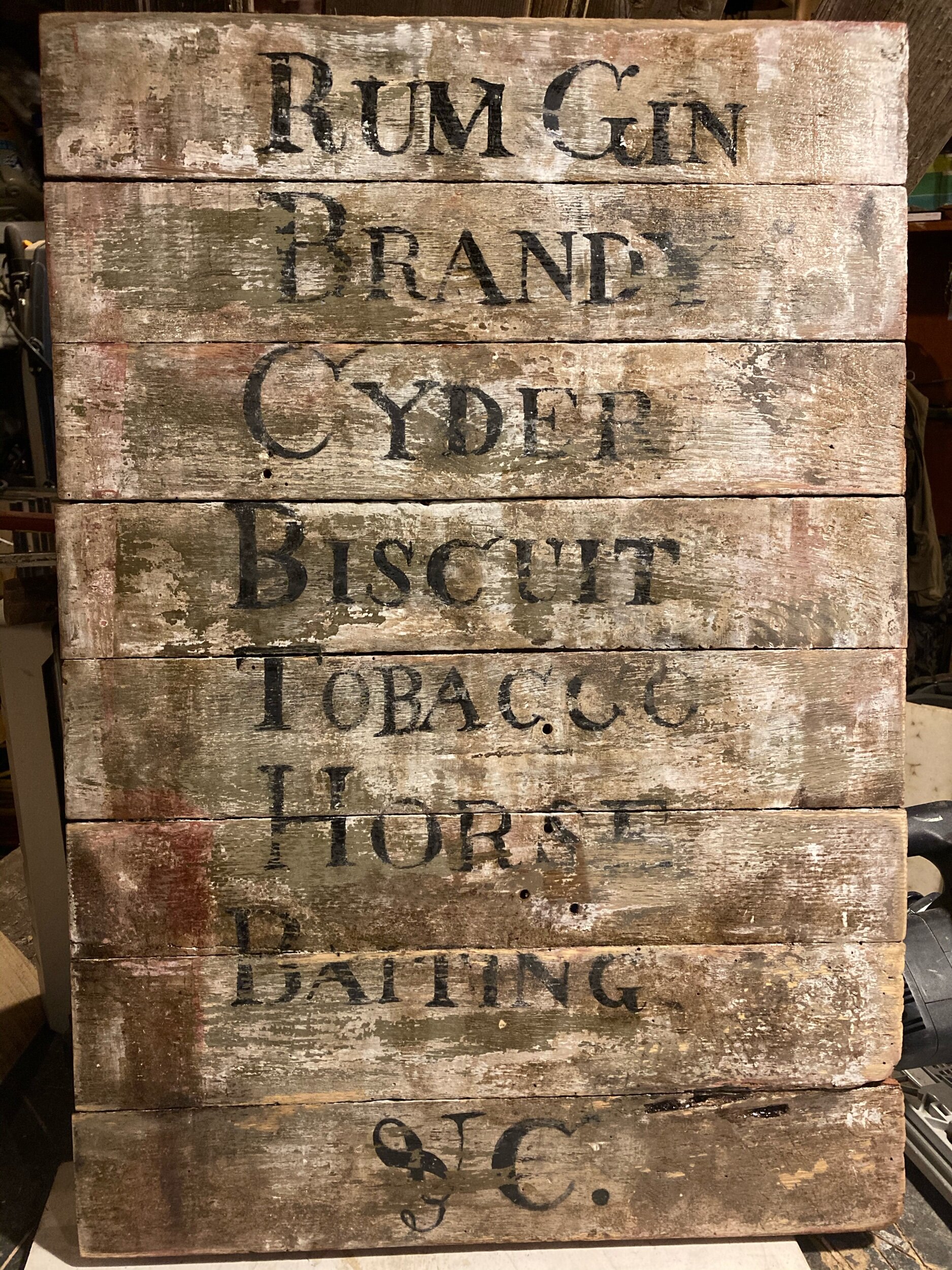
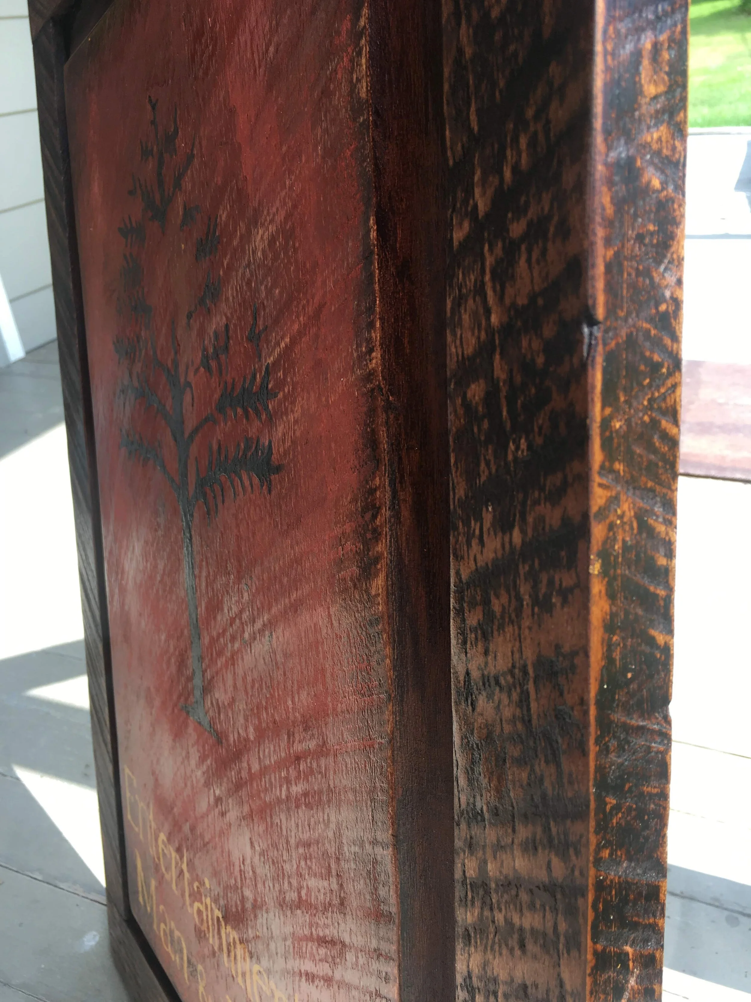
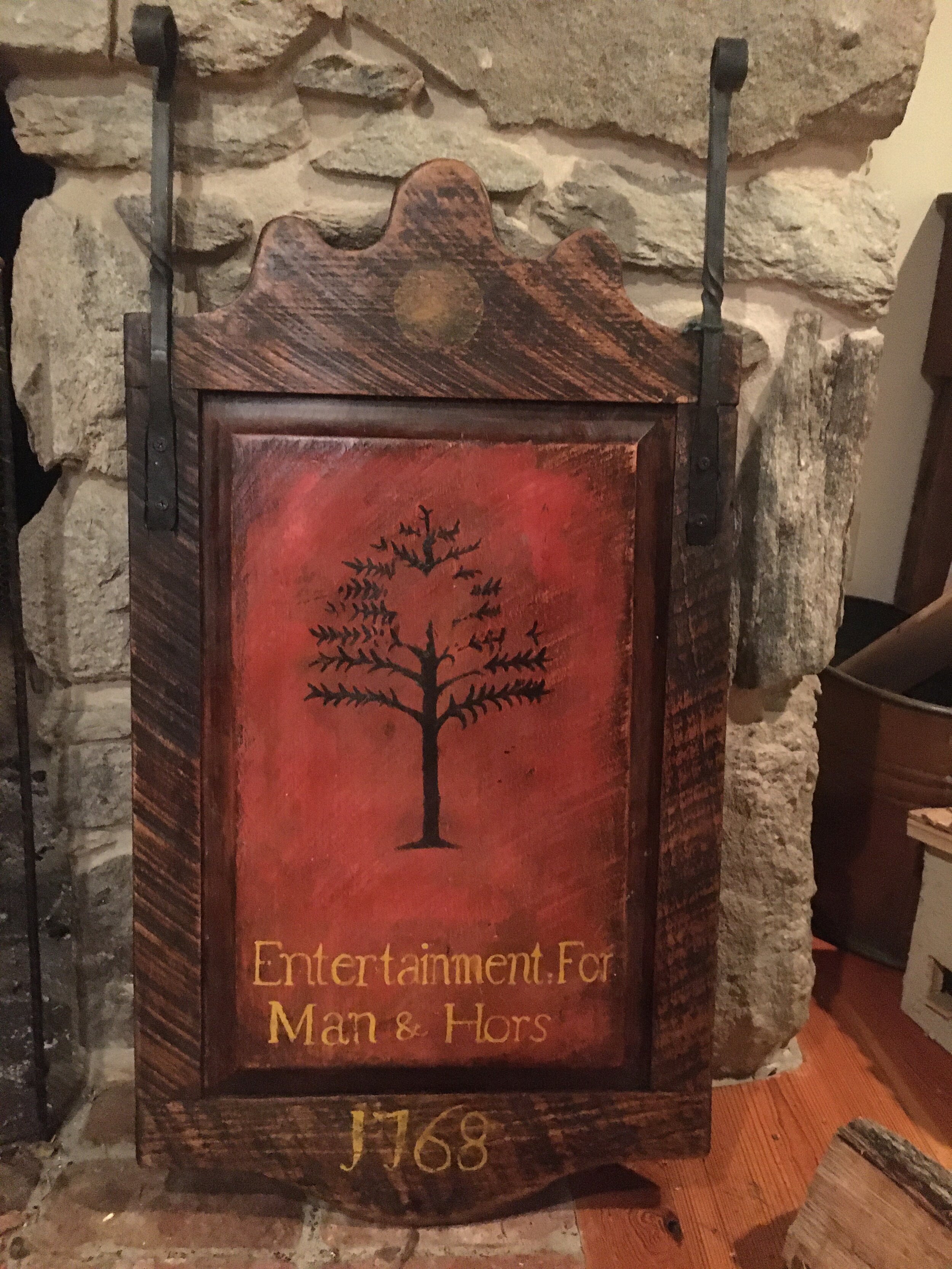
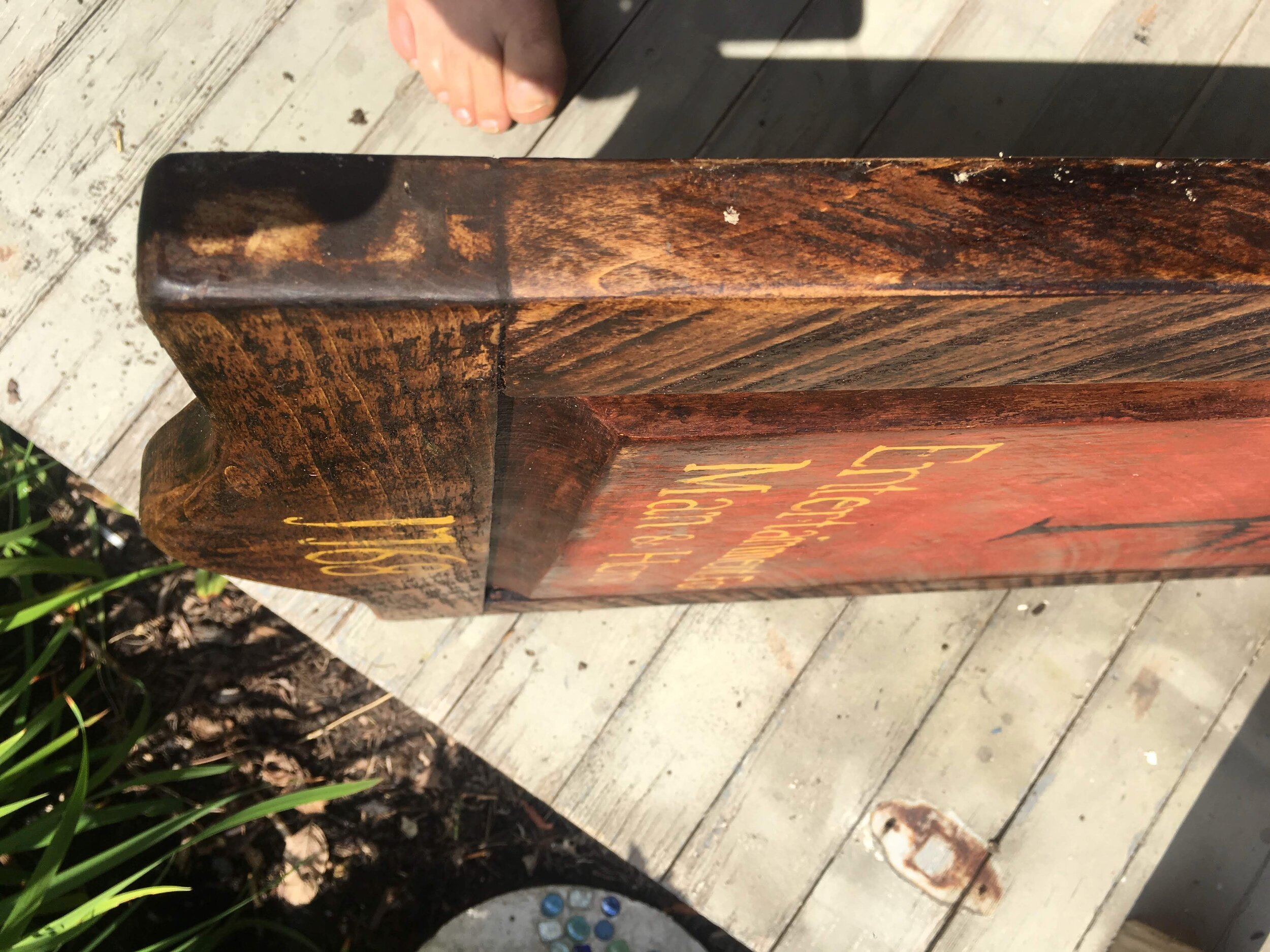
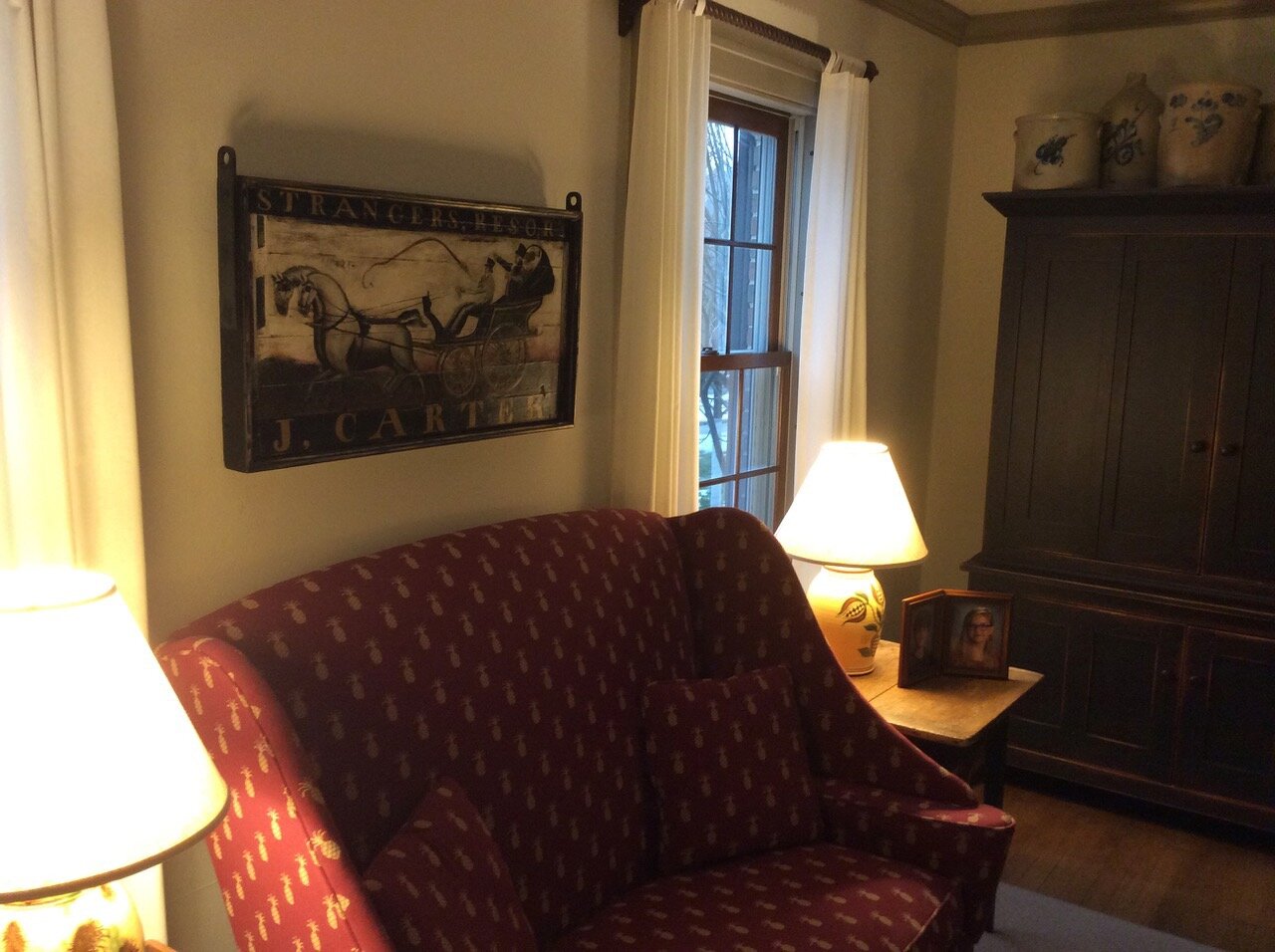
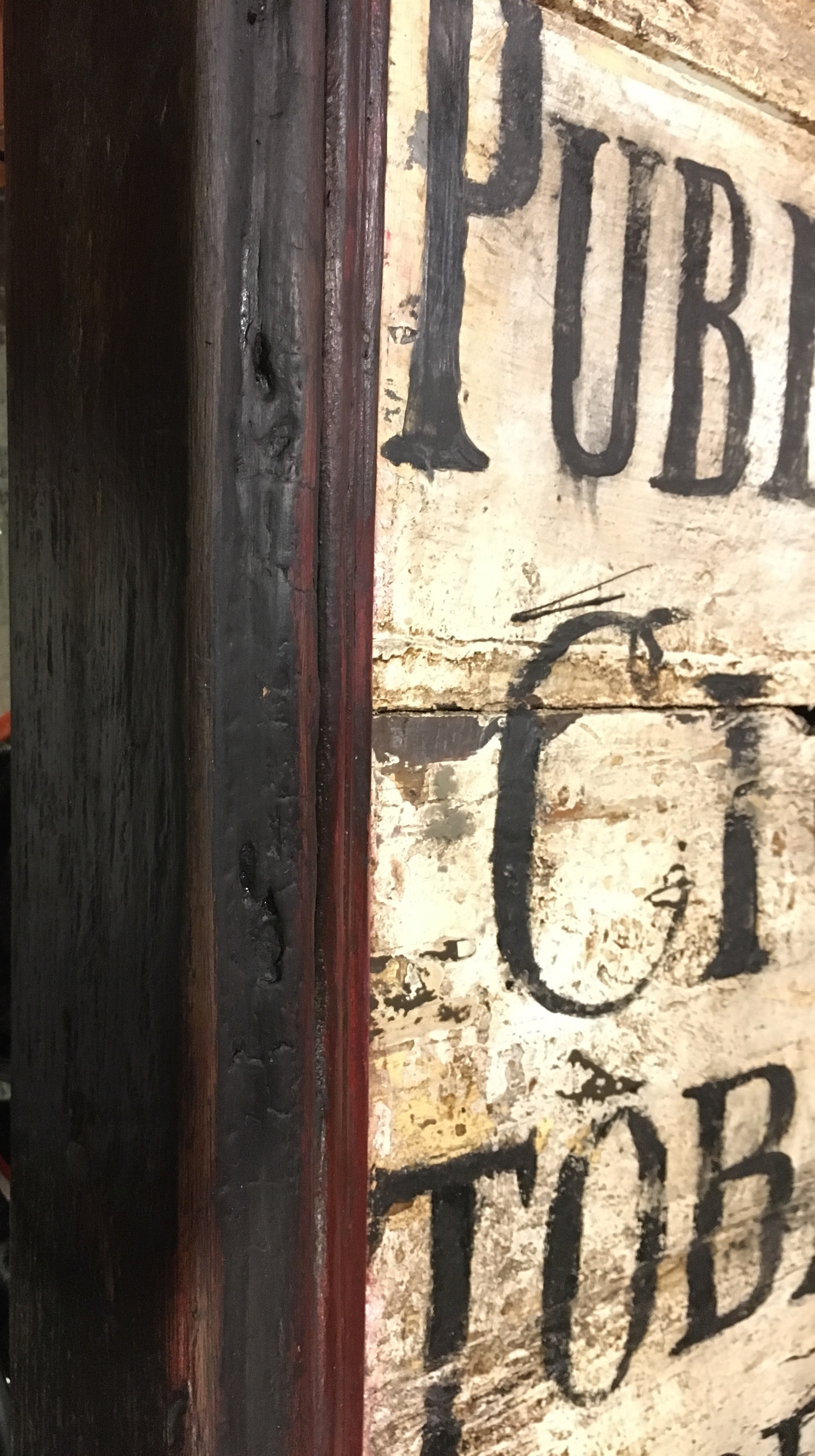
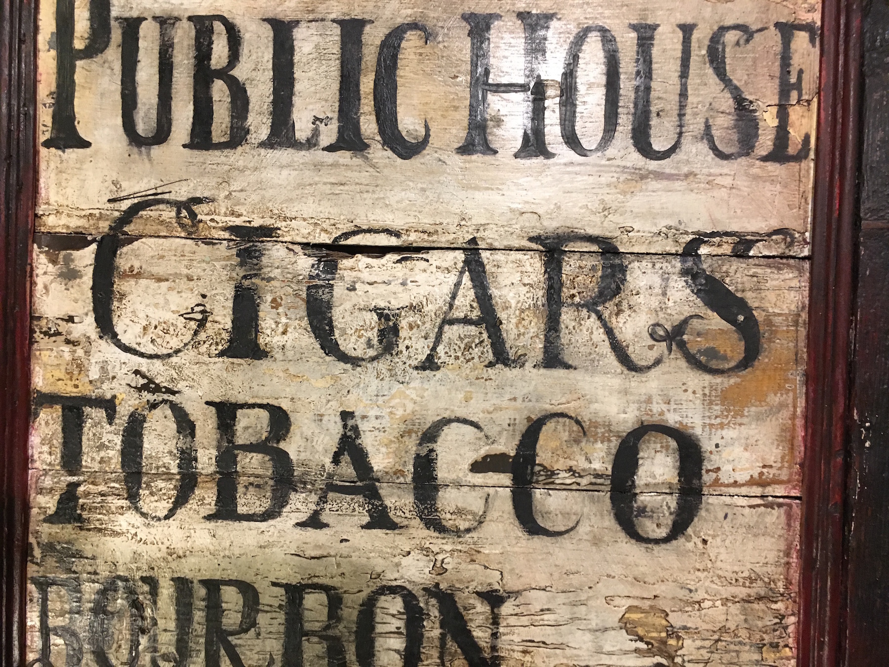
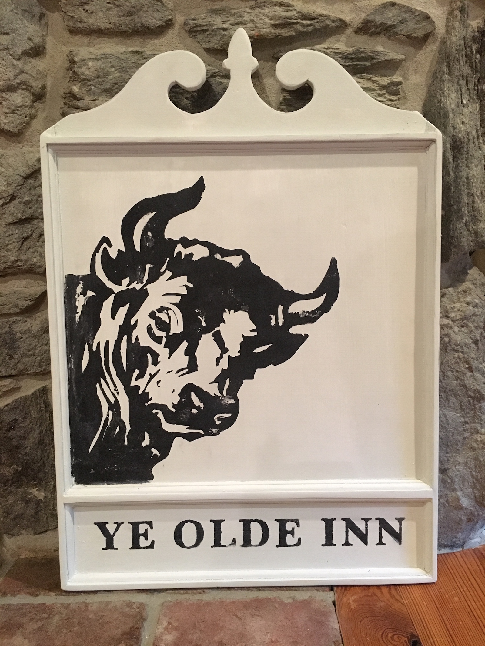
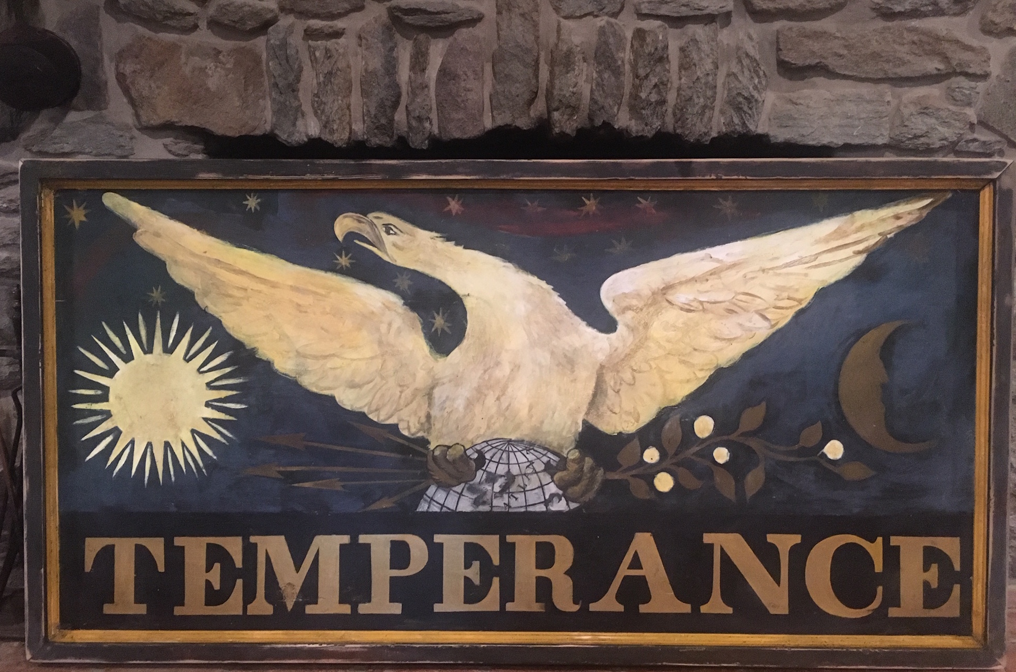
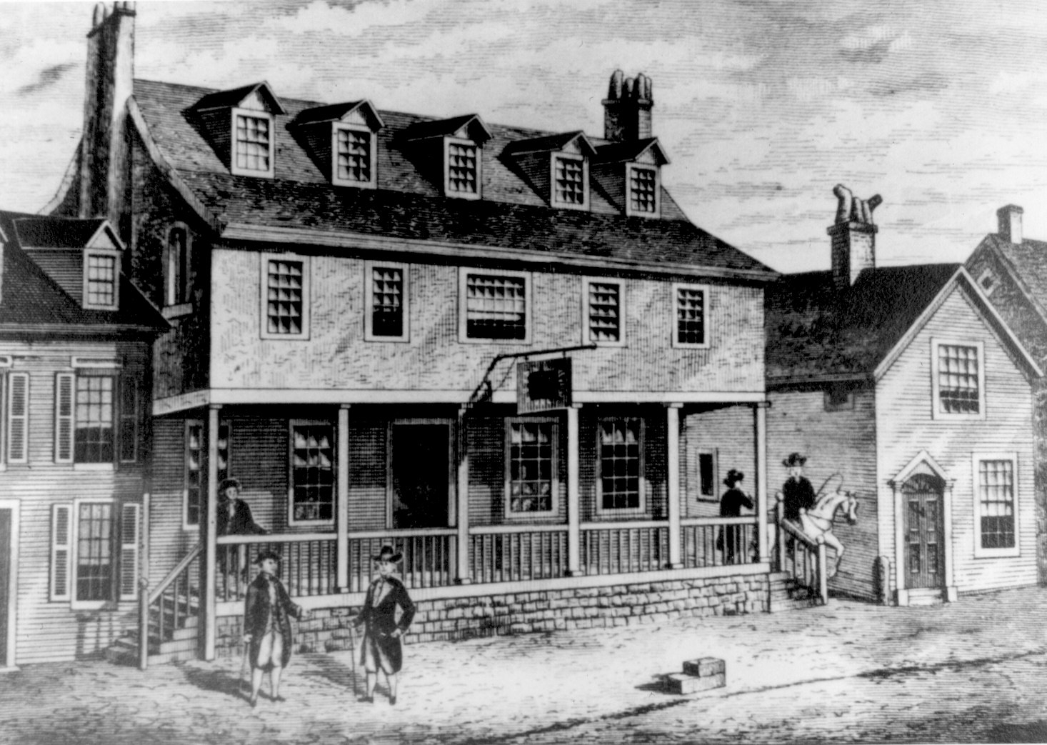
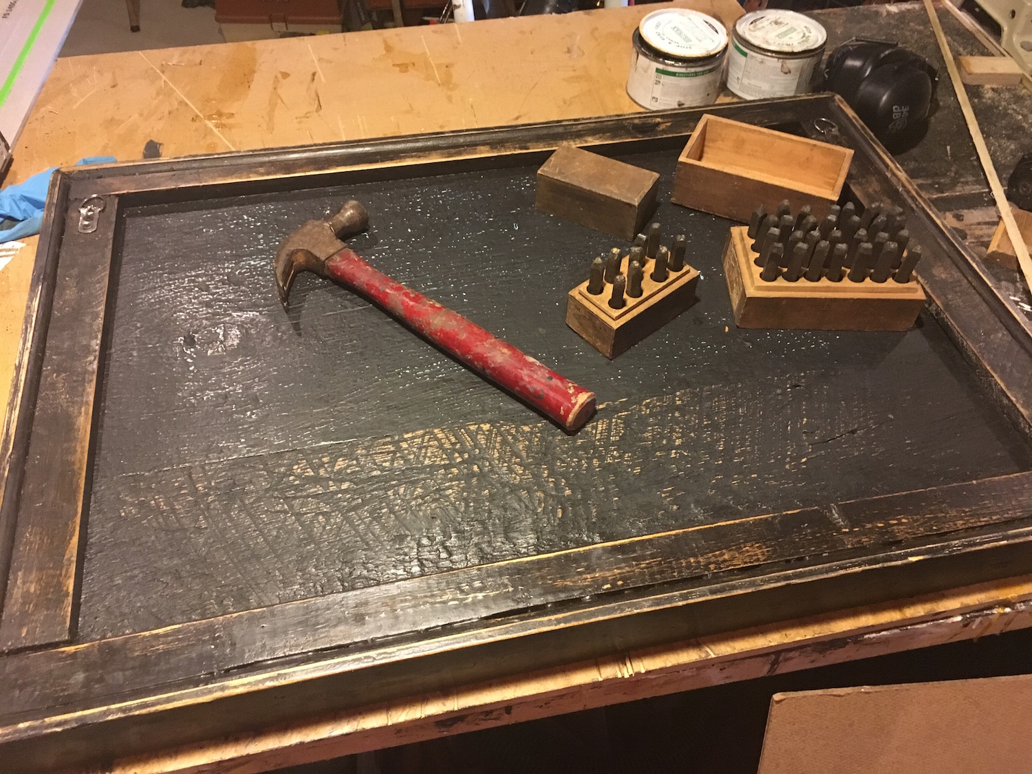
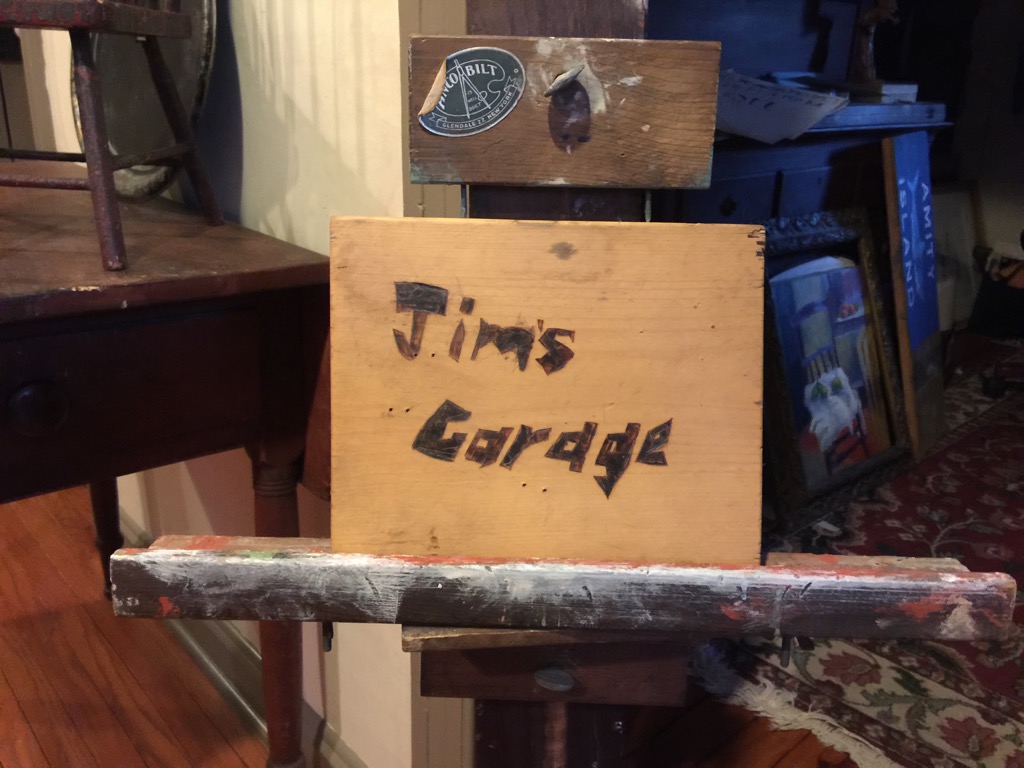
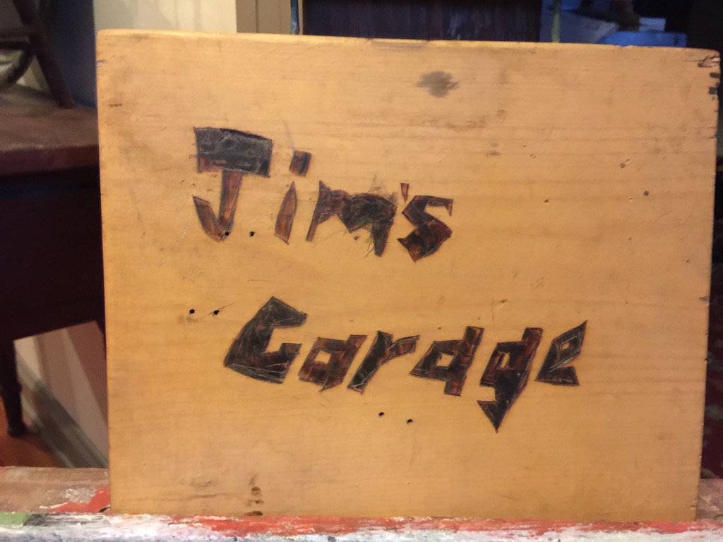
Here are a number of pictures that attempt to reflect a taste of what I have been able to produce throughout the year. In no way does this capture every commission or highlight. While some of the photos showcase a finished sign, others capture an in-progress view of the the work. In some cases, I have highlighted the mere beauty of the wood chosen for my signs. A great sign truly does begin with the character of the wood used.

Enjoy the photo dump!

Two Brothers of the American Revolution, a Gettysburg Legend, a Screaming Eagle, and much more

This is a follow-up entry, piggybacking on my previous blog post. My hope is to share with you some of the other signs that I have created or interacted with during the past year or so… signs that may interest you.

The format will be as follows -

  1. Signs in Context: Signs featured in photographs provided to me by gracious customers

  2. Recent Work: Some additional signs that I have created recently

  3. In-progress Work: Pics of a few signs that are still in the works

  4. Details of Work: Misc. detail images, reflecting various aspects of my work - some old, some new

  5. Extensions, etc.: Thoughts on possible business extensions, adaptations, offerings as well as some odds and ends

Signs in Context

Tucked Inn at Orange Lake

Here is the sign that was mentioned in my previous blog post. Check out the wonderful signpost assembly that presents the sign/s in a clear and effective manner. While I do not typically travel to sites for installation of exterior signs, many of my customers have been generous in providing me with photographs of their exceptional displays.

colonial american sign company_blogB - 1.jpeg
colonial american sign company_blogB - 2.jpeg

Mount Joy Farm

Here is a sign made for an estate located in Greensburg, Pennsylvania - a region just south of Pittsburgh. Lying within the Laurel Highlands and the ecoregion of the Western Allegheny Plateau, Greensburg possesses its share of rich history. The home to which this sign points consists of an original log structure, something that today qualities as being rather unique. However, what makes it even more exceptional is the fact that it was built by two brothers who fought in the Revolutionary War. The 1786 date commemorates the year of construction and the Betsy Ross flag motif reflects the original 13 Colonies that existed during such a time.

Photo provided courtesy of customer

Photo provided courtesy of customer

Photo provided courtesy of customer

Photo provided courtesy of customer

Photo provided courtesy of customer

Photo provided courtesy of customer

A House Museum?

One of my most devoted customers appears to have redecorated her house in the style of my work. We joke often about the fact that her house is slowly becoming a museum for my work. Believe it or not, such a house exists in New Mexico! This is a perfect example of how, regardless of locale, your interior decor can transform a given space into your very own world. My dear customer claims to be a Yankee-at-heart and her extraordinary style proves just that. It is a true honor to know that much of what leaves my easel will be prominently displayed within the special spaces within the homes of my customers.

As much time as I spend fussing over every little detail when making each sign, I know that much more will be spend observing and appreciating it over the course of its existence. It is this reality that drives me to do the very best with the sign while it’s in my care. Once I send it off, I simply cannot change anything.

Photo provided courtesy of customer

Photo provided courtesy of customer

Photo provided courtesy of customer

Photo provided courtesy of customer

A Nautical Nook

Here, the customer has dedicated a perfect, intimate corner of the room towards a nautical display of two of my signs. I particularly find the arrangement of these signs aesthetically pleasing, on the account that they are feature elements that move in opposite directions. The opposing force of the whale moving towards the right juxtaposed with the mermaid-prowled ship moving left counterbalance one another. Such forces create energy (visual interest), yet coexist in a neutral state of harmony that is quite satisfying to the human eye.

My apologies for the art teacher in me coming out there, but it proves my point that “good design” is important - not only in the art itself, but in the arrangement of it. Many people, when they see it, “know what they like” or “know what looks good”, but have a difficult time actually arranging things or explaining what it is they desire. Although there are no real absolutes, I always tell my students that resorting to a few design rules / guidelines can greatly increase the visual impact of anything. It’s not that difficult, and it thrills me to the bone to see that my customers have done very well in making excellent display choices!

Did I mention that the choice of blue for this wall is simply exceptional? What better way to unify two nautically-themed tavern signs than envelop them in a soft, velvety blue hue.

Photo provided courtesy of customer

Photo provided courtesy of customer

Hartley House Weddings

Here are some images of the sign made for the Hartley House in South Carolina. For more information on this, read on (below).

Image courtesy of Hartley House

Image courtesy of Hartley House

Image courtesy of Hartley House

Image courtesy of Hartley House

Image courtesy of Hartley House

Image courtesy of Hartley House

Two of My Signs on a Large Wall

A dear customer from California commissioned two signs from me this year. Here, you can see the beautiful display on their grand staircase. My customers do a terrific job making my work look good.

Photo provided courtesy of customer

Photo provided courtesy of customer

Recent Work

The Fox Tavern & Inn

This is a sign painted, based upon the request of the customer. I do believe a similar sign (by another sign painter) can be found online and can be purchased as a print. However, this commission called for a hand-painted version of this ‘sly fox’, a sign that was quite large in scale and hefty in its weight. The barn wood used to create this signboard was beyond exceptional. The grain found in the wood was rivaled only by the density comprising it. It’s as if the wood was so old that it began petrifying!

colonial american sign company_blog - 5.jpeg
colonial american sign company_blog - 4.jpeg

SNEAK PEEK: Check out the grain in the wood used to make Mr. Fox!

Black Hound Hill

Similar to the sign featuring ‘Mr. Fox’, this sign features a set of eyes which appear to stare the viewer down. Set against a black backdrop, these eyes appear a bit more menacing than those found in the fox piece. The design featured here was not mine, but rather one which was provided by the client. This double sided sign was made using some of the thickest old-growth heart pine wood I had in my possession. It was rugged, full of knots and deep character. To temper such ruggedness, I hand-planed the surface and jointed the three (3) planks jointed together with wooden (beech) tenons and glue.

Because this sign is intended for the out-of-doors, I treated it accordingly. Yes, the entire thing is made from ‘real wood’, so such protective considerations will prolong its structural integrity. Exterior grade primer, exterior grade paint, plenty of thermoelastic caulk and exterior grade hardware will serve as important protective measures safeguarding against the elements. The weather will certainly triumph in the long haul, even despite the annual maintenance of a real-wood sign (or any type of sign for that matter), but in many cases, a slight "weathering” can work favorably, producing a look of assimilated ruggedness. Such is my hope for this fine sign. In 10 years, mother nature will have applied a masterstroke to this sign, giving it the appearance of something that has, for the lack of a better phrase, always been there.

colonial american sign company_blog - 8.jpeg
colonial american sign company_blog - 9.jpeg

SNEAK PEEK: Below, you can get a sense of just how thick the hardwood molding stock was for this sign. Beneath this, I have included images of the planks that would be gently planed down and jointed together to form the main sign itself.

molding close up.jpeg
IMG_7736.jpeg

Some More Joshua Alden Inn and Tavern Signs?

A few words on the practice of “reproduction” -

Yes, you guessed right - another Joshua Alden Inn and Tavern sign! Well, you know that this is a hot sign - one that’s in high demand. That said, you might wonder why I need post more than one or two versions of my reproduction efforts, right? Well, while that is valid, this is a perfect opportunity to provide further proof that each and every one of my signs are unique. I know this is such a trite expression, but - even in the signs that classify as faithful “reproductions” - there are inherent differences.

Historically speaking, the practice of “reproducing” works of art, be it signs, paintings, print images, sculptural works, etc. was one of the methods through which artists would be trained in their craft. Not to be confused with ‘plagiarism’ or the notion of ‘fakes and forgeries’, there were other reasons for making faithful copies of specimen pieces. Without going into a total dissertation on the subject, I’ll mention another legitimate motivation for reproducing a given work - that of preservation or documentation. Consider an important document, especially prior to the advent of the printing press. By faithfully making a copy of a work of art, you are engaging in the preservation of the idea/s and appearance of it.

Now, back to my initial point about uniqueness. Well, my reproductions are very faithful; Yet, I am fully aware that differences between say 100 different Joshua Alden signs are going to exist. Let’s take this hypothetical number of 100 further. If all 100 Joshua Alden signs were set in front of me, I know full well that I would be hard pressed to find a mere 2 that were exactly identical - spitting images to one another, if you will. I take great delight in this reality and I hope you do too. It means that what you receive from me, regardless of its faithfulness to its original museum piece, is a work that is like nothing else out there… it is the result of my own interpretation of the original sign at that given time in my life.

A work of art’s uniqueness is distilled through the artist’s own sensibilities. The materials or resources available at the time, one’s attitude, temperament, time, knowledge, aspirations, and so forth… these are just a few of the factors that shape the quality and uniqueness of any given art object. Compare this to a commercial printing press that pops out thousands of posters in a day. Any uniquenesses found between 2 prints would be menial, most likely with respect to the saturation level in the ink. I believe you would agree with me… the inherent differences in that which comes from the human hand are much more desirable.

colonial american sign company_blog - 17.jpeg

This particular version of the Joshua Alden sign was made slightly larger than the dimension normally used. In addition, it was constructed with the necessary provisions for an exterior placement. The customer explained to me that she was replacing a sign that - interestingly enough - was hung on her chimney. A rather unique arrangement, the customer’s house is designed in a manner which allows a spectacular view its chimney from the interior. So, from the intimacy of the dining room, a spectacular view of this exterior space is offered. Furthermore, in the Spring and Summer months, the exterior space functions as a garden area, perfect for out-of-doors entertainment.

colonial american sign company_blog - 12.jpeg
IMG_9316.jpg

Hartley House - A Wedding Venue

Here is a sign that was made to look primitive in its artistic approach and rustic in appearance. George Washington is depicted in a naive painterly style atop his loyal dark horse. The sign hangs from a beautiful wrought iron sign post, welcoming people to the Hartley House facility in Batesburg-Leesville, SC.

The (Bond-Bates-Hartley House) Hartley House is listed with the National Register Properties in South Carolina. A two-and-one-half story weatherboard residence, with a central two-story portico, a closed brick foundation, and a gable roof, the property functions as a Wedding events venue. Architecturally, the house is a typical upcountry farmhouse, with a portico adapted from the Greek Revival style. It is believed to be the oldest house in Batesburg and is a perfect setting for celebrating those special moments with family and friends.

colonial american sign company_blogC - 3.jpeg
colonial american sign company_blogC - 2.jpeg

Cigars and Tobaccos (& the Indians that grew it)

Through the years, I have made several versions of this Native American-themed sign. A depiction of a “wooden Indian” statue that was commonly displayed in and around the fronts of early stores across rural America. A sign such as this would have served a similar function, but in a slightly less obtrusive dimension. It was an exclamation to passersby that the establishment posting it was fully furnished with items such as pipe tobacco, cigars, and miscellaneous goods in kind.

Cigar Store Indian.jpeg

In the 16th and 17th Century, the demand for tobacco grew and a major cultivate of this product was the Native American. The British, who became interested in the tobacco being grown on our Colonial coast (namely Virginia), began importing large amounts, was responsible for the first wooden Indian statue advertisement. The tobacconists in the harbor regions of Great Britain commissioned the plentiful ship builders to carve these figures that would serve as clear symbolic indicators to the general public that “tobacco goods could be found here”. It makes perfect sense that the shipwrights became involved here - the men who were deftly skilled in carving the ornate wooden figureheads in the bows and decorating the sterns of great vessels. What’s interesting is that such a need in the area of commerce and advertisement was met and fulfilled by shipbuilders.

We all know that the literacy levels in both the Early Colonies and Great Britain varied greatly. Therefore, it was a smart move on the part of early advertisers to call upon such a bold symbol to attract attention and promote their goods in a manner that was universally understood. One interesting tidbit of information about the earliest wooden Indian storefront statues is the fact that, because most wood carvers did not know what a Native American looked like, they had to rely on the descriptive accounts and drawings relayed to them by the sailors. Some of the earliest examples of these wooden Indian carvings reflect the Natives in an African appearance. In any case, the use of these wooden statues seems to have fallen out of practice in the mid-19th Century, with the advent of the steel being used in the ship building business. I suppose, like many things in life, such discontinuance contributes to the novelty of these fascinating early advertisement objects.

In America, the use of wooden Indian statues echoed that across the Atlantic Ocean. It wasn’t until the early 20th Century when the popularity of these wooden storefront men began to fall out of practice. Their slow and subtle disappearance appears to have been caused by virtue of the fact that many city councils began enacting ordinances and regulations to ensure ease of travel throughout the general public. As we all know, things such as lawsuits are sure to accompany any damage or injury caused from an irresponsible store owner. The last thing anyone wants to experience is the hefty weight of a wooden Native American on top of us on a blustery day in the town.

colonial american sign company_blog - 19.jpeg

SNEAK PEEK: Here are two images that reflect a profile view of the molding and how it will conform to the main sign panel. Made from rustic hemlock, this molding was full of knotty character and finished up very well when stained with a dilute paint mixture.

IMG_7743.jpeg
IMG_7744.jpeg

Solomon Powers Stone Yard, Gettysburg, PA

solomon powers_gettysburg stone mason.jpg

The quaint town Gettysburg is less than a one hour drive from my house. I take for granted the rich history that exists there. Despite the fact that I’ve taken countless field trips as a kid, visited frequently as an adult and spent my fair share watching my oldest son play soccer games there throughout the years. Despite my travels to this renowned region which lays claim as one of the most important (if not the single-most) battle in the American Civil War, I have never devoted myself to truly immerse myself in the layered richness that, even today, lies among Gettysburg’s old brick buildings, back-alleys, typical tourist-trap offerings, but especially its residents.

In my interactions with this particular client, my appreciation for all things historical was put to the test. It was an exciting experience, talking with this fellow, yet I found myself feeling quite deficient in my knowledge and enthusiasm for Gettysburg history in particular. I admired the passion held by this man who requested that I fashion a sign that honored the man known as Solomon Powers. It was the former house of Solomon Powers that had been the property and project of my client for several years now. In his hands, the property was being transformed into a spectacular state that would be both functional (as a business) and a tribute to the legacy of Mr. Powers.

Without going into too much detail (which would surely reveal my horrible sense of memory these days), I will attempt to briefly summarize the major facts surrounding Solomon Powers and his role in the town of Gettysburg. Prior to and after the great Battle of Gettysburg, Solomon Powers operated as the premiere stonemason for the town. He maintained his stone-yard adjacent his home on High Street. Specializing in certain aspects of stone masonry, he preferred using the dense granite for much of his work and became somewhat famous for his signature look in the area of home foundations. It might be important to note that he his stonework was of great importance to the Evergreen Cemetery. The following notation can be found on his “Find a Grave” site:

“LIVED ON WEST HIGH STREET AND RAN A QUARRY OFF THE BALTIMORE PIKE AT "POWERS" HILL. BORN NEW HAMPSHIRE. STONE CUTTER. IN 1838 HE MOVED HIS FAMILY FROM BALTIMORE TO GETTYSBURG AND OPENED ONE OF THE FIRST QUARRIES IN THE AREA. LOCATED AT POWERS HILL HIS QUARRY PROVIDED THE STONE FOR THE BASE OF THE EVERGREEN CEMETERY GATEHOUSE."

colonial american sign company_blogC - 8.jpeg

For a wealth of information about Powers, his property and the influences imparted towards the cause of the Battle of Gettysburg, I would certainly defer to my good friend. Hearing the stories from my client was a true joy and reaffirmed for me the true importance that Gettysburg held in the Civil War. More specifically, it became apparent that the oral history that can be learned by talking to people was quite dynamic. In the handful of years of ownership, my client explained to me the many new stories and facts obtained throughout his discussions with others and through performing a little ‘digging’ of his own. I viewed him as a curator, hellbent on preserving this history and connecting it to the larger picture (you know, the stuff in all of those books written about Gettysburg).

So, I offered my hand towards my client’s cause - humbly making a contribution to the story… the story of Gettysburg. This sign has been affixed to the reverse side of the house and can be seen by the side traffic and those viewing the property from the back alleyway. I do believe we will be collaborating (soon) on a sign that will hang from the front of the house. It is my hope that my work brings much attention and appreciation to such an important cog in the Gettysburg experience.

Photo provided courtesy of customer

Photo provided courtesy of customer

Nostalgia

We all remember growing up as a kid and can most likely recall everything about the place we called home. This was a custom sign made to honor the memory of a customer’s childhood home. Fashioned from wood from The Mayflower, this sign packs the heft. Just kidding about the source for my wood for this sign - haha - but wherever its origin, this is some of the most solid, beefy planks I have come across. Old molding was reappropriated into the construction, as was a very old raised panel that was used for the painting of my client’s childhood home.

Personally, every square inch of my childhood home / property can conjure up a hundred memories. I can even recall the smell of certain rooms and areas of my yard. The sounds, smells, sights and textures of our childhood all contribute to the character and identity of who we become. They are personal to us and treasures that we carry with us as we experience life with others. I do trust that I was able to capturing an image that my customer’s childhood home that, in her mind, evokes the full spectrum of her childhood memories associated with it.

colonial american sign company_blogD - 4.jpeg
colonial american sign company_blogD - 2.jpeg
colonial american sign company_blogD - 1.jpeg

In-progress Work

Wooden Anker Tavern

Okay - this is a work in progress, but the sign is almost finished. There will be some nice wrought iron attached to the left and right flanks of this somewhat decoratively scrolled sign, truly capping things off from a visual standpoint. This is a custom sign that reflects the historical importance of the customer’s family name. His last name is “Ankerholz”, which roughly translates to “wooden anchor”. The request called for a motif that featured said wooden anchor juxtaposed with a metal spike. Here, you can see the arrangement decided upon, as both elements are set against one another to form a semblance of visual balance. The colors were chosen in order to match those found in what serves as my customer’s “man cave”. A truly spectacular space, it is my hope that this sign serves as a satisfying and worthy reminder to the king of the cave - something that brings to him and his family great pride.

colonial american sign company_blog - 13.jpeg
colonial american sign company_blog - 18.jpeg

Screaming Eagle of the American Revolution

Another work in progress, this war eagle is aggressively proclaiming the phrase “E Pluribus Unum”. Made on a panel that was once part of a door in the family’s historic Pennsylvania barn, this piece will be encased with an appropriate wooden frame. The molding used for this sign will nothing less than top-shelf barn wood - quite appropriate, considering the context. When this commission has been completed, it will be a spousal gift and will be displayed in the loft of the amazing barn in which the panel was found.

colonial american sign company_blog - 14.jpeg
colonial american sign company_blog - 10.jpeg
colonial american sign company_blog - 11.jpeg
colonial american sign company_blog - 21.jpeg

A New England Saltbox

Getting close to finishing this sign, I have a few tweaks to make here and there. There will be an addition of wrought iron coming soon, in order to supply the sign with vertical members for future connection to a signpost. This is a painting of my client’s house in Connecticut and one that is simply true-to-form in every way possible. This sign will serve as a marker for his property - one that I can’t it to see in place!

colonial american sign llc_new england saltbox sign.jpg
colonial american sign llc_new england saltbox sign-detail.jpg

Details of Work

From time to time, I like to share a few close-ups with the world. Here are a few recent ones :)

colonial american sign company_blogC - 5.jpeg
colonial american sign company_blogC - 4.jpeg
colonial american sign company_blogC - 1.jpeg

Extensions, etc.

Curator’s Corner

Always one to be making more work for myself than what’s required, I have begun the quest of collecting a few old signs and knick-knacks here and there. To be clear, these are objects not from my hand. They are authentic (not that my work isn’t authentic, per se - haha) antique pieces that I find in my travels; Things that I feel my customer base might desire. Trust me, I do not want to become an antiques dealer by any means, but I am going to begin to curate a small line of old objects that are related to my sign business with the hopes that some interest might exist. If not, hey - no problem. Just like my hand made signs, I’m not offering anything that I wouldn’t mind keeping myself :)

To this end, I am featuring just one object in this blog post - a small sign that was most likely once attached to a horse-drawn carriage. It reads “Gitche-Gumee”, which is actually a name referring to Lake Superior - one of America’s Great Lakes. Below is an excerpt taken from Lake Superior Magazine, explaining this:

Many people, thanks to Henry Wadsworth Longfellow’s “Hiawatha” poem (1855), have heard of Gitche Gumee, the shining Big-Sea-Water. This spelling was learned, it is said, from Henry Schoolcraft, who worked with the Ojibwe people at the time Longfellow wrote the poem.

Today in Ojibwe language class, thanks to dialectic differences, you are more likely to see gichi-gami, gitchi-gami or kitchi-gami for Lake Superior. Loosely, it does indeed mean “Big Sea” or “Huge Water,” but just about always refers to Lake Superior.

The 1878 dictionary of Father Frederic Baraga, the first one written for the Ojibwe language, says Lake Superior is Otchipwe-kitchi-gami - the sea of the Ojibwe people. The “i” at the end of gami would be more like the “i” in it than a long “e” sound.

So, if such a sign appeals to you, email me at casc1776@yahoo.com to inquire about acquiring it.

Signed and Dated on the Back

In a much earlier blog post, I had mentioned that I still use my Pappy’s metal stamps to sign each sign that leaves my studio / workshop. This is a practice that has become much more consistent during the past three years. Based on numerous customer requests, I have also adopted the practice of hand signing my work. I do all of this on the reverse side of the sign, so as not to impede upon the imagery being featured. The last thing anyone wants to see is my signature, which - in my opinion - could potentially distract from the visual dynamics found in the painted surface.

colonial american sign company_blog - 1.jpeg
colonial american sign company_blog - 3.jpeg
colonial american sign company_blog - 6.jpeg

Tavern Signs Prepared For Shipment

There is nothing more satisfying (or exciting) than the evening prior to a shipment dispatch. Here is a glimpse of a batch of signs that await a shipment on the following day. The last time together, each of these signs will part ways throughout the United States - making their way to their respective destinations.

Artist Proofs - One-of-a-Kind Prints

Occasionally, I make a few professional quality prints of my work. There are different reasons for doing this, but most times I use them to explore various appearances. For example, I might apply gold leaf to certain areas of a given image, in effort to accentuate a particular aspect of the design dynamic. An artist proof is essentially a print that is one-of-a-kind due to the manipulation of it after the time of printing. Sometimes, I include one of these bad boys in the mix of a sign commission as a courtesy to a customer. Many times, it’s a special way of acknowledging the patience of a customer, in light of a commission taking longer than anticipated.

Here is an artist proof on canvas. Paint was used overtop to highlight various areas, namely in the red and gold areas.

This second example simply illustrates an artist proof being handled on a piece of thick acid-free stock. When printed on this matte stock, the black color looks velvety and really compliments the lighter-valued areas in a design.

Prints on wood

An idea that I’ve been entertaining for some time now, I have taken some steps to put into action the reality of making available to you versions of a select number of my signs in print form. Many wish to own a hand-painted sign, but for those of you who may not have the funds available at the time to commission one, a print on wood might satisfy your needs just fine. Quite honestly, these signs are quite extraordinary! The print quality is outstanding and the wood used is exceptional - made from 3/4” cabinet grade hardwood. Furthermore, each of these prints are encased using old barn wood molding.

Here is a quick screenshot of a developing image that showcases my collection. Once I finalize things, I’ll publish it on my webpage, but if you are interested now, please shoot me an email.

*Note: This is a mere screenshot of an image that I’m working on.

*Note: This is a mere screenshot of an image that I’m working on.

As Independence Day Approaches

1. Well, all but another year has whirled past me and I realize that I haven’t made any updates to my webpage / blog.

I’ll avoid any cliches about the challenges thrown on everyone’s lap this past year and a half, but express just how necessary it was to put an end to this past school year. I have been very busy, juggling many roles and responsibilities , whether they be school-related, home related or sign related.

2. One major happening during the past twelve months was the building of a brand-new timber frame barn.

Yes, this barn will serve as my new workshop space… the epicenter of Colonial American Sign, LLC. While this project certainly was one of the factors contributing to the hectic year, but one that issued its share of excitement for me. I plan on providing a substantial blog update about the new barn very soon (believe me - it certainly deserves its very own post), but - for now - believe me, the transition from my home basement to the new, detached space has been (and still continues to be) a very staggering process.

3. So, in the few days before we all celebrate another July 4th, I wanted to provide you with some sign pics.

My apologies for the lack of structure, but I trust that something is better than nothing (given the radio silence). Well, I suppose the tie that binds is the fact that our independence has defined our history and history is the very thing that my business seeks to honor. There is some juicy watermelon, screaming eagles and plenty of historical figures featured here… all of which smack of freedom and our independent national spirit.

4. The format of this share will feature some finished signs, accompanied by several odd in-progress pics.

In addition to some of the sign pics, I am including a random assortment of some customer-provided images that feature their commissioned signs hanging in or outside of their property. My gratitude to those who have provided me with such photographs.


Who Doesn’t Like Ice Cold Watermelon?

Here is a small sign that was made to look like it was once a part of a roadside stand; Perhaps this sign was once bolted to an old wooden fruit trailer or attached to a storefront display.

colonial american sign company - 6.jpeg

In this photo, you can see an in-progress view of the sign. After constructing the main sign substrate, I prepare it by painting and distressing it and then penciling-in the main design elements.

colonial american sign company - 5.jpeg

Another view of the watermelon sign, showing the nice thickness of the barn wood used to construct it.

colonial american sign company - 7.jpeg

Reverse side of sign, reflecting my signature and date.

colonial american sign company - 8.jpeg

Photograph of the watermelon sign hanging on the wall of the customer. What a beautiful setting for the sign?!

colonial american sign company - 9.jpeg

Washington and Woolen Mill

I’ll introduce this sign by showing you a photo it mounted above of this customer’s hearth. This was a custom commission and the request involved creating a strongly horizontal format sign that incorporated George Washington’s portrait within the title “Woolen Mill”. I used various milk paints to achieve a rustic look here, but the magic resulted from the fortunate availability of two old wooden planks of a most interesting character. Each were found with a unique shape and, with a little bit of shuffling, I realized that combining them would result in a most pleasing sign shape.

colonial american sign company - 22.jpeg
Up-close view of the two planks that were eventually jointer together to form a most unique signboard shape.

Up-close view of the two planks that were eventually jointer together to form a most unique signboard shape.

I especially like how the raw wood patina compliments the painted surfaces in this sign. But, why does George appear to be scowling at us from this angle? :)

colonial american sign company - 19.jpeg

Detail of George Washington’s face, the central motif of the sign.

colonial american sign company - 20.jpeg

Detail of the milk paint layers used to craft George Washington’s facial features.

colonial american sign company - 21.jpeg

A Tavern in Honor of a British General

General James Wolfe was a British officer renowned for his military reforms and especially for his major victory over the French (1759) in Quebec. Just before his death, Wolfe learned of the French defeat and, knowing that the French capital in North America had fallen, he uttered the famous words “Then I die happy”.

Here we have a custom sign that aimed to reflect the historical legacy of the man we call General Wolfe. This sign was commissioned as a gift that would be given to the customer’s mother as a surprise. Again, various layers of milk paint were added, removed and then added again in effort to create an image that reflected something carried over the course of several generations.

colonial american sign company - 26.jpeg

Here is a detailed view of the Wolfe Tavern sign that gives you a sense of the paint layers and deeply aged surface patina that is one of my specialties. If the average viewer only knew how much time and energy goes into every square inch of my signs, they would certainly be surprised. In an age where many of us scrub and buff our surrounding surfaces to maintain their freshness and blemish-free sheen, it does seem counterintuitive to expend such elbow grease to make something look old and weather, doesn’t it? Well, such is the nature of creating reproduction signs - new items that appear as though they had existed for centuries. It’s a rather fun process, regardless of the toil.

colonial american sign company - 27.jpeg

Check out those under layers showing through. The fact that the board used to paint this sign was found with some rather lovely craquelure increased the visual dynamic.

colonial american sign company - 28.jpeg

Okay, I couldn’t help it… I tossed in a few extra detailed view of General Wolfe (below) for your viewing pleasure.

colonial american sign company - 30.jpeg

Joshua Alden Inn and Tavern

The Joshua Alden Inn & Tavern sign is always a popular request and never seems to disappoint.

colonial american sign company - 34.jpeg

Here is a close-up of the Joshua Alden inn / tavern, a lovely symmetrically designed house with the most spectacular colonial red coloration. The old barn wood used for this sign certainly adds to the visual character, making it a rather convincing historically authentic object to those viewing it.

colonial american sign company - 36.jpeg

Inn at Popponesset

I have painted two of these signs in the past several months. An homage to the brave sailors who worked the New England waters hundreds of years ago, such signs serve to highlight the importance of maritime trade, warcraft, exploration and transportation. An extension of the ship prow, this maiden safely guides and protects it.

Popponesset is located in Mashpee, Massachusetts; Today, Folks traveling through Cape Cod still consider it one of the most charming locations to visit.

colonial american sign company - 42.jpeg

Detail of the Inn at Popponesset sign.

colonial american sign company - 41.jpeg

Here is a detail showing the lettering done in gold leaf.

colonial american sign company - 38.jpeg

In this image, you can see that the lettering here was fashioned in paint (as opposed to gold leaf); Each technique offers its own visual aesthetic.

colonial american sign company - 39.jpeg

A photograph of the reverse side of one of the Inn at Popponesset signs; As I mentioned previously, the reverse sides of my signs are treated well. It varies as to the exact treatment - depending on the sign. However, I make it a point to bring the back side of any commissioned sign to a degree of finish. Even though the backside of most signs will face the wall, I’m compelled to give it its due attention.

colonial american sign company - 40.jpeg

Here we see one of the fine maidens hanging in the home of the customer. In addition, the mermaid sign on the far wall happens to feature an older sign I made several years ago. It thrills me to know that my customers take such pride in showcasing my work! I mean - Just check out those lights that are dedicated to my signs! Some peoples’ “display game” is simply that good!

colonial american sign company - 44.jpeg

Montpelier Farm

Here is a charming outdoor sign that I thought I’d share. Simple yet effective. Sometimes the most fundamental elements result in the most effective communication.

colonial american sign company - 54.jpeg

An up-close pic of the sign. While I do not personally hang / mount any of the signs I paint, I do offer my advice in terms of possible options. Sometimes, my customers already know how they are going to mount an exterior sign (such as in this case). The dimensional constraints are therefore communicated to me and considered in the design process.

colonial american sign company - 55.jpeg

A special gift for mom

Now here is a piece I made for my mom. I gave it to her at Christmas (2020) and she was thrilled to showcase it for me. This is not necessarily a sign per se, but a folk / primitive style painting on wood. While this was given as a gift to my mom, it was originally used as an image that was professionally scanned and printed onto cabinet grade plywood en mass. The prints, which look pretty darn close to the original painting, were commissioned for a time-share company and incorporated into the historical interior design scheme of living spaces. I have a few of these left, so email me if you have any interest. The original, of course, is out of the question… you’d have to pry it from my mother’s hands!

colonial american sign company - 57.jpeg

Colonial silhouettes

Here are some miniature silhouette paintings that I made for Christmas gifts. A few of them made their way to a customer or so, as a token of my appreciation for their patience :) <<< As I said, this year has been exceptionally busy.

colonial american sign company - 52.jpeg

And yes - that is a silhouette of a dog! This was a gift to my sister-in-law, whose little dog Lillie has been forever immortalized in this original, hand-painted silhouette :)

colonial american sign company - 53.jpeg

Join or Die

Never unpopular, the Join or Die image continues to be a crowd favorite. The wood used in this version was exceptional - hardwood with excellent surface character. A good surface makes my job of painting much easier. I also like how the rough cut edge of the exterior molding echoes the scaly texture of the snake.

colonial american sign company - 58.jpeg

Warren Tavern

This was a commission from the owner of the Warren Tavern, located in Charlestown Massachusetts. Check out the historical roots of this establishment (below).

From The Massachusetts Society (Sons of the American Revolution):
https://www.massar.org/bostons-historic-taverns/

Warren Tavern is the oldest tavern in Massachusetts and the most famous watering hole in the United States still in its original building and location. First erected in 1780, the Warren Tavern was the first building to be rebuilt in Charlestown after the British burned the whole area during the Battle of Bunker Hill in June of 1775.

Warren Tavern is one of the most historic Boston bars, even down to the low beams in the ceilings, which the builders salvaged from old boats at nearby Charlestown Navy Yard – making the beams even older than the rest of the Tavern. Inside, the large fireplace steps you back into time.

The Tavern was built by Captain Eliphelet Newell, who fought at Bunker Hill and had been a close friend of Sons of Liberty leader and fervent Patriot, Captain Newell named his tavern after his friend Dr. Joseph Warren, who was killed on the hill by the British. Paul Revere, who frequently who frequently met there with other patriots, remarked that it was one of his favorite watering holes. General George Washington stopped by for "refreshments" while visiting a friend in Charlestown

colonial american sign company - 68.jpeg

It was an honor to have fulfilled this commission, creating a sign that honored America’s historical roots. The fact that this sign - today - hangs in one of America’s oldest taverns is flabbergasting and thrills me to no end.

colonial american sign company - 66.jpeg

Here is a nice three-quarter view of the sign. The beautiful wrought iron that I incorporated into this sign was made by a local blacksmith.

colonial american sign company - 74.jpeg

One more image of this sign, this time a black and white version. Here, you can see the visual effectiveness that comes from high contrast. The light and dark values work well together, generating a powerful image that reads well from a great distance.

colonial american sign company - 75.jpeg

Honoring those who called Turtle Hill their home

Okay, this was a rather interesting commission. The request was to construct an object that featured the title of the historical estate / property (Turtle Hill) and an image of the building. In addition, this piece should provide space for honoring the previous property owners through the years and possess an ability to recognize any future owners. Each of the plaques contain the family name, years of ownership and a small image that reflects something about either their profession or area of interest.

The notion of creating individual plaques was suggested by the customer, but the means through which the design would address this was up to me. Therefore, after much consideration and trial-and-error, I arrived at the solution. This involved embedding magnets into both the main substrate and the individual plaques. This method provided both security and portability of the parts involved. The main substrate was made using the most exceptional piece of old wood. This thing had the most appealing paint texture / craquelure! The small plaques were made using thin, oak stock. The construction process involved a great deal of sweat equity, especially in the area of hand-carving. Each of the rectangular areas in which the plaques nest had to be carved away.

I do have a video or two that showcases how the magnetic capture works. This might be a good idea for a future blog post :) is that any future owner of this estate can send to me the blank plaque/s to add to the documentation.

colonial american sign company - 79.jpeg

Here is a picture of the Turtle Hill property; The sign hanging out front was an earlier commission.

colonial american sign company - 78.jpeg

The individual plaques featuring the proprietors’ names, time of ownership and image reflective of them.

colonial american sign company - 83.jpeg

New England Menu Board

Here is a menu board that I made recently. The wood used for this sign was quite suitable to work with.

colonial american sign company - 90.jpeg
colonial american sign company - 92.jpeg

Another Joshua Alden

colonial american sign company - 93.jpeg

Molding detail of the Joshua Alden Inn & Tavern sign.

colonial american sign company - 94.jpeg

Another molding detail of the Joshua Alden Inn & Tavern sign.

colonial american sign company - 95.jpeg

Montrose House, Harrisburg PA

Interestingly, a previous sign exists beneath; I initially painted this small sign for a customer who moved. This current version reflects the new residence :)

colonial american sign company - 96.jpeg

Another pic of the Montrose House - Harrisburg, PA

colonial american sign company - 97.jpeg

E Pluribus Unum

This Latin text translates to “Out of many, one”. We see it on currency, flags, old documents, etc. but how many of us know what it means? Here, the popular phrase is coupled with another symbol we see in our great nation, the eagle. Here, the symbol of America is perched atop a globe, wings spread and ever watchful. This was a custom sign that was made using thick hemlock wood that was left-over from my timber frame barn construction.

Here are a few pictures of the process at various stages of construction.

The framework consists of rails (horizontal pieces) and stiles (vertical pieces) that are connected to one another. This framework holds the main raised panel in place. Here, you can see that my method of joinery is by means of tenons (Festool Domino, to be exact). These pieces of Beechwood are glued into place and strengthen the joint.

Because wood expands and contracts, it is essential that the framework surrounding a raised panel be made in a manner that allows for this. If the central panel was fit snugly into the framework will little to no wiggle room, the swelling that occurs in the summer months would most likely cause damage.

Williamsburg Taverns

Below are a pair of tavern signs that are based on those still in operation in Colonial Williamsburg, VA. Both the Christiana Campbell’s Tavern and Shield’s Tavern are popular destinations for those wishing to experience early tavern life in our present day.

colonial american sign company - 110.jpeg

Here is a reproduction of the Shields Tavern sign, a staple of Colonial Williamsburg Virginia. As was common in early America, the advertisement of one’s goods or services had to be simple and clearly read. This sign tells us that, inside this establishment, we will find quality meats and cold libations.

colonial american sign company - 109.jpeg
colonial american sign company - 111.jpeg

Support your local library

Do young folks still use libraries? Do older folks still use libraries? Well, we certainly are in the thick of the digital age where everything any anything can be found at the touch of our fingertips. That said, the so-called ‘black mirror’ didn’t exist hundreds of years ago and the pursuit of knowledge outside of the classroom took place by means of visiting a building that housed stacks and stacks of books. While I personally don’t miss the rigors that accompanied using the card catalogue system, I do recall fondly the experience that visiting a library provided me. Don’t lie, one of the your highlights most certainly was the smell of old books! Am I right?

colonial american sign company - 119.jpeg

Over the course of the year, I made quite a few versions of this sign. In fact, one of them represents my first official overseas commission. A fellow living in Ghent (Brussels) commissioned a version for his own personal library. I’m a bit jealous that one of my signs made it to Europe before I had the chance to myself, yet I’m honored to have made a connection to the European market.

Check out this display! This customer said that he had just the spot prepared for my sign. Once he sent this photo to me, I knew exactly what he meant.

Wadsworth’s Inn and the fighting eagle

This was my first time painting this particular sign. The original hails from the Connecticut Historical Society (Hartford, Connecticut). You can visit their website and actually take a virtual tour of their exquisite sign collection here https://chs.org/online-exhibition/virtual-tour-inn-tavern-signs-of-connecticut/

colonial american sign company - 165.jpeg
colonial american sign company - 166.jpeg

Lake Placid - A long lost old resort sign

There aren’t many out there… Old signs from Lake Placid, NY that is. My customer requested a sign from me that smacks of an early 20th century style - one that might have once hung from a wrought iron bracket extended from an inn or tavern along the scenic landscape of Lake Placid.

By the way, you might recall that Lake Placid was the site of the 1980 Winter Olympics Games (XIII). I believe at least a couple movies have been made, based on that ‘miraculous’ United States hockey team that took the gold medal there.

colonial american sign company - 137.jpeg

So, I know this isn’t a “Colonial era” sign reproduction. If you think about it, very few signs from the Colonial era really exist! Most of the oldest American signage springs from the 19th century.

Yet, the reason I’m showcasing such a sign here is to convey to you the range of styles and eras that my work aims to address. I feel that the rather aged distress achieved on the paint here fits the severe weather that would have beaten against this sign over the 100 odd years.

colonial american sign company - 136.jpeg

A small eagle

As a teacher, I appreciated this commission very much. This eagle sign was a gift from a wife to her husband. However, it wasn’t just a random gift - it served to honor his retirement as a public school teacher. I was honored to have been a part of commemorating a lifetime of service to this man. Reaching a retirement milestone in public education is no small feat!

colonial american sign company - 162.jpeg

Here is the sign, featured from an angled vantage point. The silver frame color was a request from the client, as it was a desired aesthetic found among their other collectible items.

It sure is a small sign, but it looks great featured among the customer’s other items of significance.

colonial american sign company - 164.jpeg

Temperance

Over the past few years, this particular sign has been a popular request.

I often share with my customers each and every step throughout a given commission. However, I seldom show such undeveloped progress pictures like this with the world. So, here is a rare look at the mid-state development of the Temperance tavern sign. You can see that the areas a merely blocked-in with color. As days pass, subsequent layers of color are applied, sanded and reapplied. Ultimately, this process will result in a finished patina that appears both fully developed, yet gently aged.

In the image below, you can catch a glimpse of the smalts that was used to surround the lettering. Smalts (or smaltz) is a mixture of finely ground glass, mixed with a binding paint to form a slurry-like liquid that, when applied to a sign, serves to create a little “bling”. The glass captures the ambient daylight and produces a bit of sparkle. This was a technique / method used in the early days and aimed to strengthen the business owner’s ability to capture the attention of those walking near their sign.

I do believe I am one of the very few reproducers of signs who employ this measure for select signs. Should anyone learn of another, please share their name with me. It’s a fascinating technique that results in an added visual character worth the extra work.

Can you see the stars? The faint banner? These are details that many “reproducers” of this sign fail to address. If you study the original signs that many of the reproductions our there are based upon, you begin to realize just how much is missed.

I suppose some of us simply want a sign to hang on our wall - one that looks “historical”. That’s perfectly fine and I respect that. However, when you order a sign form me, you are going to be receiving a piece that is deeply based in historical traditions, an eye for detail and a passion for bringing the authenticity of forgotten eras back to light.

colonial american sign company - 177.jpeg

Tucked Inn At Orange Lake

This is a double-sided custom made sign that attempts to capture the nostalgia surrounding the area known as Orange Lake.

Here is a sneak peak into an early stage of this sign creation. You can see the old spindle picked up at an antiques shop; This will later be used to fashion the finials / post caps. Additionally, you can see the tenons that will be used to attach the skirt of the sign to the lower framework.

colonial american sign company - 168.jpeg
colonial american sign company - 186.jpeg

Candle Light Farm

This commission involved a custom design that aimed to capture what my customer described to me as the magical essence of her property. Through conversation with her, I could sense the great enthusiasm and pride maintained for the family property. This was a place where family and friends spend a great deal of time. Furthermore, the architectural makeup of the house itself was very period accurate.

One of the main features of the house had to do with the fact that each window was accompanied by a candle. At night, a visitor would be met with the majestic sight of piercing illuminations that softly extend from each window of this glorious house. Therefore, Candle Light Farm was the name my customer so appropriately decided upon and this sign serves to honor that.

Here is a picture of the same sign, captured in my “new” barn space :)

Custom molding stock made from poplar wood. This was used as a perimeter framework for the Candle Light Farm sign.

colonial american sign company - 190.jpeg
colonial american sign company - 191.jpeg

Here are several in-progress pics depicting the construction of the main sign substrate. Because this sign was destined for an exterior setting, additional measures were necessary. Appropriate substrate materials (wood), adequate sealing measures (thermoelastic caulk), three coats of exterior grade primer and three coats of base coat paint to begin with.

Once all of these provisions have been addressed, the actual design (painting) process can begin. Trust me - the painting is only one dimension of the entire process. The designs are important, but - from a longevity standpoint - it is essential that the sign has been built properly if it’s being placed out of doors.

colonial american sign company - 195.jpeg

Final thoughts

Okay, I now realize that this blog post is actually pretty long. In the interest of concluding it, I am going to leave you with some additional customer-supplied pictures of my work in their and about their beautiful homes / properties. I promise to follow this post up with another post here soon. The second post will attempt to highlight the signs I didn’t get to in this one. Stay tuned and thanks for reading :)

-Andy

colonial american sign company - 1.jpeg
colonial american sign company - 15.jpeg
colonial american sign company - 47.jpeg
colonial american sign company - 37.jpeg

What’s on the menu?

Okay, this is my first attempt to create a blogpost through the “web app” offered by my webpage service. Hopefully things look good;)

Here are some pictures of an in-progress menu board. Many layers have been added and subtracted this far, but I’m getting close to a desirable ‘look’. Just thought I’d share. I’ll be sure to post the finished piece, once it’s finished!

An in-progress tavern menu board.

An in-progress tavern menu board.

Detail photo of an in-progress menu board. It already looks as though this has seen a lot of wall time through the years, hanging in the smoky, festive atmosphere of an old, forgotten tavern.

Detail photo of an in-progress menu board. It already looks as though this has seen a lot of wall time through the years, hanging in the smoky, festive atmosphere of an old, forgotten tavern.

IMG_1659.jpeg
IMG_1661.jpeg
Andy Walker is showcasing an in-progress video of one of his hand-painted tavern signs. This is going to be a menu board - very similar to what one might enc...

Goodbye Summer, Hello Fall

What seems to have been a summer packed full of heat, hustle and plenty of opportunities to experience all the things that make up this season of the year - sadly it appears as though it is coming to an end. Well, not an end, per se, but a transition. Not being someone who embraces closure or anything involving the term “end” (except for weekends - haha), I tend to view everything as a transition. By and large, the slow fade from one season to another is something that most of us merely sense now and then - the warm sun rays hitting our foreheads during an April day, the cruel bite of a late autumn wind blowing against our cheeks; the observation of slow-but-steady growth of the corn in the fields that accompany our daily commute or lace the corridors of our favorite walking path. Such subtle hints of a disturbance in a given season. Well, for me there are no seasonal transitions so obvious (and poignant) as the one which stands before us - the one that ushers us into the land of “fall”.

A week from now, my day will be filled with the duties and responsibilities of teaching. Nothing new; This is (I believe) my 23rd year. Boy, does that number look very strange to me! It really hasn’t been that long, has it?! Well, regardless of any degree of tenure in this profession, the upcoming year is sure to offer its share of challenges and opportunities. Given the situation facing public education this fall, it seems as though each district is handling things a bit differently. My own district has elected to offer two high school modalities for students. There is a choice for families - those being a full “brick and mortar” option or a full “remote learning” option. Students may move (fluidly) between these two modalities, which will most certainly make things interesting for the teachers. Regardless, all teachers are aiming to adjust their approaches to meet the unique demands that accompany both modes of teaching / learning.

To this end, I plan on teaching as I have normally done. But, this year will see the addition of a camera aimed at me while I explain the lessons, demonstrate the techniques and offer suggestions and questions that challenge my eager crowd. Furthermore, there will be the additional component requiring me to dialogue with my “remote” kids via my computer / camera (and not in a face-to-face format).

All of this educational dialogue will [most likely] seem quite boring to you - I know :) I totally get it. However, many of my customers have asked questions here and there about what my school is going to be like. Suffice it to say that - as with every Fall season - my “sign work” will be relegated to the evenings.

Trust me - I will look forward to making and painting signs, especially after a full day of talking through a mask / shield to students both in my classroom and through my computer / camera! This is a special time and - like all things - it too will come to an end… err, should I say transition. Hang in there everybody. Cooler heads prevail in frustrating times and things do have a tendency of working themselves out, albeit some require much more time than others.

So, here is my final blog post for this Summer. I am posting a mild assortment of signs, most of which are recent commissions. The reproduction game board is a commission that took place much earlier, in the Spring of 2020, but the others are fresh off the easel. Enjoy!


An Early Game Board Featuring a Horse Weathervane

This commission involved a faithful reproduction of an original game board that was up for auction. The substrate was created from old wood and bread-boarded to reflect the structure of the original piece. The painting was geared to reflect the weathered look present in the 19th Century specimen and I even scribed mild lines here and there into the wood. One of the techniques employed by artisan painters of furniture, game boards and signs involved scoring the surface they intended to paint. Such lines would not only delineate where things were on a given piece (think lightly drawn lines in a sketch), but they served as an inherent barrier between color. So, in the case of a game board - an object whose designs naturally consist of many hard edges - scribed lines would have facilitated the painting process greatly.

The original sign (LEFT) was used to create the reproduction (RIGHT).

The original sign (LEFT) was used to create the reproduction (RIGHT).

This is a screenshot of the auction listing (Cowan’s Auction).

This is a screenshot of the auction listing (Cowan’s Auction).

Here is an early pic of the texture / color patina I was aiming to create.

Here is an early pic of the texture / color patina I was aiming to create.

Enjoy some of the detailed views (below).

gameboard_reproduction detail of texture7_colonial american sign company.JPG
gameboard_reproduction detail of texture4_colonial american sign company.JPG
gameboard_reproduction detail3_colonial american sign company.JPG
gameboard_reproduction detail of texture5_colonial american sign company.JPG
gameboard_reproduction detail of texture6_colonial american sign company.JPG
gameboard_reproduction detail of texture8_colonial american sign company.JPG
This is a customer-provided image, reflecting the finished piece hanging on their wall. Note that the other items were not made by me (property of the customer).

This is a customer-provided image, reflecting the finished piece hanging on their wall. Note that the other items were not made by me (property of the customer).

A Custom Modification of a Crowd-Favorite

The Joshua Alden Inn Tavern sign has been a popular request for me. This sign is referenced and available on my Reproduction collection. Here, this sign has been modified a bit, in effort to personalize it for the customer. Both the name and date have changed. In addition, the house featured is none other than that of the customer who commissioned this piece. Even the 2 spruce trees to the right reflect the property.

This is the finished piece, which features the client’s house (in lieu of the red house in the original Joshua Alden Inn Tavern sign).

This is the finished piece, which features the client’s house (in lieu of the red house in the original Joshua Alden Inn Tavern sign).

Rhodes Inn custom Tavern  sign_colonial american sign company.jpeg
Rhodes Inn custom Tavern  sign_colonial american sign company_detail.jpeg
Oh, the Crackle-la-ture!

Oh, the Crackle-la-ture!

Rhodes Inn custom Tavern  sign_colonial american sign company_detail3.jpeg
Customer-provided image of the sign on mantle. The clock to the left is an exquisite piece that was the handiwork of the customer. Quite impressive!

Customer-provided image of the sign on mantle. The clock to the left is an exquisite piece that was the handiwork of the customer. Quite impressive!

A Reproduction of a Very Unique Sign

This sign represents what is termed a “rebus”. The juxtaposition of the images of both a crow and a foot translates to “Crofut”, the name of a tavern keeper who lived a long time ago.

Crofut Inn Tavern Sign2_colonial american sign company.jpeg
Crofut Inn Tavern Sign_colonial american sign company.jpeg
Crofut Inn Tavern Sign_detail1_colonial american sign company.jpeg
Crofut Inn Tavern Sign_detail2_colonial american sign company.jpeg
Crofut Inn Tavern Sign_angled view_colonial american sign company.jpeg

A Whale of a Sign

Not the largest tavern sign, this sign still asserts a mighty presence. The whale swims confidently through the rugged waves of the ocean.

Starbucks Tavern sign_colonial american sign company.jpeg
Starbucks Tavern_colonial american sign company.jpeg
Starbucks_detail_colonial american sign company.jpeg
Starbucks_detail2_colonial american sign company.jpeg
Starbucks_detail3_colonial american sign company.jpeg

A Majestic Bird with Many Eyes

This is a rather interesting commission, which I will briefly touch on here. The client is a sutler who will, in the near future, be participating in public events featuring vendors who share a similar passion for our American history. She requested that I design and paint a sign that not only represents her personal affinity towards her work but reflects something similar to what would have truly existed in the possession of an 18th Century sutler. I will most likely circle back on this commission in a later blog, because there are many cool details and notations that relate to it; But, for now, here are a few images of the finished piece.

J Rook Peacock Sign_detail_colonial american sign company5.jpg
J Rook Peacock Sign_angled view_colonial american sign company.jpeg
J Rook Peacock Sign_angled view2_colonial american sign company.jpeg
J Rook Peacock Sign_detail_colonial american sign company.jpeg
J Rook Peacock Sign_detail_colonial american sign company2.jpeg

A Quartet of Signs

And finally, this blog post ends with a casual picture of the four most recent signs that I sent off to the wall-space of four amazing customers! Best wishes for a healthy and fruitful autumn season ahead of us. May you and your family find much hope in those around you!

batch of tavern signs_colonial american sign company.jpeg

Tavern Signs From Many Angles

In the waning days of hot July, I’m publishing yet another small batch of images. Talk about a mixed bag, there are pictures taken of finished work, in-progress work, signs from straight on and from various angles, zoomed-in details of patina, textures, and everything else on could wish to see. To be honest, most of these images stem from the recent past. As you know, I seldom take the time to showcase my stuff. This is my effort to throw some more visual fodder out to those of you wishing to see it. Enjoy and thanks for looking!

-Andy

When it rains, it pours.

Yes, you are seeing this correctly… a second post within a month. No, it’s not that I don’t have a boatload of painting ahead of me or a million-and-one things that I need to do; It’s just that I really know how things go. Meaning, if I don’t post more of the odds and ends that I have done between last Summer and now, you may not ever see them. For good or bad, I am constantly pointed in the forward position. I’m an ADHD-plagued do’er. I’ve come to understand that my mentality doesn’t allow much in the way of spending time and/or energy looking in the rearview. Nor do my eager curiosities in the present and near future account for prolonged interests in the past. Don’t get me wrong - I do realize the importance of reflection and recalling the experiences that shape us. Nostalgia and sentimentality… these things definitely stir my soul. I simply find it immensely challenging, the act of slowing down; taking the time to glance over my shoulder.

Therefore, in the interest of halting my pace and giving my present focus a brief rest, I am offering a visual smorgasbord of several “sign” projects that, for the past few months or so, have garnered much of my attention and captured my curiosities.

This was the visual example provided to me from the clients; The idea was to paint this scene on the beautiful blue substrate.

This was the visual example provided to me from the clients; The idea was to paint this scene on the beautiful blue substrate.

This was the amazingly-patinated object that would serve as the substrate for my reproduction.

This was the amazingly-patinated object that would serve as the substrate for my reproduction.

Just look at this patina. And the molding…and the craquelure! One-of-a-kind for sure; There’s just too much goodness in one object here!

Just look at this patina. And the molding…and the craquelure! One-of-a-kind for sure; There’s just too much goodness in one object here!

After the design and lettering were drawn up, using light pencil lines, the foundation paint layers were laid in using black milk paint.

After the design and lettering were drawn up, using light pencil lines, the foundation paint layers were laid in using black milk paint.

The finished sign reflects a modest color palette; The simplicity of the monochromatic color scheme increases its visual power. “Unity” is key in both fine art and sign-painting.

The finished sign reflects a modest color palette; The simplicity of the monochromatic color scheme increases its visual power. “Unity” is key in both fine art and sign-painting.

custom reproduction_j warne sign_colonial american sign company16.jpeg
This pic reflects another angle of the sign, as do the others following. This is a true case where my work was further enhanced by the surface on which I worked. Painting on a surface like this was like a baseball player being placed on third. All t…

This pic reflects another angle of the sign, as do the others following. This is a true case where my work was further enhanced by the surface on which I worked. Painting on a surface like this was like a baseball player being placed on third. All they need to do is ‘steal home’! I certainly cannot take all of the credit for this beauty.

custom reproduction_j warne sign_colonial american sign company10.jpeg
custom reproduction_j warne sign_colonial american sign company11.jpeg
custom reproduction_j warne sign_colonial american sign company12.jpeg
custom reproduction_j warne sign_colonial american sign company9.jpeg
custom reproduction_j warne sign_colonial american sign company13.jpeg
custom reproduction_j warne sign_colonial american sign company6.jpeg
custom reproduction_j warne sign_colonial american sign company22.jpeg
custom reproduction_j warne sign_colonial american sign company23.jpeg
custom reproduction_j warne sign_colonial american sign company21.jpeg
custom reproduction_j warne sign_colonial american sign company19.jpeg

I do feel it’s important to provide potential customers with a small window of what I do. Although I tend to keep much of my “gritty process pics” veiled in a layer of mystery, some of these images should reflect the notion that many steps or stages take place in any given process. Those of you who have commissioned work from me know that I share much with you throughout the process of making your piece. So, if you wish to learn a bit more about the grit and “trade secrets” associated with the construction and painting of a wooden tavern sign, you will need to commission me :)


Here is a picture taken of what appears to be the original sign that hung from the Red Lion Inn (Stockbridge, MA). One of my loyal customers provided this to me and asked me to reproduce it as faithfully as possible. I did my very best to translate the rugged design to a clean line drawing / pattern. Once this was done, I transferred this drawing to a substrate constructed of century-old barn wood.

original source historic sign massachusetts_red lion tavern_colonial american sign company3.jpeg

Because the background is predominantly black, painting the base layer in black made the most sense. Due to the fact that carbon transfer paper is normally… well, black or dark blue - it obviously wouldn’t show due to a lack of contrast. So, I called upon my good ole white transfer paper and proceeded to make the impression for the transfer.

beginning layout_reproduction of historic sign massachusetts_red lion tavern_colonial american sign company3.jpeg

Here, we see quite a jump, in terms of the process. However, what I normally do is what I call “laying-in” or “blocking-in”. Essentially, I apply solid color in the larger areas of the design. Many times, the initial color applied to an area may be something other than what one might eventually see. Painting is a layering process; The final image you see in the surface of any painting - be it a tavern sign or a beautiful oil painting by Paul Cezanne - is the result of numerous, subsequent layers of paint buried beneath. Most paint is transparent to a degree and, although the final layer is the one getting all of the credit, it is built upon the foundation that exists below.

in progress_reproduction of historic sign massachusetts_red lion tavern_colonial american sign company3.jpeg

Here is a close-up detailed view of the inherent physical texture of the old barn wood.

reproduction of historic sign massachusetts_red lion tavern_colonial american sign company_detail1.jpeg

By this point, you can see that the blocked-in areas have received a bit more modeling. For example, the red lion contains a variety of alternative “reds” within its shape. There are lighter reds (tints) and darker reds (shades). When these tints and shades are placed in the right locations of the overall shape, the human eye can begin to discern what we call ‘volume’. Volume is the perception of three-dimensional (3D) form or space. In other words, we begin to get a sense of illusionism - the appearance of dimension on a flat surface.

There ^ You have just been given a mini art lesson for free :)

reproduction of historic sign massachusetts_red lion tavern_colonial american sign company3.jpeg
reproduction of historic sign massachusetts_red lion tavern_colonial american sign company.jpeg

Does this look old / authentic? I really think that the texture of the black paint used here adds to the look. Sometimes, I apply a torch to semi-wet paint. When this occurs - depending on the exact nature of the paint and atmospheric conditions - the paint congeals, blisters and peels back in ways that make it seem as though the surface has been kissed by a million sunsets in the course of its life.

reproduction of historic sign massachusetts_red lion tavern_colonial american sign company_detail3.jpeg
reproduction of historic sign massachusetts_red lion tavern_colonial american sign company4.jpeg

Just to be clear here - By no means am I a professional photographer. I take many pictures for purposes of personal documentation and for sharing with my customers through the duration of their project. It’s just that here - on my blog - you will find much more variety than what is offered on my main webpage - pictures taken from odd angles, even the reverse sides of some of the signs. There are also ‘details’ that feature different aspects of signs (edges, patina, texture, etc.). My apologies if there are any redundancies, but there shouldn’t be too many.


Okay… next sign -

Talk about girthy! Well, the framework (rails and stiles) that I constructed for this sign felt as though they were fit for building a ship. The wood was poplar and was very easy to work with. I believe I pulled out every tool in my arsenal for this project. It certainly does validate the purchases of my “toys… er, I mean tools when a project calls upon an array of equipment!

detail_1_p kelly custom sign_new england_colonial american sign company.jpeg
detail6_p kelly custom sign_new england_colonial american sign company.jpg.jpeg
in progress_p kelly custom sign_new england_colonial american sign company.jpeg

The custom nature of this job centered around capturing the essence of the client’s property (and his furry friends). The entire sign, including the framework, was painted using old fashioned milk paints. Whenever a product requires you to mix a powder with water in order to yield the semi-viscous solution we call “paint”, well - that really sends you back in time and gives you the feeling like you are living in the olden times! Most people forget that the notion of the ‘paint tube’ was only invented in the 1840s; We take that for granted!

detail 3_p kelly custom sign_new england_colonial american sign company.jpeg
detail2_p kelly custom sign_new england_colonial american sign company.jpeg
detail4_p kelly custom sign_new england_colonial american sign company.jpg.jpeg
detail5_p kelly custom sign_new england_colonial american sign company.jpg.jpeg
p kelly custom sign_new england_colonial american sign company.jpeg
detail7_p kelly custom sign_new england_colonial american sign company.jpg.jpeg

This is a version of the “Tarbox Tavern” sign. The original hails from the depths of the beautiful New England countryside, initially constructed and painted well over a century ago. I have added an edge band of leather to the lower portion of this sign, a practice common to several early American tavern sign examples.

tarbox tavern sign_detail5_colonial american sign company.jpeg
tarbox tavern sign_detail2_colonial american sign company.jpeg
tarbox tavern sign_detail_colonial american sign company.jpeg
tarbox tavern sign_detail3_colonial american sign company.jpeg

Most of the old barn wood used contains more than its share of wind-worn texture and surface patina. In some cases, the square nails originally driven into the wood still remain. Here, we can see such an instance.

tarbox tavern sign_detail4_colonial american sign company.jpeg

Alright - Now, in this commission, I was asked to faithfully adhere to the dimensions of the “J Alderman” tavern sign. The client explained how they wished to use this sign as the model through which a new sign would be constructed. I researched the provenance and examined the construction notes provided for it.

j alderman sign_original_colonial american sign company.jpeg

Next, I drew it up to scale and determined the measurements of each of the components comprised within. This was necessary, due to the need to maintain a faithful adherence to the original in the new sign.

specs for new stanwich sign_colonial american sign company.jpeg

In some cases during a job, I seek help beyond my studio. In this case, I consulted with a good friend and extremely accomplished woodworker. Using his lathe, he turned the posts and finials for this sign. Mind you, we are dealing with a true craftsman, in every sense of the word. These pieces were made from a variety of hardwoods - cherry and walnut - and were precise reproductions of those elements found on the original sign! It’s very smart to know where one’s strengths and weaknesses lie; I knew that outsourcing, so-to-speak was definitely the most effective move here.

finials for stanwich sign3_colonial american sign company.jpeg
finials for stanwich sign_colonial american sign company.jpg.jpeg

Here is a view of the corner joint. Edges and corners are very important, but too easily overlooked.

detail of stanwich sign_colonial american sign company2.jpeg
detail of stanwich sign_colonial american sign company.jpeg
stanwich sign_colonial american sign company2.jpeg
stanwich sign_colonial american sign company3.jpeg
stanwich sign_colonial american sign company.jpeg
colonial american sign company_stanwich road_CT2.jpeg
colonial american sign company_stanwich road_CT.jpeg

Another reproduction of the “J Porter” sign… always a classic!

j porter tavern sign2_colonial american sign company.jpeg
j porter tavern sign_colonial american sign company.jpeg
j porter tavern sign_reverse view_colonial american sign company.jpeg
j porter tavern sign_angle view_colonial american sign company.jpeg
j porter tavern sign_top detail_colonial american sign company.jpeg
j porter tavern sign_angle view2_colonial american sign company.jpeg
j porter sign in context_colonial american sign company.jpeg

A somewhat unique commission, this one was fun to fulfill. The client described the context for this sign - a place where friends and family gathered in the afternoon for cold drinks and lively yet relaxing socialization. Mix in a break-taking view of the Gulf and what you have is a setting that even Jimmy Buffet would envy.

custom sign_rooftop bar_colonial american sign company.jpeg
side view_custom sign_rooftop bar_colonial american sign company.jpeg

Nothing crazy here… just a rustic frame :)

frame3_colonial american sign company.jpeg
frame_colonial american sign company.jpeg
frame2_colonial american sign company.jpeg
frame4_colonial american sign company.jpeg

This customer sent the metal cow medallion and, between us, we determined a way to create a unique sign that reflected the name of the property and featured the special cow.

hope springs custom sign_colonial american sign company2.jpeg
hope springs custom sign_colonial american sign company.jpeg

Here are several versions of the “Sign of the Pine Tree” signs.

sign of tghe pine tree2_colonial american sign company.jpeg
sign of the pine tree_colonial american sign company.jpeg
sign of the pine tree_detail_colonial american sign company5.jpeg
sign of the pine tree_detail_colonial american sign company4.jpeg
sign of the pine tree_detail_colonial american sign company2.jpeg
reverse view_sign of the pine tree_colonial american sign company4.jpeg
sign of the pine tree_detail_colonial american sign company3.jpeg
sign of the pine tree_colonial american sign company4.jpeg
sign of the pine tree_detail_colonial american sign company.jpeg

This was a rather large “Temperance” sign.

temperance tavern sign_large2_colonial american sign company.jpeg
temperance tavern sign_large3_colonial american sign company.jpg.jpeg
temperance tavern sign_large_colonial american sign company.jpeg

Here are 2 different versions of the “J. Carter” tavern sign, featuring the “carriage” side of the sign.

j carter carriage side view_colonial american sign company4.jpeg
j carter carriage angled view2_colonial american sign company.jpeg
j carter carriage angled view1_colonial american sign company.jpeg
j carter sign in context_colonial american sign company2.jpeg
j carter sign in context_colonial american sign company.jpeg

Here are a half-dozen signs that were painted for the Old Clinton Historic District, Georgia.

in progress_clinton county historical society_colonial american sign company.jpeg
clinton county historical society georgia sign_colonial american sign company.jpeg
clinton county historical society georgia _colonial american sign company.jpg.jpeg

This was a fun commission. Slow and steady wins the race, right? One side of the sign features a snapping turtle; The other a box turtle.

turtle hill custom sign_colonial american sign company3.jpeg
turtle hill custom sign_colonial american sign company4.jpeg
turtle hill custom sign_colonial american sign company.jpeg
turtle hill custom sign_colonial american sign company5.jpeg
turtle hill custom sign_colonial american sign company2.jpeg

What’s ye deal? Did you know that the word “Ye” means “The”? Well, if you didn’t… now you do :)

ye old inn_colonial american sign company.jpeg

Another version of the ever-popular tavern menu board.

custom tavern menu board_colonial american sign company.jpeg
custom tavern menu board_colonial american sign company2.jpeg
grouping of 2 signs_colonial american sign company.jpeg

Here is a brief example that relates to my custom work. Provided are a couple images that reflect the early discussions and planning efforts that go into the formation of a commission. The design process in any commission is absolutely paramount to the success of the project. Here, you can see some of the development that takes place on this job.

Historic London Town and Gardens identifies with an image of a mermaid. Such an identity is the result of an allegiance to an image found on an old plate, excavated on the premises. This fragmentary item features, in beautiful cobalt blue glaze, a rather interesting version of a siren / mermaid. The goal was to develop signage that honored this very version of a mermaid and tie it into the the historical aesthetic set forth by the surrounding property.

While the exact meaning of this particular mermaid and its association to the grounds of Edgewater, Maryland are unknown, there are some rather interesting meanings and fascinating stories that surround this symbol. The usual association with these long-haired females whose predilection for water and rocky coasts is equaled only by their legendary love for beautiful song, is that of a temptress. The idea here, sailors, is to steer clear of such water-laden beauties; Nothing but trouble will result from giving into the urges of such entertaining and enigmatic creatures. Many a boat has been wrecked by taking one’s eyes off the waterline ahead.

william brown tavern_comps2.png
Screen Shot 2019-05-05 at 3.17.04 PM.png
william brown tavern_comps3.png
Historic London Town and Gardens_colonial american sign comapny3.jpeg
Historic London Town and Gardens_colonial american sign comapny.jpeg
Historic London Town and Gardens_colonial american sign comapny4_detail.jpg.jpeg
Historic London3 Town and Gardens_colonial american sign comapny4_detail.jpg.jpeg
Historic London Town and Gardens_colonial american sign comapny5_detail.jpg.jpeg

Below, I have just tossed in a handful of odds-and-ends. Consider it a potluck, if you will :)

I do believe in addressing all dimensions of a sign, even those that may be hidden from the standard view. These things are being hung in your houses, folks! The last thing a you want to learn when you eagerly open up the box on your doorstep is that your sign has a ‘dirty / ugly backside’. Not here! In fact, through the years, many of my clients have expressed a wish to somehow feature the back side of their sign… that its character was too cool to place against a wall. Now, when I get feedback like that, satisfaction is certainly felt on my part for a job well done.

reverse of wooden sign2_colonial american sign company.jpeg
reverse of wooden sign_colonial american sign company.jpeg
tags_colonial american sign company.jpeg
reverse view of smaller tavern sign tavern_colonial american sign company.jpeg
george washington quotation custom wooden sign_colonial american sign company.jpeg

The last pic is probably the most random of the group. It’s a snapshot of me torching iron to a cherry-red color. It’s precisely at this point when the iron becomes soft and malleable enough to shape. Shaping occurs by the means of force and the instrument of such force is none other than the hammer. I am most definitely not a trained blacksmith or farrier. Trust me when I tell you that I want nobody around me while I’m pounding away at molten iron. I cannot imagine what one might think I’m doing, should they happen to catch a glimpse of me attempting to shape metal using the most barbaric equipment :)

forging wrought iron_colonial american sign company.jpeg


Variations on an Original Signboard - General Store Sign

Here is a sign that I have made several times. We aren’t talking about a sign that was hanging during the days of ole George Washington, but probably something quite familiar in the mid-late 19th century time frame. It’s a ‘general store’ sign, meant to garner the attention of the local townspeople living near the store upon which it was proudly displayed.

No two general store signs were alike, as each proclaimed its unique array of goods that were sold in its vicinity. As such, I have taken my own liberties to customize this particular version. The source of inspiration was found in an online auction (courtesy of Garth’s Auctioneers and Appraisers). The image included here reflects the basic idea of the original sign and the subtle variations that were made in my efforts. The biggest change exists in the way of the color scheme used, but several items were omitted and / or replaced, as I wished to place my own ‘spin’ on it.

general-store-sign-and-original_colonial-american-sign-company_andy-walker.jpg

This sign is open to orders and can be found listed within my Reproduction Signs section.

Summer is waning and Fall is just around the corner

This is my “oh crud” blog post, wherein I begin to come to grips with the fact that my time is limited. Isn’t this the case for everyone?! However, what I mean is that my school year will be greeting me much sooner than I ever expect and the ability for me to work consistently on my sign commissions will be rather… shall I say “complicated”.

Change is inevitable and certainly something we all need in our daily lives, but I’m just throwing this out there - I will be limiting my commissions come fall. Well, let me rephrase that by stating that the rate with which I am able to complete my commissions may be a bit more prolonged. Those of you who know me and have been loyal patrons of my work certainly understand this and are quite familiar with the “good things… in due time, yadda-yadda” adage.

With such change in mind, I felt the need to post a few more images of a few select pieces of work. These are pieces that, in no particular order, have (at one point or another) been resident to my studio easel, workshop table, kitchen table (and yes, this does happen), or even my lap. At the time of creation, these signs inhabit every fiber of my life. If inanimate signs had a vocal capacity, each of mine could tell a story that is unique. While no two stories would be the same, they would all be quite interesting and full of rich character.

Each sign is a part of my life… my family for a brief time and there comes a point in time when I do have to let them go. This is the part when my story ends with the sign and your story begins! So, here are a few non-professional photographic images of some of my most recent gems… I hope you enjoy:) -Andy

tavern menuboard_custom_tavern sign_colonial american sign company.JPG
IMG_0044.JPG
tavern menuboard_custom_tavern sign_colonial american sign company_detail.JPG
IMG_0038.JPG
ye olde inn_bulls head taverm_colonial williamsburg_colonial american sign company.JPG
temperance eagle_large version_colonial american sign company2.JPG
temperance eagle_large version_colonial american sign company.JPG
the five o clock place_custom_tavern sign_colonial american sign company.JPG
early american fireboard_custom_tavern sign_colonial american sign company.JPG
early american fireboard detail_tavern sign_colonial american sign company2.JPG
early american fireboard detail_tavern sign_colonial american sign company_detail.JPG
early american fireboard detail_tavern sign_colonial american sign company.JPG
Newtown Library Sign (Authentic Reproduction); Private client. The original sign was painted by esteemed American artist Edward Hicks.

Newtown Library Sign (Authentic Reproduction); Private client. The original sign was painted by esteemed American artist Edward Hicks.

IMG_1419.JPG
kings arms tavern sign_CASC_colonial american sign company.jpg
kings arms tavern_CASC_colonial-american-sign-company.JPG.JPG
eagle sign shield.JPG
culper ring tavern_walkers colonial american sign company.JPG
culper ring tavern_benjamin talmage.JPG
wobbly penguin_walker colonial american sign company.PNG
IMG_9852.JPG
publick house_colonial american sign company.jpg
upenn_city hall philadelphia_CASC_colonial-american-sign-company.JPG
revolutionary war brewery sign_walker colonial american sign company.JPG
gettysburg pennsylvania sign_CASC_colonial-american-sign-company.JPG
gettysburg pennsylvania sign_CASC_colonial-american-sign-company detail.JPG.JPG
gettysburg pennsylvania sign_CASC_colonial-american-sign-company_in workshop.JPG
eagle sign_e pluribus unim_CASC_colonial-american-sign-company.JPG.JPG
eagle sign e pluribus unim_CASC_colonial-american-sign-company_detailJPG
eagle sign e pluribus unim_CASC_colonial-american-sign-company_detail2JPG
starbucks tavern_CASC_colonial-american-sign-company_detailJPG.JPG

Summer 2019 update

Here are some odds and ends of my work, most done within the past year or so.

^Well, as I’m about to publish this, the reason why I don’t update my webpage (blog) often was reaffirmed. My MacBook 2008, which was used when I purchased it, has been chugging along for quite some time. Tonight, it is an understatement to say that it sounds as though I’ve strung it along far too long… the fan is running in full effect and the delays - oh THE DELAYS in my keystrokes and commands… well, it’s just enough to send me over the edge! I’m quite confident that there are very few things in life that are more annoying and aggravating to me.

Sorry for ranting, but I felt the need to explain just how pithy my website attention has been and, (case in point), just how ridiculous this particular blog post is. *I do have plenty more images that I would love to share with you right now, but my patience is waning quickly. I promise to find a remedy and provide you with a more respectful update of my work as of late.

Thanks in advance for your patience!
-Andy

colonial american sign company_blue anchor tavern_thos budd2.jpg
colonial american sign company_blue anchor tavern_thos budd3.jpg
colonial american sign company_blue anchor tavern_thos budd1.jpg
colonial american sign company_kendall tavern.jpg
colonial american sign company_culper ring tavern.jpg

Update

Well, not sure if my blog is even followed by anyone - but in the interest of entertaining even a single soul who might subscribe... here is proof that I am indeed alive :)

Not being one for glossing up my website and maintaining a regular blog, those who know me "best" certainly understand that I'd much rather succumb to the gritty, rubber-meets-the-road side of the business. Essentially, this means that I have been up to my elbows in paint and sawdust - deeply engrossed in the production side of the sign business.

While the workshop /studio dimension is absolutely vital, it is also important - I suppose - to take a bit of time, now and then, in order to reflect and explain to the vast audience of our free world what the heck I have been up to. Being a true sucker for overdoing a given task, I will not fall victim to lighting this humble blog post up in any way... Rather, I am going to dump a potpourri of images that reflect, in some small way, the fruits of my labor. Some of the pics are older than others and in no way is the collection a comprehensive account of my activity since the last update.

In the spirit of brevity, I'll end my words now. Thanks for reading! My hope is that the visual language of pictures serves as a sufficient means for such an update.

-Andy

colonial american tavern sign - 1 (1).jpg
colonial american sign company - 2.jpg
colonial american sign company - 1.jpg
colonial american sign company - 3.jpg
colonial american sign company_aphelpinntavernsign - 1.jpg
Here is a picture provided from a loyal customer; The A Phelps' Lion sign was a new addition to their display and seems to make good company with the Starbuck's Tavern Whale.

Here is a picture provided from a loyal customer; The A Phelps' Lion sign was a new addition to their display and seems to make good company with the Starbuck's Tavern Whale.

colonial american sign company_great jones lumber co - 2.jpg
colonial american sign company_great jones lumber co - 3.jpg
colonial american sign company_great jones lumber co - 1.jpg
colonial american sign company_tavern on main - 1.jpg
colonial american sign company_tavern on main - 2.jpg
colonial american sign company_jcarter outside - 1.jpg
colonial american sign company_jcarter_detail view - 1.jpg
Here is another image reflecting one of my signs on display, in a patron's house. This was a rather large sign (actually, scaled to the dimension of the original), yet in such an expansive living space, it appears quite modest. What a terrific setti…

Here is another image reflecting one of my signs on display, in a patron's house. This was a rather large sign (actually, scaled to the dimension of the original), yet in such an expansive living space, it appears quite modest. What a terrific setting, though!

Something rather hidden, unless you have purchased one of my signs, is the special attention I provided to the reverse sides of my work. Of course - the front of a single-sided sign is 'where it's at'; however, I feel that it is crucial that the bac…

Something rather hidden, unless you have purchased one of my signs, is the special attention I provided to the reverse sides of my work. Of course - the front of a single-sided sign is 'where it's at'; however, I feel that it is crucial that the back side is finished off with the appropriate degree of completeness also. Personally, I enjoy the richness of character offered in the old wood used to make my signs.

colonial american sign company - 4.jpg
colonial american sign company - 6.jpg
colonial american sign company - 5.jpg

Fine art prints of my tavern signs

This summer has proven to be yet another enjoyable chapter in the novel that is my life. While I certainly found time to relish special moments with my family, the clarion call to create signs for my loyal customers was certainly strong. As I look ahead, the fall season appears to be very promising - undoubtedly full of new opportunities to work with both my loyal customer base and anyone else desiring to own one of my hand-painted signs. Establishing the acquaintance of new customers has always been a part of my business that I hold very dear to my heart. Each client becomes yet another treasured page in my story.

Well, here is something new. I have finally decided to create a slightly different aspect to my offerings. While I certainly have no intention of altering the manner in which I hand-paint each of my wooden signs, I intend to address what has been both a silent ambition maintained throughout the past decade as well as an intermittent request initiated by several customers throughout my tavern-sign-reproduction journey. Yes, I am now offering small edition fine art giclee prints of a select number of my tavern signs.

Practically speaking, some of you do not need to own a large wooden sign. Furthermore, many of us do not have the wall space required for some of my signs. In each of our houses, we know that there exists that prominent, yet modest, sliver of wall space that screams for attention; yet, nothing truly seems to fulfill its demand. The good news is that maybe - just maybe - one of my modestly-scaled prints would solve this home decor hurdle.

I have priced the prints to a very modest margin and feel that, given the upcoming holidays, my customers will find them to be desirable for family gifts. My plan is to feature a rotation of prints as time goes on. As this kicks off, I will hand select approximately 5 images for a period of time. As the season transitions, I will switch these out and replace the offerings with 5 fresh choices.

Check out the initial print collection here and feel free to comment or email me with any questions. I would love to hear from you as well, in terms of your thoughts on my decision to offer my work in the way of fine art prints. Just to reiterate, in no way do I intend on replacing or undermining the true nature of my business with these prints... Nothing comes close to rivaling the unique qualities offered by the 'real deal' - a physical hand-painted wooden sign, full of character, patina and texture. However, I do hope that my prints will satisfy a worthy niche that certainly exists in the world of those great people who possess a passion for historic tavern signage.

A busy summer ahead!

Tavern Signs are in demand!

Summer is here

Well, we are now fully immersed in the month of June, with the Independence Day close in our sights. In effort to provide a mere update, I will provide you with some pictures of my most recent signboard reproduction - this one being the faithful old lion that Arah Phelps decided would best reflect his tavern's character, many years ago.

Follow either of the following links to learn more about the history of the original sign:

tavern sign_colonial american sign company
colonial american sign company_studio_in progress

More pictures of this sign

Here are some further pictures of this sign, as one picture can hardly convey the sheer brute gravity that this embodies, when viewed in person. The molding used was custom made, of course. But, when I milled the wood for this sign, I chose to mirror the decorative profile for both the front and reverse side. Although this sign (as are most all of my orders) is a single-sided reproduction, the original signboard would have sported both of its surfaces with equal visibility. The original signboard's reverse (side 2) contains an equally mighty eagle and would have been displayed in a manner conducive to equal visibility from either side [see visuals below].

lion tavern sign_walker_a phelps inn

I am going to attempt to insert a short video (below). If all goes well, you will be able to click it and view some footage of me trying to capture more than what I feel one picture frame is capable. Nothing beats viewing any work of art in person, but maybe this will help bridge the gap in the meantime.

Here (below), you can see the reverse of this signboard. The planks have originally been connected by domino joints. Although is was not entirely necessary, the reverse perimeter has been reinforced with wooden strips. This did allow for additional surface area for attaching the perimeter molding and also provided a nice structure on which the hanging hardware could be secured.

tavern sign_stamping_walker
colonial american sign company_tavern sign_tag_logo

For those of you who may be considering a custom order, I recommend that you touch base with me asap; I am looking down the pike and can see that I will be extremely busy in the upcoming months. Feel free to browse the "available now" signs, as these are ready for immediate dispatch.

What ever happened to Customer Service? (Part 1 - CS Series)

A word or two on Customer Service...

As a consumer, I find “customer service” to be an essential ingredient within my personal consumer formula. Countless times, my decisions (some of them quite momentous, I might add) have hinged on the subtle experiences relating to the service experience in which I am confronted. Honesty, transparency and a willingness on the part of an establishment’s service members seems to be something of a lost art… speaking from my own, personal perspective, of course.

Certainly, it’s not hard to find a customer service representative at any given establishment who is oozing with zealous energy, but I often question the motives behind many such smiling faces. For example, what motivates this man or woman? Is it a commission that can be gained from a sale made on my behalf? A step closer to a promotion? Might this individual actually have nothing more to gain from me than the personal satisfaction that their eager help will increase my life through my newfound interaction with their product / service?

Is it really a lost art, in such a short period of time?

Smart, conscious consumers must wonder about these things. I mean – when I was a young kid accompanying my parents on their ritual errand runs, I never questioned the quality customer service that I witnessed all around me. Whether it be seen in the eyes of a restaurant waitress, the knowledgeable words offered by an employee at Sears, or in the helpful hands of the customer service representatives who combed the expansive aisles of the local lumber yard in search of facilitating the experience of the typical weekend warrior – I simply cannot recall any negative feeling about our consumer experiences.  I hate to swallow the feeling that “customer service is a lost art”. That said, I cannot help but say that – because I rarely witness the same care today (in relation to what I recall as a child), when I am met with what I consider to be ‘quality customer service’, it most certainly possesses overwhelming power. This power compels me to feelings of great respect and, quite honestly, the results are most certainly quite favorable for the service representative. Okay – I suppose that I’m a sucker for good service. Call me whatever you like, I have a substantial weakness here.

More than a sign

It is with this sentiment that I can only hope that those with whom I have done business regard my sign business. I have always maintained that my customers, though their goal is obviously attaining a finished product from my hand, receive much more from me. The process of any given commission has as much to do with the “experience” as it does the “product”. To this thought, I feel it important to state that it’s the diversity of experiences encountered with my customers that makes me want to continue doing what I do. Who on earth would ever want to reproduce a limited number of museum quality signs, over and over? While I do indeed enjoy a degree of the inevitable monotony that accompanies this gig, it is the colorful people who commission work from me who make the work exciting and rewarding.

Why my work is different than other "sign painters"

1. Communication

Some of the things that I do to ensure that my customers a positive experience have to do with communication. Especially with custom work, it is critical that I communicate via email or phone – in order to establish a common understanding of the desires and expectation for a given job. Throughout the process of sign creation, I find it helpful to provide regular progress updates – many times in a visual form. Technology certainly makes this effort much more efficient and effective.

Maintaining a healthy dialogue throughout the process is essential to providing my customers with a work of art that is not only satisfactory, but exemplary with respect to their original expectations. Sometimes a batch of pictures will more clearly illustrate my progress; Other times, a short video clip taken with my handy-dandy iPhone will serve to convey the status of a particular job. Ultimately, the last thing I would want to happen is for a customer to anxiously walk their package into their home, open it up and remain surprised by something that was less than impressive and / or something that was not reflective of the commission they called for.

Stay tuned for a second edition to this series on "Customer Service". In the next post, I will reveal the second point which I feel distinguishes my work from any other sign painters.

Nostalgia, reflection & my very first sign?

My very first sign?

As the 2016 year mysteriously (I mean, like - wasn't it just March!?) comes to a close, I find it appropriate to reflect - not only on this year, but 'in general'.

A few months ago, my dad told me he had something very interesting to show me. He alluded that it somehow related to my present endeavor in sign-making, but wanted to surprise me.  Being an appreciator of mystery and suspense, I eagerly anticipated what this enigma might be. When my dad ultimately revealed this item to me, my face instantly lit up. My face wore a large grin - the kind that can only be rendered by a great wave of nostalgia. Before my eyes, I witnessed what may possibly represent my "very first signboard". This rather small object powerfully time-warped me to my early adolescence. All but three decades were vaporized by the mere sight of it.

So, what exactly was this object? Well, it was a sign that I had made for my dad... one that was created a very long time ago. The sign itself had been forgotten (at least the details of it), yet its presence triggered a boatload of nostalgia for me. Somewhere in this nostalgia, I may have pinpointed an early seed that affirms my present efforts in 'sign making'. If I have your interest, please read on...

As a young boy, my dad maintained a part-time / side business (much like the sign business here) that was run from a small, detached cement-block building located a mere stone's-throw from our family house. When he wasn't tinkering, my dad spent his time repairing radiators in this building. The business was aptly named Jim's Radiator Service and its humble headquarters represented, for me, a sheer wonderland for my own imagination. To this day, I would hold my dad's work ethic up to anyone who proclaims to be a 'hard worker'.  His full-time factory job demanded great energy from him. To boot, most weeks were overflowing in overtime hours, of which he took full advantage. Despite this, my dad spent considerable time in his small unassuming garage space - engaging in the gritty pursuit of radiator repair.

Like most good kids my age, I delighted in offering my dad a helping hand (<<< Not always, but most times). Not one to engage in the specialty tasks that would be performed in this small space (such as: welding, grinding, or soldering), I oftentimes reached for the broom and dustpan - making small strides each session to reveal the hidden cement floor that lied beneath the layers of debris and dust. Great pride was taken in my "garage-beautification" efforts, as the words and facial expressions from my dad's face were more than affirming to me - his loyal helper. Sometimes, I would reach the point in my organizational activity where I felt that 'everything that can possibly be done had thoroughly been done';  While I would love to go back in time to observe whether or not I was indeed correct in such assessments (haha), I am happy to say that such milestones would permit me the opportunity to engage in hands-on creation of my own.

Such creation fell into one of two activities - using a wood-burning tool to make marks on wood or grinding into wood with an electric Dremel tool. Yes, employing the good ol' Dremel tool would ironically contradict the clean-up efforts that, most likely, preceded this. But, this point merely confirms my mom's all too familiar statement of me - that "There is nothing more enticing to you than a clean room." Yes, I absolutely love to begin a new hands-on activities in a clean environment, but I regress... :)

Most of the time, I would make various types of signs with these tools, much like the cool CNC-routered specimens I would casually admire at places like the Ocean City boardwalk, various trade shows and the annual York County Fair. I recall making signs stating words and expressions like "Open" and "Jim's Radiator Service", but also remember a few depicting scenes of whitetail deer and game fish. Wearing my safety goggles, I would hack away at my creations - most times within a veil of secrecy. You see - it was my intention to unveil these masterpieces to my dad or other family members as surprises.

Finally cutting to my point, the following example represents one such creation. In my mind's eye, this sign was much more fabulous and grandiose. My dad explained just how much this sign meant to him, especially way back then - when I initially presented him with what I considered the manifestation of my artistic genius. I recall the feeling vividly... it was as if my soul was smiling and bubbling with joy over the satisfaction that met the shock of this well-calculated surprise. To this day, I still thrive on the creation of such emotional well-springs. There are few more authentic indicators of satisfaction to an artist / craftsman than the positive reaction on the part of a person receiving a work in hand.

To this end, it is my hope that my efforts in creating continue to bring joy to my customers. While I'm no longer a small kid working away in the corner of a small cinder block radiator shop, but my goal remains the same - to bring a special element of surprise and great pleasure to whomever rests at the receiving end of my creation.


The Bell-in-Hand-Tavern (Boston, MA)

In keeping with my thoughts about creating tavern signs for establishments that once existed (the approach I have called "historical fiction"), I have forged ahead with yet another historical treasure. This time, I attempted to breath life into what has been called "America's first tavern". The Bell-in-Hand Tavern in Boston claims to have poured the first draft of cold beer in the year 1795.

Serving as a busy hub for printers and politicians, sailors and students, in no time at all, this New England watering hole established itself as the most prominent alehouse in Boston. The first owner of this famous establishment was Jimmy Wilson. The name sounds quite common to our modern ears, and in the streets of Revolutionary Boston, it was one that, more than likely, every Bostonian knew very well.

What was it about his tavern that made his name so familiar to everyone in Boston? Well, for Jimmy Wilson, such "fame" (as we refer to it today) derived initially from the fact that he, for some fifty years, had served as the town crier to his beloved neighbors. Being the bearer of news (good, bad or indifferent), Wilson had established himself within the hearts and minds of his city's populous. When he retired from his long-tenured post, he decided to open a bar. It would only seem fitting that his choice in naming this tavern be "The Bell-in-Hand".

So, what was so interesting about Jimmy Wilson's tavern? Well, this tavern not only insisted in the exclusive serving of ale (as opposed to the litany of standard liquors popular at the time), each drink order was served in two mugs. Apparently, one mug was used for the ale; the other held its frothy byproduct. As thick as the news Wilson had, for so many years, dispensed to his fellow citizenry, so too was the elixir served from his tap.

To this day, this tavern is in full operation - 45 Union Street, Boston, MA. Obviously, the establishment has changed substantially in both appearance and tradition. I mean, surely Jimmy Wilson would appear puzzled to learn that the Bell-in-Hand rocks a Facebook page! The menu offerings have inevitably grown to meet the needs of Boston's thirsty inhabitants and visitors. Within the rapid pace of Boston's daily life (considered a 'rat-race' to many), the cacophony resulting from the hustle and bustle can easily find its way from the streets into establishments like the Bell-in-Hand, attempting to distract us from enjoying a small piece of mind whilst in the company of our good friends and a cool beverage.

Despite this, I'll wager that - if one stops to listen very hard (even during happy hour) - they just might hear the sound of a singular bell ringing, finding its way through the thick crowd of this glorious alehouse... an echo which began in the wake of the Revolution; one that today reminds us of our American spirit and the need to unite with our fellow man / woman over a cold mug of ale.


My thought process

So, after my digging and learning about this amazing tavern, I located a very interesting panel that once rested inside a shutter, possibly a door. The physical surface was perfect for this venture, as I proceeded to apply layers and layers of paint, in hopes to create the appearance of a substrate that had bore witness to years and years of experience amidst a tavern environment - the smoke, soot, changes in temperature, sunlight, occasional repair / repainting, cleaning, and the possible slight alteration here and there to the sign's design.

My aim was to create something that would have functioned as a secondary sign, not the main exterior billboard that would have graced the exterior. This sign would have rested above the fireplace mantel, possibly behind the bar... in either case, a product of pride in the establishment; one that reminded the customers within that they were indeed, even if for a small time, a true part of this environment. The color choices - red and teal/green - might appear strange at first. However, by integrating this scheme within multiple layers of varnish and washes, the results are harmonious. I particularly enjoy seeing the highly saturated versions of the red and green poke through here and there, even though they are present in small and subtle measure. The gravy-brown tonality serves to unify the entire sign, holding the visual aesthetic together.

As of today, this sign is available for purchase. This is an original work and rather exclusive, so I encourage you to act swiftly. I may or may not choose to make more like this, but am certain that there will not be two alike... the panel used for this sign was a true maverick, hiding deep within my stockpile of surfaces. Please let me know if you have any questions or would like to see additional photos of this piece. Thank you for reading!

-Andy

The finished sign, available for purchase.

The finished sign, available for purchase.

References

http://bellinhand.com/

Bookbinders Seafood House - UPDATE!

Greetings,

Check out my previous blog "A Philadelphia Treasure, Bookbinder's Seafood House" to view my update. The sign has been painted and is included for your viewing pleasure. I will be placing it for sale in the upcoming day or so, featuring it on my "Available Now" page. This is a one-of-a-kind sign and certainly something that any dyed-in-the-wool Philadelphia-history-lover would be glad to have in their collection.

Here is another picture of this custom sign - taken 'straight-on'.

Here is another picture of this custom sign - taken 'straight-on'.


Link to previous blog entry:
http://colonialamericansigncompany.com/blog/2016/6/28/a-philadelphia-treasure