This is a follow-up entry, piggybacking on my previous blog post. My hope is to share with you some of the other signs that I have created or interacted with during the past year or so… signs that may interest you.
The format will be as follows -
Signs in Context: Signs featured in photographs provided to me by gracious customers
Recent Work: Some additional signs that I have created recently
In-progress Work: Pics of a few signs that are still in the works
Details of Work: Misc. detail images, reflecting various aspects of my work - some old, some new
Extensions, etc.: Thoughts on possible business extensions, adaptations, offerings as well as some odds and ends
Signs in Context
Tucked Inn at Orange Lake
Here is the sign that was mentioned in my previous blog post. Check out the wonderful signpost assembly that presents the sign/s in a clear and effective manner. While I do not typically travel to sites for installation of exterior signs, many of my customers have been generous in providing me with photographs of their exceptional displays.


Mount Joy Farm
Here is a sign made for an estate located in Greensburg, Pennsylvania - a region just south of Pittsburgh. Lying within the Laurel Highlands and the ecoregion of the Western Allegheny Plateau, Greensburg possesses its share of rich history. The home to which this sign points consists of an original log structure, something that today qualities as being rather unique. However, what makes it even more exceptional is the fact that it was built by two brothers who fought in the Revolutionary War. The 1786 date commemorates the year of construction and the Betsy Ross flag motif reflects the original 13 Colonies that existed during such a time.

Photo provided courtesy of customer

Photo provided courtesy of customer

Photo provided courtesy of customer
A House Museum?
One of my most devoted customers appears to have redecorated her house in the style of my work. We joke often about the fact that her house is slowly becoming a museum for my work. Believe it or not, such a house exists in New Mexico! This is a perfect example of how, regardless of locale, your interior decor can transform a given space into your very own world. My dear customer claims to be a Yankee-at-heart and her extraordinary style proves just that. It is a true honor to know that much of what leaves my easel will be prominently displayed within the special spaces within the homes of my customers.
As much time as I spend fussing over every little detail when making each sign, I know that much more will be spend observing and appreciating it over the course of its existence. It is this reality that drives me to do the very best with the sign while it’s in my care. Once I send it off, I simply cannot change anything.

Photo provided courtesy of customer
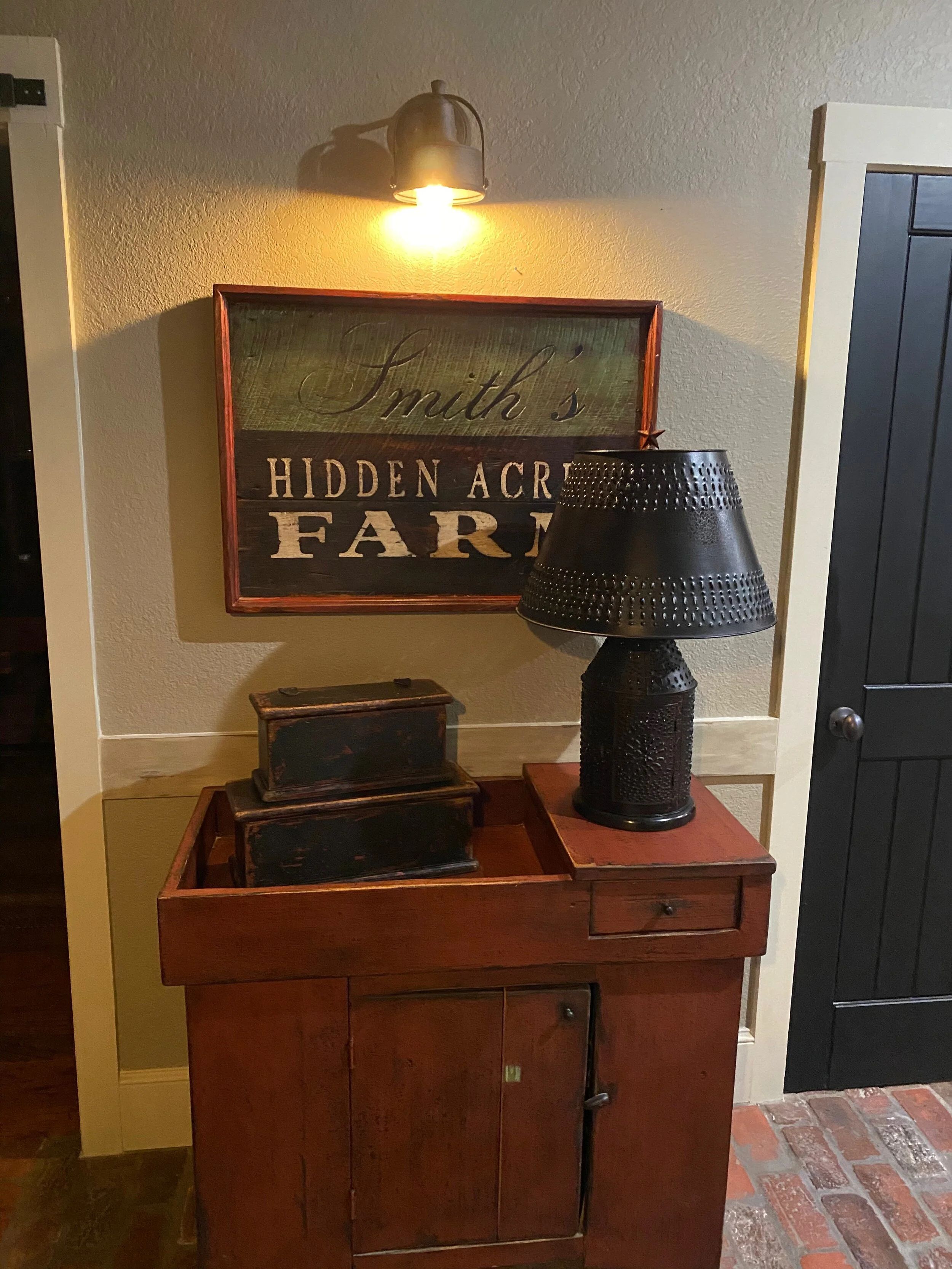
Photo provided courtesy of customer
A Nautical Nook
Here, the customer has dedicated a perfect, intimate corner of the room towards a nautical display of two of my signs. I particularly find the arrangement of these signs aesthetically pleasing, on the account that they are feature elements that move in opposite directions. The opposing force of the whale moving towards the right juxtaposed with the mermaid-prowled ship moving left counterbalance one another. Such forces create energy (visual interest), yet coexist in a neutral state of harmony that is quite satisfying to the human eye.
My apologies for the art teacher in me coming out there, but it proves my point that “good design” is important - not only in the art itself, but in the arrangement of it. Many people, when they see it, “know what they like” or “know what looks good”, but have a difficult time actually arranging things or explaining what it is they desire. Although there are no real absolutes, I always tell my students that resorting to a few design rules / guidelines can greatly increase the visual impact of anything. It’s not that difficult, and it thrills me to the bone to see that my customers have done very well in making excellent display choices!
Did I mention that the choice of blue for this wall is simply exceptional? What better way to unify two nautically-themed tavern signs than envelop them in a soft, velvety blue hue.

Photo provided courtesy of customer
Hartley House Weddings
Here are some images of the sign made for the Hartley House in South Carolina. For more information on this, read on (below).

Image courtesy of Hartley House

Image courtesy of Hartley House

Image courtesy of Hartley House
Two of My Signs on a Large Wall
A dear customer from California commissioned two signs from me this year. Here, you can see the beautiful display on their grand staircase. My customers do a terrific job making my work look good.

Photo provided courtesy of customer
Recent Work
The Fox Tavern & Inn
This is a sign painted, based upon the request of the customer. I do believe a similar sign (by another sign painter) can be found online and can be purchased as a print. However, this commission called for a hand-painted version of this ‘sly fox’, a sign that was quite large in scale and hefty in its weight. The barn wood used to create this signboard was beyond exceptional. The grain found in the wood was rivaled only by the density comprising it. It’s as if the wood was so old that it began petrifying!


SNEAK PEEK: Check out the grain in the wood used to make Mr. Fox!


Black Hound Hill
Similar to the sign featuring ‘Mr. Fox’, this sign features a set of eyes which appear to stare the viewer down. Set against a black backdrop, these eyes appear a bit more menacing than those found in the fox piece. The design featured here was not mine, but rather one which was provided by the client. This double sided sign was made using some of the thickest old-growth heart pine wood I had in my possession. It was rugged, full of knots and deep character. To temper such ruggedness, I hand-planed the surface and jointed the three (3) planks jointed together with wooden (beech) tenons and glue.
Because this sign is intended for the out-of-doors, I treated it accordingly. Yes, the entire thing is made from ‘real wood’, so such protective considerations will prolong its structural integrity. Exterior grade primer, exterior grade paint, plenty of thermoelastic caulk and exterior grade hardware will serve as important protective measures safeguarding against the elements. The weather will certainly triumph in the long haul, even despite the annual maintenance of a real-wood sign (or any type of sign for that matter), but in many cases, a slight "weathering” can work favorably, producing a look of assimilated ruggedness. Such is my hope for this fine sign. In 10 years, mother nature will have applied a masterstroke to this sign, giving it the appearance of something that has, for the lack of a better phrase, always been there.


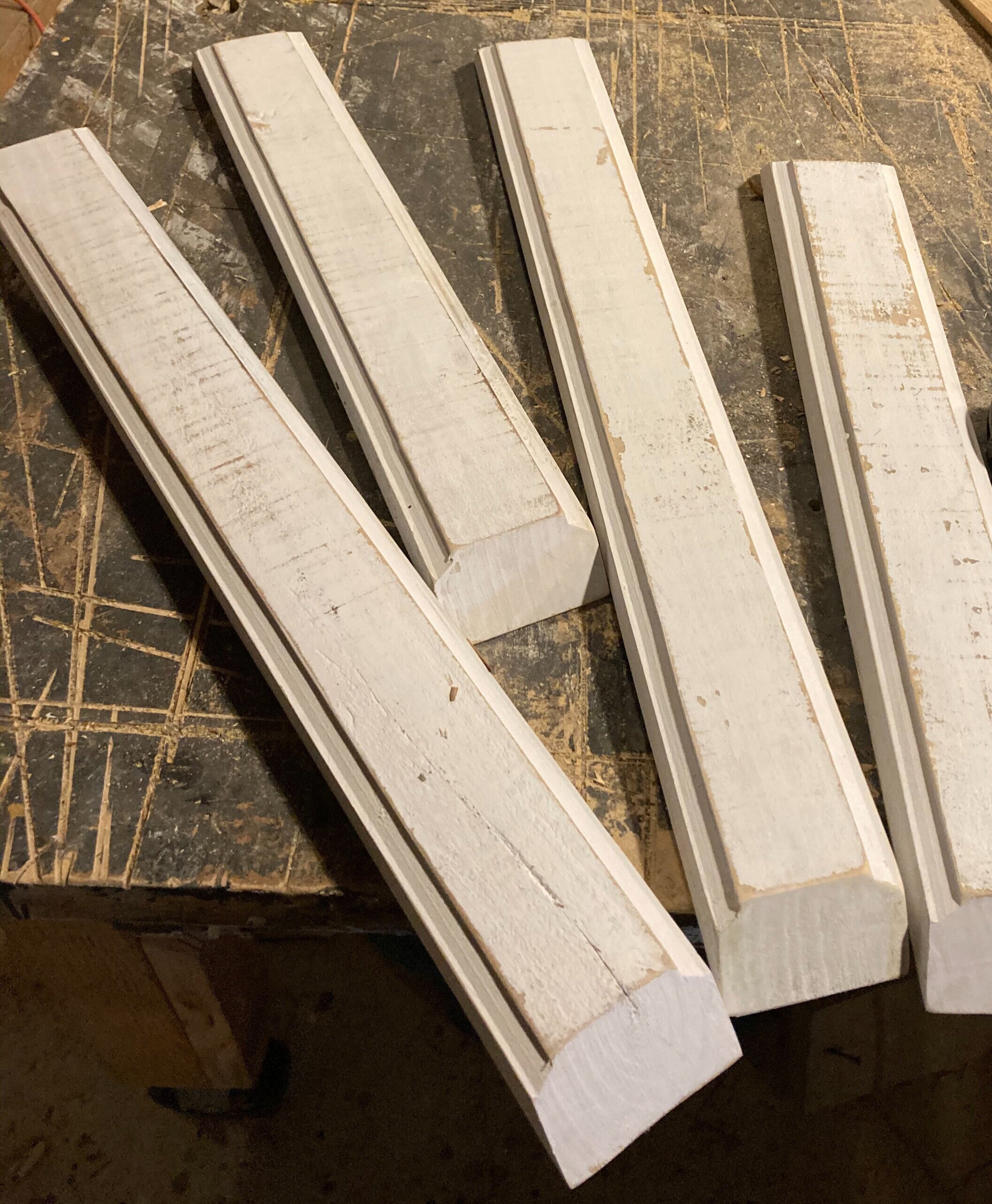
SNEAK PEEK: Below, you can get a sense of just how thick the hardwood molding stock was for this sign. Beneath this, I have included images of the planks that would be gently planed down and jointed together to form the main sign itself.


Some More Joshua Alden Inn and Tavern Signs?
A few words on the practice of “reproduction” -
Yes, you guessed right - another Joshua Alden Inn and Tavern sign! Well, you know that this is a hot sign - one that’s in high demand. That said, you might wonder why I need post more than one or two versions of my reproduction efforts, right? Well, while that is valid, this is a perfect opportunity to provide further proof that each and every one of my signs are unique. I know this is such a trite expression, but - even in the signs that classify as faithful “reproductions” - there are inherent differences.
Historically speaking, the practice of “reproducing” works of art, be it signs, paintings, print images, sculptural works, etc. was one of the methods through which artists would be trained in their craft. Not to be confused with ‘plagiarism’ or the notion of ‘fakes and forgeries’, there were other reasons for making faithful copies of specimen pieces. Without going into a total dissertation on the subject, I’ll mention another legitimate motivation for reproducing a given work - that of preservation or documentation. Consider an important document, especially prior to the advent of the printing press. By faithfully making a copy of a work of art, you are engaging in the preservation of the idea/s and appearance of it.
Now, back to my initial point about uniqueness. Well, my reproductions are very faithful; Yet, I am fully aware that differences between say 100 different Joshua Alden signs are going to exist. Let’s take this hypothetical number of 100 further. If all 100 Joshua Alden signs were set in front of me, I know full well that I would be hard pressed to find a mere 2 that were exactly identical - spitting images to one another, if you will. I take great delight in this reality and I hope you do too. It means that what you receive from me, regardless of its faithfulness to its original museum piece, is a work that is like nothing else out there… it is the result of my own interpretation of the original sign at that given time in my life.
A work of art’s uniqueness is distilled through the artist’s own sensibilities. The materials or resources available at the time, one’s attitude, temperament, time, knowledge, aspirations, and so forth… these are just a few of the factors that shape the quality and uniqueness of any given art object. Compare this to a commercial printing press that pops out thousands of posters in a day. Any uniquenesses found between 2 prints would be menial, most likely with respect to the saturation level in the ink. I believe you would agree with me… the inherent differences in that which comes from the human hand are much more desirable.

This particular version of the Joshua Alden sign was made slightly larger than the dimension normally used. In addition, it was constructed with the necessary provisions for an exterior placement. The customer explained to me that she was replacing a sign that - interestingly enough - was hung on her chimney. A rather unique arrangement, the customer’s house is designed in a manner which allows a spectacular view its chimney from the interior. So, from the intimacy of the dining room, a spectacular view of this exterior space is offered. Furthermore, in the Spring and Summer months, the exterior space functions as a garden area, perfect for out-of-doors entertainment.

Hartley House - A Wedding Venue
Here is a sign that was made to look primitive in its artistic approach and rustic in appearance. George Washington is depicted in a naive painterly style atop his loyal dark horse. The sign hangs from a beautiful wrought iron sign post, welcoming people to the Hartley House facility in Batesburg-Leesville, SC.
The (Bond-Bates-Hartley House) Hartley House is listed with the National Register Properties in South Carolina. A two-and-one-half story weatherboard residence, with a central two-story portico, a closed brick foundation, and a gable roof, the property functions as a Wedding events venue. Architecturally, the house is a typical upcountry farmhouse, with a portico adapted from the Greek Revival style. It is believed to be the oldest house in Batesburg and is a perfect setting for celebrating those special moments with family and friends.


Cigars and Tobaccos (& the Indians that grew it)
Through the years, I have made several versions of this Native American-themed sign. A depiction of a “wooden Indian” statue that was commonly displayed in and around the fronts of early stores across rural America. A sign such as this would have served a similar function, but in a slightly less obtrusive dimension. It was an exclamation to passersby that the establishment posting it was fully furnished with items such as pipe tobacco, cigars, and miscellaneous goods in kind.

In the 16th and 17th Century, the demand for tobacco grew and a major cultivate of this product was the Native American. The British, who became interested in the tobacco being grown on our Colonial coast (namely Virginia), began importing large amounts, was responsible for the first wooden Indian statue advertisement. The tobacconists in the harbor regions of Great Britain commissioned the plentiful ship builders to carve these figures that would serve as clear symbolic indicators to the general public that “tobacco goods could be found here”. It makes perfect sense that the shipwrights became involved here - the men who were deftly skilled in carving the ornate wooden figureheads in the bows and decorating the sterns of great vessels. What’s interesting is that such a need in the area of commerce and advertisement was met and fulfilled by shipbuilders.
We all know that the literacy levels in both the Early Colonies and Great Britain varied greatly. Therefore, it was a smart move on the part of early advertisers to call upon such a bold symbol to attract attention and promote their goods in a manner that was universally understood. One interesting tidbit of information about the earliest wooden Indian storefront statues is the fact that, because most wood carvers did not know what a Native American looked like, they had to rely on the descriptive accounts and drawings relayed to them by the sailors. Some of the earliest examples of these wooden Indian carvings reflect the Natives in an African appearance. In any case, the use of these wooden statues seems to have fallen out of practice in the mid-19th Century, with the advent of the steel being used in the ship building business. I suppose, like many things in life, such discontinuance contributes to the novelty of these fascinating early advertisement objects.
In America, the use of wooden Indian statues echoed that across the Atlantic Ocean. It wasn’t until the early 20th Century when the popularity of these wooden storefront men began to fall out of practice. Their slow and subtle disappearance appears to have been caused by virtue of the fact that many city councils began enacting ordinances and regulations to ensure ease of travel throughout the general public. As we all know, things such as lawsuits are sure to accompany any damage or injury caused from an irresponsible store owner. The last thing anyone wants to experience is the hefty weight of a wooden Native American on top of us on a blustery day in the town.

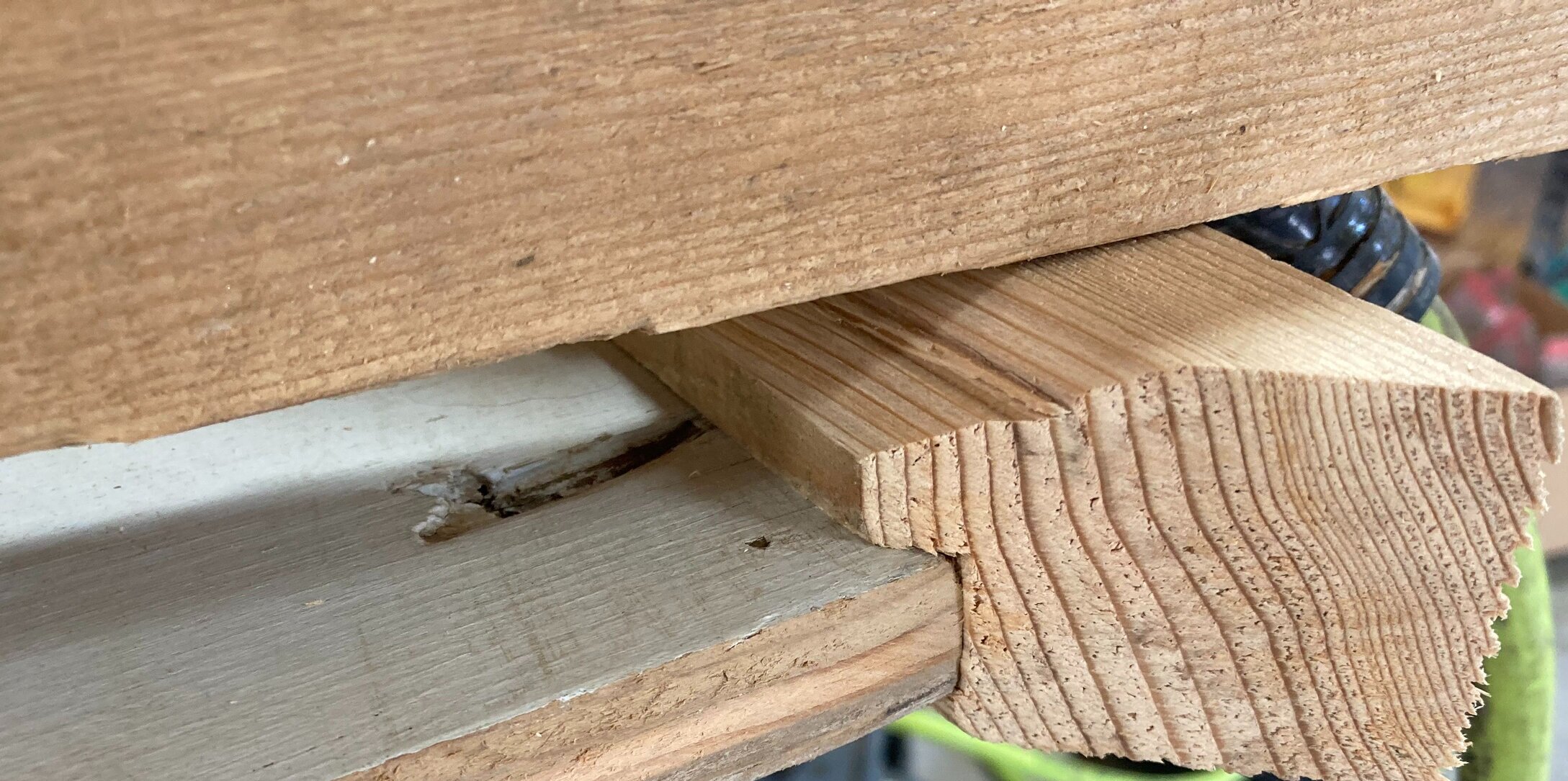
SNEAK PEEK: Here are two images that reflect a profile view of the molding and how it will conform to the main sign panel. Made from rustic hemlock, this molding was full of knotty character and finished up very well when stained with a dilute paint mixture.

Solomon Powers Stone Yard, Gettysburg, PA

The quaint town Gettysburg is less than a one hour drive from my house. I take for granted the rich history that exists there. Despite the fact that I’ve taken countless field trips as a kid, visited frequently as an adult and spent my fair share watching my oldest son play soccer games there throughout the years. Despite my travels to this renowned region which lays claim as one of the most important (if not the single-most) battle in the American Civil War, I have never devoted myself to truly immerse myself in the layered richness that, even today, lies among Gettysburg’s old brick buildings, back-alleys, typical tourist-trap offerings, but especially its residents.
In my interactions with this particular client, my appreciation for all things historical was put to the test. It was an exciting experience, talking with this fellow, yet I found myself feeling quite deficient in my knowledge and enthusiasm for Gettysburg history in particular. I admired the passion held by this man who requested that I fashion a sign that honored the man known as Solomon Powers. It was the former house of Solomon Powers that had been the property and project of my client for several years now. In his hands, the property was being transformed into a spectacular state that would be both functional (as a business) and a tribute to the legacy of Mr. Powers.
Without going into too much detail (which would surely reveal my horrible sense of memory these days), I will attempt to briefly summarize the major facts surrounding Solomon Powers and his role in the town of Gettysburg. Prior to and after the great Battle of Gettysburg, Solomon Powers operated as the premiere stonemason for the town. He maintained his stone-yard adjacent his home on High Street. Specializing in certain aspects of stone masonry, he preferred using the dense granite for much of his work and became somewhat famous for his signature look in the area of home foundations. It might be important to note that he his stonework was of great importance to the Evergreen Cemetery. The following notation can be found on his “Find a Grave” site:
“LIVED ON WEST HIGH STREET AND RAN A QUARRY OFF THE BALTIMORE PIKE AT "POWERS" HILL. BORN NEW HAMPSHIRE. STONE CUTTER. IN 1838 HE MOVED HIS FAMILY FROM BALTIMORE TO GETTYSBURG AND OPENED ONE OF THE FIRST QUARRIES IN THE AREA. LOCATED AT POWERS HILL HIS QUARRY PROVIDED THE STONE FOR THE BASE OF THE EVERGREEN CEMETERY GATEHOUSE."

For a wealth of information about Powers, his property and the influences imparted towards the cause of the Battle of Gettysburg, I would certainly defer to my good friend. Hearing the stories from my client was a true joy and reaffirmed for me the true importance that Gettysburg held in the Civil War. More specifically, it became apparent that the oral history that can be learned by talking to people was quite dynamic. In the handful of years of ownership, my client explained to me the many new stories and facts obtained throughout his discussions with others and through performing a little ‘digging’ of his own. I viewed him as a curator, hellbent on preserving this history and connecting it to the larger picture (you know, the stuff in all of those books written about Gettysburg).
So, I offered my hand towards my client’s cause - humbly making a contribution to the story… the story of Gettysburg. This sign has been affixed to the reverse side of the house and can be seen by the side traffic and those viewing the property from the back alleyway. I do believe we will be collaborating (soon) on a sign that will hang from the front of the house. It is my hope that my work brings much attention and appreciation to such an important cog in the Gettysburg experience.

Photo provided courtesy of customer
Nostalgia
We all remember growing up as a kid and can most likely recall everything about the place we called home. This was a custom sign made to honor the memory of a customer’s childhood home. Fashioned from wood from The Mayflower, this sign packs the heft. Just kidding about the source for my wood for this sign - haha - but wherever its origin, this is some of the most solid, beefy planks I have come across. Old molding was reappropriated into the construction, as was a very old raised panel that was used for the painting of my client’s childhood home.
Personally, every square inch of my childhood home / property can conjure up a hundred memories. I can even recall the smell of certain rooms and areas of my yard. The sounds, smells, sights and textures of our childhood all contribute to the character and identity of who we become. They are personal to us and treasures that we carry with us as we experience life with others. I do trust that I was able to capturing an image that my customer’s childhood home that, in her mind, evokes the full spectrum of her childhood memories associated with it.


In-progress Work
Wooden Anker Tavern
Okay - this is a work in progress, but the sign is almost finished. There will be some nice wrought iron attached to the left and right flanks of this somewhat decoratively scrolled sign, truly capping things off from a visual standpoint. This is a custom sign that reflects the historical importance of the customer’s family name. His last name is “Ankerholz”, which roughly translates to “wooden anchor”. The request called for a motif that featured said wooden anchor juxtaposed with a metal spike. Here, you can see the arrangement decided upon, as both elements are set against one another to form a semblance of visual balance. The colors were chosen in order to match those found in what serves as my customer’s “man cave”. A truly spectacular space, it is my hope that this sign serves as a satisfying and worthy reminder to the king of the cave - something that brings to him and his family great pride.


Screaming Eagle of the American Revolution
Another work in progress, this war eagle is aggressively proclaiming the phrase “E Pluribus Unum”. Made on a panel that was once part of a door in the family’s historic Pennsylvania barn, this piece will be encased with an appropriate wooden frame. The molding used for this sign will nothing less than top-shelf barn wood - quite appropriate, considering the context. When this commission has been completed, it will be a spousal gift and will be displayed in the loft of the amazing barn in which the panel was found.


A New England Saltbox
Getting close to finishing this sign, I have a few tweaks to make here and there. There will be an addition of wrought iron coming soon, in order to supply the sign with vertical members for future connection to a signpost. This is a painting of my client’s house in Connecticut and one that is simply true-to-form in every way possible. This sign will serve as a marker for his property - one that I can’t it to see in place!


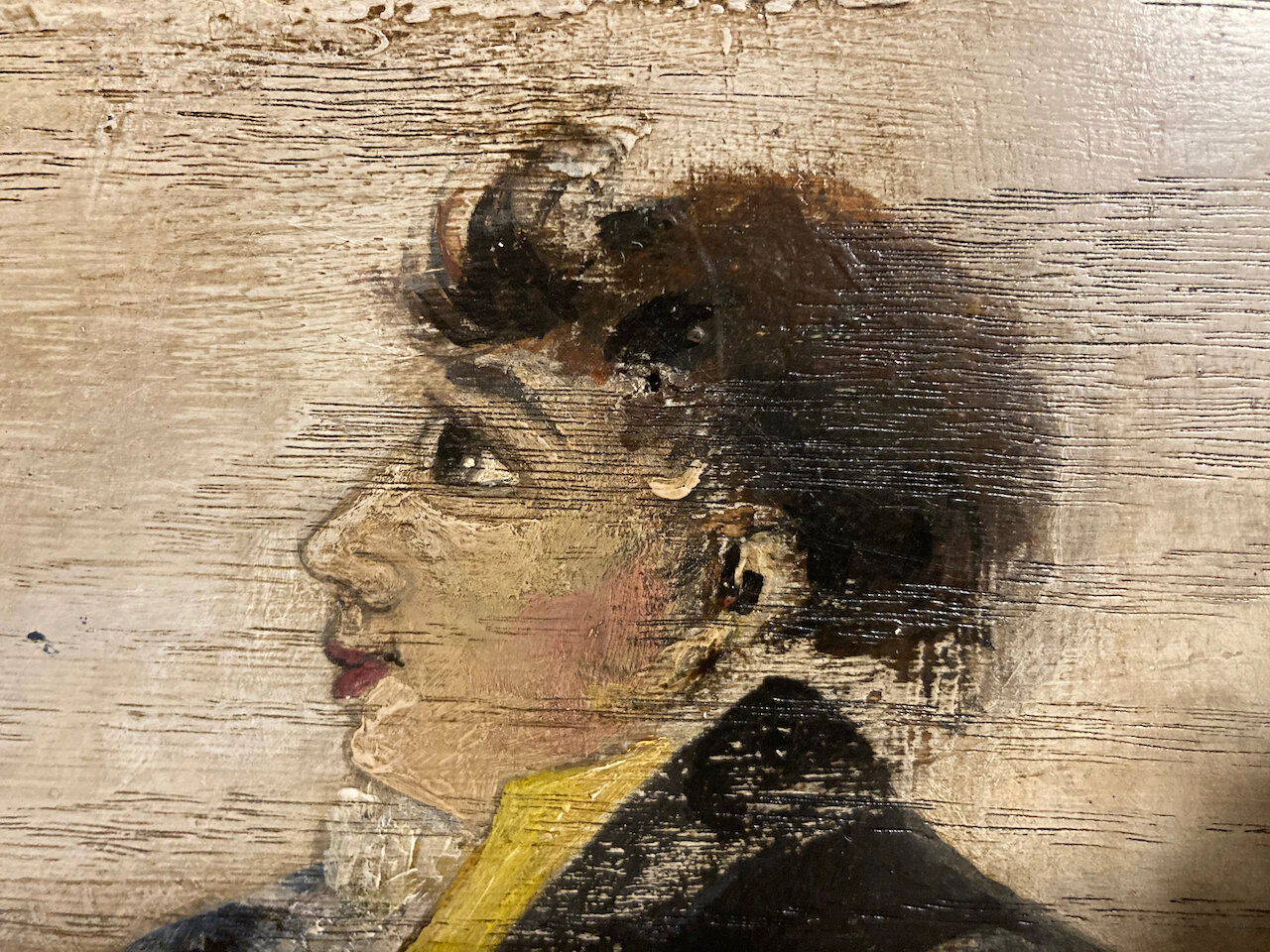
Details of Work
From time to time, I like to share a few close-ups with the world. Here are a few recent ones :)


Extensions, etc.
Curator’s Corner
Always one to be making more work for myself than what’s required, I have begun the quest of collecting a few old signs and knick-knacks here and there. To be clear, these are objects not from my hand. They are authentic (not that my work isn’t authentic, per se - haha) antique pieces that I find in my travels; Things that I feel my customer base might desire. Trust me, I do not want to become an antiques dealer by any means, but I am going to begin to curate a small line of old objects that are related to my sign business with the hopes that some interest might exist. If not, hey - no problem. Just like my hand made signs, I’m not offering anything that I wouldn’t mind keeping myself :)
To this end, I am featuring just one object in this blog post - a small sign that was most likely once attached to a horse-drawn carriage. It reads “Gitche-Gumee”, which is actually a name referring to Lake Superior - one of America’s Great Lakes. Below is an excerpt taken from Lake Superior Magazine, explaining this:
Many people, thanks to Henry Wadsworth Longfellow’s “Hiawatha” poem (1855), have heard of Gitche Gumee, the shining Big-Sea-Water. This spelling was learned, it is said, from Henry Schoolcraft, who worked with the Ojibwe people at the time Longfellow wrote the poem.
Today in Ojibwe language class, thanks to dialectic differences, you are more likely to see gichi-gami, gitchi-gami or kitchi-gami for Lake Superior. Loosely, it does indeed mean “Big Sea” or “Huge Water,” but just about always refers to Lake Superior.
The 1878 dictionary of Father Frederic Baraga, the first one written for the Ojibwe language, says Lake Superior is Otchipwe-kitchi-gami - the sea of the Ojibwe people. The “i” at the end of gami would be more like the “i” in it than a long “e” sound.
So, if such a sign appeals to you, email me at casc1776@yahoo.com to inquire about acquiring it.


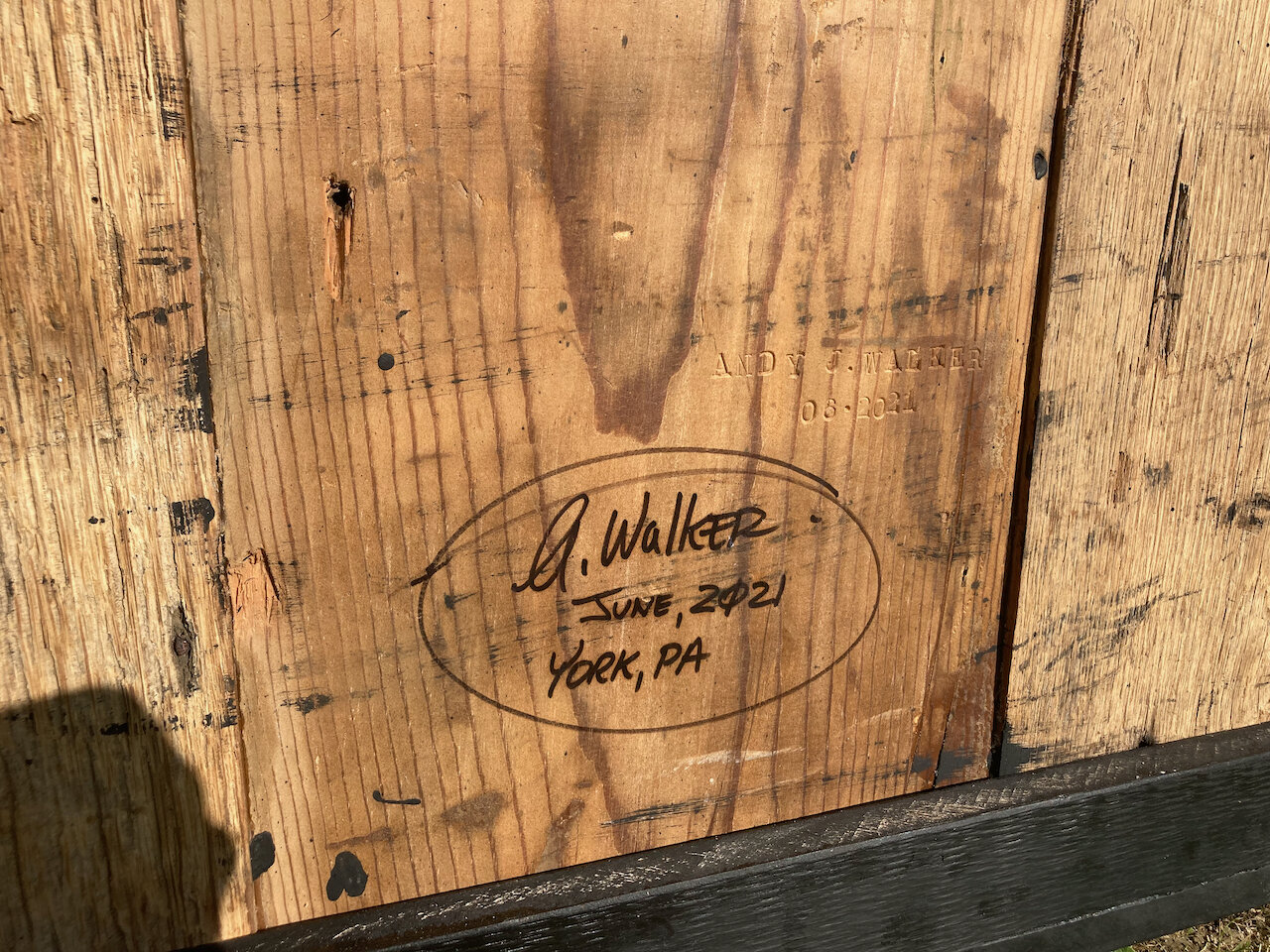
Signed and Dated on the Back
In a much earlier blog post, I had mentioned that I still use my Pappy’s metal stamps to sign each sign that leaves my studio / workshop. This is a practice that has become much more consistent during the past three years. Based on numerous customer requests, I have also adopted the practice of hand signing my work. I do all of this on the reverse side of the sign, so as not to impede upon the imagery being featured. The last thing anyone wants to see is my signature, which - in my opinion - could potentially distract from the visual dynamics found in the painted surface.


Tavern Signs Prepared For Shipment
There is nothing more satisfying (or exciting) than the evening prior to a shipment dispatch. Here is a glimpse of a batch of signs that await a shipment on the following day. The last time together, each of these signs will part ways throughout the United States - making their way to their respective destinations.

Artist Proofs - One-of-a-Kind Prints
Occasionally, I make a few professional quality prints of my work. There are different reasons for doing this, but most times I use them to explore various appearances. For example, I might apply gold leaf to certain areas of a given image, in effort to accentuate a particular aspect of the design dynamic. An artist proof is essentially a print that is one-of-a-kind due to the manipulation of it after the time of printing. Sometimes, I include one of these bad boys in the mix of a sign commission as a courtesy to a customer. Many times, it’s a special way of acknowledging the patience of a customer, in light of a commission taking longer than anticipated.
Here is an artist proof on canvas. Paint was used overtop to highlight various areas, namely in the red and gold areas.

This second example simply illustrates an artist proof being handled on a piece of thick acid-free stock. When printed on this matte stock, the black color looks velvety and really compliments the lighter-valued areas in a design.

Prints on wood
An idea that I’ve been entertaining for some time now, I have taken some steps to put into action the reality of making available to you versions of a select number of my signs in print form. Many wish to own a hand-painted sign, but for those of you who may not have the funds available at the time to commission one, a print on wood might satisfy your needs just fine. Quite honestly, these signs are quite extraordinary! The print quality is outstanding and the wood used is exceptional - made from 3/4” cabinet grade hardwood. Furthermore, each of these prints are encased using old barn wood molding.
Here is a quick screenshot of a developing image that showcases my collection. Once I finalize things, I’ll publish it on my webpage, but if you are interested now, please shoot me an email.

*Note: This is a mere screenshot of an image that I’m working on.